

 ANTERIOR

Como os cartões de agradecimento corporativos fortalecem os relacionamentos comerciais
2026-01-15
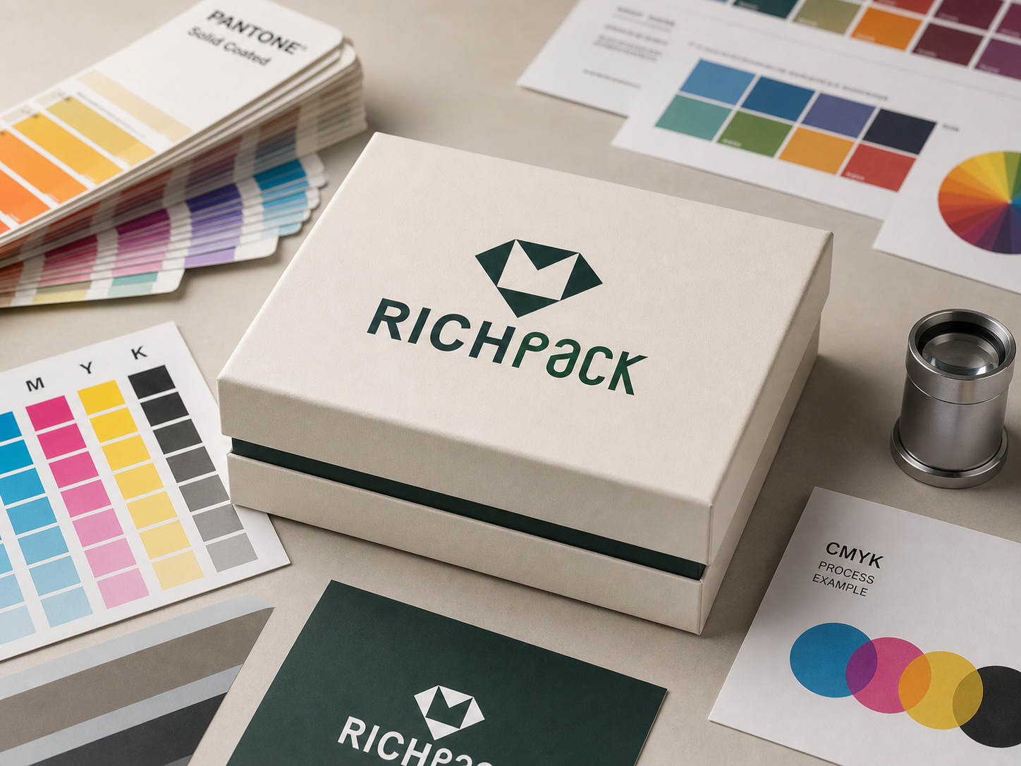



A logo can look perfect on screen and still turn muddy on a jewelry box. That failure rarely starts with a bad color choice. It starts when a color number travels through the wrong profile, paper, finish, proof, or approval path.
CMYK and Pantone solve different print problems. CMYK builds images from four process inks, while Pantone identifies named spot colors that a printer can mix as separate inks. The right choice depends on the artwork, target material, production method, budget, and how tightly the brand must control repeat orders.
After reading this article, you will get a direct comparison, a practical matching method, and a production approval path. For a deeper look at the print variables behind paper boxes, see RichPack’s guide to color management for paper jewelry boxes. The goal is simple: approve a color that the production team can reproduce, and the buyer can inspect.
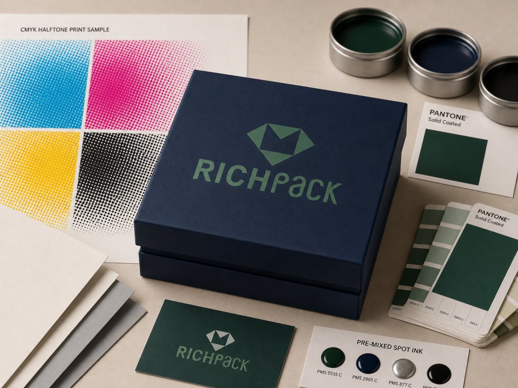
CMYK combines screened dots of cyan, magenta, yellow, and black. Pantone spot printing uses a named color as a separate ink or color separation. One is built for flexible process reproduction; the other gives teams a shared reference for a specific color.
| Ponto de decisão | CMYK | Cor Pantone |
| How color is made | Four screened process inks overlap | A separate ink is mixed for the named color |
| Strongest use | Photos, gradients, illustrations, many colors | Flat logos, signature colors, special colors |
| Gama de cores | Limited by the process condition and substrate | Can reach some colors outside standard CMYK |
| Configuração de arquivo | Four process separations | A named spot channel and separate plate or station |
| Repeat control | Depends heavily on profile and process control | Gives a stable target but still needs press control |
| Padrão de custo | Efficient when artwork uses many colors | Each spot ink can add setup and press work |
These are not rival brands of the same tool. They are different production routes. RichPack’s overview of packaging printing techniques shows why the print method must be considered with the color system.
CMYK is a subtractive printing system. Cyan, magenta, and yellow inks absorb parts of the light reflected by the substrate, while black adds density, detail, and more stable neutral reproduction.
The press does not pour four inks into one pot. It prints fine dots in separate layers, and the eye blends those dots at normal viewing distance. Dot size, registration, ink film, paper shade, and press calibration all affect the result.
CMYK works well when a care card includes a product photo, a soft shadow, and a multicolor illustration. Trying to separate every visible hue into its own spot ink would add unnecessary plates and setup.
A Pantone spot color is a named reference intended for reproduction as a dedicated color. A printer may mix that ink from a formula, buy a prepared ink, or use another controlled workflow suited to the press.
The Pantone number is a common language. It is not a force field around the color. Ink film, paper color, drying, coating, and press condition can still move the measured and perceived result.
Pantone also includes metallic and fluorescent families that standard four-color process printing cannot reproduce faithfully. Those colors need an appropriate ink and production method, not a CMYK screenshot that only imitates the appearance.
CMYK can reproduce a large working range, but that range is bounded by the selected print condition. Some saturated blues, oranges, greens, metallic effects, and fluorescent colors sit outside ordinary CMYK capability.
Pantone Color Bridge places a spot color beside its closest industry-standard CMYK match. The word closest matters. A bridge value is a practical simulation target, not proof that the process build is visually identical to the spot ink.
Color accuracy also means different things to different teams. A designer may mean closeness to a screen preview, while a buyer may mean consistency with last season’s box. Production needs a named target, a material, a measurement method, a viewing condition, and an agreed tolerance.
A process-color file normally separates into cyan, magenta, yellow, and black plates. A true spot color remains a named swatch or channel and creates an additional separation for the printer.
That distinction can disappear when a logo is flattened into a raster image or converted to process color. Printers will tell you that artwork can look correct on screen while the separations panel reveals no usable spot plate.
Before release, ask the printer whether the Pantone reference is a real spot ink, a visual target for a process build, or both. Those three words, “use Pantone 2685C,” can describe very different production instructions.
RGB and HEX describe screen color. They matter for product pages, ads, email, and digital brand standards because displays create color with emitted red, green, and blue light.
A screen can show colors that a CMYK press cannot print. Display brightness also makes a color feel cleaner or more vivid than light reflected from paper. This is why a neon-looking cover can become flat after process conversion.
Keep RGB and HEX values in the brand record, but label them as digital references. They should not approve a physical packaging color.
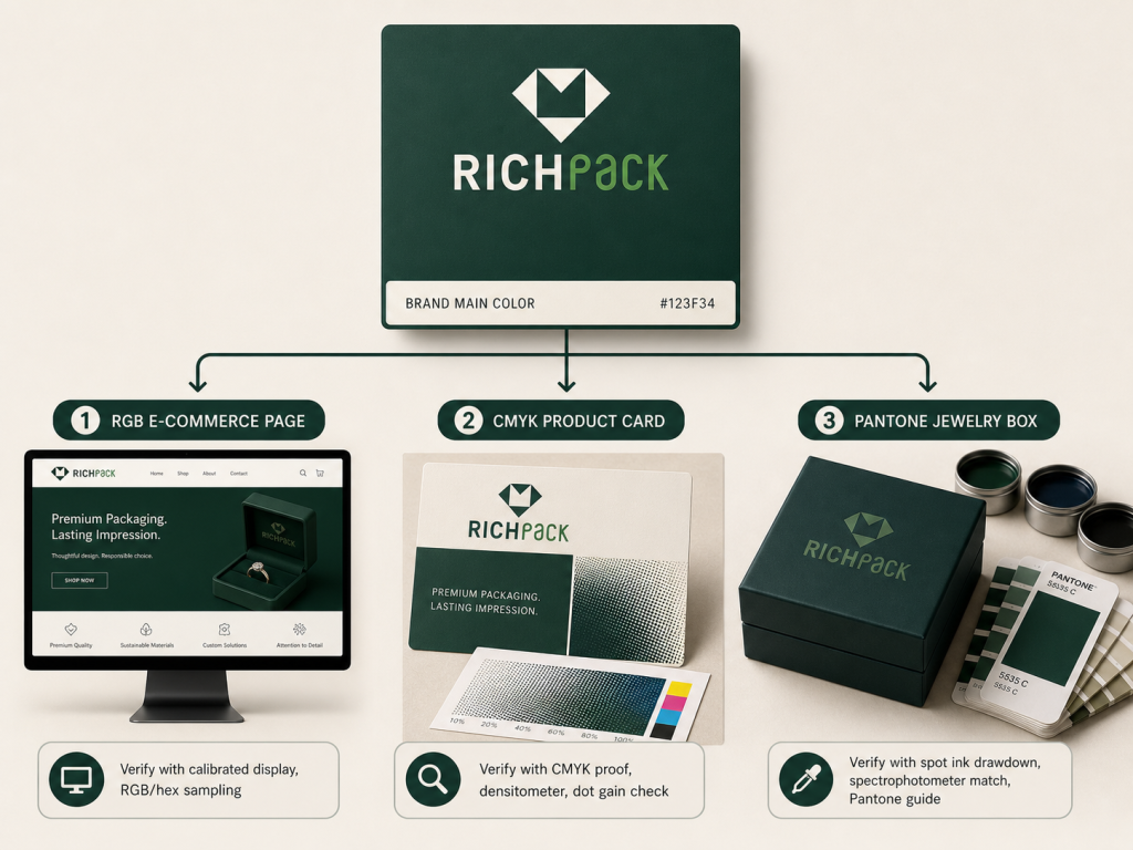
Choose by looking at the artwork first, then the color risk. A photo-heavy sleeve and a one-color logo do not ask the press to solve the same problem.
| Condições do projeto | Better starting route | Razão |
| Product photos or gradients | CMYK | Four process inks can reproduce continuous tonal content |
| One critical flat logo color | Pantone spot | A dedicated ink can give stronger control |
| Photos plus a signature logo | CMYK plus Pantone | Process handles imagery while spot ink protects the brand color |
| Very short digital run | Device-specific process simulation | Many digital presses do not run a true mixed spot ink |
| Metallic or fluorescent accent | Specialty spot ink or finish | Standard CMYK cannot create the physical effect |
| Several vendors and repeat orders | Agreed physical master plus component targets | A code alone cannot control different materials and processes |
CMYK is the sensible route for photography, gradients, watercolor art, and seasonal graphics with many hues. Four plates can carry the whole image without adding one press unit for every visible color.
A jewelry launch sleeve might show a gemstone photograph, skin tones, and a soft background gradient. Process printing handles that complexity well when the image profile and press condition are agreed before proofing.
CMYK is less convincing when one small logo color carries most of the brand recognition and falls near the edge of the available gamut. In that case, saving on one spot plate can create a long approval loop.
Use a spot color when a flat brand color must remain recognizable across repeated packaging orders. It is especially useful when standard CMYK cannot produce the required saturation or when small shifts are easy to notice.
Cadbury’s UK trademark case referred to purple Pantone 2685C for specified chocolate goods. That legal record does not prove a print method or sales result, but it shows how precisely a packaging color can be named when it becomes part of brand identity.
A Pantone reference still needs physical approval. The press operator must control the ink, film weight, stock, and drying condition. Color naming improves communication; it does not remove manufacturing.
Hybrid work is common. CMYK prints the campaign image, while a spot plate carries the brand blue on the logo and perhaps a small border.
This approach protects the color that matters most without turning every color into a separate ink. It also creates an extra plate, ink setup, wash-up step, and inspection point, so the quote and timeline must reflect that work.
For a coordinated launch set, keep the spot target consistent but approve the sleeve, rigid box, card, and bag as separate components. Their surfaces will not respond in the same way.
Offset lithography supports controlled process printing and separate spot inks. Many digital presses reproduce a Pantone target through their own toner or ink set, but that simulation is not the same as loading a mixed Pantone ink.
Screen printing can place an opaque color on velvet, coated parts, or dark substrates, yet mesh, ink deposit, cure, and surface preparation change the result. Flexographic and gravure workflows bring their own separations and process-control needs.
Start with the actual supplier and press route. RichPack’s notes on Pantone packaging color mistakes help frame the questions that should be settled before artwork release.
There is no honest universal claim that one route is cheaper. Cost depends on the print process, color count, plates, ink mixing, wash-up, run length, substrate, waste, and proofing plan.
CMYK can be efficient for artwork with many colors. A one-color spot job may be simpler for a flat logo, while CMYK plus a spot color adds another production unit. Small digital runs can change the calculation again.
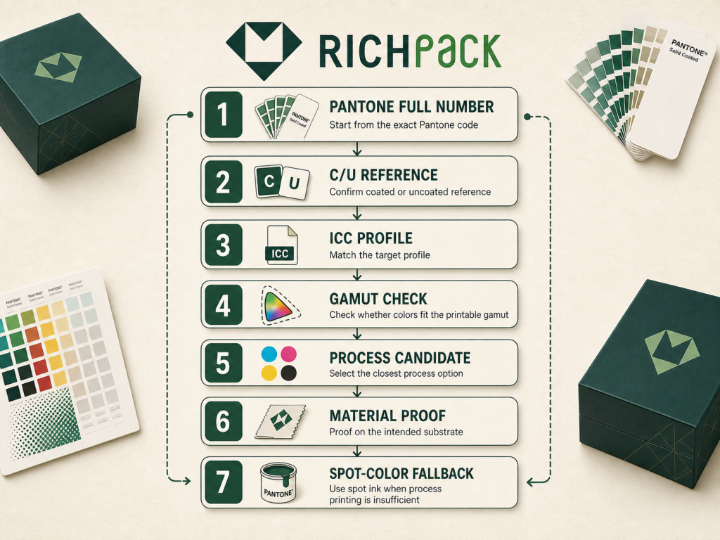
Buyers often focus on first-order unit cost and miss the cost of uncertain repeats. A cheaper setup loses its advantage if every reorder needs new conversions, new rounds of samples, or arguments about which old photograph shows the right color.
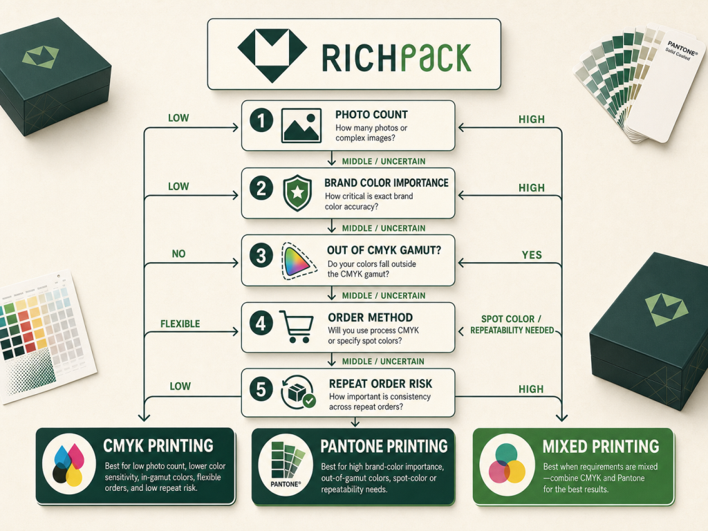
A request for CMYK for Pantone values sounds simple. It is not a lookup problem alone. The useful answer is a controlled approximation followed by a real proof on the intended material.
Confirm that the reference belongs to the right Pantone system. Graphic colors, textile colors, and other material systems are built for different applications and should not be treated as interchangeable number lists.
Record the full identifier, including C or U when it applies. Also record the guide or digital library edition. Working designers keep running into conflicts because a printed guide, an older bridge edition, and a current software library can show different process values.
Do not start by typing a number into the first free converter. Start with the color standard the brand has actually approved.
Coated and uncoated references show how paper condition changes appearance. Coated stock tends to hold ink nearer the surface, while uncoated stock absorbs more ink and has a different paper white and surface texture.
Pantone’s current Color Bridge set uses separate coated and uncoated guides and ties them to stated press references and stocks. That is useful for planning, but a jewelry-box wrap, kraft card, or textured specialty paper can still differ from the reference stock.
A supplier once changes an uncoated wrap to a brighter coated sheet and leaves the old color instruction untouched. That is an anonymized composite scenario based on recurring production complaints. The code remains the same, but the approved visual target has moved because the material changed.
An ICC profile characterizes how a device or print condition reproduces color. It connects device values to a device-independent profile connection space, which allows managed conversion between source and output conditions.
“CMYK” without an output condition is incomplete. The same artwork can preview very differently under FOGRA39 and a US web-coated profile because the profiles describe different reproduction behavior.
The profile cannot create a color outside the printer’s gamut. Rendering intent determines how the workflow handles colors that the output cannot reproduce. Agree on the printer’s profile before approving the process build.
Use a current Color Bridge reference, color-managed design software, or the printer’s separation workflow to generate a candidate CMYK build. Compare the candidate under the intended output condition rather than copying values from an unrelated webpage.
The same discipline applies when going from CMYK to a Pantone match. A tool can propose the nearest named color, but the physical guide and production sample decide whether it is useful. RichPack’s review of jewelry box printing processes adds the manufacturing context that a converter cannot see.
Approve the color on the final substrate with the intended finish and production method. A paper proof cannot approve a velvet pouch, and an unlaminated sheet cannot approve the visual effect of a matte film.
Record the sample ID, substrate grade, shade, lot where critical, ink route, coating, viewing condition, and approval date. If the brand uses a color-difference limit, record the formula and test conditions too.
A process build that looks close on coated white stock may fail on cream uncoated paper. That is not a software bug. It is a different reproduction system.
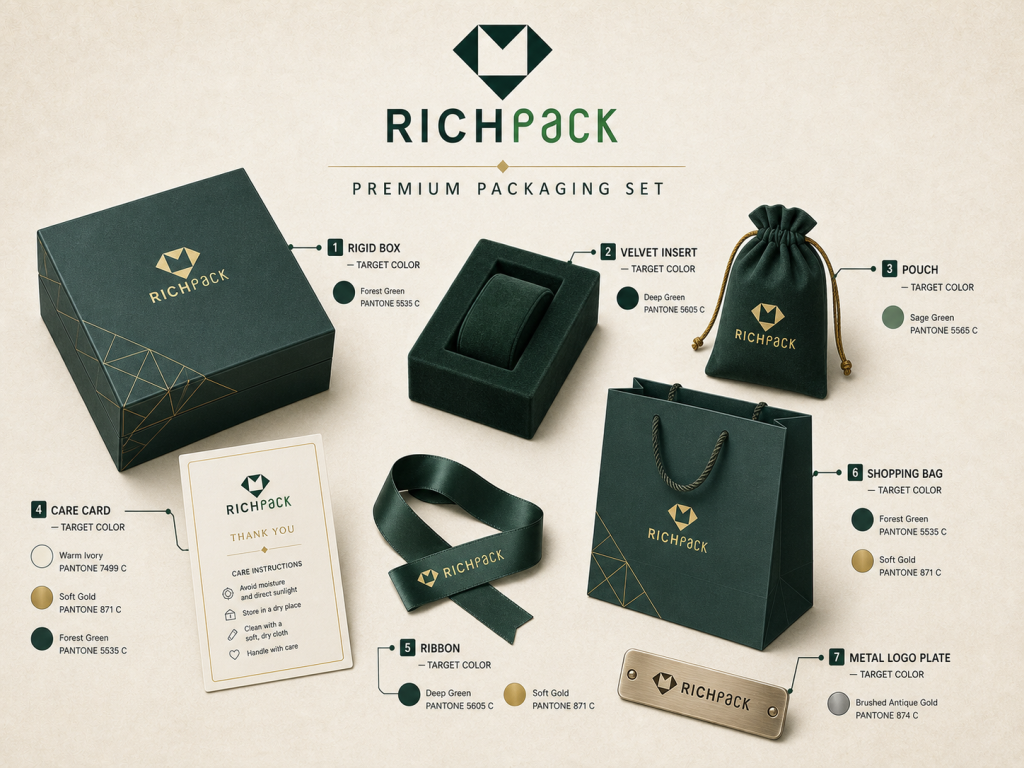
Jewelry packaging is a system of materials, not one printed sheet. A rigid box, insert, pouch, card, ribbon, bag, and metal plate can all carry the same brand color through different processes.
| Superfície da embalagem | Main color risk | Controle prático |
| Coated paper wrap | Gloss and ink film shift saturation | Approve with the final coating or laminate |
| Uncoated or kraft paper | Paper shade and absorbency reduce gamut | Test a drawdown and consider opaque underprint |
| Papel texturizado | Peaks and valleys break fine detail | Use larger marks and inspect edge fill |
| Velvet or suede | Pile direction changes reflected light | Test print, foil, emboss, or a separate badge |
| Superfície de PU | Surface energy can affect adhesion | Verify cleaning, ink family, cure, and rub resistance |
| Ribbon or fabric pouch | Fiber and weave alter color perception | Use a material-specific dye or print target |
| Placa de logotipo de metal | Reflection dominates perceived color | Approve the physical finish, not a screen swatch |
Coated paper often produces cleaner dots and stronger apparent saturation than absorbent stock. Lamination then changes the light path again. Gloss film can increase contrast and reflection, while matte film can soften the appearance.
Approve the printed wrap after the chosen film or varnish has been applied. A press sheet signed before lamination may not represent the finished box.
For image-heavy wraps, offset printing for luxury packaging can provide the tonal control needed for photography. The final finish still belongs in the proof record.
Uncoated and kraft stocks bring their own color into the image. Brown fiber, cream paper, absorbency, and texture can mute a process build or change a spot ink’s apparent hue.
An opaque white underprint can help on a dark or colored base, but it adds another layer and another variable. Sometimes the better decision is to adjust the design, use a more suitable paper, or accept a deliberate material-led version of the brand color.
Do not assign a generic percentage for how much duller uncoated paper will look. Test the actual stock. Direction and magnitude depend on the ink, paper, press, and finish.
Velvet and suede can make a printed edge look soft because the pile moves and reflects light in different directions. PU can look smooth but still reject an ink if the surface contains release agents, oil, or an incompatible coating.
A flat CMYK process image is rarely the first choice for these surfaces. Screen printing, foil, embossing, debossing, or a separate logo plate may produce a cleaner result, depending on the material and design.
The practical comparison in printing on velvet ring boxes is useful because the decoration method and substrate must be tested together. Check adhesion and rub resistance after the ink or coating has fully cured.
The same numeric color across every component can create a poor visual match. A white card reflects more light than a velvet insert, and a dyed ribbon may shift under store lighting even when it looks close in daylight.
Set one visual master, then build material-specific targets around it. Decide which component leads the identity. For many jewelry sets, the outer box is primary, while the card, pouch, and bag need to coordinate rather than pass the same instrument limit.
A brand orders boxes from one supplier and bags from another, then discovers that both vendors matched the code but not each other. That is an anonymized composite scenario drawn from repeated buyer reports. The fix is a shared physical master, component samples, agreed lighting, and a cross-component review before release.
Standard CMYK cannot create metallic reflection or fluorescent energy. A process simulation can suggest the hue on screen, but it cannot reproduce the physical effect.
Options include metallic spot ink, fluorescent ink, foil, metallized paper, or a metal plate. These are not equivalent. Each has its own shine, texture, edge behavior, cost, recyclability implications, and production limits.
Approve the physical sample at the angle and lighting that customers will see. A flat screenshot is nearly useless for judging reflection.
Color approval needs two tracks. Instruments measure a defined difference, while trained people judge the assembled package under controlled and relevant light.
A usable specification names the target and the production condition. The following fields turn that target into a production instruction.
Also check the artwork separations. Named spot colors, accidental spot swatches, overprint, rich black, and embedded raster logos can alter the plates. The file should describe what the press must print, not merely what the designer saw.
ISO 3664 specifies viewing conditions for graphic technology and photography. The point is practical: a buyer should not approve a critical color beside a warm office lamp and expect it to look identical in a daylight store window.
Metamerism occurs when two samples match under one light but separate under another. Different pigments or ink systems can create that behavior even when the samples look convincing at the approval desk.
Review critical components under the agreed approval light and one or more relevant end-use lights. Do not call every lighting change metamerism. Both samples may simply shift together, or the original match may have been poor.
Delta E is a calculated color difference, not a percentage. A result is incomplete unless the record names the formula, such as CIEDE2000, plus the measurement condition, illuminant, observer, backing, and instrument setup.
ISO 13655 covers spectral measurement and colorimetric computation for graphic arts. Use it to define how measurements are taken, not as a claim that one number suits every packaging material.
There is no universal pass limit for all brand colors. Dark colors, neutrals, textured surfaces, gloss, sample size, and end use can change what people notice and what a brand accepts. Set the tolerance with the printer after reviewing representative samples.
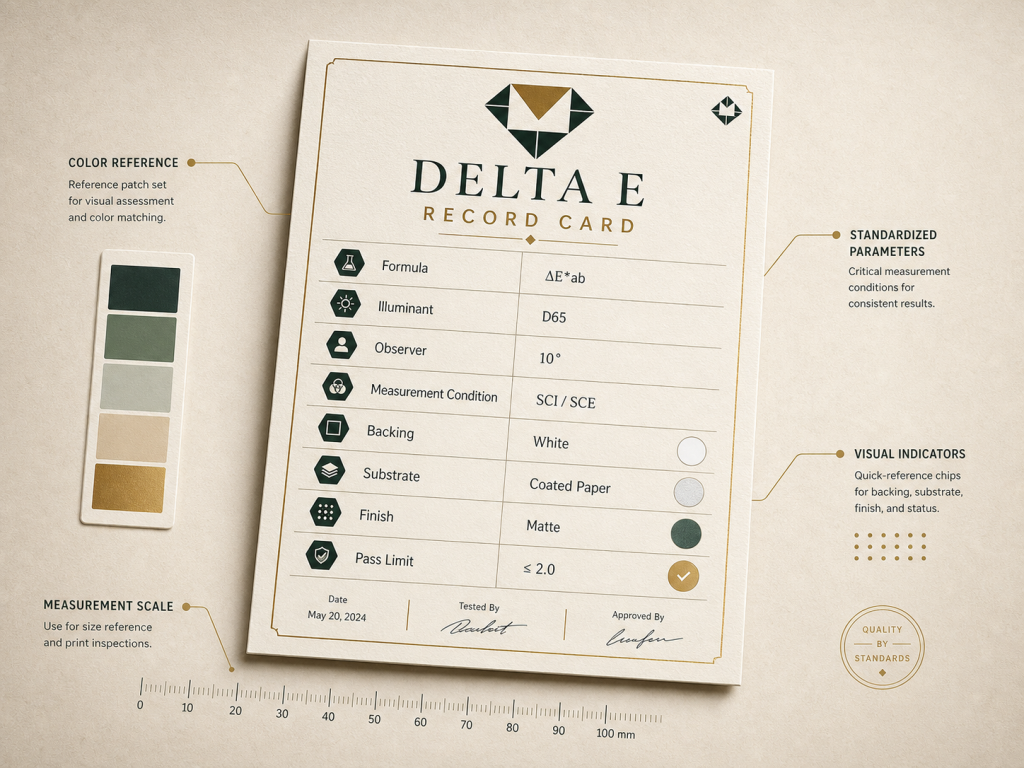
Keep a signed physical standard after approval. Label it with the artwork version, sample ID, material, finish, supplier, date, and any instrument readings used at release.
Use the same standard for first-piece review, in-process checks, final inspection, and reorders. Store it away from heat, direct light, dust, and handling damage because the standard itself can change.
ISO 12647-2 provides process-control requirements for offset halftone separations, proofs, and production prints. It does not promise an exact Pantone match across every method. Use the relevant standard and process condition for the actual job.
A box can pass its color check while the assembled set still feels wrong. The insert may be too blue, the ribbon too warm, and the bag too dark, even though each supplier worked from a valid reference.
Review the complete set. Place the jewelry in the insert, close the box, add the card, and view the bag and ribbon beside it. This catches visual competition that isolated measurements miss.
RichPack's print quality control checks provide a useful starting point for turning approval into repeatable inspection. Add component-specific limits where the set uses several materials.
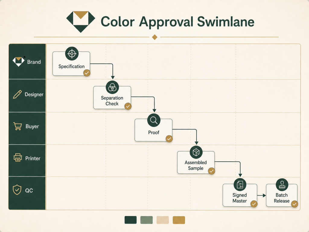
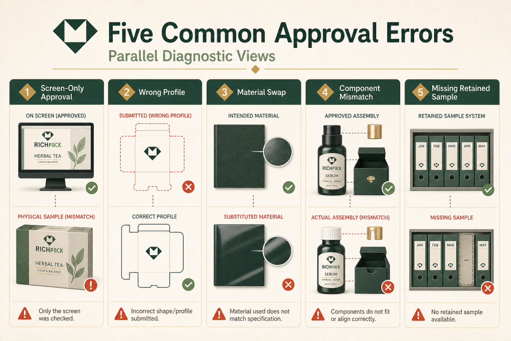
Most color failures are handoff failures. The wrong assumption survives long enough to reach production.
| Falha | Porque isso acontece | Ação corretiva |
| Screen approval only | Displays emit light and vary by calibration | Use a current reference and final-material proof |
| Universal conversion value | Profile and substrate are missing | Bind the build to an output condition |
| Material change after sign-off | Old proof no longer represents the job | Reopen color approval |
| Same target for all components | Different surfaces create different appearance | Build coordinated component targets |
| No retained master | Reorder comparison becomes subjective | Keep a labeled signed production sample |
| Hidden process conversion | Spot color was flattened or converted | Inspect separations before release |
| Approval checkpoint | Evidências a serem retidas | Decisão de liberação |
| Análise da obra de arte | Separation preview and profile record | File is ready for proofing |
| Prova material | Printed target on representative stock | Color route is viable |
| Amostra decorada | Final substrate and finish | Construction is ready for approval |
| Início da produção | Signed master and first-piece check | Batch may continue |
Screens are useful for layout, relative comparison, and soft proofing under a managed setup. They cannot approve ink film, paper shade, texture, laminate, or metallic reflection.
Buyers keep running into the same trap: a bright RGB color looks rich on a laptop, then becomes dull in CMYK. The press may be working correctly. The requested color may sit outside the output gamut.
Use the display to predict. Use the physical sample to approve.
A conversion value belongs to a source library, software setup, profile, and output condition. Change one of those inputs and the numbers or preview may change.
This is why two applications can return different CMYK builds for the same named color. It is also why an online chart should not overrule the printer’s managed workflow and physical proof.
Color Bridge calls its process values closest matches. Keep that language. Exact equivalence is the wrong promise.
A signed sample approves a defined construction. Replace uncoated paper with coated stock, add matte film, change the board wrap, or move to a new supplier, and the sample may no longer represent production.
Create a simple change trigger. Any change to substrate, supplier, ink route, press, coating, or finish sends the color back for review.
This is not bureaucracy. It prevents a familiar argument in which every team followed a valid document, but the document described the old job.
One master color should guide the set, but it should not force one recipe onto paper, textile, PU, plastic, and metal. Each surface needs a process suited to its material.
Define which component is the visual anchor. Then approve the other pieces beside it. A coordinated match is often more useful than identical numbers measured under unsuitable conditions.
If separate vendors make the components, send each one the same visual master and require assembled review samples before the full run. This check belongs before purchase orders lock the full quantity.
Without a retained sample, repeat approval drifts toward memory, phone photos, and old email attachments. None of those records the original ink and surface interaction.
Keep at least one signed production standard and a controlled record of substitutions. For a critical program, keep component masters and an assembled set.
Working vendors know how quickly “same as last time” becomes unclear when the paper mill, press, or buyer has changed. A labeled sample ends that discussion faster than another spreadsheet.
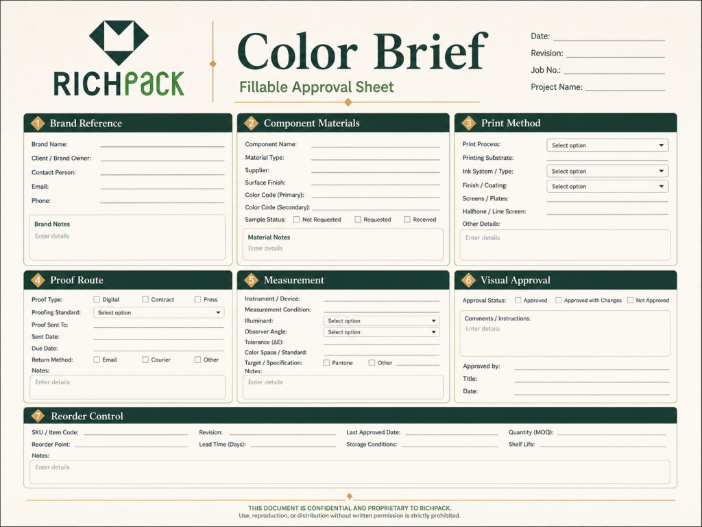
A good color brief closes the gaps that a Pantone number leaves open. It tells design, sourcing, printing, and inspection teams what must remain fixed and what requires new approval.
Name the primary print reference first. Then record the approved process alternative and the RGB or HEX values used for digital work.
Include the full Pantone identifier, C or U suffix where relevant, library, guide edition, and physical-master ID. If the brand has spectral data, state how the supplier should use it.
Do not make a screenshot the master. A screen capture has no controlled output condition.
List the material for every colored component. “Blue box set” is too vague when the set includes coated wrap, velvet, ribbon, a matte card, and a shopping bag.
Record paper grade and shade, texture, laminate, varnish, coating, opaque underprint, and reflective finish. Add lot control when normal material variation could threaten a critical color.
This is where a packaging partner adds value. RichPack’s overview of serviços de embalagem de joias personalizadas can help buyers organize material, decoration, sampling, and production as one program.
State whether each color is process-built, a true spot ink, or a digital simulation. Name the print method and identify any foil, embossing, screen print, or logo plate separately.
Ask for a separations check before release. One packaging designer reported embedding a raster logo that looked right but no longer carried the required spot separation. The printer saw CMYK where the buyer expected a Pantone plate.
Include bleed, overprint, rich black, image profiles, linked assets, and approved artwork version. Those details prevent plate surprises.
Specify the proof hierarchy. A practical route may include a color-managed digital proof, a drawdown or wet proof on representative stock, a decorated sample, and a production first article.
Name who signs each stage. Record the viewing light, instrument method, formula, tolerance, and visual criteria. If texture makes measurement unstable, define the sampling pattern and keep visual approval beside the numbers.
A flat proof should not approve a reflective foil, velvet logo, or assembled cross-component match. Choose a proof that represents the risk.
Define first-piece, in-process, final, and assembled-set checks. State the sampling plan and what happens when readings or appearance move toward the limit.
Keep the approved master, inspection record, and any accepted deviation together. Reopen approval when the material, supplier, press, ink, profile, or finish changes.
For brands building a longer sourcing program, the custom jewelry box sourcing resource helps connect color control with material selection, sampling, order planning, and repeat supply. Keep the approved color record with the sourcing file so a reorder starts from the signed standard rather than an old screen image.
Sometimes a CMYK build can look very close under a defined print condition, but exact universal equivalence is not a safe promise. Pantone Color Bridge provides closest process matches, and the final result still depends on the profile, press, substrate, finish, and viewing condition.
Confirm the Pantone library and C/U reference, select the printer’s ICC output condition, generate a process candidate, check gamut, and proof it on representative material. If the difference remains unacceptable, print the color as a dedicated spot ink.
Use CMYK when the logo sits inside photo-heavy or multicolor process artwork and the process match is acceptable. Use a Pantone spot color when a flat signature color needs tighter control, sits outside the CMYK gamut, or carries high brand risk.
A display emits RGB light, while printed ink reflects light from the substrate. Gamut, display calibration, ICC profiles, paper color, ink behavior, finish, and room lighting can all change the comparison.
Coated and uncoated references show color under different paper conditions. Use the guide closest to the intended stock family, but approve the actual packaging substrate and finish because specialty materials can differ from both reference stocks.
CMYK and Pantone work best when each one receives the job it was built to do. Use process color for photographs, gradients, and complex artwork; use a named spot ink for critical flat colors when the gamut, repeat risk, and production method justify it. Combine them when a package needs both.
The color code is only the beginning. Lock the output condition, material, finish, viewing light, measurement method, signed sample, and reorder controls before production. RichPack’s complete jewelry packaging guide can help connect that color decision to the box, insert, pouch, bag, protection, and delivery plan.


2026-01-15

2025-07-22
2026-01-20

2026-04-20

2026-02-08
2025-10-20


