 ก่อนหน้า
21 ไอเดียบรรจุภัณฑ์สร้อยข้อมือสุดเจ๋งเพื่อยกระดับแบรนด์ของคุณ (คู่มือปี 2026)
2025-08-18

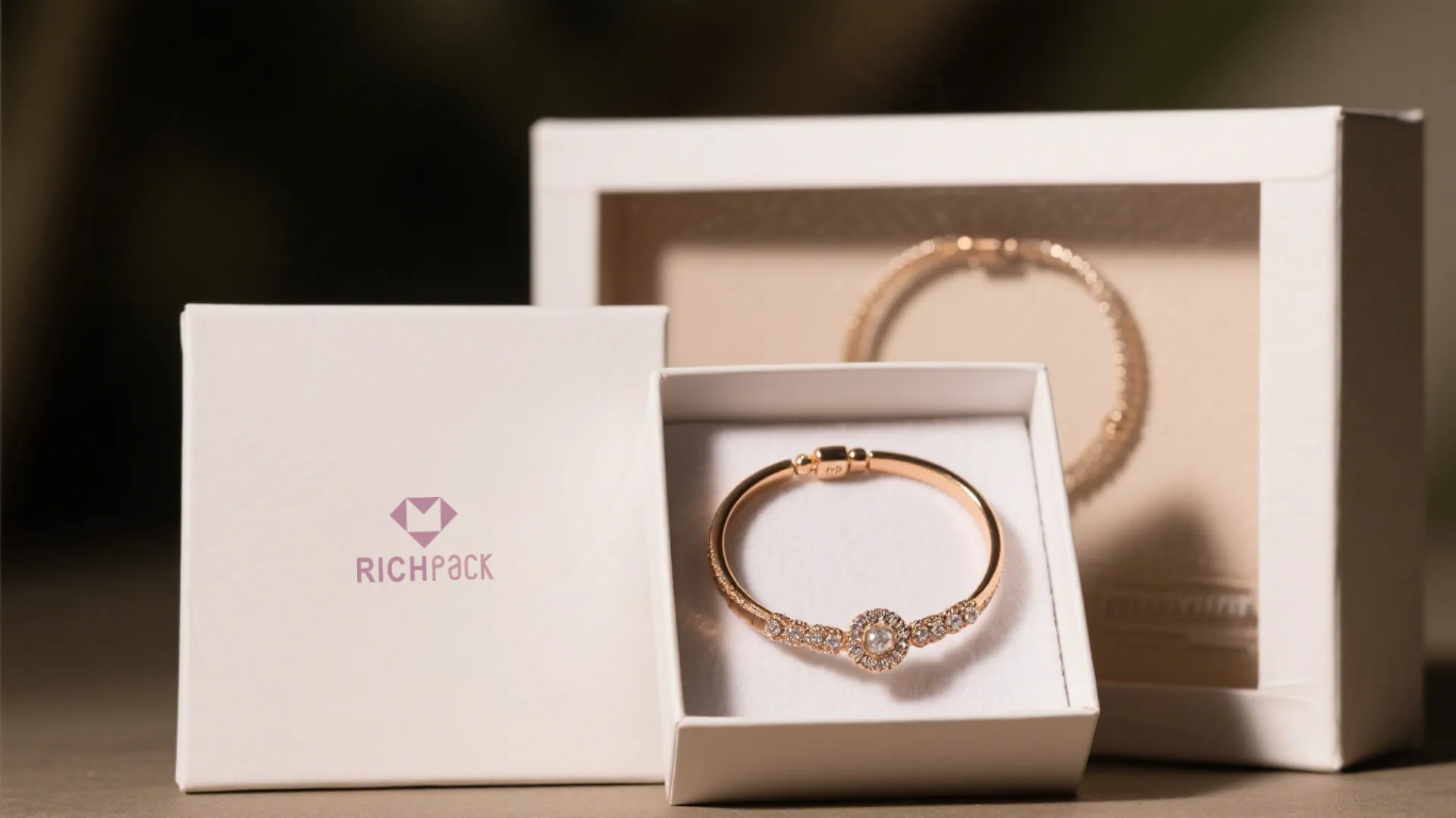
A logo can behave beautifully in a PDF and still misbehave on a jewelry box.
We have watched it happen in sampling rooms: the black mark looks sharp on the buyer’s screen, then lands gray on textured paper, too thick on velvet, or just a hair jagged on a coated, rigid lid. Nobody panics at first. Then someone places the box beside the jewelry, and the problem becomes obvious.
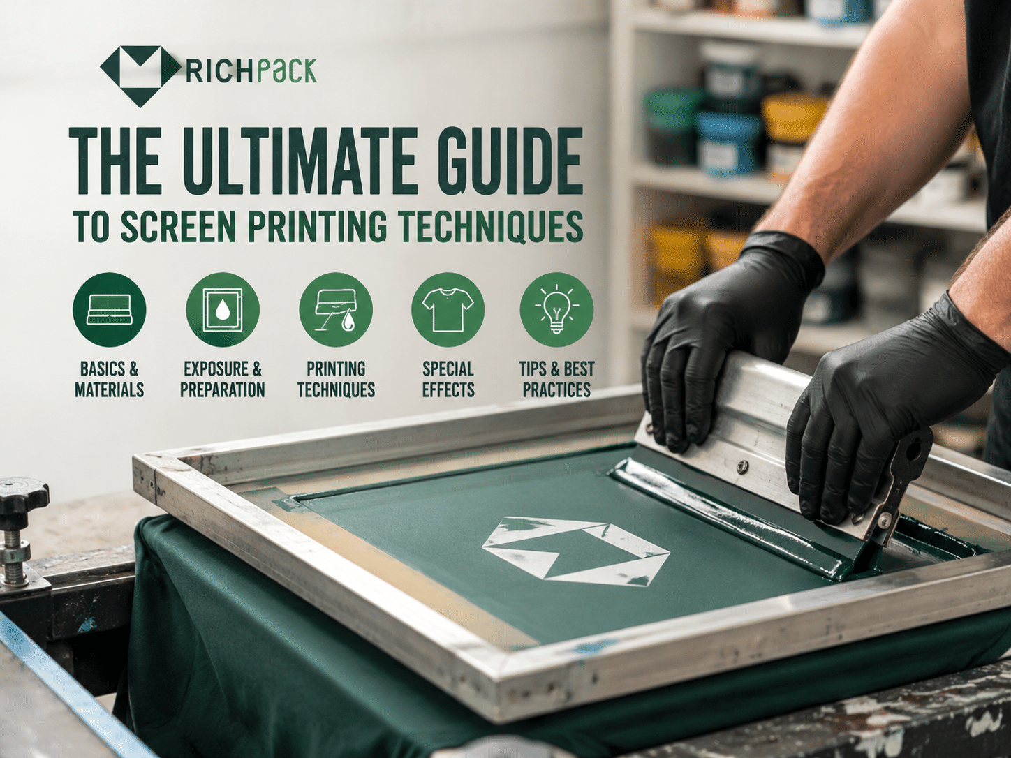
That is where Screen Printing earns its place. Not as a craft trick. As a controlled decoration system with artwork, substrate, ink, mesh, curing, inspection, and repeat orders all tied together.
If one link is weak, the package tells the customer before the jewelry does.
Need logo printed jewelry packaging built around real production checks? RichPack supports กล่องใส่เครื่องประดับแบบกำหนดเองพร้อมโลโก้ from concept through sampling and delivery.
Screen printing is a print method that transfers ink through a prepared mesh stencil onto a chosen surface. The open areas of the stencil let ink pass, while the blocked areas keep the design clean.
For packaging teams, the value is control. A properly built screen print can place dense color, crisp logos, tactile marks, and specialty ink on paperboard, fabric, leatherette, wood, acrylic, metal trims, cards, sleeves, and gift bags.
Screen printing is a stencil-based printing process that uses mesh, ink, and pressure to transfer a design onto a substrate. The mesh holds the image area. The squeegee pushes ink through that image area.
The method works best when the design uses solid color, clear edges, controlled line weight, and repeatable placement. That is why it remains common for logos, brand marks, decorative patterns, care icons, insert labels, and limited edition packaging details.
A screen print transfers ink through open mesh cells. The stencil blocks the rest of the mesh, so ink only lands where the artwork requires it.
Four forces shape the result:
When those forces are balanced, a screen print looks intentional. When they are not, the same design can blur, crack, shift, or feel too thick.
Jewelry packaging often needs a small mark to feel expensive. Screen printing gives that mark body and clarity, especially on surfaces where standard full color printing may look flat.
มีประโยชน์สำหรับ:
ริชแพค custom jewelry boxes and packaging often combine structure, insert design, and surface decoration so the print supports the product instead of competing with it.
Screen printing can outperform digital printing when the brand needs dense spot color, special ink, strong opacity, or a tactile layer. It also handles some nonstandard surfaces better than many flat digital systems.
It is a strong fit when the artwork has one to four colors, the color must stay consistent, and the run is large enough to justify setup.
Digital printing is often better for photo images, many colors, variable data, and very short runs. The right choice depends on the surface, artwork, quantity, and finish goal.
Screen printing fails when the design asks for more precision than the material can hold. Fine hairlines, tiny reversed text, heavy ink on textured surfaces, and low volume orders can create poor economics or poor results.
It also fails when teams skip testing. A sample printed on smooth white card cannot predict the same ink on suede, black paper, coated board, or recycled fiber.
The best surfaces are stable, clean, and compatible with the chosen ink. Smooth paperboard, coated art paper, rigid box wrap paper, acrylic panels, some wood finishes, and many leatherette materials can work well after testing.
Soft and absorbent surfaces need more caution. Velvet, cotton-filled inserts, raw paper, and textured recycled stocks can absorb ink unevenly or soften the edge of a fine logo.
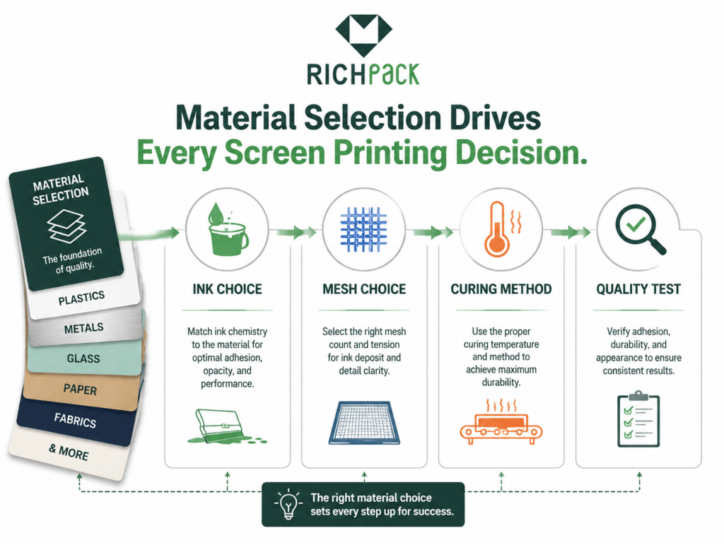
A clean screen print starts before ink touches the package. The process begins with artwork decisions and ends with inspection under the same lighting used for approval.
The following table shows how screen printing moves from the design file to finished packaging. It gives packaging managers and production teams a shared vocabulary for sampling, approval, and repeat orders.
| ระยะ | เกิดอะไรขึ้น | ความเสี่ยงด้านบรรจุภัณฑ์ | จุดควบคุม |
| การเตรียมงานศิลปะ | Design is separated into printable colors | Thin lines disappear | Minimum line weight check |
| การเคลือบหน้าจอ | Mesh receives light-sensitive emulsion | Uneven stencil thickness | ความสม่ำเสมอของการเคลือบ |
| การเปิดรับ | The artwork film creates the stencil | Soft or blocked detail | Exposure time test |
| การพิมพ์ | Ink is pushed through the mesh | Bleed, blur, heavy deposit | Squeegee angle and pressure |
| บ่ม | Ink is dried or hardened | Rub off or cracking | การควบคุมอุณหภูมิและเวลา |
| การตรวจสอบ | The finished surface is checked | ความไม่สอดคล้องกันของแบตช์ | Color and adhesion checks |
Artwork preparation turns a design idea into a production file. For most packaging jobs, vector artwork gives the cleanest edge and easiest color separation.
The file should specify:
From our production bench, the most expensive mistake is not a bad logo. It is a logo that was never checked against the real box structure.
The screen is coated with emulsion to create a controlled stencil layer. A smooth stencil helps the ink edge stay sharp.
Uneven coating can cause pinholes, broken detail, or inconsistent ink deposit. On premium packaging, those defects are easy to see because the printed area is often small and surrounded by clean space.
Exposure hardens the emulsion where light reaches it. The artwork blocks light in the design area, leaving that part open after washout.
A weak exposure can make the stencil break down during production. An overexposed stencil can close fine detail. Both problems become obvious on small jewelry logos and delicate line art.
Ink is placed on the screen and pulled across the stencil with a squeegee. Pressure, speed, and angle decide how much ink reaches the packaging surface.
A lower angle and heavy pressure can deposit too much ink. A sharper angle and controlled pressure usually give cleaner detail, but the exact setting depends on ink, mesh, and substrate.
Each color usually needs its own screen. Registration aligns those screens so the colors land in the right place.
For packaging, registration tolerance should be agreed upon before sampling. A 0.3 mm drift may be acceptable on a large pattern but obvious on a small gold and black monogram.
Curing stabilizes the ink. The right curing method depends on the ink system and material.
Paper packaging may require air drying, heat, UV curing, or a controlled combination. Heat-sensitive materials, laminated surfaces, velvet, and leatherette need careful tests so the finish does not warp, shine, shrink, or stain.
Finished prints should be checked under consistent lighting and handling conditions. A mark that looks acceptable under warm office light may look dull under retail lighting.
A practical approval set includes:
Not every screen printing technique belongs on premium packaging. The right one depends on brand tone, surface, order quantity, and how the customer will handle the package.
The table below compares the techniques that most often affect jewelry packaging decisions. It connects each technique with its best use, risk, and packaging value.
| เทคนิค | การใช้งานที่ดีที่สุด | ความเสี่ยงหลัก | มูลค่าบรรจุภัณฑ์ |
| Spot color printing | Logos and solid graphics | สีไม่ตรงกัน | Clean brand recognition |
| Halftone printing | Gradients and tonal images | จุดกำไร | Softer visual depth |
| CMYK process printing | Full color artwork | การตั้งค่าความซับซ้อน | Rich image reproduction |
| Simulated process printing | Complex art on dark surfaces | Registration demand | ภาพผลกระทบสูง |
| การพิมพ์ด้วยหมึกน้ำ | Soft matte effects | Absorption variation | Natural premium feel |
| UV ink printing | Coated and nonporous surfaces | Brittleness on flex | Sharp surface detail |
| การพิมพ์หมึกนูน | Tactile accents | เงินฝากจำนวนมาก | Memorable touch point |
| การพิมพ์หมึกโลหะ | Luxury effects | Dullness on porous stock | Subtle shine without foil |
Spot color printing uses one prepared color at a time. It is the most common choice for packaging logos because it gives clean control over brand color.
For jewelry boxes, spot color works well on rigid paperboard wraps, smooth cards, sleeves, and premium bags. It is also easier to approve than complex image printing.
Halftone printing creates tonal shading from dots. It can soften gradients, shadows, or illustration effects.
The risk is dot gain. On absorbent paper or textured surfaces, dots can spread and make the image darker than expected. Test the exact material before approving the final file.
CMYK process printing uses four process colors to build full color imagery. It can be useful for artwork, patterns, or image-heavy packaging.
It is less forgiving than simple spot color work. Each color needs accurate registration, and some premium packaging surfaces may not support fine process detail well.
Simulated process printing uses selected spot colors to imitate full color effects. It is common in apparel but can be used for specialty packaging graphics when the design needs strong visual depth.
For jewelry packaging, use it selectively. A small box with delicate jewelry rarely needs a complex graphic surface unless the brand identity is bold and art-led.
Water-based ink can create a softer, more integrated look. It can be attractive on natural paper, kraft surfaces, and some sustainable packaging concepts.
The tradeoff is absorption. If the surface drinks ink unevenly, the edge can soften, and the color can dry lighter than expected.
UV ink cures quickly under ultraviolet light. It can create sharp detail and good surface hold on coated stocks and some nonporous materials.
It needs careful material matching. A rigid coating can crack if the packaging surface flexes, folds, or rubs during shipping.
Puff and raised inks add tactile volume. They can turn a small logo or pattern into a touchable brand detail.
Use them with restraint. Too much raised ink can feel novelty-driven rather than premium, especially on fine jewelry packaging.
Metallic inks can add shimmer without using foil. They are useful when the design needs a softer shine than hot stamping.
Metallic particles can reduce edge precision, so avoid tiny text and hairline marks. For a mirror-like metal effect, foil stamping may still be the better choice.
A screen printing setup can be simple or industrial. A beginner screen printing kit may teach the process, but packaging production needs tighter control over alignment, curing, cleaning, and repeatability.
For brands sourcing packaging, the point is not to buy every tool. The point is to know which equipment signals supplier competence.
A basic screen printing kit usually includes a frame, mesh screen, squeegee, ink, emulsion, scoop coater, transparency film, exposure light or lamp guidance, tape, and cleaning chemicals.
For packaging trials, that kit can help a designer understand how the process behaves. It should not be treated as proof of production readiness.
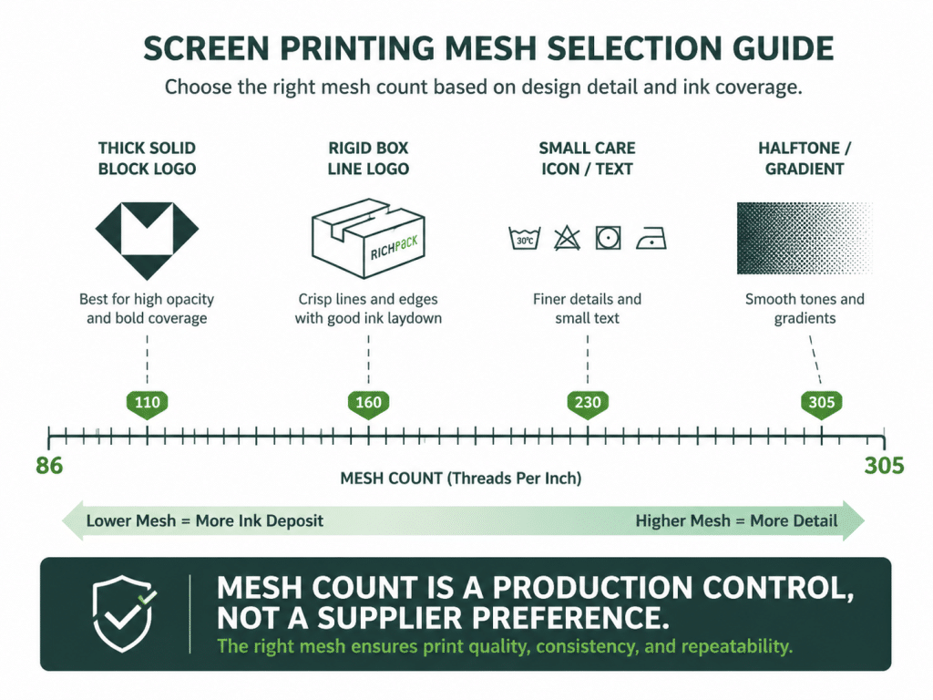
Mesh count controls how much ink passes through and how much detail the stencil can hold. Lower mesh counts allow more ink. Higher mesh counts hold finer detail with less ink deposit.
For packaging work, do not leave this as a vague “low or high” choice. RichPack’s production review should start with a mesh window, then tighten it after ink drawdown and first article sampling.
The table below gives practical starting ranges for packaging applications. Final settings still need material testing, especially on coated paper, velvet, PU leather, acrylic, and anodized aluminum.
| การใช้งานบรรจุภัณฑ์ | Recommended mesh range | Typical ink behavior | ใช้เมื่อ |
| Heavy white logo on dark paperboard | เพื่อ 110 160 | Higher deposit, stronger opacity | The mark must read clearly on black, navy, burgundy, or deep green wrap paper |
| Bold one-color logo on rigid box wrap | เพื่อ 156 200 | Balanced deposit and edge control | The artwork has medium line weight and solid areas |
| Fine logo, small type, care icons, jewelry cards | เพื่อ 200 230 | Cleaner edges, lower deposit | The artwork has small details but no photographic dots |
| Water-based ink on paper, wood, or kraft stock | เพื่อ 200 230 | Thin deposit, less bleeding | The brand wants a soft matte surface |
| Halftone, tonal pattern, process detail | เพื่อ 230 305 | Better dot control, lower ink volume | The artwork needs gradients or fine image detail |
| Metallic or raised specialty ink | เพื่อ 86 160 | More open mesh for particles or volume | The finish needs shimmer, relief, or tactile weight |
| UV ink on coated, acrylic, or metal detail | เพื่อ 230 305 | Thin controlled film | The surface is smooth, and detail matters more than ink thickness |
Those numbers are not decoration trivia. They change cost, sampling time, opacity, edge quality, drying behavior, and reject rate.
A simple guide for packaging teams:
The squeegee is the pressure tool. Blade hardness, edge condition, angle, and speed all affect ink deposit.
A soft blade can push more ink and follow uneven surfaces. A harder blade can give sharper control on smooth materials. Worn blades create streaks and inconsistent edges.
Exposure tools create the stencil. A supplier should control exposure time, light distance, film density, and screen drying conditions.
Poor exposure shows up as broken detail, blocked openings, pinholes, or early stencil failure during the run.
Drying and curing tools depend on ink chemistry. Heat, airflow, UV lamps, or rack drying may be used.
For packaging, curing must protect both the ink and structure. Heat can warp thin paperboard, soften glue, or mark delicate surfaces if the process is not controlled.
Cleaning tools protect future print quality. Screens need proper washout, ink removal, emulsion removal, degreasing, and drying.
A supplier with poor cleaning discipline may produce good first samples and unstable repeat orders. That is a warning sign for packaging programs with seasonal replenishment.
Production lines need more than screens and squeegees. They need fixtures, registration stops, curing stations, inspection lighting, clean racks, material handling tools, and documented quality checks.
ริชแพค บริการบรรจุภัณฑ์แบบกำหนดเอง connect decoration choices with structure, materials, samples, inspection, and global delivery.
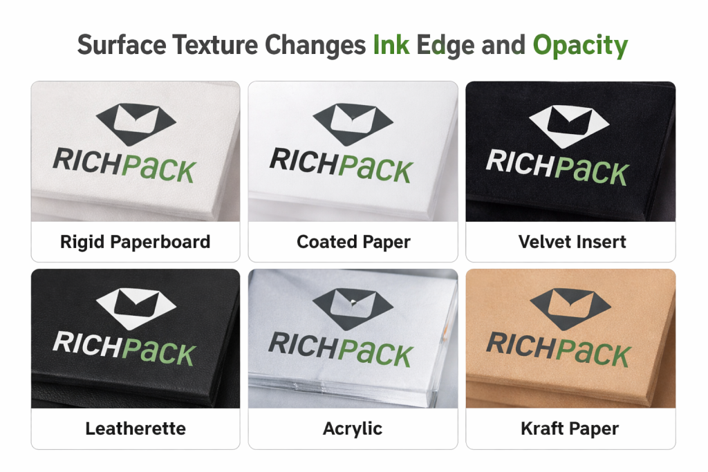
Screen printing is never separate from the material. The same ink can look premium on one surface and cheap on another.
The table below compares common jewelry packaging materials with their screen printing behavior. Use it before approving samples or asking suppliers for pricing.
| วัสดุ | Print Behavior | การใช้งานที่ดีที่สุด | จุดเฝ้าระวัง |
| ห่อด้วยกระดาษแข็ง | Stable and clean | Logos and patterns | ความเข้ากันได้ของการเคลือบ |
| กระดาษอาร์ตเคลือบเงา | รายละเอียดคมชัด | Fine graphics | การยึดเกาะของหมึก |
| Velvet insert | นุ่มและดูดซับ | Simple marks only | ขอบไม่ชัด |
| หนัง PU | Premium surface feel | Logos and badges | การรักษาพื้นผิว |
| ไม้ | ความแปรผันตามธรรมชาติ | Boutique accents | Grain absorption |
| อะคริลิค | เรียบเนียนและกรอบ | ส่วนแสดงสินค้า | Scratch and curing |
| กระดาษคราฟท์ | Natural matte feel | บรรจุภัณฑ์ที่เป็นมิตรต่อสิ่งแวดล้อม | Color dullness |
Rigid boxes are often the best packaging base for screen-printed logos. The surface is stable, the shape feels premium, and the design can be positioned with strong visual control.
The main question is the wrap paper. Smooth coated paper can hold fine detail. Textured paper may need thicker lines and simpler marks.
Coated paper gives sharper edges but may resist certain inks. Adhesion testing matters because ink can sit on the surface instead of bonding well.
If the package will rub during shipping, check both color and abrasion resistance before approving production.
Velvet and fabric inserts are difficult because fibers change how the ink lands. Small marks can look soft, and heavy ink can flatten the texture.
Use simple artwork, wider line spacing, and restrained placement. If the mark must be crisp, consider a woven label, metal plate, foil tag, or printed card instead.
PU leather and leatherette can look strong with a screen-printed logo, but surface chemistry varies widely. Some finishes accept ink well. Others repel it or require pretreatment.
Always test adhesion, rub resistance, and color appearance on the exact production material.
Wood brings grain variation. Acrylic brings clarity and scratch risk. Metal details require the right ink and surface preparation.
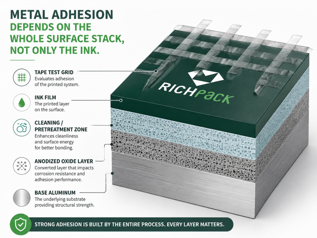
Anodized aluminum deserves its own warning. The oxide layer is hard and porous, which can help mechanical grip, but sealed anodizing, oil residue, polishing compound, or fingerprint contamination can wreck adhesion before the ink has a chance.
For metal nameplates, logo tags, drawer pulls, magnetic closure plates, and rigid box accents, RichPack should treat screen printing as an engineered surface stack:
A metal part can pass a quick thumb rub and still fail in a customer’s drawer six weeks later. That is why adhesion should be checked after the ink has fully settled, not only when it comes off the line.
These materials can elevate limited edition packaging, but they need more testing than standard paperboard. The supplier should confirm the ink system, curing method, and post-print handling.
Paper bags, jewelry cards, and sleeves are practical screen printing surfaces. They are also handled often, so rub resistance and fold behavior matter.
Cards with earring holes, necklace slits, or folded tabs should be printed after the structure is checked. A logo placed too close to a cut can look misaligned after assembly.
Sustainable packaging often uses recycled board, FSC-certified papers, kraft stocks, water-based coatings, or lower-impact inks. These choices can support brand values, but each one changes print behavior.
ริชแพค ตัวเลือกบรรจุภัณฑ์ที่ยั่งยืน และ วัสดุบรรจุภัณฑ์ can help teams match surface choices with decoration goals before sampling.
The best screen printing technique is not the most complex one. It is the one that protects brand recognition while surviving production, packing, shipping, retail display, and customer handling.
A good decision starts with the package’s job. A ring box, paper bag, drawer sleeve, gift card, and display tray do not need the same print behavior.
A luxury logo usually needs restraint. Dense black, deep white, warm gray, soft metallic, or tonal ink can do more than a loud special effect.
Ask what the mark should say:
The answer should guide ink, color, placement, and surface feel.
Each color adds setup, registration work, and inspection risk. One color is usually the cleanest route for premium packaging logos.
Two to four colors can work well for patterns, illustrations, and collection-specific designs. Beyond that, compare screen printing with offset, digital, or hybrid decoration.
Fine lines can disappear in emulsion, fill with ink, or break during printing. Reversed text is especially risky on absorbent or textured surfaces.
A practical rule is simple: if the mark must be read from arm’s length on a small box, make it bolder than it looks on screen.
Screen printing has setup work, so it becomes more efficient as the quantity rises. Very low volume orders may be better served by digital printing, labels, foil stamping, or stock packaging with a branded sleeve.
For repeat packaging, the first setup cost may be acceptable because the process can be controlled across reorders.
Texture can make a package feel premium, but it reduces edge precision. Smooth surfaces favor crisp logos. Textured surfaces favor larger marks, tonal graphics, and simpler forms.
Never approve texture and artwork separately. They must be sampled together.
A jewelry box lid is touched often. A paper bag rubs against tissue, ribbon, and shipping cartons. A sleeve may slide across the box every time it opens.
Those motions decide whether the print needs stronger adhesion, lighter ink deposit, a protective coating, or another decoration method.
Screen printing works well with foil stamping, embossing, debossing, soft touch coating, and textured paper when each finish has a clear role.
One strong combination is a screen-printed tonal pattern with a foil-stamped logo. Another is a printed care line inside the lid with an embossed exterior mark.
ริชแพค การสนับสนุนการออกแบบบรรจุภัณฑ์ helps connect artwork, structure, surface finish, and production feasibility before the first sample is made.
Most screen printing defects come from a mismatch between artwork, material, ink, and process control. The fix is rarely one magic setting.
The table below gives packaging teams a fast diagnostic view. Use it during sample review and production troubleshooting.
| ปัญหา | สาเหตุที่เป็นไปได้ | แก้ไขปัญหา |
| Ink bleed | Mesh too open or ink too thin | Adjust mesh, ink, and pressure |
| ขอบไม่ชัด | Texture or poor stencil | Simplify art, improve exposure |
| การเปลี่ยนสี | Ink mix or substrate variation | Use drawdown and batch target |
| Rub off | Poor adhesion or curing | Test pretreatment and cure |
| Registration drift | Fixture or setup movement | Improve stops and tolerance |
| Heavy-handed feel | Too much ink deposit | Raise mesh or reduce pressure |
| Sample mismatch | Different material or process | Lock approved production spec |
Ink bleeds when it moves beyond the intended print area. This can come from thin ink, open mesh, heavy pressure, absorbent material, or poor stencil edge.
On packaging, bleed is most obvious on small logos and fine type. The best fix is to test the real substrate and simplify fragile details before production.
Fuzzy edges often come from surface texture, weak stencil definition, or excess ink. A textured paper may look elegant, but it still softens a logo edge.
If the brand needs sharp precision, choose smoother paper or a different decoration method for that specific mark.
Color shift can come from ink mixing, paper color, coating variation, curing, or lighting. A warm ivory paper will change how white, gray, gold, and black inks appear.
Keep a signed sample and color target with each order. For repeat runs, compare against the approved physical sample, not only the file.
Ink cracks when it cannot flex with the surface or was cured incorrectly. Ink rubs off when adhesion is weak or the surface coating resists bonding.
Use tape tests, rub tests, and packaging simulation. A beautiful sample that fails handling is not ready for a launch.
Registration drift happens when screens, fixtures, substrates, or operators move outside tolerance. Multi-colored artwork makes the problem more visible.
For premium boxes, ask for registration tolerance before production. It should be measured, not guessed.
Too much ink can make a package feel rough or cheap. This happens with low mesh, heavy pressure, thick ink, or repeated passes.
A premium print should feel intentional. If the ink layer distracts from the jewelry, reduce the deposit or change the finish strategy.
Samples often receive more attention than bulk production. The cure time, operator, material batch, fixture, or ink mix may change later.
Prevent that gap by approving a production realistic sample and asking the supplier to document the settings used.
Quality control should begin before printing and continue through final packing. The goal is not only a beautiful first sample. The goal is a repeatable standard.
ริชแพค กระบวนการควบคุมคุณภาพ covers design review, material checks, production inspection, traceability, and final review for custom packaging programs.
Artwork review checks whether the file can print cleanly on the chosen surface. It should catch small type, weak line weight, reversed detail, poor color separation, and risky placement.
A design that works on a website may not work on a 50 mm ring box lid.
Substrate approval locks the material before print approval. Paper shade, coating, texture, fabric pile, leatherette grain, and recycled content can all affect the result.
Approve the actual production material whenever possible.
An ink drawdown is a test of ink on the target material before full sampling. It shows opacity, color, surface feel, and adhesion risk.
This small step can prevent expensive sample loops.
The first article sample is the first production representative piece. It should match the approved structure, material, color, print position, surface finish, and packaging assembly.
Do not approve a print swatch alone if the final package has folds, curves, lids, trays, or inserts.
Batch color control compares bulk output against the approved target. Lighting should be consistent, and checks should happen during production rather than only at the end.
If a color drifts early, the team can correct it before too many units are finished.
Adhesion and abrasion checks show whether the ink survives real handling. The exact test can vary, but the principle is simple: the print must stay on the package through shipping and customer use.
For jewelry boxes, check lid handling, sleeve sliding, insert contact, and tissue rub.
Final inspection looks at the whole package, not just the printed mark. A clean logo still fails if the box is warped, glue is visible, velvet is stained, or the insert fit is loose.
Quality must be judged as the customer will experience it.
A strong supplier brief reduces revisions, cost surprises, and launch delays. It also helps the factory choose the right print path before quoting.
The brief should be practical. The supplier needs enough detail to build a reliable sample, not a brand manifesto.
Give the supplier the product type, retail channel, price tier, and packaging role. A fine jewelry ring box and a seasonal charm card need different choices.
Include whether the package is for retail display, e-commerce unboxing, gifting, wholesale replenishment, or a limited collection.
Send vector files when possible. Include color references, logo size, placement, and any allowed tolerance.
If the color is critical, request a physical drawdown or printed sample before mass production.
List the structure, material, surface paper, insert material, coating, and finish. If you are unsure, ask the supplier to recommend options and explain the tradeoffs.
The print method should be chosen after the material is known.
State launch date, first order quantity, expected reorder quantity, and delivery market. MOQ and timing can change the best decoration method.
This is the point where guessing gets expensive.
A 300-piece launch may look cheaper with digital printing because the setup is lighter. A 3,000-piece reorder can flip the math because screen printing spreads screen setup across more units. Add a second color, a dark substrate, or a metallic ink, and the break point moves again.
Define how samples will be approved. Include who signs off, what lighting is used, what defects are unacceptable, and whether approval covers color, placement, texture, adhesion, or all of them.
This prevents one team from approving color while another later rejects surface feel.
Ask for the tests that matter to the package. For screen-printed packaging, this often includes rub resistance, tape adhesion, color consistency, placement, and visual inspection.
For premium packaging, also check odor, glue marks, insert fit, and final assembly.
Packaging is part of the supply chain. Reorder notes should include the pack out method, carton strength, moisture protection, storage guidance, and the approved sample reference.
If the item will be reordered seasonally, keep the specification stable.
Need a supplier brief reviewed before sampling? RichPack can help convert design goals into logo-printed jewelry packaging that is ready for quotation and production.
Screen printing is one option in a larger decoration toolkit. Premium packaging often uses several methods together.
The best method is the one that matches artwork, surface, budget, quantity, and brand feel with the least production risk.
Screen printing is stronger for dense spot colors, specialty inks, and certain surfaces. Digital printing is stronger for full color art, short runs, and variable designs.
For a clean logo on a rigid box, screen printing may feel more premium. For a photographic sleeve, digital may be more practical.
Offset printing is strong for high-volume paper-based packaging with detailed color reproduction. Screen printing is stronger for thicker ink deposits, specialty effects, and nonstandard surfaces.
A rigid box wrap may use offset printing for a pattern and screen printing for a dense spot logo.
Foil stamping gives metallic shine, luxury contrast, and crisp impact. Screen printing gives ink color, opacity, and more varied surface effects.
Use foil when the brand needs metal brilliance. Use screen printing when the brand needs color density, matte ink, tonal marks, or specialty ink texture.
Pad printing transfers ink with a silicone pad and works well on curved or irregular objects. Screen printing works better on flatter surfaces.
For a flat jewelry box lid, screen printing is often simpler. For a curved cosmetic cap or irregular accessory, pad printing may be better.
UV printing can refer to several digital or ink-curing approaches. It often works well on coated surfaces and short-run customization.
Screen printing may still win when the goal is a controlled spot ink layer, tactile finish, or traditional production repeatability.
Use this practical shortcut:
RichPack case work, including timeless jewelry packaging และ บรรจุภัณฑ์เครื่องประดับที่หรูหรา, shows how decoration, structure, material, and brand story must work together.
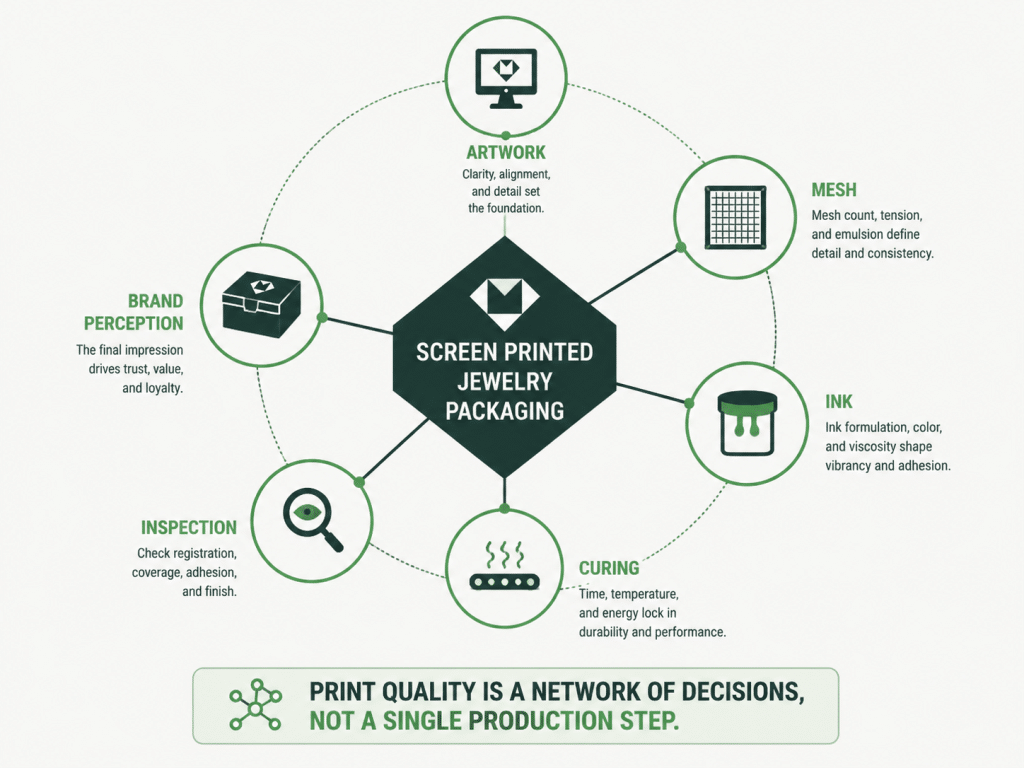
Screen printing works as a system. Each entity changes another entity, and the final package reflects those relationships.
| เอกลักษณ์ | คุณลักษณะ | Value for Packaging Decisions |
| งานศิลปะ | Line weight | Determines stencil and edge success |
| ตาข่าย | Count and tension | Controls ink flow and detail |
| หมึก | Viscosity and chemistry | Controls opacity, adhesion, and feel |
| พื้นผิว | Texture and coating | Controls edge sharpness and bonding |
| ไม้กวาดหุ้มยาง | Angle and hardness | Controls ink deposit |
| บ่ม | Time and energy | ควบคุมความทนทาน |
| ตารางการแข่งขัน | การควบคุมตำแหน่ง | Controls repeat placement |
| การตรวจสอบ | Lighting and tests | Controls batch acceptance |
| โครงสร้างบรรจุภัณฑ์ | Fold, lid, insert, sleeve | Controls where print can survive |
| คุณค่าของแบรนด์ | Visual and tactile signal | Controls customer perception |
Screen printing is best used for solid logos, bold graphics, specialty inks, tactile effects, and repeatable decoration on packaging, apparel, signage, cards, bags, and promotional products. In premium packaging, it is especially useful when the printed mark needs strong color density and controlled placement.
Yes, screen printing is good for jewelry boxes when the surface, ink, artwork, and curing method are tested together. It works well for rigid box lids, drawer sleeves, paper wraps, interior branding, jewelry cards, and premium paper bags.
The core equipment includes a mesh screen, frame, stencil system, squeegee, ink, exposure tools, drying or curing tools, cleaning supplies, and registration fixtures. Production packaging also needs inspection lighting, stable jigs, material handling racks, and documented approval samples.
A screen printing kit usually includes a screen frame, mesh, squeegee, ink, emulsion, scoop coater, transparency film, tape, and cleaning chemicals. Starter kits are useful for learning, but professional packaging requires stronger controls for registration, curing, and quality checks.
Yes, screen printing can be used on paper packaging, including rigid boxes, sleeves, cards, bags, and wraps. Smooth coated paper usually holds sharper detail, while textured or recycled paper needs testing because it can soften edges and shift color appearance.
Screen printing can be very durable when ink, substrate, curing, and handling conditions are matched. Durability should be checked with rub, adhesion, and real package handling tests before approval.
Screen printing can handle multiple colors, but each color usually needs its own screen and registration step. For premium packaging, one to four colors are often the most practical. Complex full color graphics may be better suited to offset or digital printing.
Screen printing is better when the job needs dense spot color, special ink, tactile feel, or strong opacity. Digital printing is better for full color imagery, low quantities, and fast artwork changes. Packaging teams should choose based on material, artwork, quantity, and finish goal.
A good screen print does not begin with ink. It begins with a decision about what the package must communicate when the customer first touches it.
For jewelry brands, that decision is rarely only about color. It is about whether the logo feels stable, whether the box supports the price point, whether the finish survives shipping, and whether the next reorder looks like the first one.
Screen Printing is still one of the strongest decoration methods for premium packaging when it is managed as a full production system. Match the artwork to the substrate, test the ink, control the mesh, approve a real sample, and hold production to the same standard.
If you are building a new jewelry packaging program, RichPack can help you choose the right decoration method, structure, material, and quality plan. Start with a project review or request a packaging quote before locking artwork for production.
2025-08-18
2025-04-27
2025-10-26
2025-05-18
2026-04-08
2026-03-08

กล่องเครื่องสำอางแบบพิมพ์ตามสั่งสำหรับแบรนด์ความงาม | โซลูชันบรรจุภัณฑ์ที่เหมาะสำหรับพ่อค้าแม่ค้าที่ต้องการสั่งทำจำนวนมาก
ดูเพิ่มเติม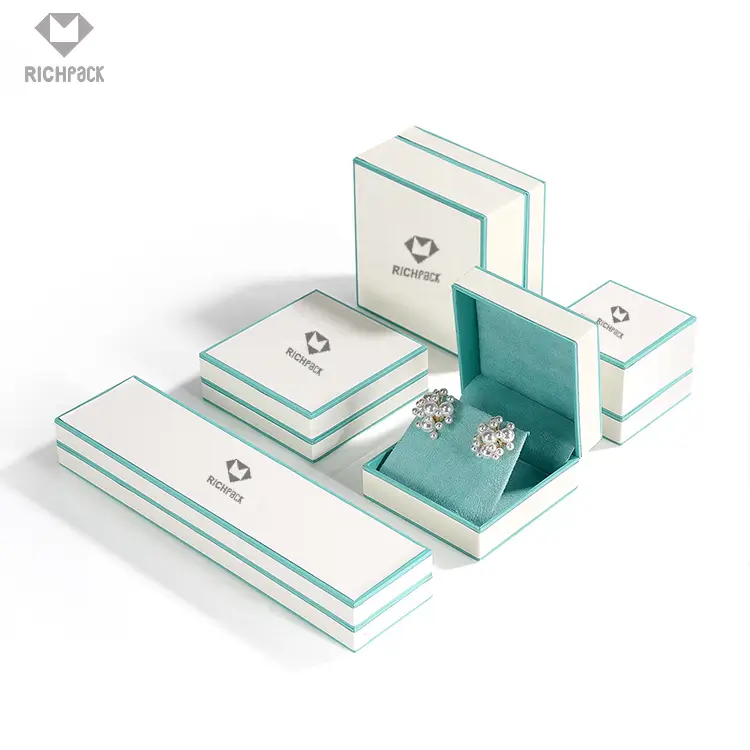
โซลูชันบรรจุภัณฑ์เครื่องประดับจำนวนมากพร้อมการจัดส่งที่รวดเร็ว | การออกแบบที่ปรับแต่งได้สำหรับผู้ค้าปลีกและผู้ค้าส่ง Richpack
ดูเพิ่มเติม
ถุงกระดาษแบบกำหนดเองพร้อมหูหิ้วเพื่อการพกพาที่ง่ายดาย – ถุงกระดาษที่ใช้งานได้จริงพร้อมหูหิ้วที่แข็งแรง
ดูเพิ่มเติม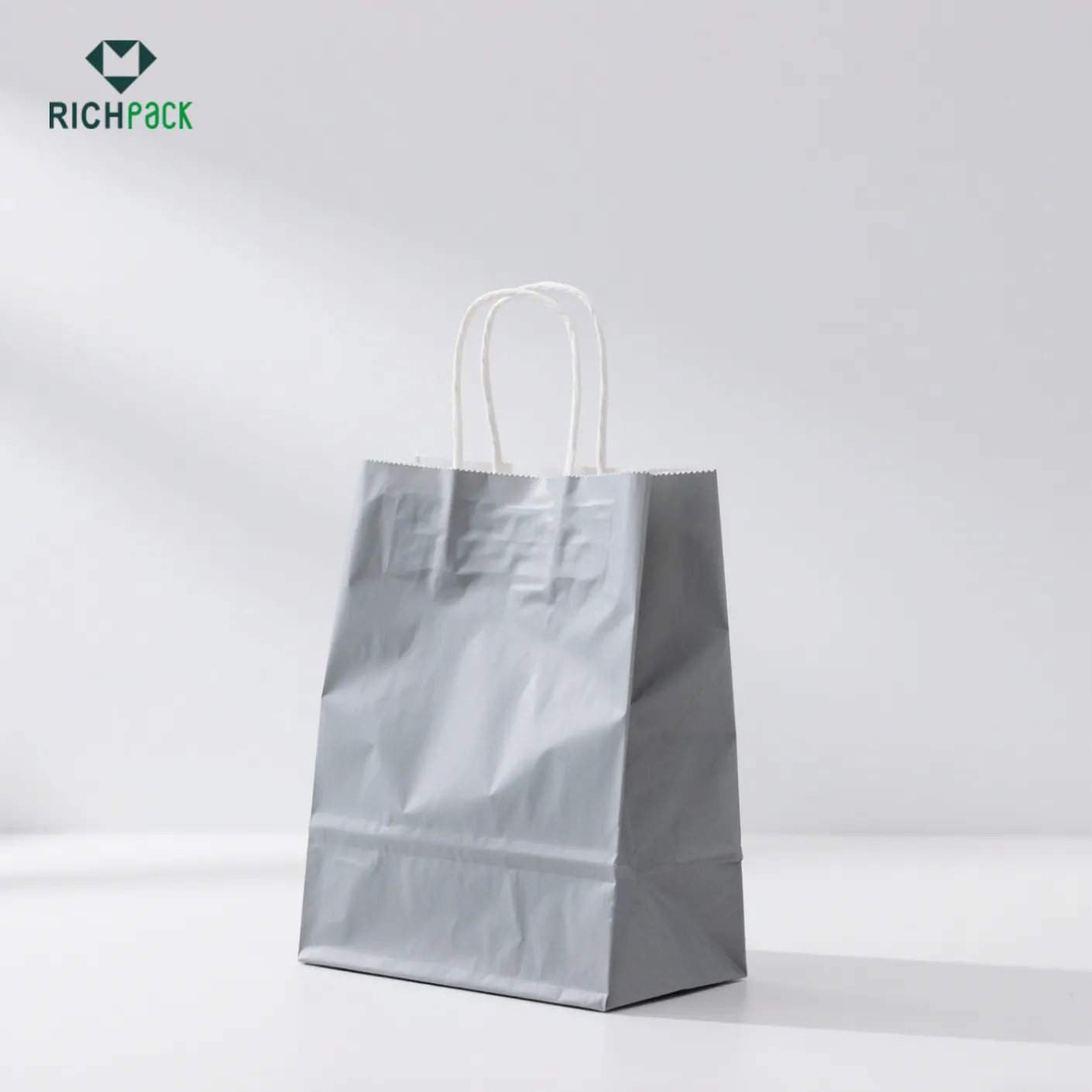
ถุงกระดาษพิมพ์แบบกำหนดเองสำหรับร้านขายเครื่องประดับ | โซลูชันบรรจุภัณฑ์ส่วนบุคคลสำหรับผู้ค้าปลีกที่ต้องการการนำเสนอเครื่องประดับที่มีแบรนด์และหรูหรา
ดูเพิ่มเติม
ชุดบรรจุภัณฑ์ที่ย่อยสลายได้และคงทนสำหรับแบรนด์ที่ใส่ใจสิ่งแวดล้อม | บรรจุภัณฑ์ที่ยั่งยืนสำหรับธุรกิจจิวเวลรี่
ดูเพิ่มเติม
ถุงกระดาษรีไซเคิลที่ทนทานและปลอดภัยพร้อมก้นเสริมสำหรับสินค้าหนัก | โซลูชันบรรจุภัณฑ์ที่เชื่อถือได้สำหรับร้านขายเครื่องประดับและผู้ค้าปลีก
ดูเพิ่มเติม
ถุงกระดาษสีเขียวเป็นมิตรกับสิ่งแวดล้อมพร้อมหน้าต่างเพื่อการจัดแสดงที่หรูหรา – ปรับปรุงการนำเสนอผลิตภัณฑ์ด้วยโซลูชันที่ปรับแต่งได้จาก Richpack
ดูเพิ่มเติม