Jeśli próbujesz wybrać właściwy dziękuję karty Rozmiar, zacznij tutaj. Do większości codziennych zastosowań standardowy rozmiar kartki z podziękowaniami to A2, czyli 4.25 x 5.5 cala. Ten rozmiar jest odpowiedni, ponieważ jest elegancki, pasuje do standardowych kopert i zapewnia wystarczająco dużo miejsca na krótką, odręczną notatkę, nie sprawiając, że kartka będzie wyglądać na pustą.
Mimo to, format A2 nie zawsze jest najlepszym rozwiązaniem. Karta w formacie 4 x 6 lub A6 często lepiej sprawdza się w przypadku wkładek biznesowych i opakowań e-commerce, natomiast format 5 x 7 jest zazwyczaj lepszym wyborem na śluby, prezenty dla klientów i prezentacje marek premium. Z mojego doświadczenia wynika, że odpowiedni rozmiar to nie tyle kwestia tradycji, co dopasowania. Musi pasować do przekazu, koperty, zasad dotyczących nadania znaczka i momentu, w którym marka jest promowana.
W tym przewodniku przedstawię najpopularniejsze rozmiary kartek z podziękowaniami, kiedy używać każdego z nich, jak dobrać je do kopert i limitów wysyłki, jak grubość papieru wpływa na odczucie każdego formatu oraz jak wybrać rozmiar, który faktycznie odpowiada celom Twojej firmy lub wydarzenia.
Standardowy rozmiar kartki z podziękowaniami
Większość czytelników nie potrzebuje katalogu w wielkim formacie. Chcą jednej, jasnej odpowiedzi. Na rynku amerykańskim typowy format kartki z podziękowaniami to A2, który po złożeniu ma wymiary 4.25 x 5.5 cala. Jest to idealne połączenie praktyczności i estetyki.
Nie oznacza to jednak, że każda kartka z podziękowaniami powinna mieć format A2. Oznacza to, że format A2 jest najbezpieczniejszym formatem domyślnym, jeśli zależy Ci na łatwej do znalezienia, wydrukowania, wysłania i wykorzystania w życiu prywatnym i biznesowym kartce.
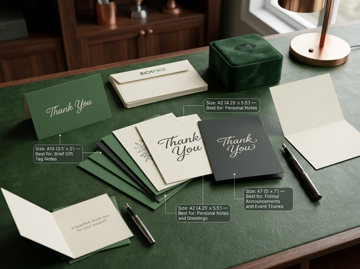
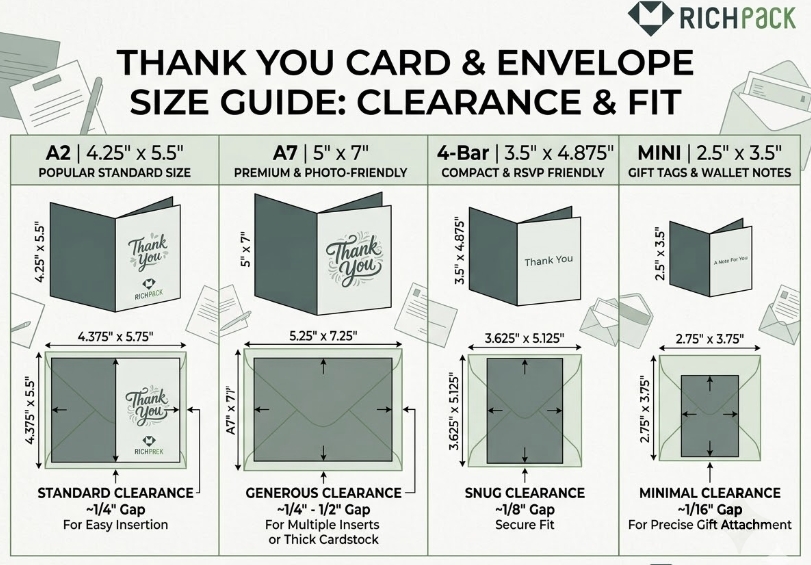
A2
A2 to standardowy rozmiar kartki z podziękowaniami, który sprawdza się w wielu codziennych sytuacjach. Zapewnia wystarczająco dużo miejsca na krótką osobistą notatkę, czysty projekt frontu i niewielki znak firmowy, bez nadmiernego narzucania układu.
Ta równowaga ma znaczenie. Kartka z podziękowaniami powinna być przemyślana, nie przeładowana i nie do połowy pusta. A2 zazwyczaj udaje się znaleźć złoty środek.
Jest to również jeden z najłatwiejszych formatów do kupienia i wydrukowania. Drukarnie, dostawcy kopert i narzędzia do tworzenia szablonów często obsługują go domyślnie. To zmniejsza tarcia produkcyjne.
Najlepszy dla:
Codziennie, podziękowania
firmowe karty z podziękowaniami dla klientów
włóż karty do opakowań średniej wielkości
krótkie wiadomości pisane odręcznie
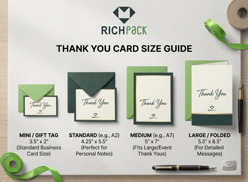
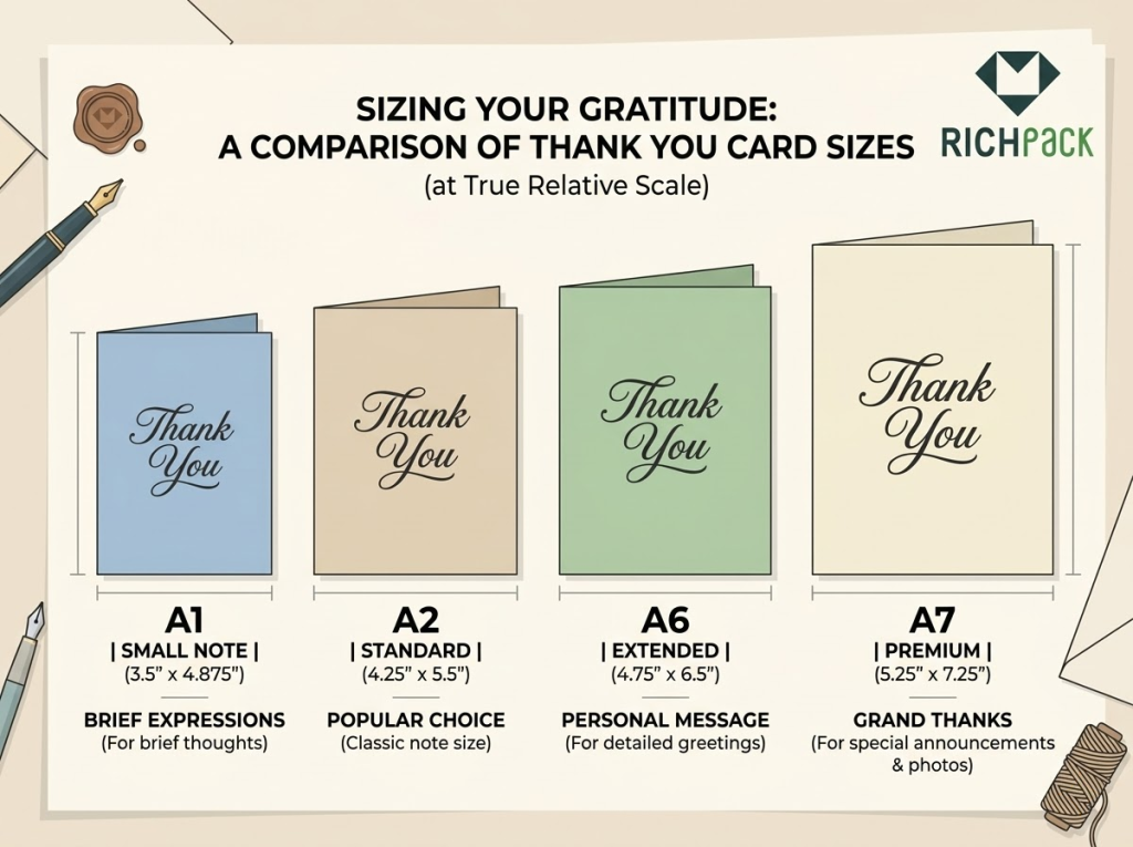
A1
Format A1, często o wymiarach około 3.5 x 5 cali, to mniejsza opcja. Sprawdza się, gdy wiadomość jest krótka, a głównym celem jest efektywność.
Lubię ten rozmiar do kopert prezentowych, minimalistycznych wkładek i ekonomicznych zamówień hurtowych. Jest kompaktowy, łatwy do włożenia do opakowania i tańszy w produkcji i wysyłce niż większe kartki.
Kompromis jest oczywisty. Nie masz dużo miejsca. Jeśli projekt zawiera logo, kod QR, nazwę użytkownika w mediach społecznościowych, notatkę z prośbą o opiekę i podziękowanie, A1 bardzo szybko zaczyna wydawać się ciasne.
Najlepszy dla:
karty podarunkowe z załącznikami
lekkie wkładki do opakowań e-commerce
krótkie, jednowierszowe notatki z podziękowaniami
hurtowe ulotki promocyjne
A6
Format A6 jest powszechnie podawany jako 4.5 x 6.25 cala w amerykańskich papierach firmowych, choć wiele firm używa również formatu 4 x 6 jako praktycznego odpowiednika w druku komercyjnym. To właśnie tutaj czytelnicy często się mylą, ponieważ „standard” i „powszechnie stosowany w biznesie” to nie zawsze to samo.
Format A6 zapewnia większą elastyczność niż A2. Możesz zmieścić pełniejszy przekaz, mocniejszą identyfikację marki, lepszy układ zdjęć lub notatkę z podziękowaniami połączoną z informacją o pielęgnacji produktu.
W zastosowaniach biznesowych jest to często jeden z najinteligentniejszych formatów. Nadal wydaje się łatwy w obsłudze, ale daje Twojemu projektowi więcej swobody.
Najlepszy dla:
Biznesowe kartki z podziękowaniami
karty do wkładki e-commerce
komunikaty marki po zakupie
notatki z podziękowaniami zawierające kod QR lub wiadomość promocyjną
A7
Format A7, czyli 5 x 7 cali, wydaje się bardziej formalny i obszerny. To właśnie ten rozmiar preferują osoby, które chcą mieć kartkę z podziękowaniami ślubnymi lub kartę klienta premium.
Dodatkowa przestrzeń zmienia charakter. Daje miejsce na dłuższy, odręczny tekst, mocniejsze zdjęcia, bardziej wyrafinowaną typografię i bardziej podniosły charakter rozpakowywania lub wręczania prezentu.
Płacisz za tę obecność. Format A7 zużywa więcej papieru, zajmuje więcej miejsca w opakowaniu i może nie być odpowiedni do programów z dużą liczbą wkładek.
Najlepszy dla:
kartki z podziękowaniami ślubnymi
luksusowe marki z podziękowaniami
wyjątkowe chwile z prezentami
karty z podziękowaniami dla klientów z osobistą notatką
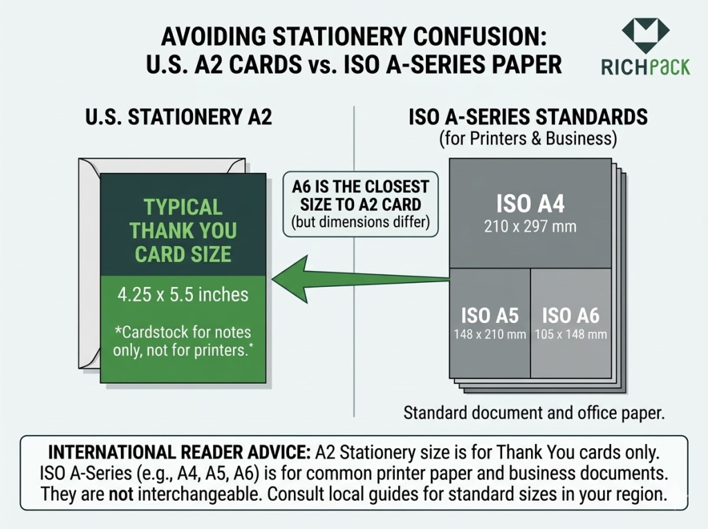
Seria A w USA a międzynarodowe rozmiary ISO
Łatwo się tu pomylić. Na amerykańskim rynku kart i kopert nazwy takie jak A2, A6 i A7 zazwyczaj odnoszą się do konwencji nazewnictwa artykułów papierniczych, a nie do międzynarodowego systemu nazewnictwa papieru ISO 216.
Oznacza to, że karta amerykańska A2 to nie to samo, co arkusz ISO A2. To samo nakładanie się nazw może dezorientować czytelników z zagranicy, zwłaszcza gdy porównują amerykańskie szablony kart z globalnymi standardami papieru, takimi jak A5 lub A6.
Jeśli obsługujesz klientów spoza Stanów Zjednoczonych, zawsze podawaj zarówno wymiary calowe, jak i milimetrowe. Ten jeden ruch pozwala uniknąć wielu błędów w zamówieniach.
Szybka tabela rozmiarów
Oto prosta wersja, której potrzebuje większość czytelników.
Format karty
Cale
Około mm
Typowy format
Typowe zastosowania
Typowa koperta
A1
X 3.5 5
X 89 127
Złożone lub płaskie
załącznik do prezentu, krótka notatka, tania wkładka
A1 / 4-taktowy
A2
X 4.25 5.5
X 108 140
Fałdowy
standardowy rozmiar karty z podziękowaniami, do użytku osobistego i biznesowego
A2
X 4 6
X 4 6
X 102 152
Mieszkanie
wkładka biznesowa, wkładka produktowa, notatka w stylu poczty bezpośredniej
Koperta komercyjna w stylu A6
A6
X 4.5 6.25
X 114 159
Fałdowy
pełniejsza notatka z podziękowaniami, firmowa wkładka, małe ogłoszenie
A6
A7
X 5 7
X 127 178
Fałdowy
ślub, luksus, formalna kartka z podziękowaniami
A7
Tabela wymiarów koperty
To właśnie tego stołu potrzebuje wielu kupujących, gdy nadchodzi czas na znalezienie materiałów. Zamiast ograniczać się do rozmiaru karty, dopasuj ją od razu do koperty.
Format karty
Typowy rozmiar gotowej karty
Popularna nazwa koperty
Rozmiar koperty w calach
Rozmiar koperty w mm
A1
X 3.5 5
Koperta A1 / 4-paskowa
X 3.625 5.125
X 92 130
A2
X 4.25 5.5
Koperta A2
X 4.375 5.75
X 111 146
X 4 6
X 4 6
Koperta w formacie A6 lub 4 x 6
X 4.75 6.5
X 121 165
A6
X 4.5 6.25
Koperta A6
X 4.75 6.5
X 121 165
A7
X 5 7
Koperta A7
X 5.25 7.25
X 133 184
Krótka uwaga. Dostawcy usług poligraficznych nie zawsze stosują ten sam system etykietowania, zwłaszcza w przypadku produktów w formacie 4 x 6 i A6. Zawsze sprawdzaj rozmiar gotowej karty, a nie tylko nazwę koperty.
Jak wybrać odpowiedni rozmiar kartki z podziękowaniami
W tym miejscu większość artykułów popada w zbytnie ogólnikowość. Wymieniają wymiary, a potem kończą. W praktyce rozmiar karty należy wybrać, przechodząc przez krótki filtr decyzyjny.
Najpierw sprawdzam pięć rzeczy: długość wiadomości, przypadek użycia, dopasowanie koperty, koszt wysyłki i wrażenie marki. Jeśli rozmiar nie spełnia dwóch z tych pięciu kryteriów, zazwyczaj jest to zły wybór.
Długość wiadomości
Zacznij od wiadomości. Jeśli potrzebujesz tylko „Dziękujemy za zamówienie” plus logo i ewentualnie kod QR, mała kartka sprawdzi się doskonale.
Jeśli chcesz odręcznie napisać notatkę, powitanie, wskazówki dotyczące pielęgnacji produktu lub bardziej spersonalizowaną wiadomość zwrotną od klienta, wybierz większy format. Właśnie dlatego formaty A2 i A6 są często bardziej uniwersalne niż A1.
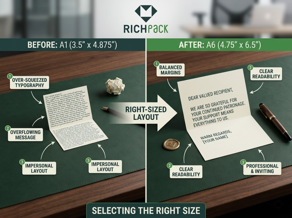
Częstym błędem jest wciskanie długiej wiadomości do małego formatu. Karta jest gęsta, trudna do odczytania i mniej wartościowa niż prostsza, większa opcja.
Przypadek użycia
Ta sama wielkość kartki z podziękowaniami nie sprawdza się w każdym scenariuszu.
Kartka ślubna wymaga więcej miejsca i większej ceremonii. Wkładka do opakowania musi być ciaśniejsza. Firmowe podziękowania mogą wymagać znalezienia równowagi między profesjonalizmem a wydajnością wysyłki.
Przypadek użycia powinien decydować o rozmiarze, a nie nawyk.
Dopasowanie koperty
Zgodność kopert wydaje się mało istotna, dopóki nie spowolni projektu. Standardowe rozmiary są łatwiejsze do znalezienia, ponieważ pasujące koperty są powszechnie dostępne.
Ma to znaczenie zarówno dla kosztów, jak i szybkości. Jeśli wybierzesz niestandardowy format zbyt wcześnie, możesz zwiększyć opóźnienia w zaopatrzeniu, wyższe koszty jednostkowe i utrudnienia w realizacji zamówień.
Jeśli chcesz wybrać najłatwiejszą opcję, trzymaj się rozmiarów kart serii A lub innych powszechnie obsługiwanych rozmiarów komercyjnych.
Koszty wysyłki
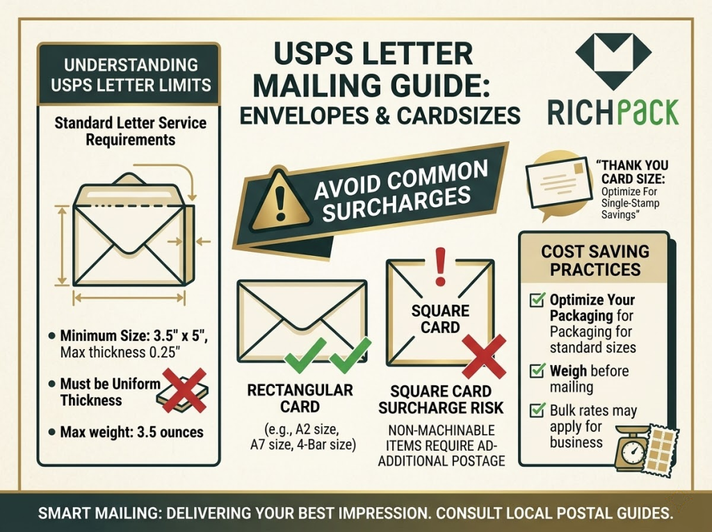
Zasady nadawania przesyłek pocztowych mają większe znaczenie, niż większość ludzi się spodziewa. Według USPS Postal Explorer, listy wyceniane jako standardowe przesyłki listowe muszą mieścić się w określonych granicach rozmiaru i grubości, a kwadratowe lub nieobrabialne elementy mogą wiązać się z dodatkowymi opłatami.
Oznacza to, że efektowny kształt może wyglądać lepiej na makiecie, ale w rzeczywistości będzie droższy. Jeśli wysyłasz przesyłki na dużą skalę, te dodatkowe centy szybko się sumują.
W przypadku formatów nadających się do wysyłki bezpośredniej bezpieczniejszym wyborem są zazwyczaj mniejsze, prostokątne kartki.
Wrażenie marki
Mniejsza karta wydaje się wydajna. Większa karta wydaje się bardziej przemyślana. Żadna z nich nie jest automatycznie lepsza.
W przypadku częstych zamówień e-commerce czytelnicy zazwyczaj dobrze reagują na kompaktową i schludną wkładkę. W przypadku prezentów premium lub w celu dotarcia do wartościowych klientów, większa, składana kartka często wydaje się bardziej przemyślana i warta zachowania.
Nie chodzi tylko o rozmiar. Chodzi o to, czy rozmiar jest w stanie udźwignąć emocjonalny ciężar chwili.
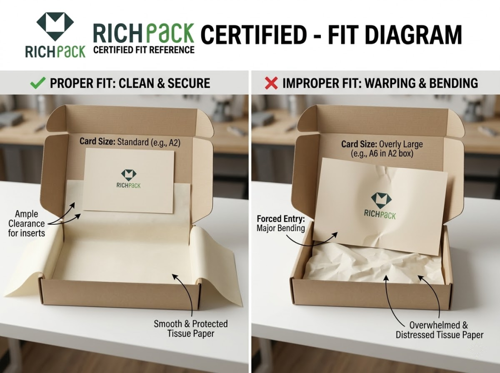
Przestrzeń opakowaniowa
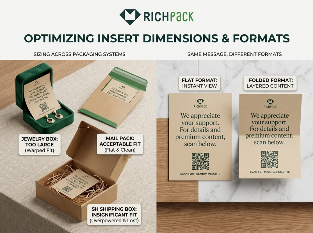
Jeśli karta ma być umieszczona w pudełku, koszulce, woreczku lub kopercie, przetestuj opakowanie przed sfinalizowaniem pliku do druku. Jest to szczególnie ważne w przypadku opakowań na biżuterię, gdzie kilka milimetrów może zmienić całe dopasowanie.
Z mojego doświadczenia wynika, że wiele marek przesadza w projektowaniu. Wybierają duży rozmiar, bo wygląda luksusowo na ekranie, a potem okazuje się, że wygina się on w środku opakowania lub blokuje dostęp do produktu.
Kartka z podziękowaniami powinna ułatwiać rozpakowywanie, a nie mu przeszkadzać.
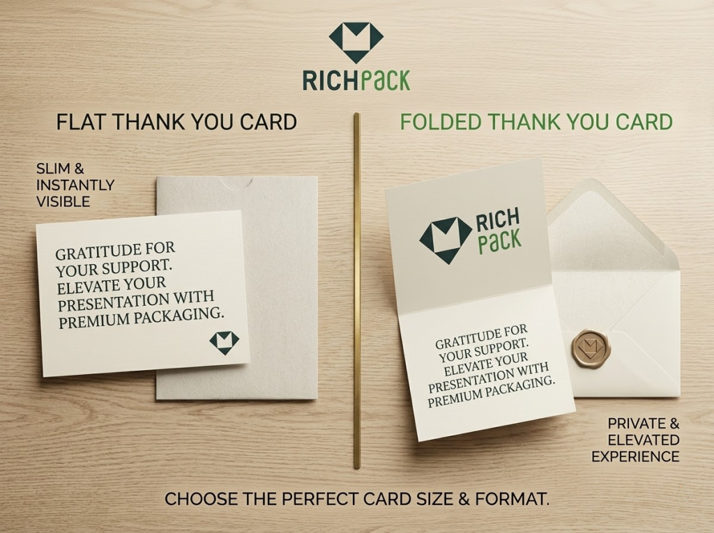
Płaskie lub złożone
Kolejnym ważnym wyborem nie jest dokładny rozmiar, ale format. Płaska karta i złożona karta o tym samym rozmiarze zachowują się zupełnie inaczej w praktyce.
Jeśli wybierzesz niewłaściwy format, nawet właściwe wymiary mogą wydawać się nieodpowiednie.
Karty płaskie
Płaskie kartki są prostsze, lżejsze i często tańsze. Idealnie sprawdzają się, gdy wiadomość jest krótka, a kartka musi bezproblemowo przejść przez opakowanie lub pocztę.
Sprawdzają się również, gdy sam projekt przodu robi największą uwagę. Wyrazisty napis z podziękowaniem, logo, krótka notatka i kod QR mogą wystarczyć.
W przypadku kampanii e-commerce i wysyłek bezpośrednich płaskie karty są często najskuteczniejszym rozwiązaniem.
Składane karty
Składane kartki mają większą wartość postrzeganą. Bardziej przypominają pamiątkę niż funkcjonalną wkładkę.
To ma znaczenie w przypadku ślubów, prezentów dla kadry kierowniczej, luksusowych sklepów i momentów doceniania klienta, gdzie przekaz powinien być osobisty. Wewnętrzny panel daje Ci przestrzeń do oddychania.
Użyj składanych kartek, jeśli chcesz, aby podziękowanie było prawdziwym przekazem komunikacyjnym, a nie tylko wydrukowanym dodatkiem.
Styl pocztówki
Karty w stylu pocztówki plasują się w ciekawym punkcie pośrednim. Są płaskie, łatwe w użyciu i często idealnie nadają się do krótkich wiadomości promocyjnych lub posprzedażowych.
Sprawdzają się również w kampaniach, które łączą wdzięczność z kolejnym krokiem, na przykład kodem QR do rejestracji produktu, nagrodami za lojalność lub stroną ponownego zamówienia.
Wystarczy zachować dyscyplinę przekazu. Pocztówki tracą na sile, gdy próbują przekazać zbyt wiele.
Wkładki dwufunkcyjne
Jednym z najmądrzejszych posunięć marek e-commerce jest łączenie funkcji. Na jednej wkładce można wyrazić wdzięczność, wyjaśnić instrukcje dotyczące pielęgnacji, udostępnić kod polecający i wskazać źródła pomocy.
Tutaj rozmiar staje się strategiczny. Zbyt mała karta nie poradzi sobie z wieloma zadaniami. Zbyt duża karta marnuje materiał i przestrzeń.
W tym przypadku najlepszymi punktami wyjścia są zazwyczaj format 4 x 6, A2 lub A6.
Kiedy złożone, czuje się lepiej
Złóż notatkę, gdy wymaga ona emocji, przestrzeni lub formalności. Dotyczy to ślubów, prezentów premium, ręcznie pisanych materiałów informacyjnych i wartościowych relacji B2B.
Składane kartki sprawdzają się również lepiej, gdy chcesz, aby zewnętrzna okładka odsłoniła coś. Ten drobny moment sprawia, że kartka wydaje się bardziej przemyślana.
Kiedy wygrywa Flat
Postaw na płaskie rozwiązania, gdy szybkość, dopasowanie i koszt liczą się bardziej niż ceremoniał. Jest to powszechne w programach e-commerce z dużą liczbą zamówień, kampaniach hurtowych i kompaktowych opakowaniach produktów.
Płaskie karty również redukują złożoność. To ma znaczenie, gdy Twój zespół wstawia setki lub tysiące jednostek.
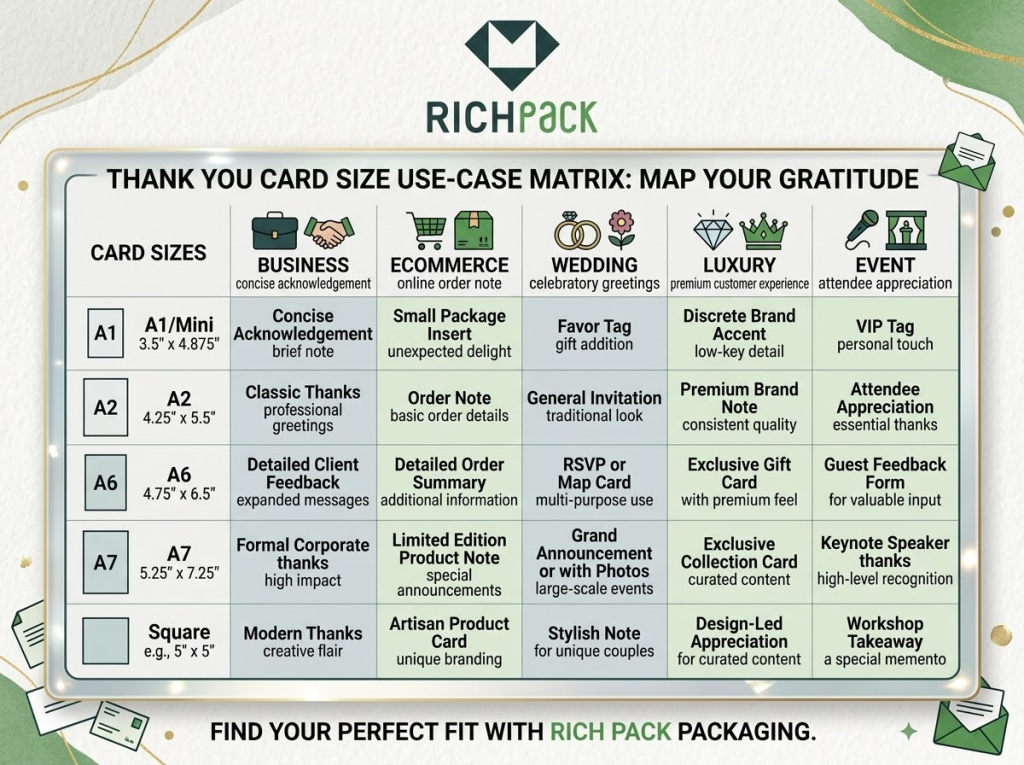
Najlepsze rozmiary według przypadku użycia
To właśnie ta sekcja interesuje większość decydentów. Nie chcą abstrakcyjnych wskazówek. Chcą najkrótszej drogi do właściwej specyfikacji.
Oto wersja praktyczna.
Karty z podziękowaniami biznesowymi
Do większości zastosowań biznesowych najlepszym rozwiązaniem są formaty 4 x 6 i A2. Wyglądają profesjonalnie, zapewniają wystarczająco dużo miejsca na krótką notatkę i są wydajne w produkcji masowej.
Jeśli potrzebujesz bardziej przejrzystej prezentacji marki z większą swobodą projektowania, wybierz format 4 x 6. Jeśli wolisz klasyczny format składany, użyj formatu A2.
To zazwyczaj najlepsza odpowiedź na zapytania dotyczące rozmiaru wizytówki z podziękowaniami i rozmiaru firmowej karty z podziękowaniami.
Ulotki do opakowań e-commerce
W przypadku kart wkładanych do zamówień, mniejsze rozmiary są zazwyczaj bardziej praktyczne. Karta powinna idealnie pasować, nie zaginać się i pozostawiać miejsce na produkt w centralnym miejscu.
Format A1 sprawdza się w przypadku bardzo lekkich wiadomości. Format A2 lub 4 x 6 sprawdza się lepiej, gdy potrzebujesz notatki z podziękowaniami, kodu QR, nazwy użytkownika w mediach społecznościowych, instrukcji pielęgnacji lub monitu o ponowne zamówienie.
Kartki z podziękowaniami ślubnymi
Na śluby A6 i A7 są zazwyczaj mocniejsze niż A2. Oferują one większą wyrazistość wizualną i więcej miejsca na serdeczną nutę.
Jeśli kartka zawiera zdjęcie, formalny podpis lub jest wykonana na papierze premium, format 5 x 7 cm często wydaje się odpowiedni. Dlatego wielu czytelników poszukujących kartki z podziękowaniami ślubnymi skłania się ku większym formatom.
Luksusowe karty z podziękowaniami
Marki luksusowe nie powinny wybierać większych kart tylko po to, by wyglądać na drogie. Powinny wybrać rozmiar, który będzie pasował do materiałów, systemu wkładek i historii marki.
Mimo to, format 5 x 7 lub dobrze zaplanowany, niestandardowy format często sprawdza się lepiej niż mała wkładka, gdy celem jest prezentacja premium. Folia, tłoczenie, powłoka miękka w dotyku i gruby papier wymagają przestrzeni wizualnej.
Widziałem, że w przypadku opakowań biżuterii najlepiej sprawdza się nieco większa karta, umieszczona jako odsłaniająca warstwę, a nie ułożona obok produktu.
HR i docenianie pracowników
Karty z informacjami o HR, kulturze wewnętrznej i docenianiu pracowników najlepiej sprawdzają się w formacie A2 lub A6. Te formaty są przemyślane, ale nie za duże.
Jeśli firma planuje dodać odręczne notatki od menedżerów lub kierowników zespołów, format A6 zapewnia większą elastyczność. Jeśli wiadomość jest wstępnie wydrukowana i zwięzła, format A2 często wystarcza.
Karty wydarzeń i działań następczych
W przypadku monitorowania wydarzeń, wysyłania powiadomień w stylu RSVP lub kartek z podziękowaniami po spotkaniu rolę odgrywają formaty 4 x 6, A2 i 5 x 7.
Użyj formatu 4 x 6, gdy przekaz jest zwarty i nastawiony na działanie. Użyj formatu A2, aby złożyć kartkę w klasyczny sposób. Użyj formatu 5 x 7, gdy kartka ma być ważniejsza lub bardziej zapadająca w pamięć.
Kiedy niestandardowe rozmiary kartek z podziękowaniami mają sens
Spersonalizowana kartka z podziękowaniami może być dobrym pomysłem. Może też okazać się stratą pieniędzy. Różnica sprowadza się do tego, czy niestandardowy rozmiar rozwiązuje rzeczywisty problem.
Jeśli nie poprawia to dopasowania, funkcjonalności lub wpływu marki, zazwyczaj wygrywają rozmiary standardowe.
Opowiadanie historii marki
Wybierz niestandardowy rozmiar, jeśli kartka jest częścią doświadczenia marki, a nie tylko notatką. Jest to powszechne w przypadku luksusowych opakowań, kampanii sezonowych i mailingów dla influencerów.
Format niestandardowy może wywołać większe zaskoczenie i lepiej dopasować się wizualnie do całego systemu opakowań.
Dopasowanie produktu
Czasami standardowe rozmiary po prostu nie pasują do prezentacji produktu. Dzieje się tak w przypadku sztywnych pudełek na biżuterię, wąskich osłon, nietypowych pudełek szufladowych i systemów wkładek warstwowych.
W takim przypadku niestandardowe wymiary są uzasadnione. Rozwiązujesz problem strukturalny, a nie gonisz za nowością.
Systemy projektowania
Dostosowanie rozmiaru ma również sens, gdy karta z podziękowaniami musi być spójna z innymi elementami. Mogą to być karty lojalnościowe, karty opieki, karty certyfikatowe, wkładki polecające lub wkładki powitalne.
Wspólny system wizualny może sprawić, że cała marka będzie wydawać się silniejsza i bardziej przemyślana.
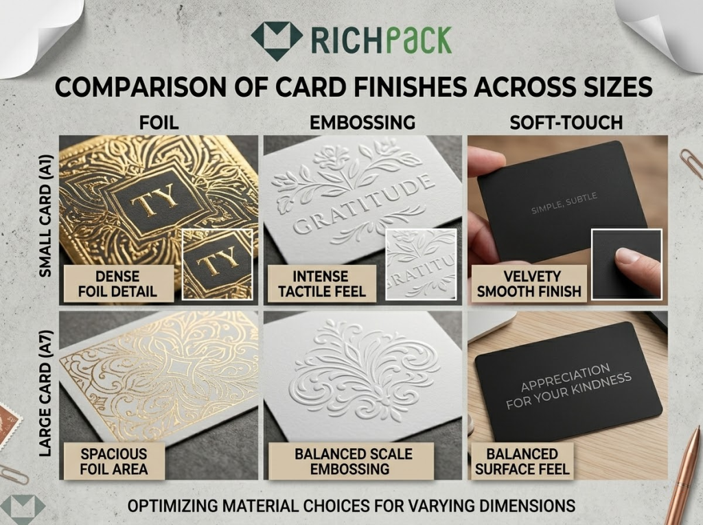
Wykończenia premium
Folia, tłoczenie, laminowanie typu soft-touch, papier dwustronny i malowanie krawędzi – to wszystko zmienia odbiór karty. W przypadku bardzo małych formatów te ulepszenia mogą wydawać się ciasne lub przekombinowane.
Nieco większy rozmiar niestandardowy może zapewnić tym wykończeniom wystarczająco dużo miejsca.
Kompromisy kosztowe
To właśnie tutaj personalizacja nabiera realnego znaczenia. Niestandardowe rozmiary mogą oznaczać niestandardowe koperty, więcej pracy przygotowawczej, różne impozycji druku i wyższe koszty jednostkowe.
To nie zawsze jest złe. Po prostu karta musi na to zasłużyć.
Reguła decyzyjna
Użyj standardowego rozmiaru, gdy liczy się szybkość, skala i prostota. Użyj rozmiaru niestandardowego, gdy poprawia on dopasowanie, funkcjonalność lub postrzeganą wartość w mierzalny sposób.
To najczystsza zasada jaką znam.
Typowe błędy, których należy unikać
Większość problemów z kartkami z podziękowaniami nie wynika ze złego smaku. Wynikają one z niewłaściwych decyzji dotyczących rozmiaru.
Oto błędy, które widzę najczęściej.
Wybór wyłącznie na podstawie wyglądu
Rozmiar może wyglądać świetnie w pliku projektowym, ale nie sprawdzić się w produkcji. Może nie pasować do koperty, pudełka lub budżetu na przesyłkę.
Zawsze testuj rzeczywisty przypadek użycia przed zatwierdzeniem druku.
Ignorowanie rozmiaru koperty
Czytelnicy często skupiają się na kartce i zapominają o kopercie. To stwarza niepotrzebne problemy z zaopatrzeniem i realizacją zamówień.
Dobra karta powinna mieć równie praktyczną kopertę.
Zapominanie o zasadach dotyczących przesyłek pocztowych
Karty kwadratowe i o nietypowych kształtach mogą wymagać obróbki nieobrobionej lub dodatkowych opłat pocztowych na niektórych rynkach. USPS wyraźnie zaznacza, że przetwarzanie kart o nietypowych kształtach może wiązać się z wyższymi kosztami.
Jeśli wysyłasz pocztą dużą ilość przesyłek, decyzja o ich rozmiarze powinna być podejmowana od pierwszego dnia.
Umieszczanie zbyt dużej ilości tekstu na małej karcie
Mała kartka nie powinna zawierać treści na dużej karcie. Jeśli tekst, logo, kod QR i instrukcje wydają się ściśnięte, format jest nieprawidłowy.
Nie zmniejszaj projektu, dopóki nie będzie pasował. Zmień rozmiar.
Wykorzystanie dużych kart do ciasnego pakowania
Duże karty wydają się ekskluzywne, dopóki się nie odkształcą, nie zsuną się lub nie zdominują pudełka. Wtedy stają się niezgrabne.
W przypadku opakowań dopasowanie jest częścią luksusowego doświadczenia.
Traktowanie każdej publiczności tak samo
Klienci, goście weselni, klienci korporacyjni i pracownicy nie czytają kartek z podziękowaniami w ten sam sposób. Ich oczekiwania są różne.
Rozmiar odpowiedni dla jednej grupy odbiorców może nie być odpowiedni dla innej.
Wskazówki projektowe, dzięki którym każdy rozmiar będzie lepszy
Po wybraniu odpowiedniego rozmiaru liczy się przede wszystkim wykonanie. Dobrze zaprojektowana karta A2 prawie zawsze przewyższy źle zaplanowaną, zbyt dużą kartę.
Stosuj te zasady, aby format działał lepiej.
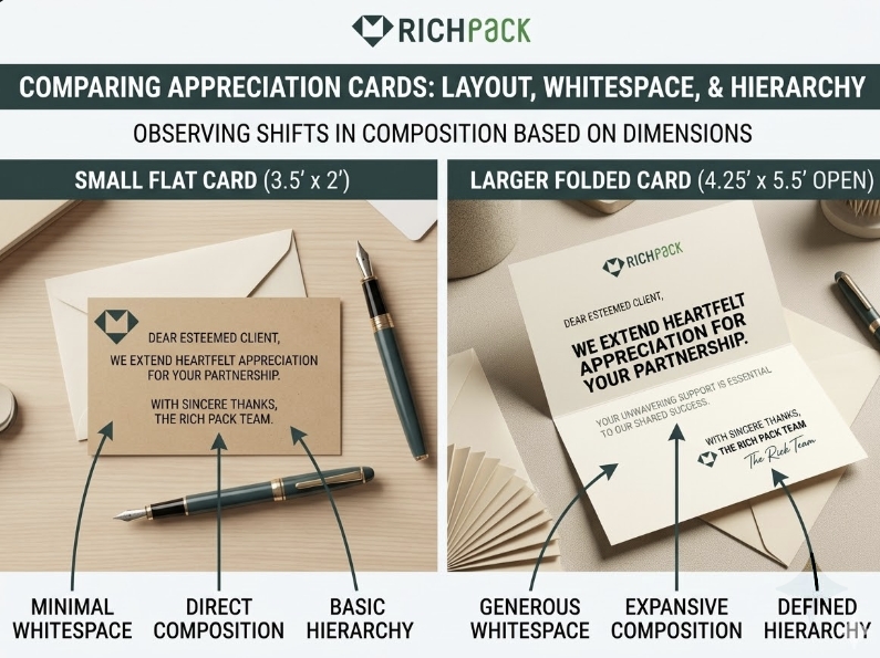
Zachowaj krótką wiadomość
Kartka z podziękowaniami sprawdza się najlepiej, gdy przekaz jest konkretny. Powiedz jasno jedną rzecz.
Jest to szczególnie ważne w przypadku mniejszych kart, gdzie każda linia musi zapracować na swoją przestrzeń.
Nadaj priorytet białej przestrzeni
Biała przestrzeń sprawia, że wizytówka wydaje się bardziej ekskluzywna niż przeładowane dekoracje. Poprawia czytelność i dodaje przekazowi pewności.
Ma to znaczenie w przypadku każdego rozmiaru, ale największe znaczenie ma w przypadku formatów kompaktowych.
Dopasuj rozmiar czcionki do rozmiaru karty
Małe karty wymagają większego i bardziej czytelnego druku, niż oczekuje wielu projektantów. Jeśli czytelnik musi mrużyć oczy, karta już teraz nie spełnia oczekiwań.
Zasadniczo treść powinna być czytelna w rzeczywistym rozmiarze druku, a nie tylko na ekranie.
Użyj jednego wyraźnego sygnału marki
Nie przeciążaj karty brandingiem. Użyj jednego, mocnego akcentu. Może to być logo, charakterystyczny kolor, detal foliowy lub krótka linia marki.
Jeden wyraźny sygnał zazwyczaj wydaje się bardziej wartościowy niż pięć rozproszonych.
Dodaj kod QR tylko wtedy, gdy to pomoże
Kod QR powinien prowadzić do użytecznego miejsca. Opieka nad produktem. Ponowne zamówienie. Program lojalnościowy. Rejestracja. Prośba o recenzję.
Jeśli nie wpłynie to pozytywnie na następny krok czytelnika, pomiń tę opcję.
Wybierz wykończenia pasujące do okazji
Matowy papier emanuje spokojem i nowoczesnością. Błyszczący może podkreślać wyraziste wizualizacje. Miękki w dotyku i foliowy często lepiej pasują do marek luksusowych. Grubszy papier może sprawić, że nawet prosty projekt będzie wyglądał przemyślanie.
Wybieraj wykończenia pasujące do chwili obecnej, a nie tylko do tablicy inspiracji.
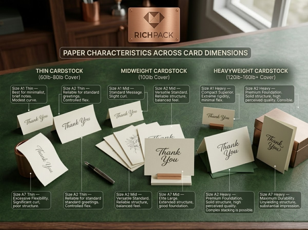
Dopasuj gramaturę papieru do rozmiaru karty
Grubość papieru zmienia odbiór karty. To jeden z najprostszych sposobów, aby dobry rozmiar wydawał się tani, a prosty rozmiar – luksusowy.
Na przykład kartka z podziękowaniami w formacie 5 x 7 lub A7 wydrukowana na jasnym papierze może szybko wydawać się nietrwała. W większości eleganckich i formalnych okazji zbyt cienka kartka sprawia, że wydaje się mniej wartościowa i bardziej jednorazowa.
Z drugiej strony, bardzo mała kartka, taka jak A1, może stać się niewygodna, jeśli papier jest zbyt ciężki, zwłaszcza po złożeniu. Bardzo gruby papier może się stawiać opór składaniu, pękać przy bigowaniu lub wydawać się nieporęczny w stosunku do treści.
Z reguły:
Do bardzo małych wkładek funkcjonalnych należy używać lżejszego lub średnio ciężkiego materiału
Do kart A2 i A6 użyj solidnego papieru o średniej lub wysokiej gramaturze
Użyj grubszego papieru do kart A7 lub luksusowych, zwłaszcza jeśli chcesz, aby karta była solidna
Przed zatwierdzeniem bardzo grubych kart składanych należy przetestować ich wydajność.
Jeśli karta ma symbolizować luksus, jej grubość powinna to podkreślać. Jeśli karta ma sprawnie przemieszczać się w opakowaniu, jej waga powinna być praktyczna.
FAQ
Jaki jest standardowy rozmiar kartki z podziękowaniami?
Standardowy format kartki z podziękowaniami to zazwyczaj A2, czyli 4.25 x 5.5 cala. Jest to najczęściej spotykany format domyślny, ponieważ zapewnia równowagę między miejscem na pisanie, dostępnością koperty, łatwością drukowania i ogólną prezentacją.
Który format kartek z podziękowaniami jest lepszy: A2 czy A6?
Format A2 jest lepszy, jeśli zależy Ci na klasycznym, domyślnym formacie. Format A6 jest lepszy, jeśli potrzebujesz więcej miejsca na branding, dłuższą notatkę lub połączenie podziękowania i wkładki. W zastosowaniach biznesowych i e-commerce format A6 często zapewnia większą elastyczność.
Jaki rozmiar koperty pasuje do kartki z podziękowaniami
Zależy to od rozmiaru karty. Karty A2 wymagają kopert A2, karty A7 – kopert A7, a wkładki komercyjne 4 x 6 często wykorzystują kompatybilne koperty w formacie A6. Kluczem jest sprawdzenie rzeczywistych wymiarów gotowej karty przed zamówieniem kopert.
Jaki jest najlepszy rozmiar firmowej kartki z podziękowaniami?
Do większości zastosowań biznesowych najlepszym wyborem będą formaty 4 x 6 i A2. Są praktyczne, ekonomiczne, łatwe do wydrukowania i wystarczająco duże, aby zmieścić krótki komunikat, oznaczenie marki i proste wezwanie do działania.
Czy wymiary 5 x 7 to za dużo na kartkę z podziękowaniami?
Format nr 5 x 7 nie jest zbyt duży, jeśli moment wymaga większego efektu wizualnego lub dłuższej notatki. To mocny format na śluby, prezenty premium, marki luksusowe i dotarcie do wartościowych klientów. Zazwyczaj jest za duży do ciasnych wkładek do opakowań.
Czy wysyłanie kwadratowych kartek z podziękowaniami jest droższe?
Mogą. USPS zaznacza, że przesyłki kwadratowe i o nietypowych kształtach mogą wiązać się z dopłatą, ponieważ są trudniejsze w obróbce. Jeśli koszt wysyłki ma znaczenie, standardowa, prostokątna karta jest zazwyczaj bezpieczniejszą opcją.
Wniosek
Odpowiedni rozmiar kartki z podziękowaniami zależy od jej przeznaczenia. Jeśli zależy Ci na najbezpieczniejszym formacie domyślnym, zacznij od A2 o wymiarach 4.25 x 5.5 cm. Jeśli potrzebujesz więcej miejsca na firmowe wkładki lub branding, wybierz format 4 x 6 cm lub A6. Jeśli zależy Ci na bardziej formalnym lub ekskluzywnym charakterze, 5 x 7 cm często sprawdzi się lepiej.
Wybierz rozmiar pasujący do wiadomości, koperty, metody wysyłki, gramatury papieru i sposobu pakowania. W ten sposób kartka z podziękowaniami przestaje być zbędnym kawałkiem papieru, a staje się częścią doświadczenia marki.

 POPRZEDNIE