 POPRZEDNIE
Kluczowe punkty do zapamiętania w przypadku niestandardowych kartek z podziękowaniami dla firm z logo
2026-03-04

A logo can look perfect on a laptop and still fall apart on a jewelry box. I have seen a soft champagne mark turn muddy on velvet, then watched the room go quiet because the launch date was already set.
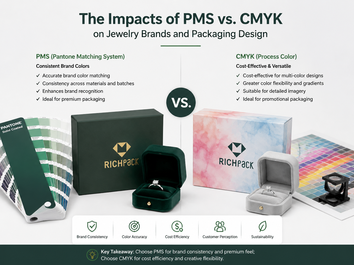
PMS vs CMYK is not a design-school debate. It is a packaging control decision: PMS protects a signature shade with a pre-mixed spot ink, while CMYK builds color from four process inks for photos, gradients, illustrations, and flexible artwork.
In this guide, you will get the plain-English difference between the two, when each one works, where each one breaks down, and how to approve color before a rigid box, drawer box, gift sleeve, insert card, pouch, thank you card, or retail display moves into production. You will also see how RGB and HEX fit into the brand file without becoming the wrong approval standard for print.
For jewelry brands, the best choice is not one system forever. The better question is what the color has to do with the packaging program.
If the color must identify the brand at a glance, PMS usually deserves the first look. By contrast, if the color must carry product photos, watercolor artwork, seasonal graphics, or full-panel campaign imagery, CMYK usually carries the job better.
PMS is the safer choice for a signature brand color that appears on jewelry boxes, pouches, ribbons, shopping bags, and printed cards. It uses a defined spot color formula instead of asking for four process inks to simulate the shade every time.
That matters when a brand has a recognizable blush, deep green, navy, ivory, or black. A small shift can make premium packaging feel like a cheaper replacement.
CMYK is the better fit for photographic images, shaded illustrations, gradients, and multi-color artwork. It creates color by layering cyan, magenta, yellow, and black in controlled dot patterns.
A jewelry care booklet, gemstone story card, campaign sleeve, or holiday insert often needs CMYK because the design contains many tones rather than one exact brand color.
RGB belongs to screens. It is useful for websites, email, ads, e-commerce images, and design previews, but it should not be the final approval reference for a printed box.
The screen produces color with light. A box produces color with ink, coating, paper, texture, and finishing.
A premium jewelry package can use CMYK for artwork and one PMS spot color for the logo or master brand shade. Printers often call this a four-color process job with an added spot color.
That hybrid choice works well when the front panel needs a precise logo and the surrounding artwork needs tonal depth.
PMS can add setup cost because each spot color may require its own ink preparation, plate, station, or production setup. CMYK can be more efficient for full-color designs, especially when the artwork already requires process printing.
The real cost question is not only the invoice cost. A wrong color on a jewelry launch can cost samples, repacking time, delayed shipments, and lost brand trust.
The table below compares PMS, CMYK, and RGB for jewelry packaging components so a brand team can assign the right system before artwork release. It covers the color role, common use, risk level, and best approval method for each option.
| Komponent opakowania | Best color system | Dlaczego to działa? | Główne ryzyko | Approval standard |
| Rigid jewelry box logo | PMS | Keeps the signature mark consistent | Extra setup cost | Printed sample on final wrap |
| Full-panel artwork sleeve | CMYK | Handles photos and tonal graphics | Slight drift between runs | Press proof or physical sample |
| Product story card | CMYK | Works for images and text layouts | Dark images can lose detail | Printed proof on cardstock |
| Pouch logo | PMS | Supports simple brand marks | Fabric texture changes the look | Sample on the final fabric |
| Website product image | RGB | Built for screens | Cannot approve print output | Calibrated digital preview only |
| Thank you card accent | PMS lub CMYK | Depends on logo precision and artwork | Mismatched cards and boxes | Component set review |
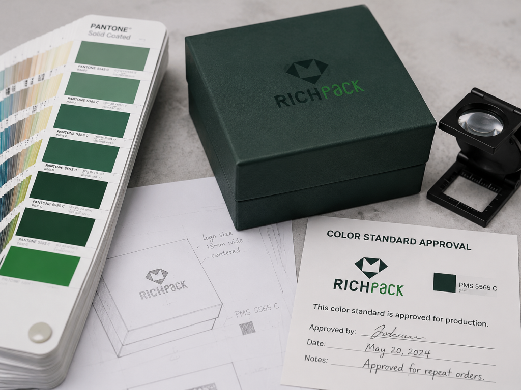
The Pantone Matching System (PMS) is a standardized color reproduction system used in printing to support exact color matching through named spot-color references. In packaging, it matters whether the brand shade remains recognizable on a real box, card, pouch, ribbon, or bag.
For jewelry brands, PMS often sits closest to brand identity. It controls the logo, brand block, ribbon shade, printed tissue, insert card accent, and the small details customers remember.
A PMS color is a pre-defined color reference used to mix or specify a spot ink. The goal is repeatability across print runs, suppliers, and components.
That does not mean every material looks identical. It means the team has a controlled target instead of guessing from a screen or a generic CMYK build.
Jewelry packaging often uses quiet design signals: a soft ivory box, a muted rose logo, a deep green drawer sleeve, or a warm gray insert card. PMS helps protect those signals.
Small luxury brands often underestimate how much customers notice a color shift. The product may be a ring or necklace, but the box sets the expectation before the clasp opens.
Pantone coated and uncoated references can look different because the paper surface affects how ink sits and is absorbed. Coated paper keeps ink closer to the surface, while uncoated paper can pull the color inward.
A brand choosing an ivory or blush shade for a textured jewelry box should review the right reference book and the actual packaging material. A coated swatch alone can mislead the approval process.
Rigid jewelry boxes often use wrapped paper over grayboard, MDF, or other structural cores. The wrap paper, lamination, texture, and adhesive process can all affect the final color.
PMS gives the printer a stronger starting point, but the final decision still belongs to the physical sample. The approved standard should be the finished box, not only the ink number.
PMS is strongest with flat, solid, controlled color. It is not built for a gemstone photo, skin tone, watercolor wash, or soft gradient across a sleeve.
A brand can use multiple spot colors, but that becomes expensive and less practical as the artwork grows more complex. At that point, CMYK or a hybrid setup usually makes more sense.
PMS may cost more on short runs because setup work is spread across fewer pieces. For repeat orders, the cost can become easier to justify because the brand color stays stable.
From our packaging bench, the strongest use case is a brand planning to reorder the same box for several collections. The earlier the color standard is locked, the easier each reorder becomes.
CMYK is a four-color process printing system that builds images from cyan, magenta, yellow, and black ink. It is the workhorse for packaging artwork that needs photos, gradients, shadows, illustrated scenes, or frequent campaign changes.
For jewelry packaging, CMYK shines when a design needs photographic richness, seasonal graphics, complex illustration, care instructions, or multi-color storytelling.
CMYK uses four ink channels to simulate a wide range of colors. Each color appears through tiny dot patterns and ink percentages.
That dot structure is why CMYK can create a gemstone photo or soft product illustration. It is also why a flat brand color may shift slightly from one press condition to another.
CMYK handles depth better than spot color when artwork contains many tones. A holiday jewelry sleeve with pearls, ribbon, shadows, and warm background texture would be impractical as a stack of spot inks.
Process printing also supports flexible campaign work. A brand can change artwork without rebuilding a separate ink setup for every color in the design.
Digital print commonly uses CMYK for shorter runs, fast sampling, and flexible artwork changes. Offset print can use CMYK for higher volume runs and more controlled results when the project justifies setup.
Neither method is automatically better for every jewelry box. The choice depends on quantity, artwork, material, finish, tolerance, and timeline.
CMYK can drift because ink density, substrate, press calibration, humidity, coating, and finishing all influence the final result. A warm beige can become slightly gray. A soft pink can lose warmth.
This is manageable when the team agrees on tolerance before production. It becomes painful when the first serious color discussion happens after the boxes arrive.
Some saturated blues, greens, oranges, purples, and neons sit outside what standard CMYK can reproduce cleanly. The screen preview often looks brighter because RGB light has a wider visual range in that area.
If a jewelry brand owns a vivid signature color, ask the supplier for a PMS option or a proofed CMYK match before approving the design.
CMYK is often enough when the design does not rely on one exact brand shade. It works well for pattern fills, illustrated sleeves, printed mailer interiors, product cards, and care brochures.
The safer rule is simple: use CMYK for flexible image content and PMS for identity-critical color.
The table below compares typical jewelry packaging print surfaces with CMYK strengths and limits. It helps design and purchasing teams decide where process color is efficient and where a spot color review should happen first.
| Packaging item | CMYK strength | CMYK limit | Praktyczna rekomendacja |
| Campaign sleeve | Rich seasonal artwork | The brand logo may drift | Add PMS for the logo if needed |
| Care booklet | Photos and instruction graphics | Small type can fill in on rough paper | Test final paper stock |
| Insert card | Flexible design and batch changes | Pale colors can wash out | Review a physical proof |
| Karton wysyłkowy | Low-cost graphics | Brown Kraft shifts color strongly | Use simple dark graphics |
| Rigid box wrap | Can print patterns and art | Solid luxury colors may look uneven | Use PMS for key solid color |
| Gift tag | Good for small artwork | Color may differ from the box wrap | Approve with the full packaging set |
RGB is not the enemy of print. It is simply built for another environment.
A strong jewelry brand guide with wsparcie w projektowaniu opakowań should include RGB and HEX for screens, CMYK for process print, and PMS for critical printed brand color. The mistake is asking one system to do every job.
RGB is a light-based color model used by screens. It belongs in ecommerce storefronts, digital ads, email designs, online lookbooks, and product renderings.
A jewelry founder may fall in love with the glow of a color on a phone screen. That glow cannot be printed as light on a paper box.
HEX is a compact code used to define web colors. It helps developers, ecommerce teams, and designers keep digital brand assets consistent.
It should appear in a brand guide, but it should not be sent to a packaging supplier as the only color reference for a printed jewelry box.
An RGB file can guide the design direction, but it cannot approve ink behavior. Monitors vary, brightness settings vary, and screen color does not account for paper texture or coating.
If the printed box matters, approve print with a printed sample.
RGB artwork must be converted into a print-ready color space before production. During conversion, bright screen colors often become duller because ink cannot reproduce every light-based color.
Designers should check this shift early. A last-minute conversion can damage a launch palette after photography, ads, and packaging have already been approved separately.
Even a digital-first jewelry brand needs a stable printed identity. Customers may discover the brand on a phone, but the first physical proof of quality is often the box in their hands.
PMS gives that physical moment a controlled reference. It keeps the unboxing from feeling disconnected from the online brand.
A useful jewelry brand guide should separate digital and print values clearly:
That last item is the one many brand guides miss. Packaging is not just a color code. It is a color code on a real surface.
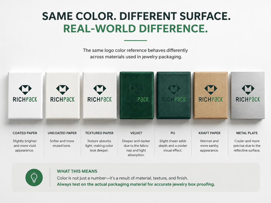
Materiały opakowaniowe do biżuterii change color. That one sentence prevents a lot of expensive packaging mistakes.
A PMS shade or CMYK build may look controlled on white coated paper and still behave differently on textured paper, velvet, kraft board, molded pulp, PU, or a metal logo plate.
Coated paper wraps usually keep color cleaner and sharper because the ink sits closer to the surface. This can help PMS logos look crisp and CMYK artwork hold detail.
They also show defects more clearly. Fingerprints, scuffs, and surface glare can become part of the color experience.
Uncoated paper absorbs more ink, so colors can look softer, warmer, or duller. Textured paper adds another layer because the surface catches light unevenly.
For muted luxury palettes, that softness can be beautiful. For exact brand matching, it needs sampling before approval.
Velvet and suede-touch surfaces change how color is perceived because pile direction and light angle affect the visual tone. A logo printed or transferred onto these materials may look darker from one direction and lighter from another.
Use a physical sample and view it at the angle customers will see during unboxing. A flat desk review may not reveal the shift.
Leather paper and PU can create a premium hand feel, but surface texture may reduce edge sharpness. Fine logo strokes, small type, and pale metallic effects need extra caution.
If the brand mark has thin lines, test size and contrast on the final material instead of only on coated stock.
Kraft and recycled paperboard carry their own base color. CMYK printed on brown kraft will not behave like CMYK printed on white stock.
White ink, PMS spot color, foil, or a simplified dark graphic may work better than trying to force a bright campaign palette onto a warm, natural surface.
Metal details introduce another surface stack: base metal, plating, coating, cleaning, ink or enamel, and curing. Fingerprints, polishing residue, and sealed anodized surfaces can affect adhesion.
For printed metal plates, ask for adhesion checks after curing. ASTM D3359 describes tape-test methods that rate coating adhesion by cutting the film, applying pressure-sensitive tape, and removing it under controlled conditions.
A quick thumb rub is not enough for a premium jewelry package. On metal, PU, or coated details, the useful question is whether the ink or coating can survive realistic handling without lifting.
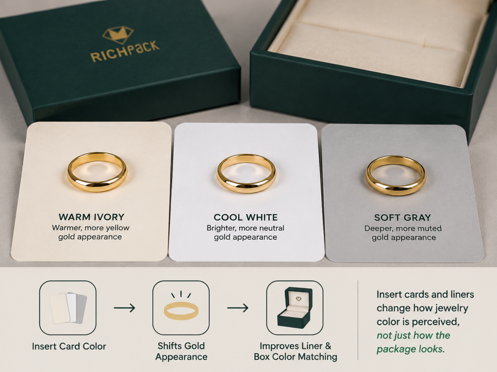
Insert cards, foam covers, suede pads, and paperboard holders sit right next to the jewelry. Their color can make gold look warmer, silver look colder, or gemstones look more saturated.
That is why the inserted color should be reviewed with the actual product, not alone on a table.
The table below maps common jewelry packaging materials to color behavior, proofing risk, and likely color system. It gives buyers a practical starting point before samples are ordered.
| Powierzchnia materiału | Color behavior | PMS fit | CMYK fit | Proofing risk |
| Papier powlekany | Sharp and saturated | Silny | Silny | Średni |
| Papier niepowlekany | Softer and more absorbent | Strong with testing | Good for muted art | Średni |
| Papier teksturowany | Light catches unevenly | Good with the sample | Detail may soften | Wysoki |
| Aksamit | Directional shade shift | Possible with testing | Ograniczony | Wysoki |
| PU or leather paper | Texture affects edges | Good for bold marks | Limited for fine detail | Wysoki |
| Tektura Kraft | Warm base changes ink | Good with dark colors | Limited for bright art | Wysoki |
| Metalowy talerz | Surface prep controls adhesion | Good with specialty ink | Rare | Wysoki |
Color is not decoration on a jewelry box. It tells customers what kind of brand they are holding.
A precise color system can make a small brand feel controlled and established. A careless color system can make an expensive piece feel less trustworthy before the customer opens the lid.
A signature color helps customers recognize a brand before they read the logo. Think of the box color, ribbon, tissue, card, and pouch as one physical memory system.
PMS is usually the stronger choice when that memory depends on one stable shade.
Luxury packaging often wins through restraint. One exact color, one good material, and one clean logo can feel stronger than a busy full-color layout.
That said, CMYK is not less premium. It means process artwork should support the brand world rather than fight the jewelry for attention.
CMYK gives brands more room for storytelling. A gemstone origin card, care booklet, or collection sleeve can use photography and illustration to build emotional context.
The key is hierarchy. Let PMS protect the brand mark and let CMYK carry the visual story.
Limited editions often need faster artwork changes than core packaging. CMYK can help brands test seasonal sleeves, printed inserts, and campaign cards without rebuilding the whole packaging system.
The core brand color should stay disciplined. The seasonal layer can move around it.
Many jewelry purchases start with a digital image, but packaging still appears in product photos, unboxing shots, and gift previews. If the box color changes from batch to batch, the product page starts to look inconsistent.
The catch is that inconsistency can make customers question whether the item is authentic, new, or from the same collection.
In retail, color has to work under store lighting and beside other brands. A jewelry box that looked soft in the studio may look flat under cool LED lighting.
Review packaging samples in the actual selling environment when possible. A showroom counter tells a different truth than a design monitor.
Color decisions affect more than appearance. They affect tooling, sample rounds, production scheduling, minimum order quantities, and reorder reliability.
A good supplier should explain these tradeoffs early, especially when the brand needs both premium presentation and predictable delivery.
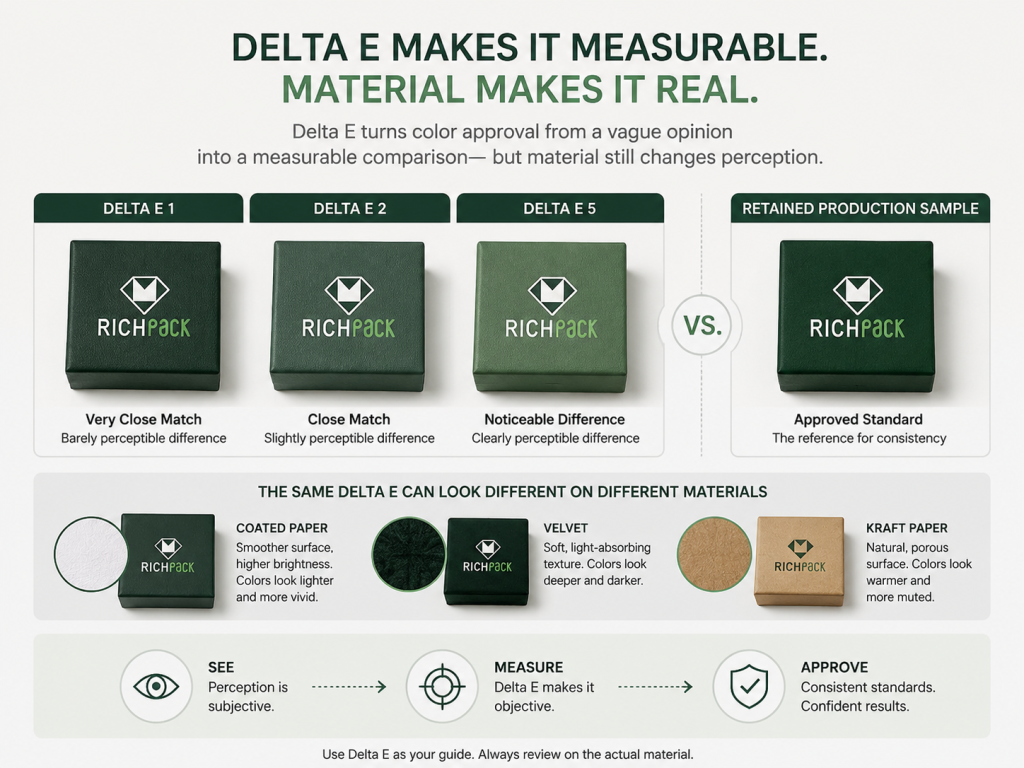
For planning, treat color control as a measurable production item, not a mood-board preference. ISO 12647-2 process control for offset work uses tolerances such as maximum Delta E 5 for CMYK primary-color deviation from the target and tighter production-run fluctuation values around Delta E 4 for CMK and Delta E 5 for yellow under standard process conditions. Those numbers are not a luxury-box guarantee, but they give buyers a real starting point for talking about tolerance instead of saying “close enough.”
PMS may require separate ink mixing, additional plates, or a dedicated print station, depending on the print method. That setup can increase cost and lead time.
For a core jewelry box that will be reordered, setup may be worth it. For a one-time insert card, CMYK may be more practical.
By contrast, CMYK can be efficient when the design already needs four process colors. Adding many images or tonal graphics does not create a separate spot ink for every shade.
That efficiency helps with seasonal inserts, campaign cards, and printed sleeves where artwork changes often.
A hybrid job can use CMYK for artwork and one PMS spot color for the brand mark. This is common when the logo must stay exact, but the design still needs rich visuals.
The buyer should ask whether the extra spot color changes cost, schedule, and proofing requirements before approving the artwork.
Low MOQ custom jewelry packaging often starts with low quantities and a limited budget. CMYK digital print can help test a packaging direction without a heavy setup.
If the brand color is central to the identity, order a small physical sample first. Saving money on setup does not help if the first customer’s photos show the wrong color.
Large repeat orders reward discipline. A PMS standard, approved substrate, retained sample, and written tolerance can make the second and third runs more stable.
A packaging manufacturing process note should stay with the approved run. That includes material lot, finish, print method, ink reference, measurement target, and any adjustments made during sampling.
International jewelry brands often reorder packaging for different markets, gift seasons, or distribution centers. Color drift becomes more likely when production is split, rushed, or moved between suppliers.
A sealed reference sample and clear color specification reduce argument. They do not remove the need for inspection.
A higher print cost can be cheaper than a weak brand moment. If the box color is part of the brand promise, precision is not a luxury add-on.
It is a protection layer.
The table below turns common business scenarios into practical color choices. It weighs cost, timing, brand risk, and reorder stability for jewelry packaging teams.
| Scenariusz | Najlepszy wybór na początek | Czemu | Extra check |
| New brand launch | CMYK with sampled PMS logo | Controls cost while protecting identity | Approve the final box sample |
| Luxury rebrand | PMS for master color | Signature shade must hold | Review across the full packaging set |
| Holiday collection | CMYK sleeve with PMS core mark | Allows seasonal artwork | Keep the core box color stable |
| Wholesale expansion | PMS standard for repeat boxes | Helps multi-market consistency | Keep the retained production sample |
| Low quantity test | CMYK digital sample | Szybciej i elastyczniej | Check color against future scale plan |
| luksusowe pudełka na prezenty program | PMS plus premium finish | Protects high-value impression | Review under event lighting |
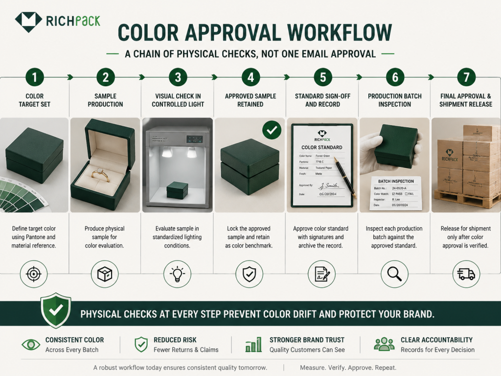
Color approval should be a controlled handoff, not a hopeful email. The team needs the right reference, the right material, and the right viewing conditions.
A jewelry box is approved when the finished component matches the agreed standard closely enough for the brand, not when a screen preview looks attractive.
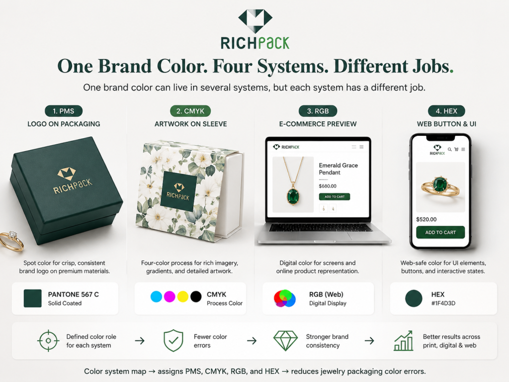
Begin with the correct value for the job: PMS for exact printed brand color, CMYK for process artwork, and RGB or HEX for digital previews. Put these values in the brand guide with clear use notes.
Do not let a designer, buyer, and printer each work from a different version of the same color.
Approve color on the actual material whenever possible. A logo on coated paper, uncoated paper, velvet, and kraft can look like four different decisions.
If the material changes after color approval, the approval should be repeated.
Digital proofs help catch layout, spelling, scale, and placement issues. They are not a final color guarantee for premium packaging.
Use them for structure and file review. Use physical samples for color judgment.
A physical sample is the most useful approval tool because it combines ink, material, finish, structure, and lighting. For jewelry packaging, review the full set together.
That means box, insert, pouch, tag, card, sleeve, and any retail display element that will appear in the same customer experience.
Lighting changes color perception. A warm office lamp, cool LED store light, and daylight-balanced booth can make the same package look different.
For high-value programs, review the sample under controlled lighting and the likely sales environment.
Once approved, keep a signed production sample or master color standard. Store it safely and use it for reorders.
A photo of the approved sample is helpful for communication, but it cannot replace the real object.
Before shipment, compare batch samples against the approved standard. Check logo color, background color, finish, rub resistance, adhesion, and component matching.
For international delivery, this step can prevent a color problem from becoming a warehouse problem.
Use this seven-step workflow before mass production:
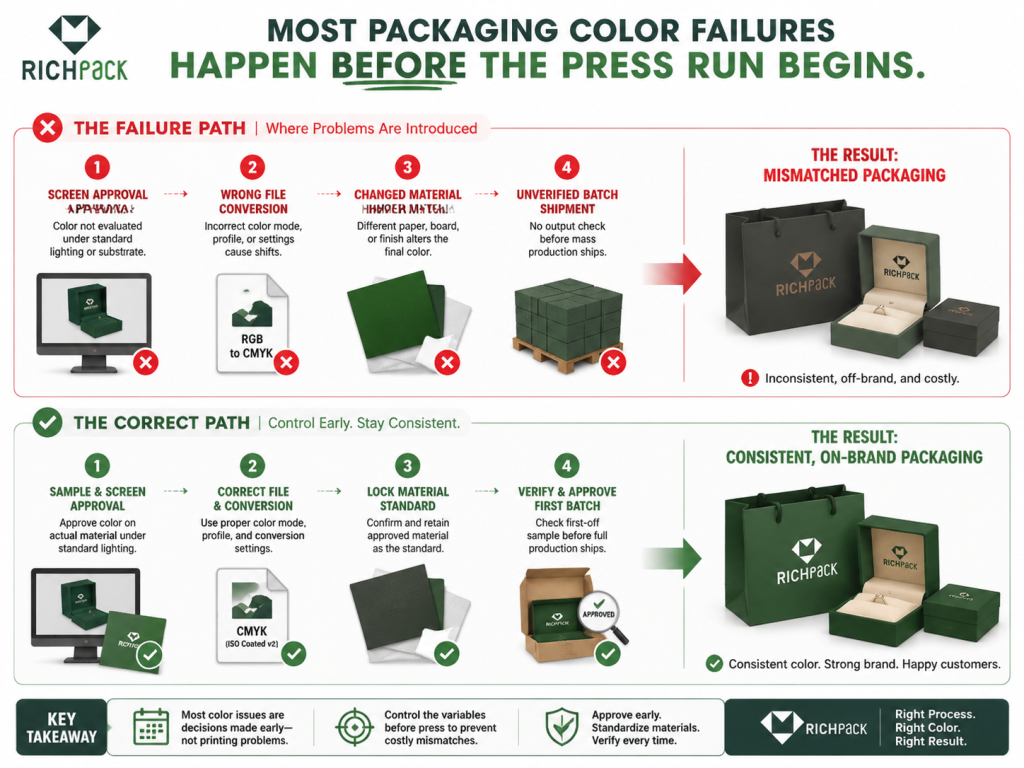
Most color failures are not mysterious. They come from rushed approvals, unclear files, changed materials, or a missing production standard.
The good news is that these mistakes are preventable when the brand, designer, buyer, and supplier make color decisions in the same order.
In sample-room reviews, we treat four issues as high-frequency delay triggers: mixed color standards, material changes after approval, missing component-set reviews, and no retained production sample. If an internal return log claims that 70% of color delays came from one of those causes, I would not be surprised. I would ask to see the approval trail.
A screen is a direction, not a contract. It cannot show how ink will behave on textured paper, velvet, kraft, or coated board.
Use the screen to design. Use the sample to approve.
RGB artwork can produce disappointing print output if it is not converted and reviewed properly. Bright colors may become duller, and subtle shadows may change.
The fix is simple: check print-ready files early and compare important colors before sampling.
CMYK can approximate many colors, but it may not hold a critical logo shade tightly enough across runs. A logo printed in CMYK on one component and PMS on another can also look mismatched.
If the logo is central to the brand, ask for a spot color strategy before final approval.
A Pantone number can look different on coated and uncoated references. Packaging materials add even more variation.
Do not approve a color from the wrong surface and expect the final box to obey it.
Material changes can cancel an earlier approval. A switch from coated paper to textured paper may soften the color, while a switch to kraft may warm or darken the design.
Treat a material change as a new color review. If the approved sample used one wrap paper and the production order uses another, the old signature is no longer enough.
The customer sees the packaging as one set. If the box, liner card, pouch, tag, and thank you card all use slightly different versions of the brand color, the set feels patched together.
The most common miss is the inside color. A champagne outer box paired with a cooler white insert card can make gold jewelry look flatter, even when both pieces look acceptable alone.
Review components together before mass production.
Different suppliers may interpret the same file differently. Without a shared standard, each vendor makes a reasonable choice, and the brand receives unreasonable inconsistency.
A retained sample and written color note give everyone the same target.
A strong supplier brief saves money because it removes guessing. It should tell the packaging team what must match, what can vary, and how approval will happen.
For RichPack-style projekty niestandardowych opakowań, the brief should cover design, material, printing, finishing, sampling, inspection, and reorder plans in one place.
List every brand color with its use case. Separate the screen values from print values so nobody treats a HEX code as a final box standard.
For signature colors, include PMS coated or uncoated references and an approved physical sample when available.
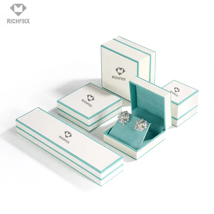
Name every component in the set. Include rigid box, drawer box, sleeve, pouch, insert, display card, thank you card, shopping bag, ribbon, sticker, and shipping carton when relevant.
A supplier cannot control color across components that were never listed together.
Specify paper type, texture, lamination, soft-touch finish, foil, embossing, debossing, UV, metal detail, fabric, and insert material. These choices affect color and adhesion.
If the material is not final, say so. Then avoid final color approval until it is.
State whether the artwork is expected to use PMS, CMYK, or a hybrid setup. Mention foil stamping, raised ink, UV varnish, screen printing, digital print, or offset print if already chosen.
If the supplier recommends a different method, ask them to explain the impact on color, cost, and lead time.
Define what the sample must prove. For example, logo color, background shade, edge sharpness, insert match, rub resistance, adhesive performance, and full set consistency.
A sample without a decision checklist invites subjective debate.
Color tolerance should be discussed before production. Some brands use visual approval only, while larger programs may use measured tolerance, such as Delta E targets.
Delta E measures the visible distance between two colors. A Delta E under 2.0 is commonly treated as difficult for most people to notice, while commercial print tolerances can be wider depending on method, substrate, and viewing conditions.
If no internal standard exists, ask the supplier to recommend a practical tolerance for the material and print method.
| Approval item | Practical planning target | Dlaczego jest to ważne |
| Signature PMS logo on final box wrap | Delta E 1.5-2.0 when measurable | Keeps the brand shade tight enough for premium presentation |
| CMYK process color under ISO-style control | Up to Delta E 5 for primary-color target checks | Gives a process-control ceiling for four-color printing discussions |
| Repeat batch against retained standard | Delta E 2.0-3.0 when the substrate allows it | Reduces visible drift between reorders |
| Visual component set review | Same light source and viewing angle | Catches insert-card and pouch mismatch that instruments may not explain |
Tell the supplier if the packaging will be reordered, shipped to several markets, or used across multiple product families. That changes how carefully the first standard should be archived.
A one-time event sleeve and a global core jewelry box do not need the same control plan.
Use these fields in the supplier brief:
Packaging color decisions sit at the center of design, materials, production, quality control, and brand perception. Treating them as isolated design choices is the fastest way to create production problems.
A practical knowledge map helps every role see the same system.
PMS, CMYK, RGB, and HEX should be treated as connected but separate tools. PMS controls spot color, CMYK builds process print, RGB displays screen color, and HEX supports web implementation.
Each system has value when it is used in the right place.
Offset print, digital print, flexographic print, screen printing, foil stamping, UV, and specialty ink each change how color is produced or perceived. A color choice should never be separated from the print method.
The same brand shade may need a different execution on a rigid box, pouch, and metal plate.
Jewelry packaging includes more than the outer box. Inserts, pads, sleeves, tags, cards, tissue, ribbons, bags, and displays all shape the customer’s color memory.
A good program reviews the whole set, not only the hero box.
Coated paper, uncoated paper, specialty paper, velvet, suede, PU, kraft, molded pulp, and metal each influence color. Texture, absorbency, reflectivity, and base tone all matter.
Material is part of the color decision.
Soft-touch lamination, gloss coating, matte film, embossing, debossing, foil, varnish, and spot UV can change how color feels and reflects light. A color may look right before finishing and wrong after finishing.
Ask to review the finish with the printed sample.
przydatny standardy kontroli jakości include physical proof review, light-controlled comparison, retained production sample, batch sample inspection, rub testing, adhesion checks, and full component set review.
For premium jewelry packaging, visual beauty and production reliability have to be met.
Brand founders care about recognition. Creative directors care about fidelity. Buyers care about cost and schedule.
Supply chain managers care about repeatability. Project managers care about fewer surprises.
A clear PMS and CMYK plan gives each role a better decision path.
The map below connects the major entities involved in packaging color control:
| Jednostka | Atrybut | Value for jewelry packaging |
| PMS | Funkcjonować | Controls the signature printed color |
| CMYK | Funkcjonować | Produces photos and multi-tone artwork |
| RGB | Funkcjonować | Displays digital brand color |
| Papier specjalny | Atrybut | Changes absorption and surface tone |
| Rigid jewelry box | Atrybut | Requires color approval on the final wrap |
| Próbka fizyczna | Funkcjonować | Confirms ink material finish and structure |
| Kontrola jakości | Funkcjonować | Compares batch output to the approved standard |
| Supplier brief | Funkcjonować | Aligns design, purchasing, and production |
PMS is better when the brand color must stay consistent across boxes, cards, pouches, and repeat orders. CMYK is better when the packaging needs full-color artwork, photos, gradients, or seasonal graphics.
For many premium programs, the best answer is both: PMS for the identity color and CMYK for artwork.
CMYK can approximate many PMS colors, but it cannot match every one exactly. Bright blues, greens, oranges, purples, and some deep luxury shades can be difficult to reproduce with four process inks.
Ask for a printed proof before accepting a CMYK substitute for a critical brand color.
Yes. A practical brand guide should include RGB and HEX for digital use, CMYK for process print, and PMS for important printed brand colors.
The guide should also say which value controls which use. Without that note, teams may approve packaging from the wrong reference.
PMS is worth considering when the brand color is part of the identity, and the packaging will be reordered. If the budget is tight, start by using PMS only on the most visible brand mark.
For a one-time insert or small campaign card, CMYK may be enough after a physical proof.
Yes. A jewelry box can use CMYK for artwork and PMS for the logo or signature color.
This approach is useful when a brand wants rich visual storytelling without losing control of the master brand shade.
A screen uses light, while a printed box uses ink on a material surface. Brightness settings, monitor calibration, paper texture, coating, and finishing all affect the final look.
Approve packaging color from a physical sample, not only from a digital preview.
Sustainable packaging choices often include uncoated paper, recycled paperboard, kraft, molded pulp, or lower-impact coatings. These surfaces can soften or shift color compared with coated white stock.
PMS can help control a key brand color, while CMYK can still work for artwork if the design is tested on the final material.
Soy-based inks often support vivid color and easier paper recycling, but they can dry more slowly than petroleum-based alternatives. Water-based inks can reduce solvent load and work well on porous paper packaging, but they may need careful drying control and may look softer on some surfaces.
The tradeoff is practical: PMS may protect a sustainable brand color, while CMYK gives more artwork range. Either way, the final recycled paper, kraft, or molded pulp sample should carry the approval.
Buyers should ask what color system is being used, what material will be printed, what proof will be provided, what tolerance is acceptable, and how reorders will be matched.
They should also ask whether the approved sample will be retained for batch comparison.
A jewelry box carries more than the product. It carries the brand’s promise before the customer touches the ring, bracelet, necklace, or watch inside.
PMS vs CMYK should be decided by color responsibility. PMS protects the signature shade that customers learn to recognize, while CMYK gives artwork, photography, and seasonal graphics the range they need. RGB and HEX support the digital brand world, but they should not become the final judge for printed packaging.
The safest path is practical: define the color system, confirm the material, approve a physical sample, retain the production standard, and inspect batch samples before shipment. If your team is planning a new niestandardowe pudełka na biżuterię, a packaging refresh, or a multi-market reorder, RichPack can help request a packaging color review before sampling begins.
2026-03-04
2025-11-09
2026-06-26
2025-07-18

2026-01-08

2026-01-30
Rozwiązania w zakresie opakowań hurtowych biżuterii z szybką dostawą | Projekty dostosowane do potrzeb sprzedawców detalicznych i hurtowych Richpack
Więcej informacji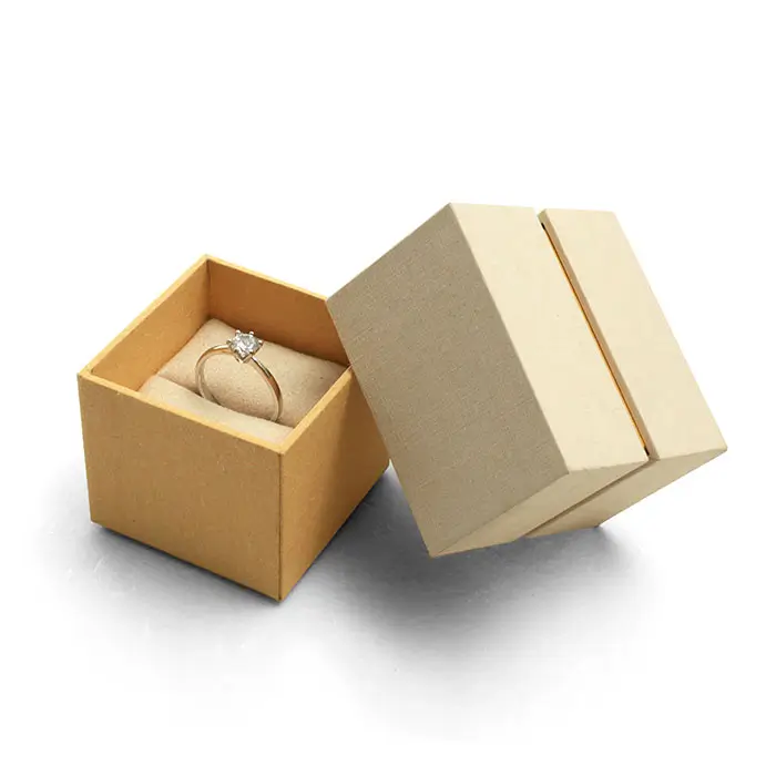
Przystępne cenowo pudełka prezentowe z niestandardowymi wzorami dla jubilerów butikowych | Indywidualne rozwiązania opakowaniowe | Dostępne opcje przyjazne dla budżetu
Więcej informacji
Przystępne cenowo, zrównoważone opakowania na duże zamówienia biżuterii | Idealne dla hurtowników poszukujących skalowalnych, ekologicznych rozwiązań w konkurencyjnych cenach
Więcej informacji
Czy brązowe torby papierowe nadają się do recyklingu – dowiedz się więcej o ekologicznych i przyjaznych dla środowiska torbach papierowych do recyklingu i nie tylko Dostępne zrównoważone opcje opakowań
Więcej informacji
Pudełka na bransoletki do bezpiecznego i stylowego przechowywania | Idealne do ekspozycji detalicznych i rozwiązań prezentowych Cennik Richpack Trade
Więcej informacji