 PREV
PREV
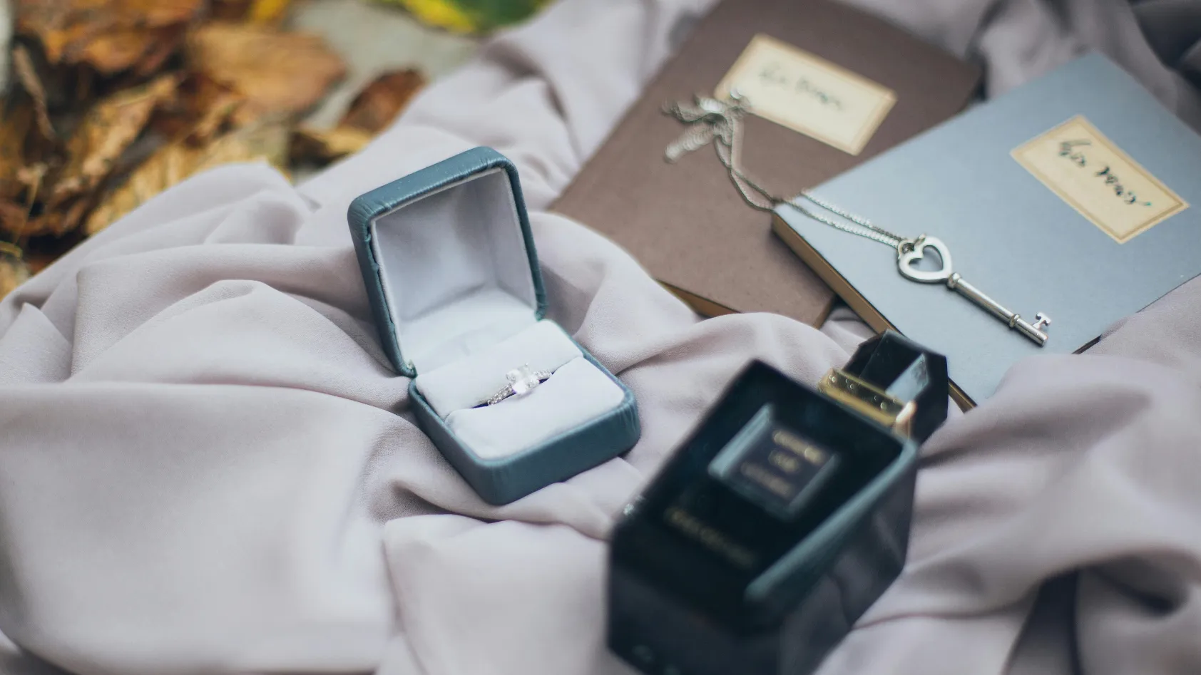
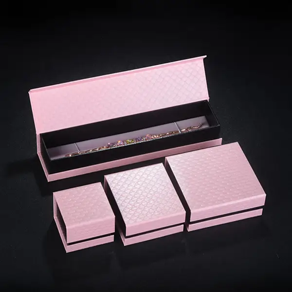
Custom Jewelry Case for Your High-End Jewel
2025-04-27
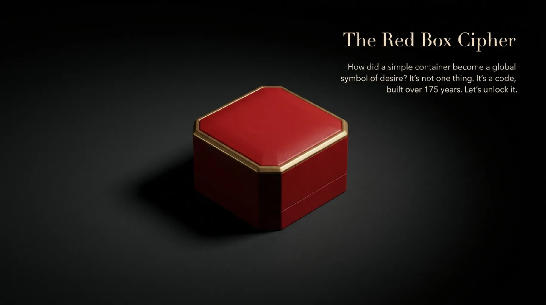

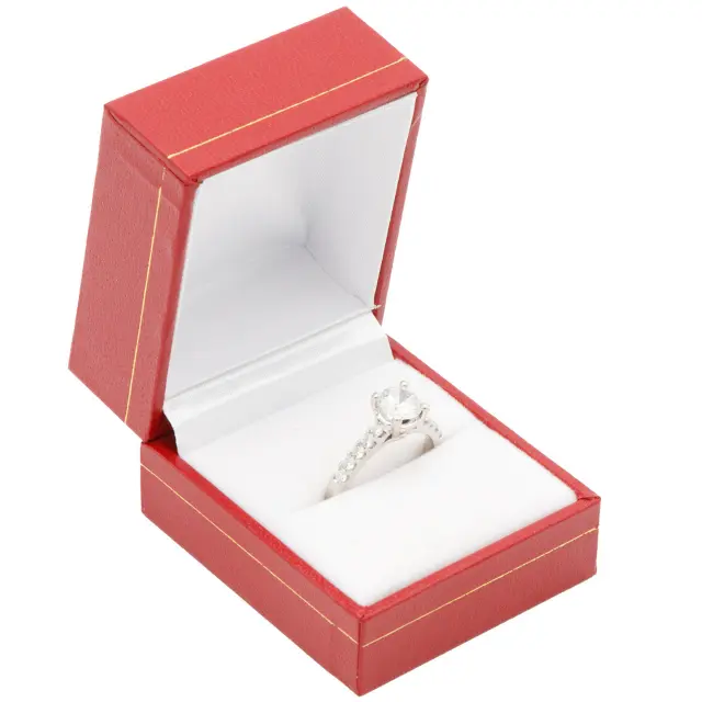
In the jewelry industry, few packaging designs command as much recognition and respect as the Cartier Red Box. It has become almost synonymous with luxury jewelry itself. The iconic red box is the physical embodiment of over 175 years of history and craftsmanship.
The definition of the Red Box must be understood from multiple dimensions. First, it is a physical container serving the practical function of protecting precious jewelry. Second, it is a semiotic system conveying complex messages about brand identity, artisanal excellence, and social status. Third, it is an emotional vessel tightly bound to purchasing, gifting, and life’s significant milestones. The combination of these layers makes the Cartier Red Box one of the most successful case studies in modern luxury marketing.
For brands aspiring to create their own legacy, choosing the right wholesale ring box partner is the first step. Richpack specializes in helping brands craft packaging that tells a story.
The unique status of the Cartier Red Box is defined by its dual role. As a functional container, it must meet rigorous physical demands: protecting fragile jewelry from damage during transport, maintaining its condition, and providing a safe, clean storage environment. However, as a brand symbol, it carries meaning far deeper than these utilitarian functions.
Research indicates that merely seeing the Cartier Red Box allows consumers to immediately associate it with the brand’s values, historical depth, and promise of quality. This instant visual recognition suggests that packaging has evolved from a functional tool into a core component of brand identity. In the contemporary luxury market, packaging is as important as the product itself—sometimes even more so. Some consumers purchase Cartier jewelry with an anticipation for the red box that rivals their excitement for the jewelry inside. This reflects the modern consumer’s desire for a complete experience, a demand Cartier understands and meets perfectly.
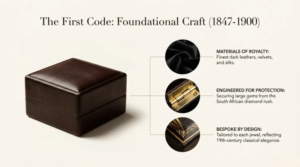
Cartier’s story began in 1847 when young Louis-François Cartier established the foundation of this family jewelry business in Paris. In this nascent stage, packaging design was not a core strategic consideration. Instead, it was a means to meet the practical needs of the aristocracy and the wealthy class.
Early Cartier packaging utilized the highest grade materials available at the time. Leather, particularly dark leather, became the primary exterior covering due to its durability, nobility, and ease of embossing. Inside, designers used velvet and flannel linings to protect precious jewels from abrasion or surface damage. Gilded brass accents, including hinges and clasps, added visual opulence to the packaging and reinforced the perceived value of the treasure within.
During this period, there was no unified Cartier style. Instead, packaging design varied by order, often customized by workshop artisans based on specific client preferences and the nature of the jewelry piece. However, a consistent theme ran through these designs: a pursuit of quality, durability, and visual refinement. Even in the earliest Cartier packaging, one can see the obsessive attention to detail that would become the brand’s hallmark.
In 1874, Louis-François’ son, Alfred, took over the business, launching Cartier’s expansion phase. Under his leadership, Cartier began forging ties with European royalty and aristocracy—relationships that would dictate the brand’s trajectory and influence the evolution of its packaging aesthetics.
The prevailing aesthetic in late 19th-century aristocratic circles emphasized classical elegance, complex ornamentation, and an overt display of craftsmanship. Packaging design had to reflect these tastes. Cartier’s boxes were designed not just to protect the jewelry inside but to be works of art themselves. This aligned with trends in European art movements, specifically a return to 18th-century French taste and the aesthetics of Versailles.
Packaging from this era often featured symmetrical designs, intricate decorative elements, and an emphasis on balance and harmony. In terms of color, browns, blacks, and deep reds were common, signaling high material quality while aligning with the aesthetic preferences of the European nobility. While gold tooling was not yet as extensive as it would later become, it began to appear, foreshadowing the future importance of gold elements in the Red Box aesthetic.
The late 19th century brought significant changes to the jewelry market with the discovery of massive diamond mines in South Africa (circa 1870s). Suddenly, Cartier and other jewelers had access to larger, higher-quality diamonds and gemstones. This posed a new challenge for packaging design: how to effectively protect these increasingly valuable stones.
Cartier’s packaging innovations during this period focused heavily on function. Designers developed more complex internal compartment systems to ensure each piece of jewelry had its own space, preventing items from colliding or scratching one another. Velvet lining was not just aesthetic but scientifically sound: the soft fabric prevented abrasion on gem surfaces while stopping the jewelry from shifting during transport.
For particularly fragile stones like emeralds and opals, Cartier artisans created extra protective layers within the box. Practices like using tissue paper and cotton padding, while simple, reflected the brand’s commitment to protecting client investments.
If you are looking for a wholesale ring box solution that prioritizes protection without sacrificing elegance, explore our custom ring boxes wholesale options to see how we engineer safety into every design.
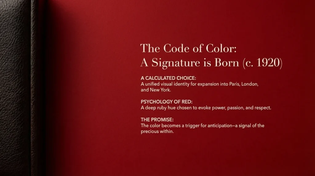
While the iconic red box is now synonymous with the brand, the exact moment of its adoption is slightly blurred in historical records. However, reliable sources indicate that this vibrant deep red began appearing in Cartier packaging around 1920. This timing was no coincidence: it corresponded with changes in Cartier’s corporate structure and a clearer definition of brand identity.
The three brothers—Louis, Jacques, and Pierre (Alfred’s sons)—led Cartier’s global expansion in the early 20th century. Louis managed the flagship in Paris, Jacques opened the London branch in 1902, and Pierre arrived in New York in 1909. This geographic expansion demanded a more unified and recognizable visual identity. Red—specifically this particular shade of deep red—became that unifying visual symbol.
Cartier Red was chosen carefully. This deep, rich red symbolizes power, passion, courage, and respect. It is associated with the color of rubies, which themselves symbolize wealth and high status. Psychologically, this red sends a clear message to the consumer: opening this box means receiving something truly special and precious.
During this period, Cartier did not radically redesign its packaging overnight. Instead, the brand gradually and intentionally integrated this iconic red into its aesthetic. Earlier brown or black leather cases were replaced by deep red leather or red paper coverings. This transition was gradual, reflecting respect for brand continuity while demonstrating the need for a distinct visual identity.
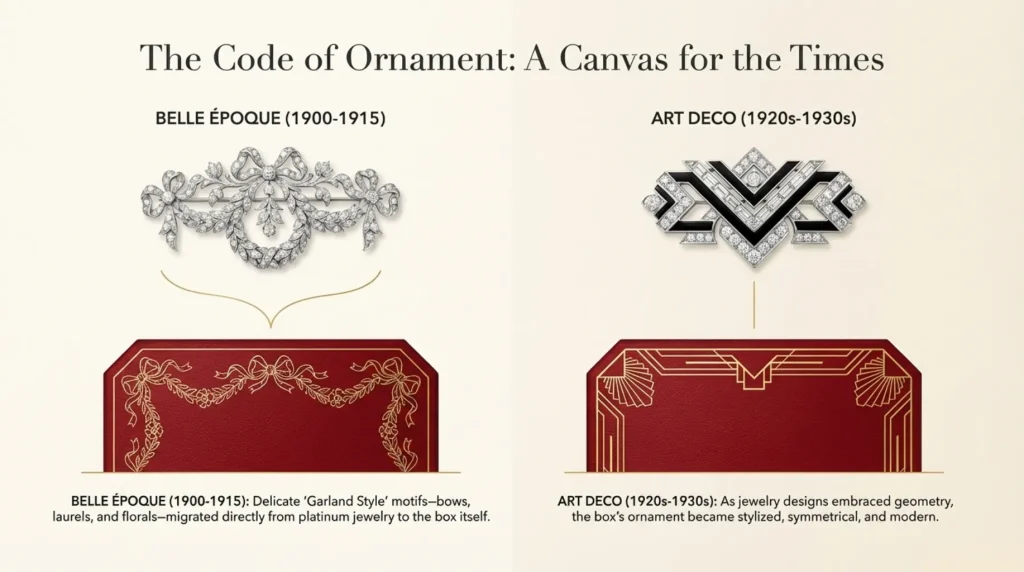
During the Belle Époque (1901-1915), Cartier had already popularized the Garland Style (Style Guirlande) in its jewelry. This style drew from the ornate designs of Louis XIV’s court at Versailles, featuring bows, flowers, laurel wreaths, vases, and garland motifs.
However, with the end of World War I and the arrival of the 1920s, the Art Deco movement had a profound influence on Cartier’s design. This new style emphasized geometric shapes, straight lines, symmetry, and modern aesthetics. In jewelry design, the winding curves of the Garland Style were gradually replaced by more resolute geometric forms—squares, triangles, rectangles, and wedges.
In packaging design, this evolution manifested as a reinterpretation of decorative elements. While garland motifs did not disappear entirely, they were stylized to fit the geometric language of Art Deco. For example, a garland might be presented as a series of repeating symmetrical patterns. Simultaneously, Cartier used gold tooling on the red boxes to accentuate these geometric designs, creating a high-contrast visual effect. The gold decoration, especially against the red background, enhanced the box’s visual impact and reinforced its luxurious nature.
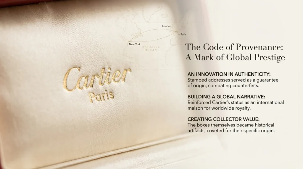
A particularly innovative touch introduced during Cartier’s global expansion in the 1920s and 30s was the practice of engraving boutique addresses on the boxes. These addresses—Paris, London, New York—became integral features of the packaging.
This practice served multiple purposes. First, it provided a form of brand authentication. In an era without global trade standards, engraved addresses signaled authenticity. Second, it reinforced Cartier’s global prestige. By highlighting its international locations, the brand communicated that it was not just a French jeweler but a global phenomenon. Third, these addresses created collectible value. Today, vintage wholesale ring box collectors seek out specific city editions, adding historical value to the packaging independent of the jewelry.
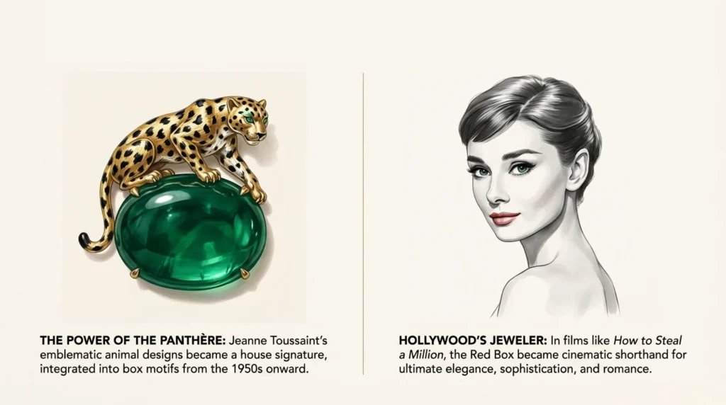
The 1940s marked a turning point in Cartier jewelry design, largely through the work of designer Jeanne Toussaint. Known as “The Panther,” her obsession with the motif profoundly influenced the brand. While the panther pattern first appeared in 2D form in 1914, Toussaint evolved it into a three-dimensional icon.
In 1948, the Duchess of Windsor, Wallis Simpson, purchased the first 3D panther brooch, changing everything. The panther was no longer a subtle pattern; it was a powerful presence. This motif was soon integrated into packaging decoration. In the 1950s and 60s, Cartier boxes began featuring panther motifs in their embossing or decorative details, serving as a visual reminder of the brand’s creative power.
Snake motifs also appeared, symbolizing power and mystery, aligning with Cartier’s interest in exotic styles. These animal symbols transformed the box from a simple container into an artistic statement.
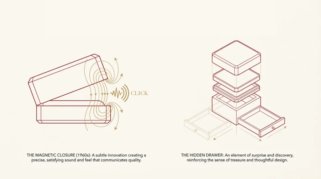
In the 1960s and 70s, Cartier introduced innovations in mechanism and function. Most notably, the magnetic closure. Traditional hinges were aesthetically pleasing but magnetic closures offered a more sophisticated solution: a satisfying glide when opening and a definitive “click” upon closing.
Equally innovative was the concept of hidden drawers introduced in certain high-end boxes. These provided extra storage while maintaining a clean exterior. This reflected Cartier’s consideration for the owner—caring for how the jewelry was stored. If you want to incorporate similar sophisticated mechanics into your brand’s packaging, contact Richpack to discuss advanced wholesale ring box engineering.
The packaging’s influence was powerfully demonstrated through film. In the 1960s, Cartier became the jeweler of choice for Hollywood. The 1966 film How to Steal a Million, starring Audrey Hepburn, is emblematic. Hepburn’s character receives a Cartier engagement gift, cementing the brand’s status.
For the audience, Cartier was no longer just a brand; it represented a lifestyle. The red box became a symbol of that lifestyle. Stories of Elizabeth Taylor and Grace Kelly receiving Cartier jewelry further integrated the red box into the cultural narrative of the 20th century.
Entering the 21st century, Cartier faced the challenge of maintaining luxury while addressing environmental concerns. In late 2009, Cartier redesigned its iconic red box. The new wholesale ring box design utilized eco-friendly materials, including paper containing 50% Post-Consumer Waste (PCW) recycled fiber, certified by the FSC (Forest Stewardship Council).
This shift set a standard for the industry, proving sustainability and luxury are not mutually exclusive. Since 2011, Cartier’s after-sales packaging has used OEKO-TEX® Standard 100 compliant materials, ensuring sustainable practices throughout the supply chain.
At Richpack, we share this commitment. We offer sustainable wholesale ring box solutions that help your brand meet modern environmental standards without compromising on quality.
Cartier balances tradition with modernity. While the iconic red and gold remain, they are interpreted in new ways. The modern box retains the signature octagonal shape, but manufacturing is optimized via contemporary technology. Gold detailing uses eco-friendly processes to minimize waste.
Internally, the classic black velvet lining is now made from more durable, sustainable materials. Personalized hot stamping options allow customers to add initials, turning the brand symbol into a personal treasure.
In recent years, Cartier has deliberately revisited the Garland style for limited edition collections. This strategy acknowledges that history is a living source of inspiration. The elegant curves and floral motifs of the Belle Époque are reappearing on special edition boxes, creating a narrative bridge between the past and present.
This revival encourages collecting behavior. Many contemporary customers keep their boxes, especially limited editions, treating the packaging as an artifact as valuable as the jewelry itself.
The immediate impact of the Cartier Red Box is instant brand recognition. Seeing the deep red box with gold tooling evokes specific historical and social meanings. This power is evident in the resale market. On platforms like 1stDibs, empty vintage Cartier boxes sell for hundreds of dollars, proving the packaging itself is a collectible asset.
Cartier’s packaging history is a microcosm of 20th-century art. from the 18th-century elegance of the Belle Époque to the geometric modernity of Art Deco and the exoticism of Orientalist trends, the boxes document the evolution of design aesthetics.
Cartier transformed packaging from an afterthought into a strategic asset. Today, when consumers evaluate luxury jewelry, packaging is a primary consideration. Competitors like Tiffany & Co. (Blue Box) and others have followed Cartier’s lead, investing heavily in signature packaging. The Cartier Red Box remains the definitive case study for what a luxury wholesale ring box should be.
The story of the Cartier Red Box is a lesson in how a simple object can acquire profound cultural significance. It is a synthesis of French craftsmanship, symbolism, and historical continuity.
Cartier’s success lies in evolution rather than revolution. The red color remains, but the materials change. The shape endures, but the mechanics improve. This approach allows the brand to maintain recognition while adapting to the future.
Looking ahead, we can expect further sustainable innovations and perhaps digital integrations, such as QR codes connecting the physical box to a digital story. Whatever the future holds, the Cartier Red Box will remain a symbol of quality and taste.
Create Your Own Legacy with Richpack
Cartier proves that packaging is part of the product. Whether you need a classic design or a modern, sustainable solution, Richpack provides the expertise to elevate your brand.
A: The iconic red box appeared around 1920, coinciding with the company’s global expansion. Deep red was chosen to symbolize power, passion, and respect, and for its association with rubies. It signals to the consumer that they are receiving something truly precious.
A: Originally a 2D design in 1914, the Panther became a 3D brand icon under Jeanne Toussaint in the 1940s. It was integrated into packaging decoration as a symbol of brand power and creative innovation.
A: Cartier evolves rather than revolutionizes. Since 2009, they have used FSC-certified paper with 50% recycled content and eliminated plastic coatings, maintaining the classic aesthetic while meeting modern environmental standards.
A: The boxes are collectibles representing brand history, design evolution, and craftsmanship. Factors like age, boutique address provenance, and rarity drive their value. Owning the box is a status symbol in itself.
A: Films like How to Steal a Million in the 1960s cemented Cartier’s status as the jeweller to the stars. The red box became a symbol of a sophisticated, cosmopolitan lifestyle.
2025-04-27
2024-10-10
2024-10-10
When I think of an 18K gold bracelet, the first thing that comes to mind is its sparkle. It’s a memory, a moment of joy shared with loved ones, or a milestone you want to hold onto. In this guide, we’ll dive deep into the world of 18K gold bracelets—their beauty, durability, and the importance… Continue reading Case Study of the Cartier Ring Box
Ever seen a necklace tangled in a mess or earrings lost in a drawer? A jewelry pouch with zipper might be the solution you’ve missed. These pouches protect, organize, and enhance your jewelry. They’re great for retailers shipping gifts or for keeping heirlooms safe. They prevent scratches, dust, and damage. Their sleek designs also make unboxing… Continue reading Case Study of the Cartier Ring Box
A jewellery box for rings is the perfect gift, combining practicality and sentiment. It safeguards rings, keeps them organized, and holds emotional value.

Draw a Gift Box for Your Brand | Custom High-End Jewelry Boxes Inspiration from Cartier or Anthropologie Jewelry Boxes Richpack Jewelry Packaging Supplier
Affordable Custom Jewelry Boxes for Independent Jewelers | Budget-Friendly Solutions with High-Quality Designs
Biodegradable Jewelry Packaging with Personalized Designs for Retailers | Ideal for Jewelers Needing Green and Branded Packaging Solutions
Cartier Ring Box | Custom Luxury Jewelry Packaging – Richpack
View More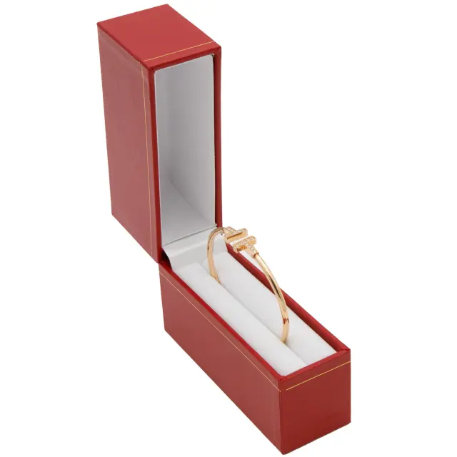
Cartier Bangle Box | Premium Leather Jewelry Packaging & Custom Design – Richpack
View More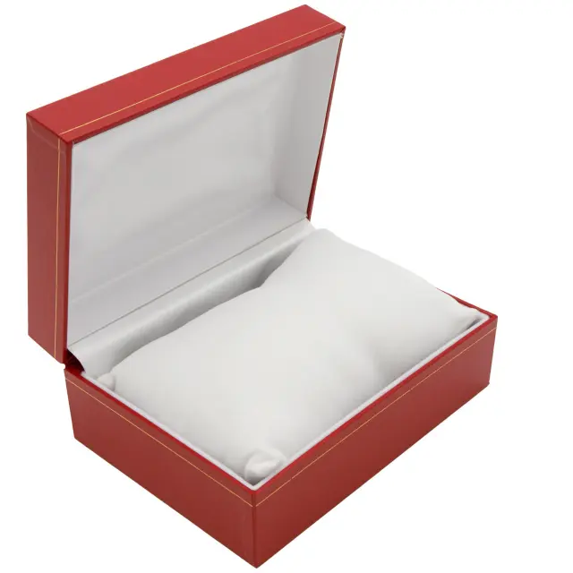
Cartier Watch-Pillow Box | Vintage Leather Luxury Timepiece Packaging – Richpack
View MoreJust submit your email to get exclusive offers (reply within 12 hours)