 PREV
PREV
Top 10 Sterilization Techniques for Safest BVLA Jewelry Packaging
2024-12-20

Designing packaging for BVLA Jewelry has truly been a challenging yet incredibly interesting task. BVLA Jewelry boasts a unique style, deeply infused with a strong Gothic charm, which is both cool and mysterious. Precisely presenting this style in the packaging has really taken a great deal of my thought and effort. Now, let me tell you all about how I did it.
Jewelry box design is of utmost importance and should be carried out steadily and progressively. Next, I’ll go into detail about the key aspects of this process, including colour selection, material choice, structural design, and the integration of brand elements.
The first thing I do when starting a project is to ponder over the color scheme. As soon as I think of those classic designs of BVLA, a sense of mystery and aloofness rushes over me, and I immediately decide to make black the primary color. This black is just like the deepest part of the night sky, firmly establishing the mysterious foundation of the entire packaging.
Then, I need to find an auxiliary color that can complement black beautifully. There’s a rebellious streak and a touch of passion in BVLA’s designs, which makes me think of blood red right away. When red and black are combined, the effect is truly stunning, just like a sudden burst of flames in the silent night, extremely eye-catching. However, at the beginning, I had a hard time with the color proportion. If there was too much black, the whole packaging would look depressing; if the blood red was overused, it would ruin the mysterious atmosphere. I made sample after sample, and after many rounds of experimentation, I finally found that a proportion of about 70% black, with blood red used for detailed embellishments, such as on the edge of the box cover or in parts of the inner lining, accounting for about 30%, achieved a perfect effect, being mysterious yet full of vitality.
After the color is determined, the next step is to consider what materials to use to carry these carefully matched colors and at the same time enhance the texture and style of the packaging. Choosing materials is just like selecting the right building materials for a structure; only when the right materials are chosen can the entire packaging stand firm and have an appealing charm.
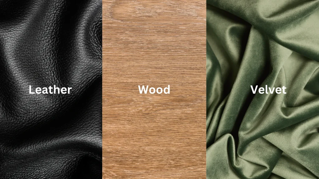
I rummaged through the green material library, and my eyes were immediately drawn to the artificial leather. This artificial leather is soft and resilient to the touch, with a texture similar to that of high-end leather goods. When we design packaging for BVLA Jewelry, we need to focus on quality. The artificial leather can make the packaging look particularly luxurious, perfectly matching the high-end positioning of BVLA. Moreover, it costs less than genuine leather, which can help you control the budget while ensuring the quality, what a great deal!
There is also the textured paper, which is particularly suitable. Once, when I was reading an old book, the rough and yellowish paper of the book had a very unique feel, which instantly inspired me. Later, I found a piece of black textured paper, and the irregular patterns on it were just like the mysterious marks engraved by time, coinciding perfectly with the ancient and mysterious feeling that BVLA’s Gothic style pursues. When consumers touch this packaging, they can immediately feel that unique charm, and the brand style can be conveyed just through the sense of touch.
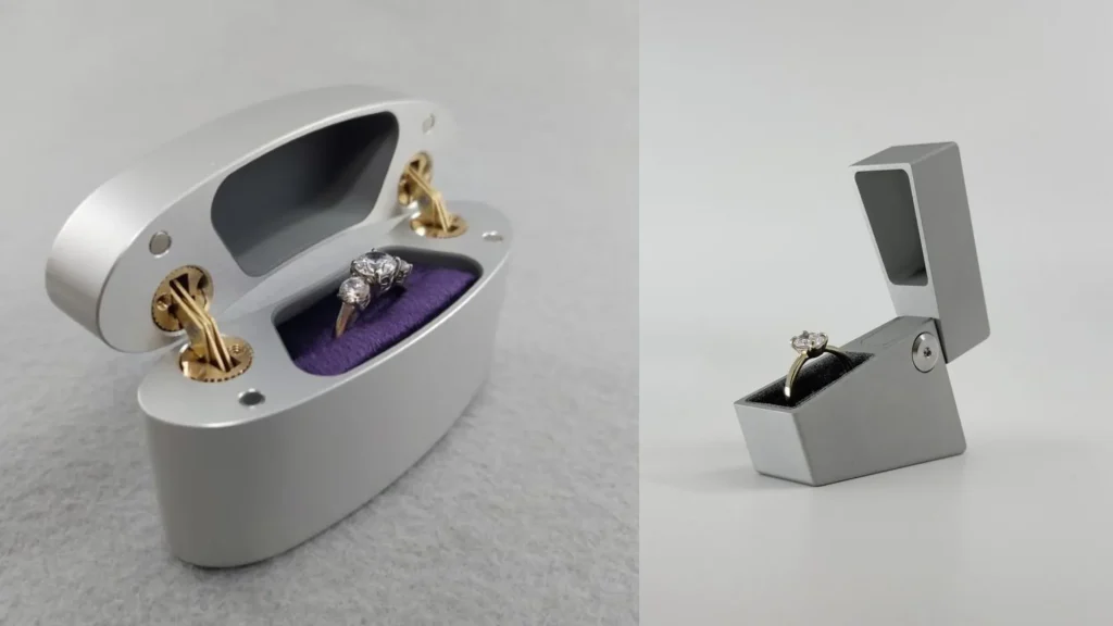
When designing the packaging structure, my first thought was to break away from the norm. I couldn’t use an ordinary rectangular box; I had to design a unique shape. I tried several options and finally decided that the hexagonal shape was quite good. The hexagonal shape has a geometric beauty and can be noticed by consumers at a glance when placed on the shelf, being extremely eye-catching.
After determining the outer shape, I started to refine the internal structure. I designed the lid to be slightly concave, just like an ancient treasure box. When it is opened, there is a full sense of ritual, and it can also protect the jewelry better. However, when designing the concave curvature of the lid, I encountered a problem. If the curvature was too shallow, the protective effect would not be good; if the curvature was too deep, it would affect the overall space layout and aesthetic appearance. I used 3D modeling to repeatedly simulate the effects under different curvatures and combined with actual sample tests. Finally, I determined a concave curvature that could effectively protect the jewelry and make the overall shape more aesthetically pleasing.
I chose a particularly sturdy metal material for the hinge, which opens and closes very smoothly, ensuring that consumers can open these nice jewelry boxes smoothly every time without being affected by a stuck hinge. However, during the initial material selection, some metal hinges looked beautiful, but they got stuck after being opened and closed a few times. We reselected the suppliers and carried out strict tests on the material hardness and hinge shaft process of the hinges before finally choosing the current ideal hinge.
I used black velvet for the inner lining. This velvet is soft and delicate, keeping the jewelry stable and preventing scratches. Moreover, the texture of the black velvet enhances the luxurious and mysterious atmosphere of the entire packaging by several levels.
During the design process, there are many details that we need to pay close attention to. These matters needing attention are just like warning signs on the road. Only by following them can we avoid the pitfalls and reach the other side of perfect packaging design smoothly.
If there is something wrong with the color matching, the entire packaging style will be completely messed up, so we must be extremely careful in this regard.
We must never use those bright and lively colors, such as lemon yellow and bright pink. These colors are completely inconsistent with the dark and mysterious style of BVLA. Using them is like ruining the brand image. When proofing the colors, we must be extremely careful to ensure that the printed colors are exactly the same as those designed on the computer. Once, due to a difference in the batch of printing ink, the red printed was much brighter than the originally designed color, and the entire packaging style was completely disrupted. Later, we strictly controlled the quality of the ink and adjusted the printing parameters before solving this problem.
Although the font is just a small detail, it plays a crucial role in packaging design. Only by choosing the right font can the brand style be better displayed.
The selection of the font is a key part of the entire packaging design, just like setting the tone for an article. It must match the unique style of BVLA Jewelry precisely. At the beginning, I wanted to highlight the brand’s mysterious personality and selected some fancy fonts with winding and complex strokes. As a result, when I made the brand logo with these fonts, it was a complete disaster! Those complex strokes were all tangled up, and it was impossible to distinguish the letters and lines clearly. When consumers took a quick look, they had no idea what brand it was, and the entire packaging also looked messy, having nothing to do with BVLA’s high-end and unique tonality.
Learning from this experience, I redoubled my efforts in font selection. I searched through the font library thoroughly, consulted a large amount of information, and referred to many classic design cases with a Gothic style. Finally, I found a font with a Gothic style. Its strokes are thick and powerful, just like the stone pillars of a medieval castle, firmly supporting the brand image. At the same time, it is simple and clear, with each letter clearly distinguishable. When I printed the brand logo with this font on the packaging, the effect was immediate. The brand information was clearly conveyed in an instant, perfectly matching BVLA’s overall dark, mysterious, and tough style.

After determining the font style, the size and layout position of the font also need to be carefully considered. If the font is too small, consumers will have to squint and search hard for it on the large packaging, and the brand’s presence will drop sharply. But if it is too large, it will be like a giant, occupying too much visual space and looking particularly abrupt, destroying the overall harmonious beauty of the packaging. After many rounds of sample printing tests, I found that controlling the logo font to account for about 5% – 8% of the area of the box cover is more appropriate. Moreover, placing it in the visual center area of the box cover can attract consumers’ attention at first glance from any angle, maximizing the role of the brand logo and enabling consumers to remember the unique brand of BVLA at a glance.
The quality of materials has a great impact on the texture and durability of the packaging. When purchasing artificial leather, we must check its abrasion resistance and tear resistance. If the leather quality is not good, scratches and cracks will easily appear, which will greatly damage the brand image. The thickness and toughness of the textured paper also need to be paid attention to. If it is too thin, it is easy to break; if it is too thick, the packaging will appear bulky and inflexible. When selecting material suppliers, we should look at more samples and choose those with good reputation and stable quality to cooperate with. We should also regularly sample and inspect the materials to ensure that the quality is always good.
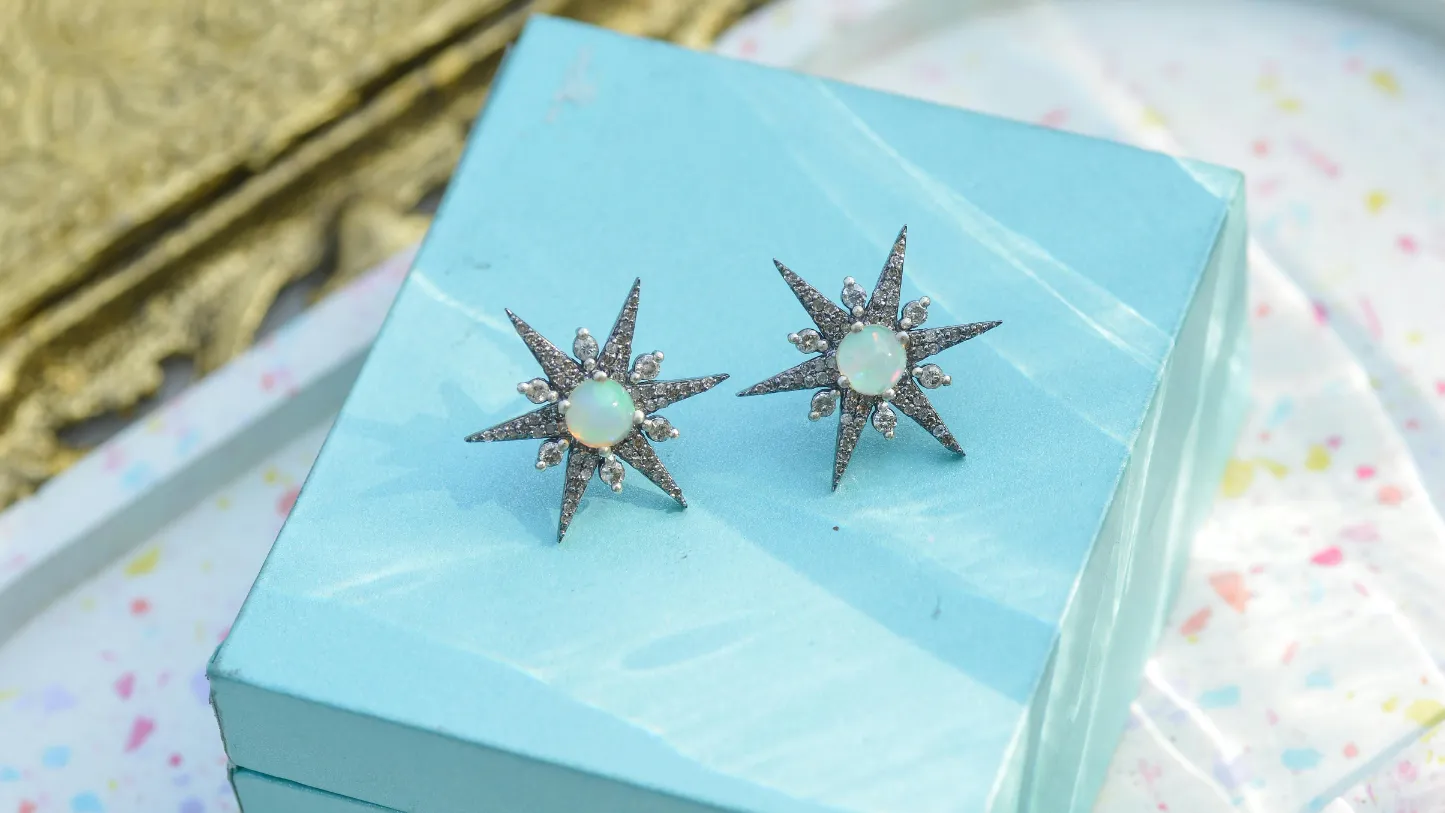
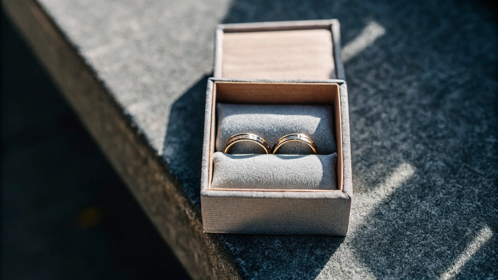
When it comes to high-quality body jewelry from brands like BVLA (Body Vision Los Angeles), proper sterilization is essential for safety. Here are the top 10 sterilization techniques for ensuring your BVLA jewelry packaging meets the highest standards:
For body jewelry enthusiasts seeking the safest options for their piercings, understanding proper sterilization techniques is crucial. Our comprehensive guide on “Body Jewelry Material Safety Standards” here provides additional insights into how these sterilization methods protect your investment and your health.
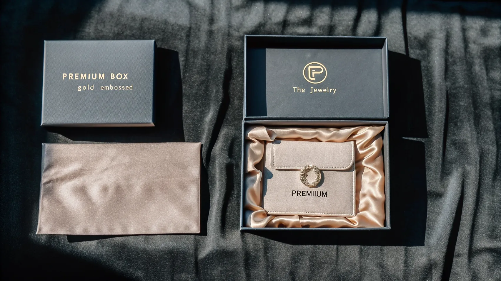
Having talked about so many design ideas and matters needing attention, you must be curious about what kind of results we can finally present. We are Richpack, a professional jewelry packaging manufacturer. Next, I’ll tell you about the excellent packaging example we created for BVLA Jewelry, allowing you to intuitively feel our strength.
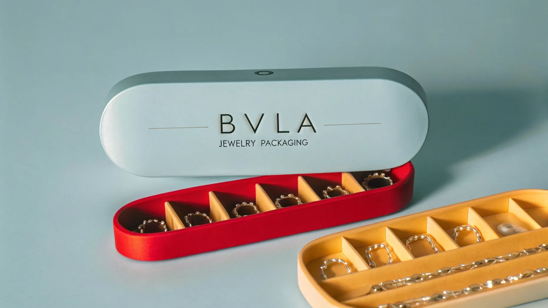
Our BVLA Jewelry packaging is made of high-quality black artificial leather, with a particularly delicate surface treatment. It feels like there is a layer of frosted texture, which is extremely high-end. The inner lining is made of black velvet. On the edge of the box cover, a circle of small silver bat metal ornaments is also inlaid, which is particularly delicate and matches the brand style very well. When it opens and closes, there is no sound at all, and it is extremely smooth. From design to production, we have been particularly attentive at every step, fully demonstrating the unique charm of BVLA Jewelry.
From color, materials, structure to the integration of brand elements, at every step, I have been thinking about how to incorporate BVLA’s unique style. Our team has professional design ability and strict requirements for quality. You can contact us to create packaging that can shine brightly in the market and accurately present the brand’s charm.
2024-12-20
2024-10-10
2024-11-19
When it comes to high-end jewelry shopping, especially at a prestigious retailer like NEIMAN MARCUS, the tactile experience of packaging is of utmost importance. High-end packaging isn’t just about containing the product; it’s about creating a multi-sensory journey that elevates the entire shopping experience. This article will focus on three key elements that can create… Continue reading How to Create the Perfect Packaging for BVLA Jewelry
Richpack · David Yurman Jewellery Packaging the Sentiments of Love and Milestones David Yurman, a brand founded in 1980 by sculptor David and painter Sybil Yurman, has become synonymous with this emotional resonance, crafting pieces imbued with meaning and designed to be cherished. Over the past five years, David Yurman’s classic cable collection has accounted… Continue reading How to Create the Perfect Packaging for BVLA Jewelry
In 2025, jewelry boxes deliver a substantial return on investment (ROI). This is where eco-friendly die cutting steps onto the stage, a technology that has been causing a stir. At Richpack, we’ve witnessed a remarkable phenomenon among our clients. Today’s shoppers, especially Millennials and Gen Z, are not only concerned with the quality of the jewelry… Continue reading How to Create the Perfect Packaging for BVLA Jewelry
Premium BVLA Jewelry Packaging by Richpack | Artisanal Solutions for Unique Creations
Affordable Custom Gift Boxes for Small Jewelry Shops | Budget-Friendly Packaging Solutions Custom Designs for Small Retailers
Branded and Sustainable Custom Eco-Friendly Jewelry Packaging with Brand Logo | Tailored for Jewelry Brands Needing Personalized and Green Packaging
Premium BVLA Jewelry Packaging by Richpack | Artisanal Solutions for Unique Creations
View More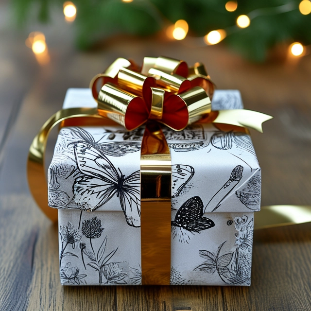
Christmas Gift Wrap – Gorgeous Wraps Infused with Christmas Enchantment for Memorable Gifts
View More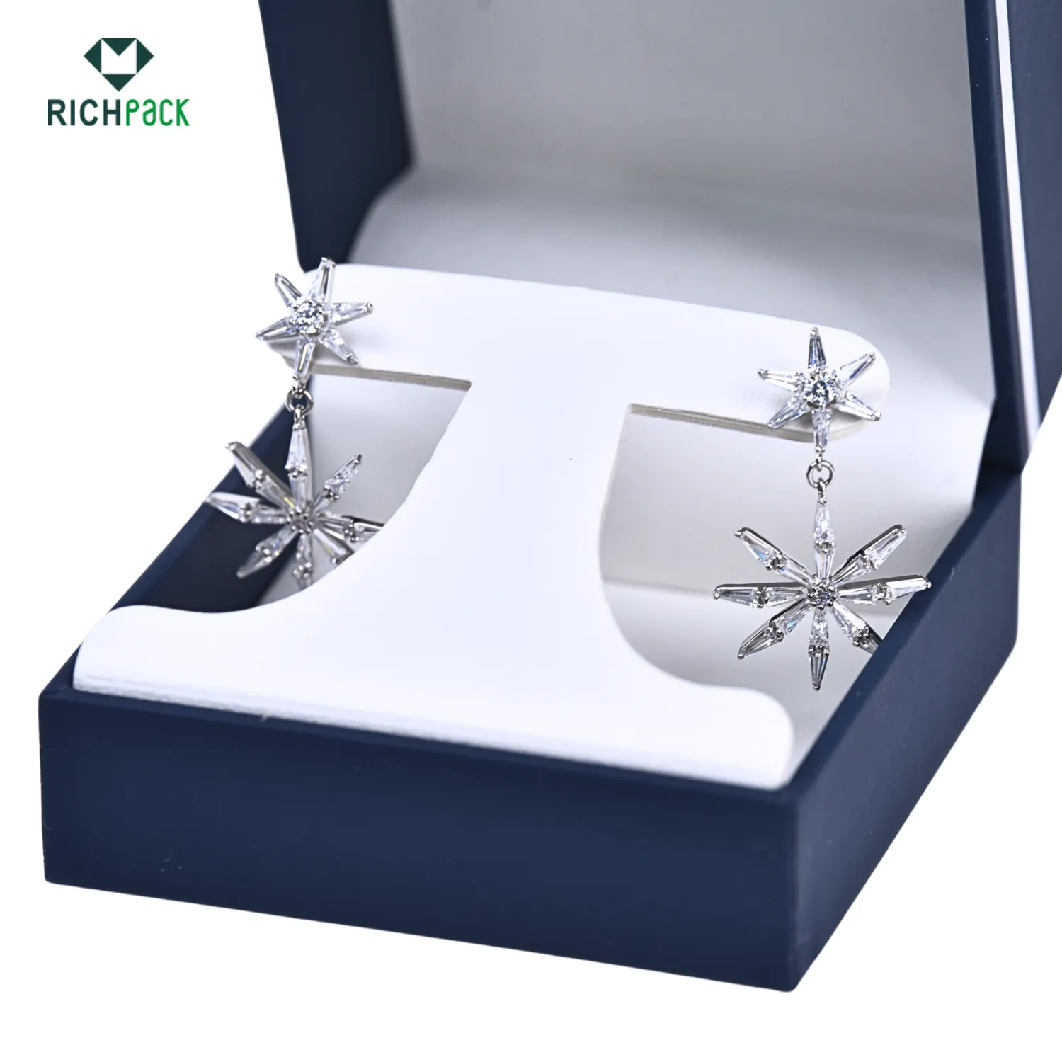
Creative Earring Packaging Design from Richpack | Innovative Jewelry Packaging Ideas for Modern Retailers Dealers & Distributors
View MoreJust submit your email to get exclusive offers (reply within 12 hours)