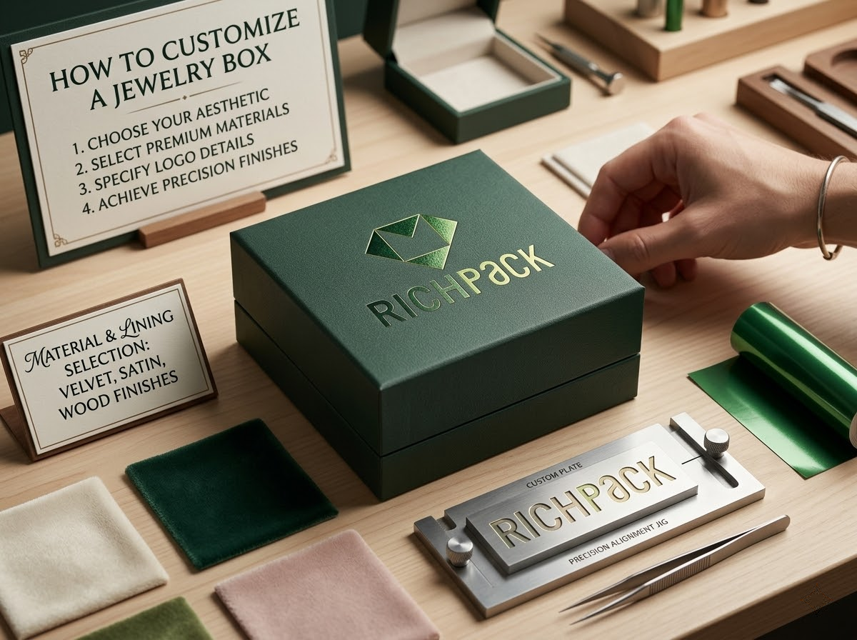

If you want to customize jewelry box packaging well, you need more than a logo and a color choice. You need a box that feels right in the hand, protects the jewelry, supports the brand, and still holds up when you move from sample to production.
In my experience, the best custom jewelry boxes do not start with decoration. They start with product fit, insert behavior, board thickness, and finish control. Once those parts are right, the outside of the box becomes much easier to design well.
By the end of this guide, you will know how to choose the right box structure, compare rigid paper with wood options, pick logo methods that actually look premium, build inserts that protect the product, and write a cleaner production brief. You will also have a clearer sense of which details raise perceived value and which ones just raise cost.
The best way to customize jewelry box packaging is to choose the insert and structure before you finalize the board, wrap, and logo finish. That order gives you a box that protects the product, feels more premium, and is easier to repeat at scale.
For many rigid box projects, a strong starting point is a 1000g to 1200g greyboard core wrapped with 120g to 157g paper, plus an EVA or foam-based insert. If the current MOQ is 500 units, the first production spec should stay tight and repeatable.
The early decisions shape the whole project. If those decisions stay vague, the sample usually looks acceptable, but the production run gets messy.
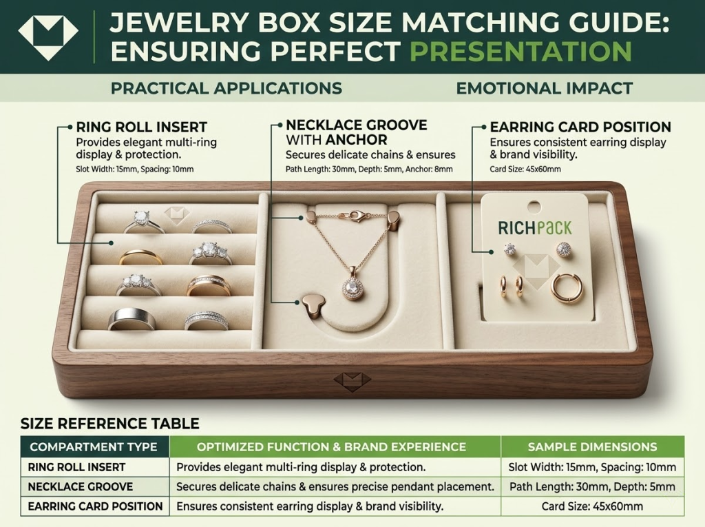
A ring box, necklace box, bracelet box, and earring box may share the same outer language, but the inside works very differently. A ring needs a firm vertical hold. A necklace needs a chain path, a pendant cavity, and enough depth to stop movement. Earrings need spacing that keeps the pair straight when the lid opens.
This is why I always start with the product itself. When the insert is wrong, the rest of the box has to work harder to hide the problem, and it never really does.
A custom jewelry box is judged in context. The same box can feel warm in a gift setting, formal in a premium retail setting, or too heavy for a lighter product line.
That is why the box should match the moment it enters. A strong custom box feels aligned with the product, the price point, and the way the jewelry is being presented.
A box sends a signal before the customer even touches the jewelry. Material, opening style, and logo finish do more work here than most decorative add-ons.
A walnut-toned box with gold foil and dark velvet feels grounded and expensive. A matte white box with blind embossing and a cream insert feels cleaner and quieter. A soft pink box with silver foil and a flocked insert feels more gift-led and light. These are not small shifts. They change how the product is read.
Budget decisions get easier when they connect to visible specs. For many premium jewelry rigid boxes, a realistic starting range is 1000g to 1200g greyboard paired with 120g to 157g wrapped paper. Inserts are often built on EVA or foam and then covered in velvet, satin, suede, or flocking, depending on the look and the product.
That does not mean every project needs the heaviest setup. A compact ring box can already feel solid at 1000g if the edges are clean and the insert is tight. A 1200g structure usually gives a denser hand feel and a stronger premium cue, but only if the finish quality keeps up.
A sample proves the concept. A production run proves consistency.
That difference matters more when the current MOQ starts at 500 units. If the first order is already 500 pieces, the spec has to be stable enough to repeat. This is why over-designing a first run usually hurts more than it helps.
The best structure is the one that fits the product, supports the insert, and creates the right reveal. In my experience, structure usually has more impact on perceived value than surface decoration.
A magnetic lid box is one of the strongest options for premium jewelry packaging. It gives a controlled opening feel and enough panel space for foil stamping, embossing, or a quiet printed mark.
This format works especially well when the box needs to feel polished from the first touch. It also gives enough interior depth for rings, pendants, and many necklace layouts.
A drawer box changes the pace of the reveal. Instead of opening upward, it opens through motion. That one detail makes the unboxing feel slower and more intentional.
I usually like this structure when the box is meant to feel giftable or when the sleeve-plus-tray format adds something to the presentation. It can also be a good middle ground between a rigid luxury box and a lighter retail feel.
This is still one of the safest structures in jewelry packaging. It is familiar, stable, and easier to repeat across different SKUs.
A good lid-and-base box can still feel very premium. It does not need to be complex. It needs clean edge work, a strong insert fit, and a finish that matches the value of the jewelry inside.
A hinged box feels more permanent than most other formats. That makes it useful for keepsake positioning, anniversary collections, and higher-ticket pieces.
The trade-off is simple. Hinged boxes expose weak production quickly. If the opening angle is awkward, the hinge line feels soft, or the lid gap is uneven, the whole box loses authority.
If the packaging is built around gifting, the reveal should feel edited, not crowded. A ribbon pull, a message card, or a printed sleeve can help, but only when those details serve the moment.
The strongest gift boxes usually combine one clear structure, one warm finish direction, and one or two details that make the packaging feel more personal.
A jewelry box usually feels premium because of its structure before its decoration. The board controls stiffness, shape retention, and edge quality. The wrap changes the surface character and the first visual read.
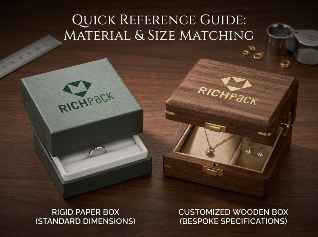
For most projects, rigid paper is still the most practical starting point. It is easier to control than wood, easier to finish cleanly, and flexible enough for many different brand directions.
A practical reference spec looks like this.
| Part | Common premium range | Why it matters |
| Greyboard core | 1000g to 1200g | Controls stiffness, weight, and edge feel |
| Wrapped paper | 120g to 157g | Supports print, foil, and textured wraps |
| Surface finish | Matte or soft-touch | Shapes tactile quality |
| Insert base | EVA or foam | Controls product stability |
If the box is compact, 1000g can already feel solid. If the brand needs a denser hand feel and stronger edge presence, 1200g is usually the safer signal.
A wood customized jewelry box works best when the material itself is part of the value story. It adds visible weight, more permanence, and a stronger fit for engraving. That is why it works well for keepsake packaging, smaller premium runs, and gift boxes that are meant to be kept.
But wood is not automatically the better choice. It is heavier in shipping, often more expensive per unit, and less forgiving when finish consistency slips. In many cases, a rigid paper box still gives a cleaner commercial result.
A simple rule helps. If the box is part of a smaller premium program, wood can make sense. If the box needs broader repeatability, rigid paper or a veneer-led look is usually easier to control.
Wrap paper can change the feel of a jewelry box faster than most people expect. Linen textures, fine-grain papers, metallic papers, and soft-touch papers all move the mood in different directions.
This is often where packaging gets more precise. Instead of redesigning the structure, the brand adjusts the wrap and gets a more resolved result with less engineering risk.
The finish should support the brand, not overpower it. Matte usually feels calmer and more confident. Gloss can feel brighter and more commercial. Soft-touch can feel elevated very quickly, but only if the board, the edge quality, and the insert fit are strong enough to support it.
I usually think about finishing in terms of fit. A quiet luxury line rarely needs loud gloss. A more gift-led collection may benefit from selective gloss or UV accents if the product and price point support that choice.
Sustainable packaging works better when the claims stay specific. A vague line about eco-friendly materials does not do much. A line about FSC-certified paper, recycled board, or a rigid structure designed for long-term reuse says far more.
That route sounds more precise, and it gives the brand a cleaner credibility signal.
The safest premium logo methods are still foil stamping, embossing, and debossing. They create sharper visual signals and stronger tactile cues than flat print alone.
A quick comparison makes the trade-offs easier to see.
| Method | Best use | Visual signal | Relative cost | Main risk |
| Foil stamping | Monograms and wordmarks | Metallic and sharp | Medium | Fine details can fill in |
| Embossing | Quiet luxury branding | Tactile and refined | Medium to high | Needs strong board support |
| Debossing | Minimal branding | Deep and understated | Medium to high | Can flatten on a weak board |
| UV print | Color accents and patterns | Gloss contrast | Medium | Can look overdone |
| Screen print | Color-heavy branding | Flat and graphic | Medium | Less tactile |
| Laser engraving | Wood programs | Natural and integrated | Medium to high | Depends on the wood consistency |
Foil stamping is still the easiest premium answer for many brands. It is familiar, it photographs well, and it works across a wide range of rigid paper formats.
Gold, silver, black foil, and muted champagne foil remain common because they stay readable and premium without asking the box to do too much.
Embossing and debossing work best when the visual language is restrained. They are quieter than foil, but often more refined.
These methods need a stable board to look right. On a weaker structure, the effect can lose definition very quickly.
Screen print helps when color accuracy matters more than tactile depth. UV helps when the box needs a gloss contrast or a more graphic accent.
The mistake is usually in scale. A small UV zone can look controlled. Too much UV can make the box feel louder than the jewelry.
Laser engraving fits a wood customized jewelry box naturally. It feels integrated into the material instead of being applied on top of it.
That is why it works well for artisan lines, keepsake boxes, and engraved gift programs.
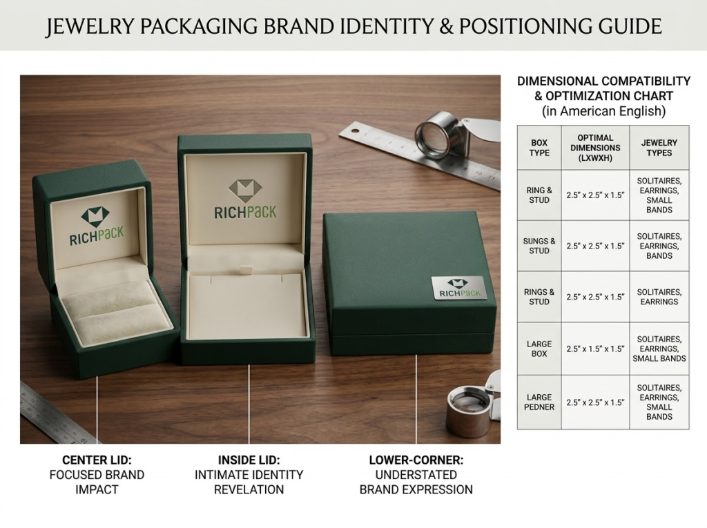
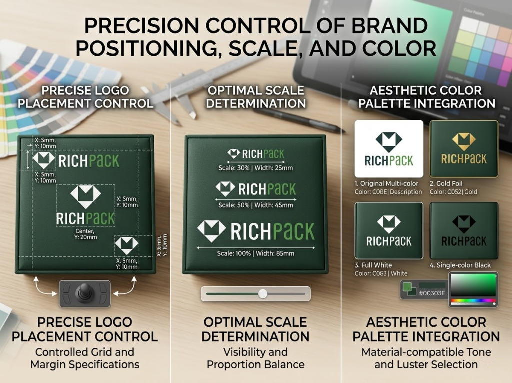
A premium logo is usually not a larger logo. It is a more disciplined one. Placement changes the read of the box as much as the finish itself.
A centered outside logo gives broad recognition. An inside-lid logo creates a more intimate reveal. A small mark near the lower corner usually feels quieter and more luxury-led.
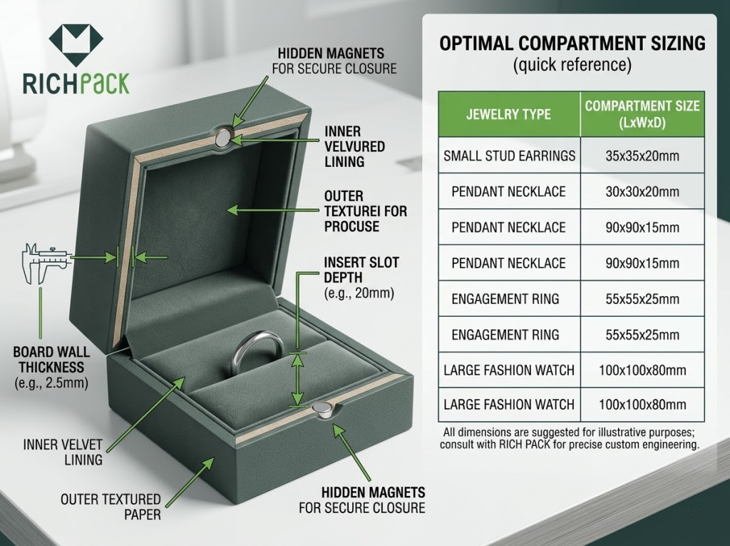
The insert decides whether the packaging actually works. If the insert allows movement, the reveal breaks. If it is too shallow, the piece sits awkwardly. If it is too loose, the whole box feels cheaper than it looks.
Ring inserts work best when they hold the product upright and centered. Earring inserts work best when the pair sits straight and balanced. These details sound small, but they change the first impression immediately.
A clean exterior can hide a weak insert for only a second. The moment the product shifts or tilts, the problem becomes obvious.
Necklaces need the clearest internal planning. A good necklace insert usually has four functional parts. It needs a top hold point, a path for the chain, a cavity for the pendant, and enough depth to keep the piece stable when the lid closes.
Bracelets need wider support and cleaner restraint. If the cavity is too tight, the product looks forced. If it is too loose, the reveal loses control.
Velvet, satin, suede, EVA, and foam all do different jobs. Velvet and suede usually improve the tactile feel. EVA and foam improve structural control. Satin can look elegant, but it also asks for cleaner execution because marks and wrinkles show more easily.
A practical pairing depends on the product. A high-ticket necklace often benefits from velvet-covered EVA. A gift-led seasonal box may work with satin over foam if presentation matters more than long-term reuse.
Accessories help when they solve a real problem. A message card helps if the box is gift-led. A care card helps if the jewelry needs maintenance guidance. A pouch helps when the buyer may store or travel with the piece later.
The strongest packaging does not add everything. It adds the one or two details that make the box feel complete.
The structure can stay similar across segments, but the signals should change. That is where customization starts to feel more intentional.
A man’s customized jewelry box usually works better with lower visual noise. Darker tones, quieter contrast, and stronger structure tend to feel more convincing than decorative detail.
Walnut tones, charcoal wraps, deep navy papers, black foil, blind embossing, and dark suede inserts usually fit this direction well because they feel controlled and mature.
A girl’s customized jewelry box should feel warmer and more giftable, but it still needs structure and discipline. Softer colors can work well. So can rose gold or silver foil. The key is to keep the insert secure and the finish polished so the box feels thoughtful rather than flimsy.
The best versions do not become childish. They stay light, friendly, and well-resolved.
Luxury packaging usually wins through restraint. A smaller logo, a better board, cleaner edge work, and a tighter insert often do more than a long list of extra features.
That is one reason premium packaging can look simple while still feeling expensive. The quality lies in the control, not in the quantity.
For custom jewelry packaging for a small business, the smartest first version is usually the simplest version that still looks established. One strong structure, one reliable logo finish, and one well-fitted insert can already do a lot of work.
Because the current MOQ is 500 units, it makes sense to put budget into the board, the insert, and the logo finish first. Those are the signals people notice fastest.
A clear brief saves revisions. It also makes the first sample much more useful.
Send exact product size, weight, and fragile points. If the necklace tangles easily, say so. If the stone setting sits high, say so. The more concrete the product information is, the better the insert result usually is.
Send the logo in vector format if possible. Include brand colors, reference images, and short notes on the visual direction. That reduces guesswork and makes the first mockup more relevant.
Tell the supplier what structure you want, what board range you expect, what wrap you prefer, and what insert style the product needs. This is where details like 1000g to 1200g greyboard, 120g to 157g paper, and the chosen logo method should be written clearly.
That way, the supplier is not building from a vague moodboard. They are building from a usable production brief.
State the budget range, launch timing, and destination market early. Also state clearly that your plan is based on a 500-unit minimum order quantity.
This helps the supplier recommend options that fit the real project instead of suggesting a sample that cannot scale.
Never approve a bulk run from a rendering alone. Approve the physical sample and review the visible quality points carefully.
In my experience, the five details that expose most packaging problems are the lid fit, the logo sharpness, the insert fit, the edge quality, and the color consistency.
The best way to customize a jewelry box is to choose the insert and structure first, then finalize the board, wrap, and logo. That order gives the box a stronger fit, a cleaner reveal, and a more stable production path.
A wood customized jewelry box is better when the material itself adds value through weight, engraving, or keepsake appeal. A rigid paper box is usually better for repeatability, lower shipping weight, and broader finish options.
Foil stamping, embossing, and debossing usually look the most premium on custom jewelry boxes. They create cleaner light response and stronger tactile cues than flat printing alone.
Start with one hero SKU, one stable rigid structure, and one reliable logo finish. Since the current MOQ is 500 units, the first run should stay focused instead of carrying too many low-impact features.
For a men’s customized jewelry box, use darker tones, lower contrast, and stronger structure. For a girls’ customized jewelry box, use warmer colors, softer fabric cues, and a more gift-ready reveal while keeping the insert secure.
To customize jewelry box packaging well, you need to make the physical choices visible and testable. Match the structure to the use case. Match the board and wrap to the price point. Match the logo method to the brand. Then test the insert like it matters, because it does.
If that process stays concrete, the result gets better quickly. The box feels stronger. The branding feels cleaner. The sample becomes easier to approve. That is how a custom jewelry box moves from concept to production without losing quality on the way.
Just submit your email to get exclusive offers (reply within 12 hours)
 PREV
PREV