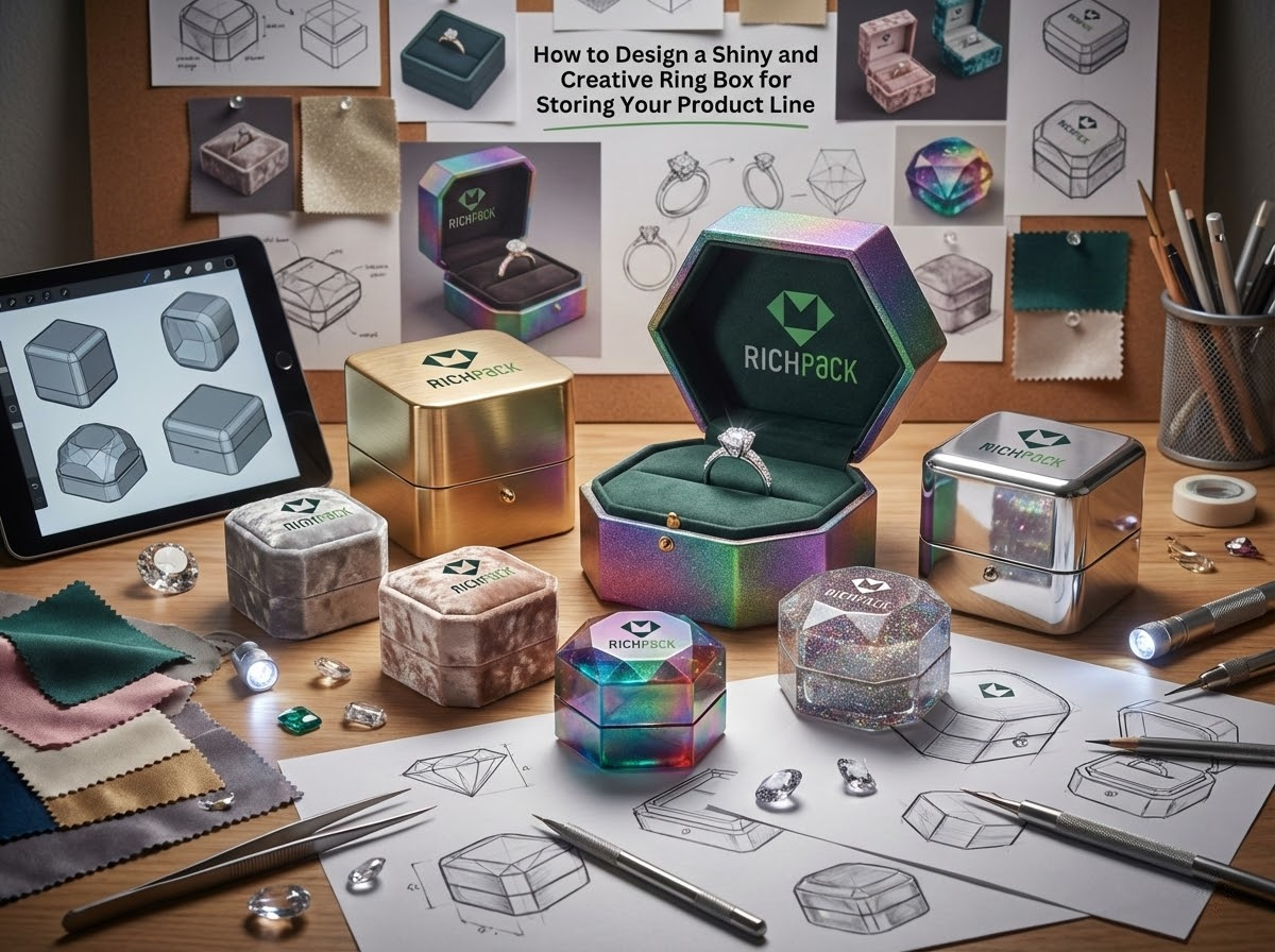

Jewelry packaging tells a story. The packaging uses touch and sight to show “who you really are and if you’re worth it.”
It will look more elegant if you use a creative ringbox with a stylish and simple design. When you open the packaging or take pictures of it, the product looks more expensive. It increases its perceived value.
This guide will help you to understand key design elements such as creative direction, structure, and surface finish. This method is something you can use immediately.
For a brand, a ring box is not a cost item. It is a brand asset that can be used repeatedly.
It affects customers’ intuitive price judgments. It also affects how efficiently you create content when launching new products.
Do it well, and you get stronger perceived value and more consistent visuals. Do it poorly, and you will keep spending money on rework, reshooting, and inconsistent displays across sales channels.
Packaging serves as a physical extension of the brand story. It doesn’t need to “say a lot”, but it should make people feel in three seconds whose brand it is and whether the price is reasonable.
You can break down brand narrative into three types of tangible visual signals:
When these three points are stable, your custom ring box is not just good – looking, but a system that can be continuously reused across different products and channels.
When reviewing samples, we are used to judging whether it deviates from the right track with one sentence, such as “Cover the logo, does this ring box still look like your brand? If the answer is uncertain, it means the narrative signal is not clear enough.”
Here are three actionable suggestions (please aim for your ROI):
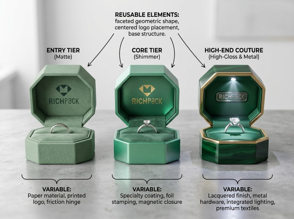
Many brand teams face a real problem. They want to create product tiers but don’t want to design each tier from scratch. If you want a better return on investment, use a single design language as your base. Then, only change the elements that users will actually notice.
This approach does two things. It keeps visual consistency. It also lets you use materials and details to separate entry-level products from high-end custom ones.
Below is a material-focused design language strategy:
Actionable tips (to reduce rework):
Minimalism isn’t “doing less.” It means spending your budget on areas where people feel the most.
Take a ring box as an example. In the first two seconds, customers notice its shine and shape first. Then they touch it with their hands to feel its texture and weight. If you add too many elements, the box will look cluttered in photos. It’s feel will also lose focus. This actually lowers the perceived value it gives people.
Actionable tips to make minimalist designs look high-end:
These small tests can tell the difference between “looking high-end” and “being truly high-end.” They also cut down on the cost of fixing mistakes later.
When you have more product lines, the most easily overlooked return on investment (ROI) comes from “efficiency.”
If the same ring box works for warehouses, stores, and live-streaming studios, you will spend less time on display setup. You will also restock faster, and your visual presentation will be more consistent.
On the other hand, if each stock-keeping unit (SKU) needs a different type of box, your inventory management will become more complex. You will also make more mistakes.
Actionable advice (turn modular design into a reusable system):
I usually advise brands to first create a “module list.” It should clearly include three columns: outer box size, inner holder specification, and display method. Then discuss material upgrades. This way, you can build a scalable system more quickly.
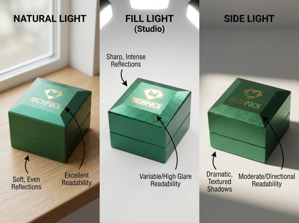
Today’s ring boxes must look good on camera. You’re not just competing on store shelves—you’re competing in Instagram and TikTok frames too.
A ring box that works for social media can directly cut the content team’s shooting costs. It means fewer retakes, less photo editing work, and more consistent visual results.
But the opposite is also true. If the shine gets out of control, the reflections look messy, or the edges turn white, the camera will make these flaws look worse. Then it becomes hard for your brand to seem “high-end and reliable.”
Useful tips (for more consistent visuals):
Sustainable development is shifting from an “added advantage” to a “must-have requirement.”
But many brands worry most about one thing: They make big promises in marketing, but can’t keep them when asked to provide evidence.
This situation may lead to compliance risks. A safer approach is to turn sustainability claims into “verifiable terms.” Only state what you can actually prove.
We suggest referencing these materials: certification body documents, standard test reports, industry research reports, or verifiable certificates from material suppliers.
You can build an “evidence chain” in your internal processes: material sources → certification documents → batch records.
This will make you more confident when communicating externally and also improve long-term supply chain management.
Many creative ring boxes look really cool. But when it comes to mass production, three problems always pop up: unstable structure, hard-to-control details, and unrealistic costs.
A more reliable approach is:
This way, you can keep visual consistency. You can also expand into different product lines and price ranges more easily.
If customization needs to be “one product, one design,” mass production will get out of control. A more workable way to achieve customization is to limit changes within a controllable range. For example, you can add nameplates, serial numbers, or short phrases in the same position. Keep the overall shape and opening-closing feel unchanged, and only modify the “identification information.” This way, you can create a series-style appearance without adding too much complexity.
Actionable suggestions:
Engraving is one of the most direct ways to add value to an item, but it can easily go wrong.
Common problems include fonts that are too thin, too much glare, or designs that fade quickly if engraved on areas that get rubbed often.
If you want an engraved ring box to look high-quality and stay in good condition, the key is to treat the engraving as “information design.” First, make sure the content is clear and easy to read. Then focus on the style.
Practical tips:
Retro style can easily become “element stacking.” To ensure stable mass production, you need to focus on “retro proportions + modern craftsmanship boundaries.”
For example, you can keep retro shapes and color schemes fixed, but the edge finishes, lining contrasts, and opening/closing resistance should be modern and consistent.
Actionable suggestions:
The value of seasonal packaging lies in “short-cycle communication,” but you shouldn’t make the outer box a one-time item.
A more practical approach is: Keep the outer box consistent with your brand. Put seasonal elements on replaceable parts (like waist bands, seals, or inner cards).
This way, you can launch promotions quickly without breaking the visual consistency of your product line.
Actionable suggestions:
The “conflict aesthetics” you mentioned works perfectly for creating a brand memory point: the warmth of wood grain plus the coolness of mirrored metal hinges naturally creates contrasting tension.
The key point is to keep the “conflict” in check—don’t let it turn into a mess. Wood grain handles the emotional feel, while metal takes care of order and sophistication.
Actionable suggestions:
Geometric forms can become part of a brand identity, just like colors. For example, Tiffany Blue is more than just a color. The proportions, corners, and opening-closing style of its boxes also create instant recognition—people can tell it’s Tiffany even from a distance.
The key to making this work in design is: geometric shapes must serve “usability.” First, make sure the product can stand, stack, and store easily. Then, add unique shape features that people will remember.
Practical suggestions:
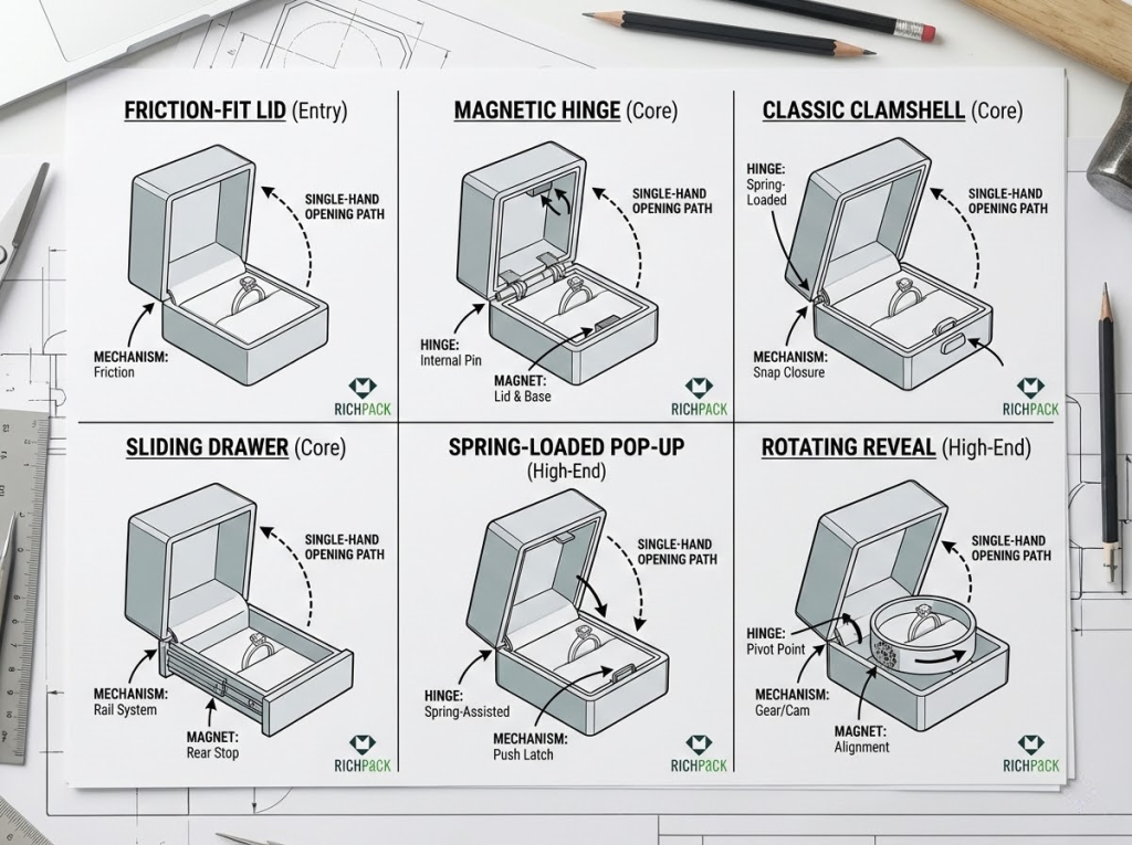
Interactive structures fear one thing most: “being complex but unstable.”
A truly mass-producible interaction is a clear action: push, pull, flip, or suck. Just choose one of these four.
We must be clear here. What you want is a noticeable unboxing experience, not a mechanical toy.
Actionable suggestions:
The production challenges for the ultra-thin slim ring box are three things: keeping the ring stable, making it scratch-resistant, and ensuring smooth opening and closing.
If the box is thin but the ring shakes inside, the user experience fails. If the box is thin but its edges turn white, it looks cheap up close. Only by making the inner holder grip the ring firmly and making the surface scratch-resistant can we turn the “discreet design” into a consistent product experience.
Actionable suggestions:
Acrylic ring boxes are perfect for “sparkle” themes because they naturally highlight display. Their mass production risks are also clear: fingerprints, minor scratches, and messy reflections.
If you want to make acrylic look high-end, you need a “visual anchor” and keep surface maintenance manageable.
Actionable suggestions:
LED and acrylic are the most direct responses to the “Shiny” theme. Lights help make diamond fire more visible in close-up shots of short videos. This cuts down the time the filming team spends adjusting lights repeatedly.
But LEDs can also cause problems like shadows, harsh glares, and battery maintenance. So the key to making this work is to “position lights and set color temperature to match the ring” – not just make the box glow on its own.
Actionable suggestions:
Starting from this point, the evaluation standard will shift from “visual inspiration” to “user experience”.
Because the sense of luxury that customers truly remember often comes from small moments they feel with their fingers: the smooth resistance when opening, the “click” sound when closing, and the consistent feedback every time they open or close.
The problems you need to avoid are also clear: the sample feels smooth, but the mass-produced version has an unstable feel; the structure looks good, but it’s hard to open with one hand; the appearance is shiny enough, but it looks cheap once the hinge gets loose.
The core value of the ultra-thin design is to “solve awkward situations”: it doesn’t bulge in your pocket, lets you move more naturally, and makes surprises feel smoother.
The real pain points aren’t about thinness itself. They’re about whether the ring will slide around after making it thin, if the edges will get worn white, and if you can open it steadily with one hand (ergonomics). If an ultra-thin box only looks good but lacks stable grip and wear resistance, it will quickly fail in real-life use.
Actionable key points:
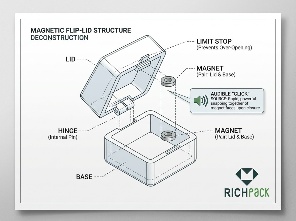
The premium feel of a magnetic flip cover comes from one specific detail: the clean “click” sound when it closes.
This is actually part of sound engineering. It results from the combined work of magnetism, hinges, and position-limiting structures.
When done well, it acts like a “confirmation button.” It makes customers feel the product is precise and reliable. When done poorly, problems like misalignment, scraping noises, or a loose feel can happen.
Actionable key points:
Drawer structures work more like “storage systems.” They fit scenarios with many SKUs and frequent store restocks.
Their usefulness shows in three ways: clear push-pull paths, visible contents at a glance, and better suitability for stacking.
The real risks are tolerance and friction. If a drawer won’t pull easily, it feels cheap. If it’s too loose, it wobbles.
Actionable key points:
The most valuable part of modular design is this: you use fewer outer box sizes to cover more product combinations.
It reduces both “design resources” and “inventory pressure” while maintaining visual consistency. But modular design can easily go wrong: too many modules will only make assembly and stock preparation more complicated.
Actionable key points:
Transparent structures often look great in photos, but they test attention to detail in real use.
Acrylic easily shows fingerprints, and even small scratches stand out more. So you need to design not just the structure, but also how it will be used and maintained.
If you want it to work well for both display and user experience, the key is to make touch points more comfortable (ergonomics) and control reflections.
Actionable steps:
Reusable structures can turn packaging from “one-time use” into “long-term touchpoints.” You can take out the ring holder and turn it into a jewelry tray. This makes customers more willing to keep the box and more likely to support eco-friendly reuse and sustainability claims.
But when putting this into practice, avoid making it “complex just for reusability.” Otherwise, assembly costs and damage rates will rise.
Actionable key points:
A well-done high-gloss finish amplifies a brand’s quality. A poorly done one just collects fingerprints and shows scratches.
Many people only say, “high-gloss finishes look more premium.” But most jewelry brands care more about three real questions: Does it still look good after being touched? Will it get scratched during shipping or stacking? Can the same Pantone color be reproduced consistently on different materials?
In the following content, I will explain these challenges clearly. I will also give you actionable inspection steps. This way, you can turn a high-gloss finish into a repeatable supply chain standard.
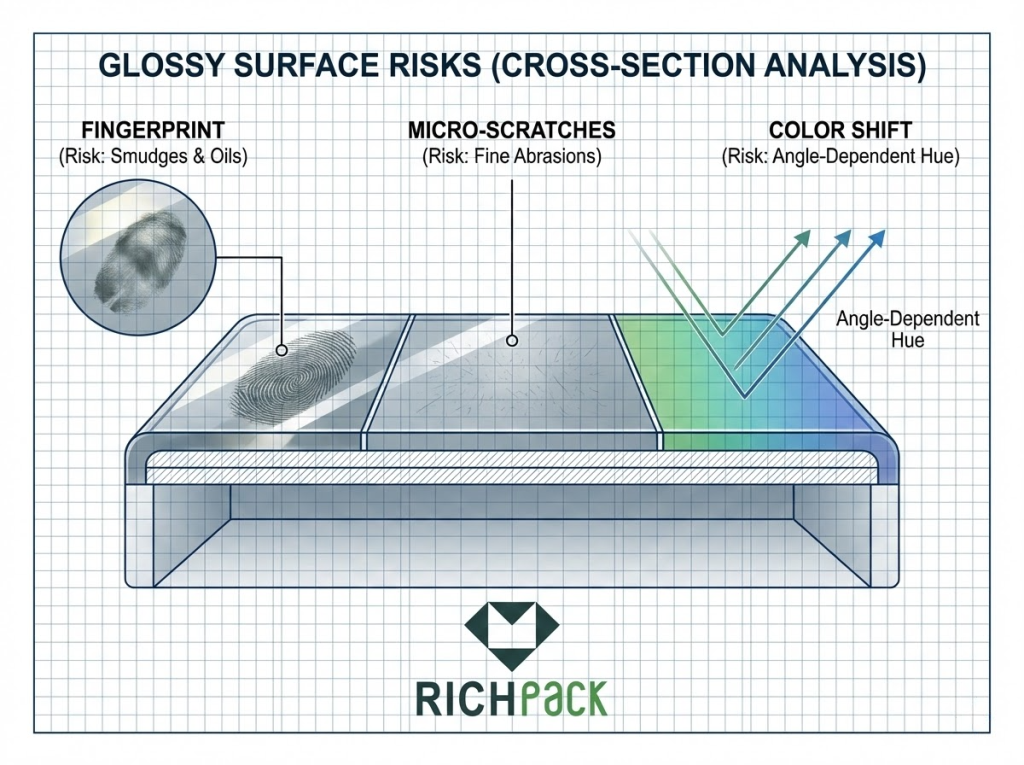
The most common issue with polished finishes isn’t large scratches, but rather a dense network of microscopic marks. These fine scratches blur the mirror-like clarity of the original shine, causing the entire case to appear worn quickly.
To address this, most factories employ UV coatings or “piano lacquer” finishes. These methods harden the surface and maintain consistent gloss. However, the key lies not in the process name, but in whether “hardness, curing quality, and tactile feel” are incorporated into acceptance criteria.
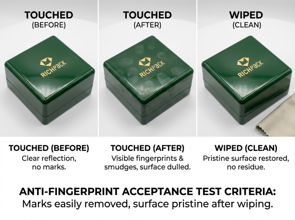
I typically recommend brands conduct a simple test during the sample stage: Take an area of identical surface size, gently wipe it 10 times with a clean soft cloth, then inspect it under side lighting. If fine scratches appear immediately, the surface will almost certainly scratch easily in the high-touch retail environment.
Actionable Steps:
The biggest enemy of glossy surfaces is fingerprints. They ruin the “clean and precise” look right away.
You can understand fingerprint resistance in two ways. First, it’s the coating’s ability to resist stains. Second, it’s how surface tension affects the way oil spreads.
Simply put, surface tension and the coating formula decide two things. Either fingerprints spread out and become very noticeable, or they are harder to stick and easier to wipe off.
In real use, you don’t need to explain complex chemistry. But you do need to identify the “touch points.” These include the opening-closing edges, the middle of the front side, and the side holding areas.
These three spots get fingerprints most easily. They also harm the texture the most.
Actionable steps:
For jewelry brands, color consistency means brand consistency. Even if you have set a Pantone color code, high-gloss surfaces will make batch differences more obvious. They reflect light strongly and are more sensitive to color. The same color may look cooler, warmer, darker, or lighter across different batches.
A more practical issue is this: The color you see does not just come from the paint. It comes from the combination of the base material, coating thickness, curing conditions, and gloss level.
One workable solution is to fix the “inspection environment + reference sample + allowed deviation” clearly.
This lets your supply chain know exactly what to do. Without this, you will keep checking colors repeatedly when restocking. This wastes time and money.
Actionable key points:
Shiny surfaces “unforgivingly highlight details” under the camera. Many packages look fine to the naked eye. But when you zoom in with a phone, all flaws show up—white edges, uneven gaps, messy chamfers, and logos that get lost in reflections.
For your product line that needs social media content, close-up quality isn’t a bonus. It’s the standard that decides if your brand looks high-end.
Make close-up checks a separate inspection step. Don’t wait until after shooting to fix problems.
Actionable steps:
“The shinier, the more high-end” doesn’t always hold on camera. Moderate micro-textures can make reflections more even and cleaner without losing shine. They also reduce the visibility of fingerprints and small scratches. You can still keep the “shiny” look, but make it appear like a premium product instead of a plastic glossy film.
Micro-textures work especially well on high-touch areas and parts that easily reflect light. They make the image more stable, and the product looks like a “reliable high-end item.”
Actionable key points:
Material selection is not “choosing a more expensive material.” Instead, it uses materials to clearly show your brand’s character.
In the first 3 seconds before a customer opens the ring box, they will first use their hands to judge: Is this traditional, reliable, and trustworthy? Is it modern, light, and like a tech product? Or is it eco-friendly, smart,t and cost-effective? This is the material-emotion connection.
You can think of it as a small knowledge graph. Different materials link to different emotional tags. These tags then link to different sales scenarios and product line levels.
This way, when you choose materials, you won’t just rely on your sense of beauty. Instead, you can make choices that are “explainable, repeatable, and mass-producible.”
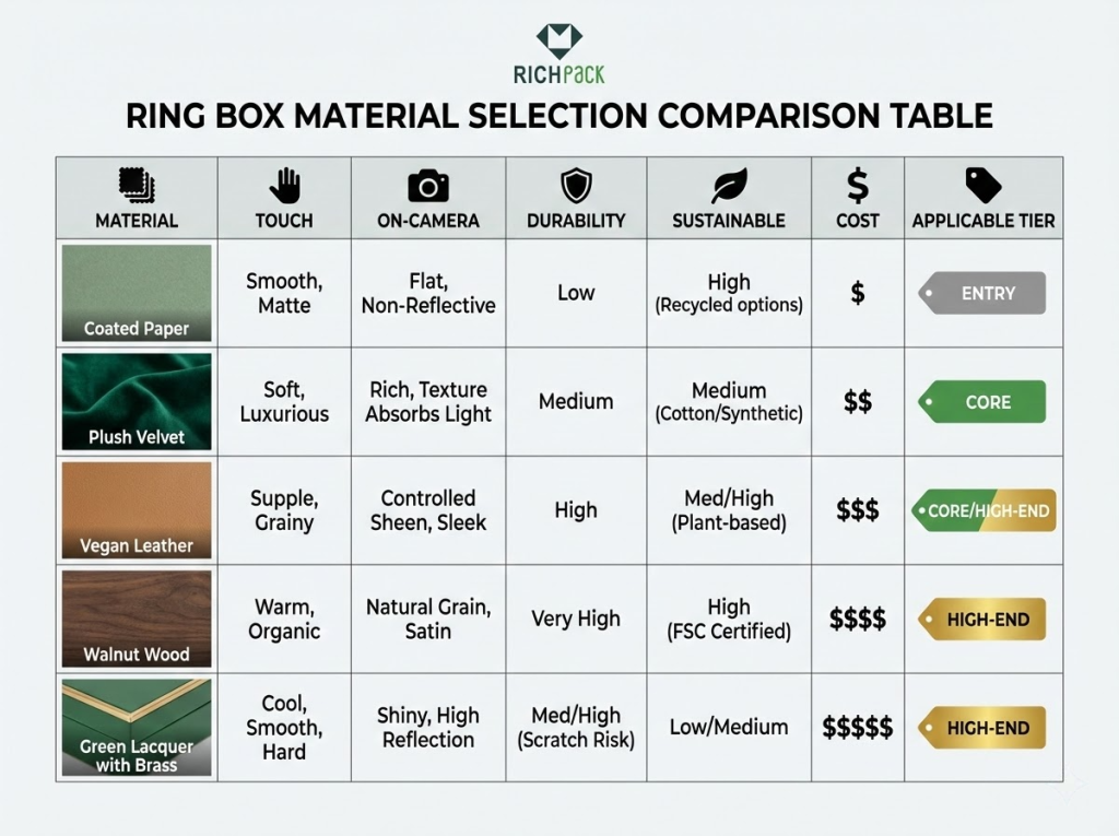
Velvet excels at expressing “tradition, security, and classic style.” Its tactile experience is clear: it feels soft, pairs well with jewelry, and brings back memories of classic jewelry counters.
This material works especially well in moments “that need trust,” such as engagement/wedding collections, key in-store styles, or high-end lines where you want to highlight your brand’s heritage.
For practical use, velvet fits “scenes where customers stay longer,” like in-store try-ons, gift box unboxing, and important gift-giving.
But if your main sales channel is e-commerce (with frequent returns and exchanges), you need stricter controls on velvet’s stain resistance and lint shedding. Otherwise, it can easily go from “high-end” to “worn-out looking.”
Recommended use cases:
Actionable tips (to avoid problems):
Wood represents “organic, authentic, and credible.” It sends a message: We don’t chase flashy things. We focus on quality and real materials.
In fact, this fits brands perfectly—brands that highlight handcrafted spirit, natural inspiration, or sustainable stories.
For specific uses, wood works well for “outdoor and natural” product lines. It also suits collectible items with gift features (keepsakes).
But the natural differences in wood mean it’s harder to keep consistency in mass production. You need to decide early: Should you treat wood grain differences as “the authenticity of unique pieces”? Or should you use a uniform coating to reduce these differences?
Suggested use cases:
Practical Tips (Avoid Mistakes):
Leather represents “reliability, maturity, and durability.” It creates a strong feeling of “long-term companionship.” When your brand wants to give customers the impression that “they won’t regret buying it and it stands the test of time,” leather is usually more reliable than pure high-gloss materials.
In terms of tactile experience, leather’s texture makes a premium feel more controllable. Unlike mirror surfaces, it doesn’t amplify fingerprints or tiny scratches.
For application scenarios, leather works perfectly as a long-term packaging standard for “core product lines” (a scalable standard). It not only unifies the visual look but also allows for tiered designs through different leather textures, colors, and hardware details across price ranges.
Recommended application scenarios:
Actionable tips (to avoid mistakes):
Acrylic represents “modernity, transparency and a sense of technology” (modernity/innovation). Its visual style is similar to consumer electronics—it looks clean, light, and display-friendly.
For the “Shiny” theme, acrylic is one of the most direct matches. It makes products look like they are placed in a display case, which works well for highlighting diamond sparkles and making products camera-ready for sharing.
In real-world use, acrylic fits product lines that prioritize e-commerce and social media (social media-ready), limited-edition new releases, or display-first display strategies.
But acrylic is very sensitive to fingerprints and minor scratches. So you should treat it as a “material that needs engineering management” instead of just focusing on how good the sample looks.
Recommended application scenarios:
Actionable suggestions (to avoid problems):
Specialty paper delivers three key values: “eco-friendly, smart, and cost-effective.” It works well for brands that want to make their “sustainability claims” more credible. It also fits perfectly for product line expansion. Why? Because paper is easier to create a series of design variations with different techniques. For example, textures, embossing, spot UV coating, foil stamping, and window cutouts—all these can quickly create distinct styles.
In terms of use cases, specialty paper is ideal for seasonal packaging, small-batch testing of new products, and entry-level product lines. These entry lines need cost control, but should not look cheap.
But remember: Paper’s wear and stain resistance depend on material science and surface treatment. Without these, the paper will look old quickly during shipping and unboxing.
Suggested use cases:
Actionable tips (to avoid problems):
Fabric better expresses “tenderness, intimacy, and a gift-like feel.” It makes the unboxing experience feel more like “being cared for” rather than “being shown off.” If your brand has a warm, handcrafted style, or if you want customers to keep the box on their dressers long-term, fabric will be a great addition.
But fabric also easily pills, collects dust, and looks cheap if its edges are uneven. So it works best for “low-complexity but high-craftsmanship” designs—like fewer patterns and more solid attention to small details.
Recommended use cases:
Actionable tips (to avoid mistakes):
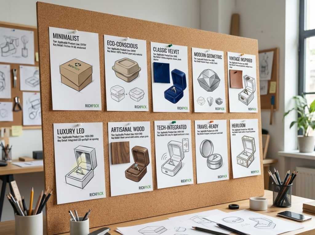
Newer trends are usually not more complicated. They are easier to see, remember, and reuse. You will notice three main directions:
If you want to keep up quickly, I suggest using a simple checklist to evaluate:
The fastest way to start is to first clearly state the “experience you want,” then discuss structure and materials.
You can define it in three sentences:
When I work with brands, I first create a “sample comparison package.” I put one ring into 2-3 different structures and materials, take 5 close-up photos from fixed angles, and then do 10 opening and closing tests. This helps you quickly decide on a direction. After that, you can move on to sample making and mass production evaluation.
There is no “best” material, only the most suitable “material-emotion mapping”. Velvet leans toward classic and heritage. Wood leans toward authentic. Acrylic leans toward modern and innovative. Specialty paper leans toward being eco-friendly and cost-effective.
A more practical approach is: first, decide the tactile experience you want—soft, warm, crisp, cool—then choose the surface finish and color management. Finally, take close-up photos under the same light to check “visual consistency”. This avoids situations where samples look good but restocks fail.
Choosing the wrong insert for your ring leads to common problems: the ring wobbles, tilts, or rubs against the metal prongs and gets scratched.
First, sort your ring settings into three types based on their structure: thin band, high crown, or wide band. Then, decide the angle based on your display goal—more front-facing, more side-facing, or closer to the camera.
For practical use, I suggest two simple tests:
If you have multiple SKUs, using a modular insert (a replaceable insert) is usually more stable. It also makes it easier to expand your product line and restock items.
Packaging rarely drives repeat purchases “directly,” but it affects three measurable metrics: the willingness to share unboxing experiences, satisfaction with received items, and friction in returns or exchanges.
A more practical way for you to quantify this is to break down packaging into trackable touchpoints: the feel of opening and closing, how it looks in close-up photos, and its reusability for storage. Then map these touchpoints to observable actions (saving the product, sharing purchase posts, visiting the store again, asking questions).
If you want to test this faster, I suggest a small experiment: randomly send two types of ring boxes (with different structures or materials) for the same batch of orders. Compare metrics like “purchase sharing rate, UGC mentions, and the types of customer service inquiries or complaints about packaging.” For sources, you can use GA4 events or e-commerce backend data for internal comparisons. When writing for external use, suggest citing “industry reports, platform trend reports, or user experience research” instead of making up specific numbers.
By now, you should see a fact: design is just the starting point. Manufacturing decides the final result.
A nice-looking ring box only adds real value to a brand when it keeps its shine, consistent color, smooth opening and closing, and stable inner lining after mass production. On the other hand, if there are color differences between batches, easy scratches on the surface, or inconsistent magnet tightness, even the best idea will turn into customer service and return costs.
If you take only one thing away, I hope it’s this “design-to-manufacturing” fast implementation path:
For all claims about “environmental protection/safety/durability,” only state verifiable content. And prepare the corresponding document types (recommended references: industry standard documents/test report types/certification document types).
Are you ready to turn your design into reality now? Send us your ring box sketches/reference images, target materials, and budget range. Discuss manufacturing feasibility with our engineers. And get an actionable list of prototyping and mass production suggestions.
Just submit your email to get exclusive offers (reply within 12 hours)
 PREV
PREV