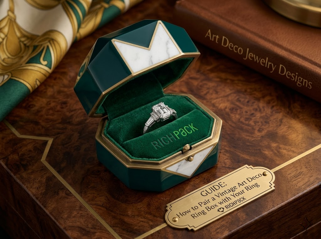

The ring earns the “yes.” The box sets the scene.
You could have the most breathtaking Art Deco platinum ring in your inventory, and still lose the moment because it arrived in the wrong box. A rustic wood case. A glossy modern clamshell. Something that appears to belong to a different era entirely.
That disconnect is more common than jewelry brands realize. It costs more than aesthetics; a flat presentation loses the emotional impact that can turn a one-time buyer into a lifelong customer.
Before diving into the details, let’s clarify who will benefit most from this guide and what you’ll take away from it.
Get this right, and your vintage art deco ring box becomes part of the story your ring tells.
Most people recognize Art Deco when they see it. However, understanding why it looks the way it does and how those design rules apply to ring boxes is what separates a matched presentation from a near miss.
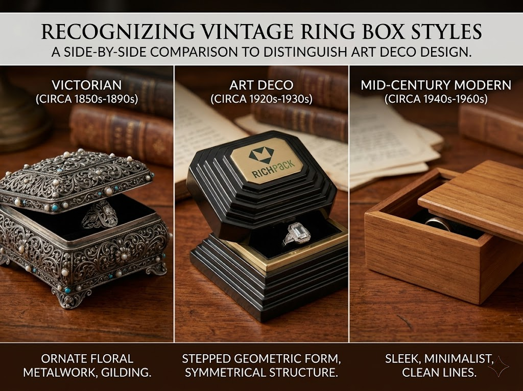
Art Deco emerged in the 1920s and peaked through the early 1930s. The movement was a deliberate break from everything that came before it: the floral curves of Art Nouveau, the romantic softness of Edwardian design. Instead, it leaned hard into geometry. Sharp angles, stepped forms, perfect symmetry.
Authentic Art Deco ring boxes from this era carry all of those signals. The base is typically stepped, rising in a series of clean horizontal tiers. The lid features engraved or embossed geometric patterns: chevrons, sunbursts, and linear grids. Nothing on the surface is accidental or organic-looking.
This matters for pairing because a ring born from that same geometric logic looks most at home inside a box that speaks the same visual language.
Three materials define authentic vintage ring boxes from the Art Deco period.
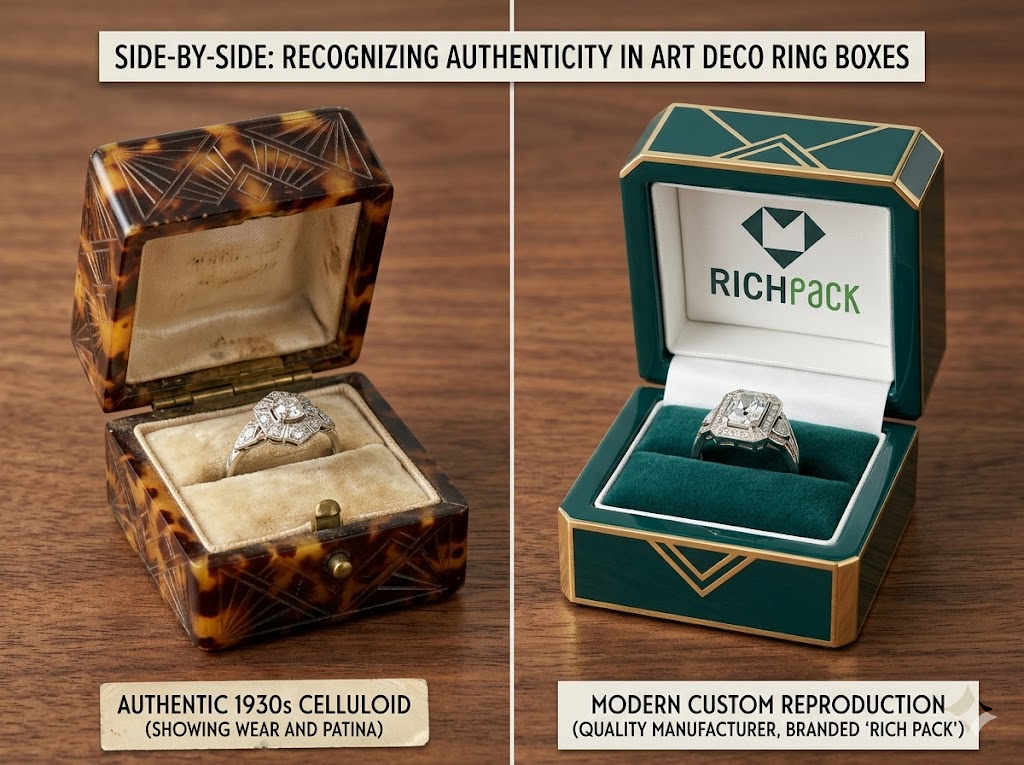
Celluloid was the most common. It was a lightweight, moldable material that jewelers could shape into precise geometric forms. Cream, ivory, black, and forest green were the dominant colors. Manufacturers like J.C. Warner & Co. (Buffalo) and R. Blackington & Co. (Massachusetts) produced celluloid boxes at scale for retailers across the country.
Sterling silver was reserved for luxury. Makers, including Roden Bros., Birks, and private-label producers for Tiffany, created small silver ring boxes with engraved lids, push-button clasps, and flared bases. These were typically included with high-end engagement ring purchases at boutique retailers.
Leatherette over hard board was the practical middle tier. It was structured, durable, and easy to brand with a retailer’s silk-stamped interior.
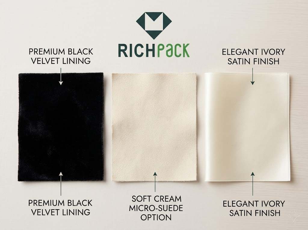
Open any authentic Art Deco presentation box, and you’ll find either velvet or satin. The difference between them tells you something important about the piece’s quality tier.
Black velvet was the premium interior choice. It creates a rich contrast against platinum and diamond, and it holds the ring slot firmly in place. Cream or ivory satin appeared in mid-range pieces. It’s elegant but less structured, and it tends to age faster.
The ring slot itself (a narrow channel cut into the cushion pad) is a defining feature. Earlier Victorian boxes often used a simple ring cushion. The precise, machine-cut slot is more characteristic of 1920s–1930s manufacturing.
One more detail worth noting: the inside of the lid in authentic period boxes often carries a retailer’s name stamped in gilt lettering. Think “Wright, Kay & Co. Jewelers, Detroit” or “F.B. Steacy, Brockville.” For collectors and antique dealers, that stamp is a provenance marker. For brands creating custom vintage ring boxes today, it’s actually a blueprint for how to add your own identity without breaking the period look.
Art Deco boxes worked in contrast. The tension between a dark exterior and a light interior, or a pale shell with a deep velvet lining, was entirely intentional.
The most common exterior colors were cream, ivory, black, deep navy, and forest green. Hardware accents (push-button clasps, hinge fittings, engraved borders) came in silver or antique gold. The combination of a cool exterior tone with warm metallic hardware was characteristic of the era’s love of visual contrast.
What you rarely see in an authentic Art Deco ring box is a warm, rustic, or organic palette. No raw wood. No earthy brown leather. No blush pink. The palette was deliberate, cool, and metropolitan. It carried the same energy that shaped the Chrysler Building.
Modern custom manufacturers now produce high-quality Art Deco–inspired packaging using the same core principles: stepped geometric exteriors, geometric lacquer finishes, gold foil accents, velvet or micro-suede interiors, and angular hinged lids.
What separates a quality reproduction from a cheap imitation comes down to three things.
Before you even look at box options, spend a few minutes reading the ring. Its materials, proportions, and design details will tell you almost everything you need to know about which packaging will complement it.
The clearest signal that a ring is Art Deco is its base metal. Platinum and white gold are the defining metals of the era. The Roaring Twenties pushed jewelry away from the yellow gold of the Victorian period. If you’re looking at a platinum ring with cool-toned hardware and geometric detailing, you’re looking at an Art Deco piece.
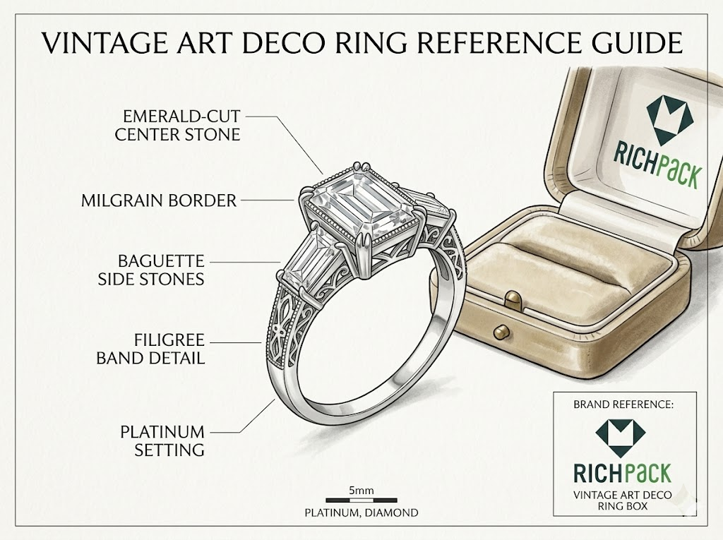
The stone’s shape confirms it. Emerald cuts and Asscher cuts are the most recognizable Art Deco diamond profiles. Both feature step-cut faceting that creates clean, mirror-like surfaces rather than sparkle. Baguette side stones are another signature: narrow rectangular diamonds set in parallel rows flanking the center stone. If the ring features milgrain edges, filigree metalwork, or a geometric halo, you have an Art Deco ring on your hands.
Ring profile (meaning how high the ring sits above the band) is the most overlooked factor in box selection. A low-profile solitaire with a bezel setting sits close to the finger and fits comfortably in a standard ring slot. But a high-profile prong setting with a tall center stone needs a box with greater interior depth, or the lid won’t close properly.
Forcing a tall ring into a shallow box damages the piece and ruins the presentation. The ring should seat fully into the slot with the lid closing flat. No pressure, no gap.
Cluster rings and multi-stone designs present a different problem. Their wider footprint requires a ring slot that’s broader than standard. Always measure your widest ring before specifying box dimensions.
The metallic hardware on a ring box (the push-button clasp, the hinge fittings, any engraved border accents) should echo the ring’s base metal. This is the detail most brands get wrong, and it’s one of the easiest to fix.
A platinum or white gold ring calls for silver hardware on the box. Warm brass clasps create a jarring temperature shift where the cool precision of the ring clashes with the warmth of the hardware.
A yellow gold accent ring (some Art Deco pieces use yellow gold inlays alongside platinum) actually looks sharp against a box with warm gold-tone hardware. The consistency reads as intentional rather than accidental.
A ring with rose gold details pairs well with blush or dusty pink velvet lining and rose gold hardware, though this combination skews more modern-vintage than strictly period-accurate.
The table below gives a quick reference:
| Ring Metal | Recommended Box Hardware | Interior Lining Color |
| Platinum | Silver | Black or cream velvet |
| White gold | Silver or pale gold | Cream or ivory velvet |
| Yellow gold (accent) | Warm gold | Ivory or champagne satin |
| Rose gold (detail) | Rose gold | Blush micro-suede or ivory velvet |
Every ring has a color story, and the best vintage ring boxes amplify it rather than compete with it.
An all-diamond platinum solitaire is essentially monochromatic: cool, clear, brilliant. A cream or ivory velvet interior in a geometric cream exterior lets the ring’s brilliance do all the work. The box says “quiet elegance.”
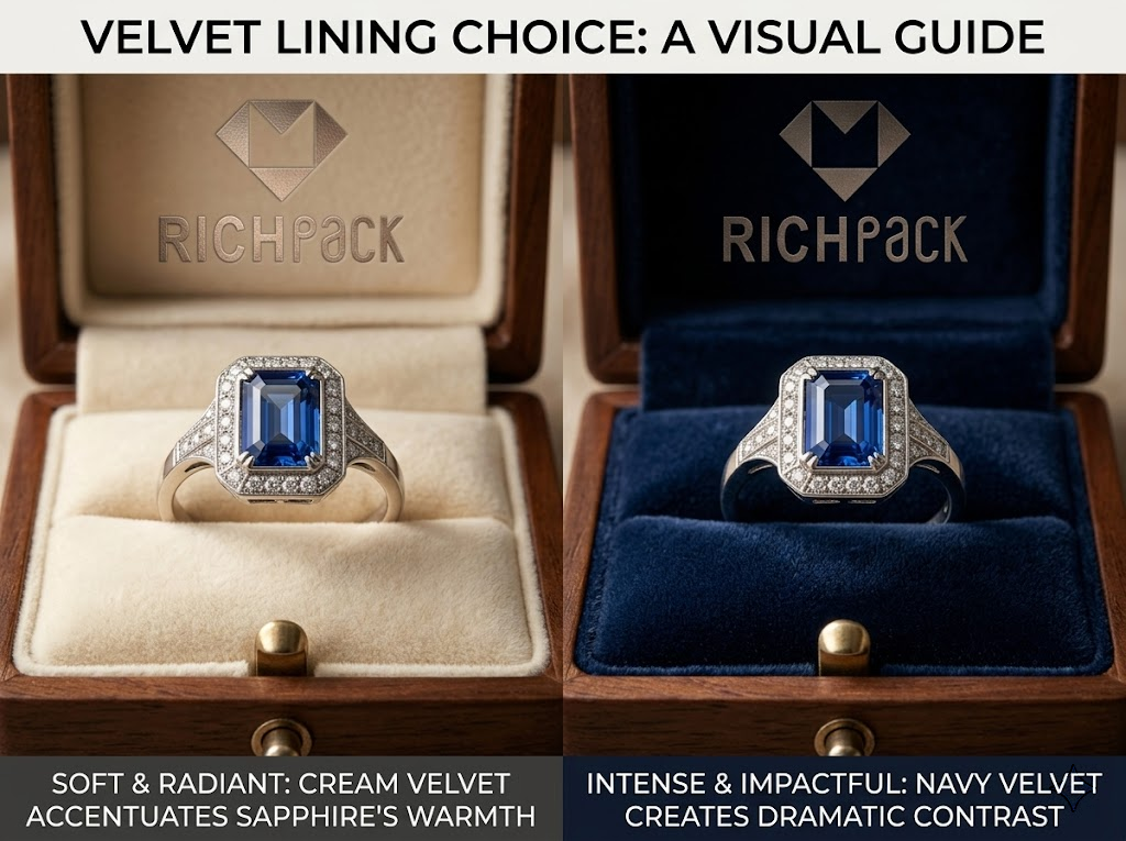
A sapphire-centered Art Deco ring shifts the palette entirely. Deep navy or midnight blue velvet interior creates visual resonance. The sapphire and the lining speak the same color family. Silver exterior hardware ties back to the platinum setting.
For ruby or emerald center stones, black velvet is the classic choice. The contrast is bold and dramatic, which is exactly what Art Deco intended. A black exterior with gold hardware makes the whole package feel like it belongs in a 1925 Paris exhibition.
Colored enamel rings (which were common in the Art Deco era) need a restrained box exterior. The ring already has visual complexity. A plain geometric exterior in cream or ivory lets the enamel work lead.
The distinction between an authentic vintage ring and a vintage-inspired modern ring changes the box strategy in one meaningful way.
With an authentic period ring (something made between 1920 and 1935), using an original Art Deco box or a faithful reproduction creates a complete heirloom experience. Every element says, “This ring has a history.” The box reinforces the age, the craftsmanship, and the provenance.
With a vintage-inspired modern ring, you have more flexibility. A high-quality reproduction Art Deco ring box works beautifully here, and actually offers something the original can’t: customization. You can add your brand identity, specify the exact interior color, and control every detail of the materials. For jewelry brands building a consistent product line, this is where a thoughtful packaging strategy creates a real competitive edge.
These five principles apply whether you’re a boutique owner sourcing one special box or a jewelry brand specifying packaging for a full product line.
There’s a difference between a box that looks old and a box that looks Art Deco. A distressed wood box looks vintage. A stepped celluloid box with geometric engraving looks Art Deco. Only one of them belongs with a platinum filigree solitaire.
The practical test is simple: do the box’s angles and geometric vocabulary echo the ring’s cut and setting? If the ring features clean linear geometry (emerald cut, baguette sides, milgrain border), the box should carry the same language. Sharp edges, precise symmetry, cool palette.
Mismatch happens most often when buyers reach for “vintage-feeling” packaging without asking which era that vintage feeling belongs to. Bohemian, rustic, and farmhouse-style boxes are vintage in a general sense. They are not Art Deco. The distinction matters every time.
Think of the interior lining as the backdrop in a product photograph. The right backdrop makes the subject pop. The wrong one flattens it.
Interior color is the single highest-impact decision in box pairing. Neutral interiors (cream, ivory) work for diamonds and platinum because they don’t introduce competing color. The ring’s brilliance is the whole point, and a quiet backdrop lets it speak.
Rich, deep interiors (navy, black) work for colored stones because contrast creates drama. A sapphire sitting on black velvet looks more intensely blue than it does against a lighter background.
A ring box that’s even slightly too large makes a ring look small. That’s a problem, especially for high-value Art Deco pieces where the presentation moment carries emotional and commercial weight.
As a practical guideline, the interior width of the box should be roughly 20–30mm wider than the ring’s outer diameter. The ring should fill the space without looking crowded, but the box shouldn’t overwhelm the piece with empty interior.
Box depth is equally critical. The ring slot should hold the ring fully (band and setting) with the lid closing flat and clean. If the ring resists seating, the slot is too shallow. If the ring rattles inside the slot, it’s too wide, and the visual impact is lost the moment the customer opens it.
Hardware finish is a detail most customers never consciously notice, but they feel it when it’s wrong.
A silver push-button clasp on a platinum-toned package creates subconscious harmony. The metallic temperature stays consistent from ring to box. The customer’s brain registers “this belongs together” without being able to articulate why.
Switch to warm brass hardware on the same cool package, and something feels slightly off. The dissonance is subtle, but it erodes the sense of care and quality that premium jewelry presentation depends on.
The fix is simple: before specifying any box, note the dominant metal of the ring and match the hardware finish accordingly. If the ring is multi-metal (platinum band with yellow gold accent), lean toward the metal that defines the setting, not the accent.
The exterior of the box has one job: to set the stage for what’s inside.
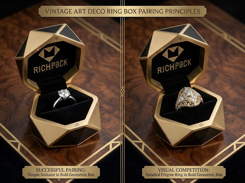
A heavily embossed, richly ornamented box exterior is visually interesting on its own. But place a filigree Art Deco ring inside it, and you’ve created a competition. Two complex, detailed things are fighting for the eye’s attention. Neither wins.
The cleaner rule: the more intricate the ring, the more restrained the box exterior should be. A bold geometric box works beautifully with a clean diamond solitaire. That same box overwhelms a ring with elaborate metalwork and colored stones.
Here’s how to apply those five principles to specific ring types. Use this as a quick reference when sourcing or specifying packaging.
The Art Deco diamond solitaire is the most classic pairing scenario. The ring is typically a platinum or white gold setting with a single emerald-cut, Asscher-cut, or old European cut diamond: clean, precise, architectural.
The box should match that precision. A stepped cream celluloid exterior or an ivory leatherette-wrapped box with a black velvet interior is the strongest pairing. A silver push-button clasp completes the period look.
For box sizing, a standard interior width of 50–55mm works for most solitaires. The ring slot should grip the band firmly with no lateral movement.
Multi-stone cluster rings (think three-stone designs with baguette flanking stones, or filigree-set cluster arrangements) are visually complex. The box needs to manage that complexity, not add to it.
Choose a wider-profile box with a deep ring slot that accommodates the ring’s full footprint. A navy or black velvet interior works well because it unifies the multiple elements visually. The exterior should use a strong geometric form but minimal surface ornamentation. A stepped base with a clean, engraved border is enough.
Avoid embossed floral exteriors or patterned lining fabrics. When the ring is intricate, the box works best as a clean backdrop.
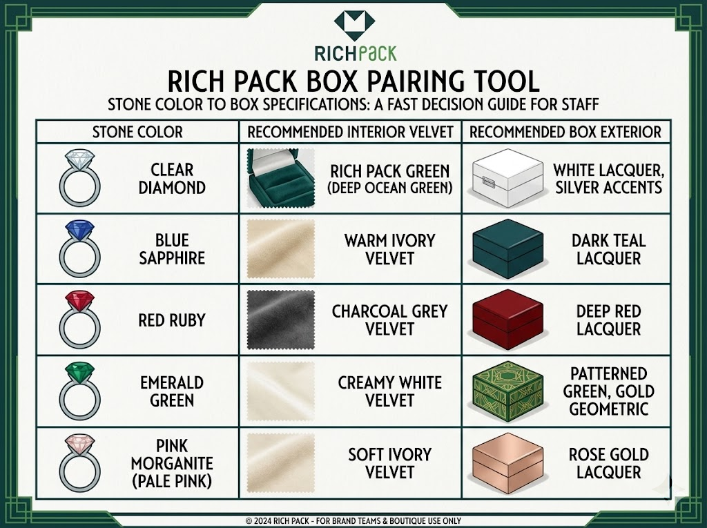
Colored gemstones were central to Art Deco jewelry. Sapphires, rubies, emeralds, and onyx appeared alongside diamonds in angular, symmetrical settings. The box pairing depends entirely on the stone.
| Ring Stone | Interior Lining | Exterior Color | Hardware |
|---|---|---|---|
| Sapphire | Midnight blue or navy velvet | Black or deep navy | Silver |
| Emerald | Black velvet | Black or forest green | Gold |
| Ruby | Black or ivory velvet | Black or cream | Gold or silver |
| Onyx (accent) | Cream or ivory velvet | Cream or ivory | Silver |
| Diamond + sapphire | Deep navy velvet | Black | Silver |
Filigree metalwork (those intricate, lace-like patterns of twisted metal wire) is among the most fragile elements in Art Deco ring design. Milgrain edges (the tiny bead-like border detail along the setting) are similarly delicate.
Both of these details can snag on the velvet pile. For filigree and milgrain rings specifically, a satin interior or micro-suede lining is a safer and more practical choice. These surfaces are smooth enough to protect the metalwork while still feeling luxurious.
The box exterior for these rings should be understated. The ring’s surface detail is already rich. A plain stepped exterior in cream or ivory is all the visual weight the presentation needs.
Vintage-inspired rings (modern pieces designed in the Art Deco aesthetic) give brands the most creative freedom with packaging. You’re not bound to period authenticity. You’re building a brand story.
This is the strongest B2B opportunity in this entire guide. A jewelry brand that sources a consistent, high-quality custom vintage art deco ring box with its own debossed logo inside the lid, a specific interior color that matches its brand palette, and a clean geometric exterior that echoes its product aesthetic owns a visual identity that’s immediately recognizable.
The best custom manufacturers can match your specifications precisely: exterior dimensions, lining color (from a full velvet swatch range), hardware finish, lid mechanism, and interior stamping. The result is packaging that looks like it was made for the ring, because it was.
Understanding what makes a good pairing is one thing. Building a scalable custom packaging program around it is another. Here’s how to approach customization without losing the vintage integrity that makes these boxes work.
The cleanest way to brand a vintage-style ring box is also the most historically accurate. Jewelers in the 1920s and 1930s stamped their name in gilt lettering on the silk lining inside the lid. Think “Wright, Kay & Co. Jewelers Detroit” or “Birks.” The box itself stayed elegant and period-correct. The brand lived in the interior.
Apply the same logic today. A debossed logo on the exterior lid (pressed into the surface, not printed) maintains the geometric integrity of the box. Paired with a subtle interior stamp on the lining fabric, this approach adds brand identity without modernizing the packaging.
What breaks the vintage look: large printed logos in contemporary sans-serif fonts, foil stickers on the exterior, or brightly colored ribbons. These elements signal “modern retail” and undermine the Art Deco story you’re trying to tell.
Material selection defines both the quality feel and the budget of your packaging program. Here’s how the main options compare.
Leatherette over hard board is the most commonly specified exterior for custom vintage-style ring boxes. It’s durable, shapeable, takes debossed logos cleanly, and is cost-effective at volume. Quality ranges significantly, so always ask for physical samples before committing.
Lacquered paper wrap over rigid board achieves the glossy, stepped look of original celluloid at a lower cost. It’s more prone to surface scratching, so it works better for boutique use than for high-volume e-commerce shipping.
Interior lining choices break down by use case. Velvet offers premium visual impact. Micro-suede is better for filigree and delicate metalwork. Satin gives a mid-tier, period-accurate option. Most manufacturers offer these in a range of colors, so request swatches for cream, ivory, black, navy, and forest green before finalizing.
Most quality manufacturers start custom production at a minimum of 100–300 units. For boutique brands with limited initial volume, some manufacturers offer pre-configured Art Deco designs with interior branding only, which keeps the MOQ lower.
The ring box is the moment of reveal, but everything around it contributes to the experience before the lid opens.
An outer mailer or shipping sleeve that carries a simple geometric border in the same color family as the ring box extends the Art Deco motif from the moment the customer receives the package. It doesn’t need to be elaborate. A clean geometric line in gold foil on a black or cream exterior does the job.
The card inserted inside the box (certificate of authenticity, care guide, or brand story card) should reinforce the period aesthetic: geometric border, cream or ivory paper stock, serif typography. Nothing with a modern gradient or bright color block.
For tissue paper wrapping inside or around the box, stick to cream, black, or deep navy. Bright colors pull the palette away from the period-correct look you’ve established everywhere else.
Sustainable materials and Art Deco aesthetics aren’t in conflict, though it takes intentional sourcing to align them.
FSC-certified paperboard is now widely available for box construction and maintains the structural quality needed for a stepped, geometric exterior form. Most quality manufacturers can confirm FSC certification on request.
Recycled velvet and recycled satin lining options are available from specialty suppliers. The visual quality is indistinguishable from virgin material at the finished product level.
The trickier question is how to communicate sustainability without undermining the luxury perception your packaging is designed to create. The answer is to keep sustainability messaging off the box itself and on supporting materials (the card insert, brand website, packaging slip). The box should feel like it came from 1928. The story of how responsibly it was made lives elsewhere.
When you brief a manufacturer on custom vintage art deco ring boxes, the more specific your brief, the more accurate the sample, and the fewer revision rounds you’ll need.
Here’s what to include in your specification document:
Always request a physical sample before approving a production run. Color, material weight, and interior fit are impossible to evaluate accurately from photographs.
These are the errors that consistently show up when jewelry brands approach vintage ring box pairing without a framework. Most are easy to avoid once you know what to look for.
The most common mistake is choosing packaging that reads as “vintage” without being period-correct. A distressed wood box, a woven rattan case, a raw linen pouch: all of these communicate “handcrafted heritage.” None of them communicates “1925 Paris.”
A platinum filigree Art Deco ring is a product of industrial modernism. Precision metalwork, geometric symmetry, cool luxury. Placing it in rustic packaging creates genuine tonal dissonance. The ring and the box are telling completely different stories.
The test: if the ring whispers “1925,” the box needs to whisper it back.
Box sizing is treated as an afterthought by many brands, and it’s one of the most damaging mistakes in the entire presentation chain.
An oversized box surrounds a delicate Art Deco solitaire with space, making the ring look small and the packaging feel generic. The preciousness of the piece depends partly on how closely the packaging wraps around it.
An undersized box forces the ring into a slot that’s too tight. It risks scratching, can bend delicate prong settings, and creates visible stress on the box structure itself.
Measure your ring (outer diameter of the band and height of the setting) before specifying any dimensions.
Interior lining color should be decided in the context of the specific ring, not as a general brand standard applied uniformly across all products.
A blush pink or warm rose velvet interior clashes with the cool, silvery precision of a platinum Art Deco ring. The warm tone pulls the viewer’s eye away from the ring’s metalwork and muddies the palette.
A bright white interior sits awkwardly inside a period-correct Art Deco box exterior. The visual language of the interior and exterior should align. Antique cream or ivory reads as period-appropriate. Clinical white reads as modern retail.
Match interior color to stone color first, ring metal second, and brand palette third.
An ornate exterior works against an ornate ring. This is simple visual logic, but brands routinely get it wrong by selecting the most beautiful or elaborate box they can find without considering whether the ring’s own detail level can absorb that visual competition.
A heavily embossed floral exterior paired with a filigree Art Deco cluster ring creates a presentation where neither element can breathe. The eye has too much to process, and the ring gets lost.
Hold to one rule: one hero. If the ring has complex surface detail, the box exterior gets restrained. If the ring is a clean geometric solitaire, the box can carry more design weight.
Push-button clasps, hinge fittings, and decorative metal borders on a ring box are small details, but they operate as part of the total metallic story of the presentation.
Warm brass hardware on a package designed to hold a cool platinum Art Deco ring introduces a tonal shift that most people can’t articulate, but everyone feels. The box suddenly looks like it belongs to a different product. The ring inside looks slightly misplaced.
Hardware finish is a one-line specification change. Match it to the ring metal, and it becomes invisible. That’s exactly what good packaging hardware should do.
The best interior color depends on the ring’s center stone. For diamond-set Art Deco rings in platinum or white gold, cream or ivory velvet is the strongest choice. It provides a warm, neutral backdrop that enhances the stone’s brilliance without competing with it. For colored gemstone rings (sapphire, emerald, ruby), black velvet creates the most dramatic contrast and makes the stone appear more vivid. Deep navy velvet is an excellent alternative for sapphire rings, specifically, as it creates tonal resonance between the lining and the stone. Avoid bright white interiors. They read as modern rather than period-correct, and they can visually wash out the ring’s metalwork.
Yes, and it often works beautifully. A vintage art deco ring box isn’t exclusive to period rings. Any ring with geometric design elements, cool metal tones, or structured symmetry can look exceptional inside Art Deco–style packaging. The key is tonal alignment. If your modern ring features emerald-cut stones, platinum-tone settings, or architectural proportions, Art Deco packaging reinforces those design qualities. Where it doesn’t work: bohemian, nature-inspired, or organic designs that draw from completely different visual traditions. In those cases, the box and the ring argue rather than agree.
Authentic Art Deco ring boxes typically date from 1920 to the mid-1930s and carry several identifiable features. Look for a stepped or tiered base, geometric engravings on the lid, a push-button or hinged clasp, and a velvet or satin interior with a machined ring slot. Many period boxes carry a retailer’s name stamped in gilt lettering on the interior lid lining. This is a strong provenance indicator. Common materials include celluloid (cream, ivory, black, or green), sterling silver, and leatherette-wrapped hard board. Sterling silver examples often carry maker’s marks such as “STERLING” plus a manufacturer’s hallmark. When in doubt, consult a specialist in antique jewelry accessories.
For most Art Deco solitaires, a standard ring box with an interior width of 50–55mm and a depth of 35–40mm works well. If the ring has a tall setting (a high prong configuration or a multi-stone cluster with significant height above the band), you’ll need a box with at least 30mm of interior depth to allow the lid to close flat without pressing on the stone. For cluster rings or wider band designs, measure the ring’s widest point across the face and add 20–25mm to get your minimum interior width. The ring should seat fully into the slot with no visible gap and no force required. If it resists seating, the box is too shallow.
The most effective customization approach mirrors what luxury jewelers did in the 1920s and 1930s: keep the exterior clean and period-correct, and use the interior lid as your branding canvas. A debossed logo on the exterior lid (pressed into the surface rather than printed) maintains the geometric aesthetic. An interior lid stamp in gold or silver lettering adds brand identity without modernizing the packaging. When briefing a manufacturer, specify your logo placement, font, and text size alongside all material and dimension requirements. Always request a physical sample before approving production. For brands starting, many manufacturers offer interior branding on a lower MOQ than fully custom exterior designs.
The difference is significant. Victorian ring boxes (roughly 1837–1901) are characterized by ornate metalwork, elaborate embossed floral patterns, heavy brass hardware, and dark velvet or plush interiors. They feel opulent and highly decorative. Art Deco boxes (1920s–1930s) are the visual opposite: geometric, stepped, symmetrical, and restrained. Where Victorian is organic and nature-inspired, Art Deco is architectural and machine-precise. The hardware in Art Deco boxes is smaller and more functional. Push-button clasps rather than elaborate hinged latches. Interior materials in Art Deco boxes tend to be flatter and more refined (velvet or satin rather than deep plush). Mixing the two eras with a ring is one of the most common pairing errors, as they do not read as compatible.
Sterling silver is the most durable material in vintage ring boxes and, when properly stored, can last indefinitely. Authentic sterling silver Art Deco boxes from the 1920s routinely appear in collector markets in excellent condition a century later. For modern custom ring boxes, leatherette over rigid board has the best durability-to-cost ratio. It resists denting, holds its shape through repeated opening and closing, and takes debossed logos cleanly. Celluloid, while historically common, is more prone to discoloration and brittleness over time and is rarely used in quality modern production. Interior velvet lining will eventually show wear in the ring slot area with heavy use, but most manufacturers offer replaceable insert pads to address this.
Yes. Hardware finish is a small detail with a large effect on the overall presentation. The metallic temperature of the push-button clasp, hinge, and any decorative accents on the box creates a visual bridge between the packaging and the ring. A silver clasp on a platinum-ring box creates consistent, seamless metallic harmony. A warm brass clasp on the same package introduces a tonal shift that feels slightly off: not dramatically wrong, but subtly mismatched in a way that undermines a premium presentation. For multi-metal rings (platinum band with yellow gold accent stones, for example), match the hardware to the base metal of the setting, not the accent material.
Pairing a vintage art deco ring box with the right ring isn’t complicated, but it is deliberate.
It means reading the ring’s geometry, metal tone, stone color, and profile before you choose a single packaging element. It means understanding that interior lining color is your highest-impact decision. It means sizing the box to frame the ring, not dwarf it. And it means keeping hardware, exterior design, and branding in the same tonal language from the first glance to the moment the lid opens.
Get those details right, and the packaging doesn’t just hold the ring. It tells the same story the ring tells.
If you’re a jewelry brand, boutique, or custom studio looking to source or develop a custom vintage art deco ring box program, we’d love to help you build it from the ground up. What’s the biggest pairing challenge you’re working through right now? Leave a question below or reach out directly.
Just submit your email to get exclusive offers (reply within 12 hours)
 PREV
PREV