
A client finds a handwritten note on their desk and flips the card over. Your logo looks sharp and clear on the back of the paper. This brief moment builds more trust than most expensive ads.
SmallBizTrends cites a survey showing 68% of customers leave because they feel uncared for. A custom card with your logo addresses this and proves you care, protecting future sales and client loyalty.
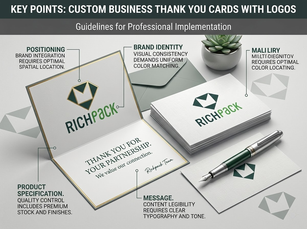
This guide helps you make the best cards by explaining logo spots and paper stock. We cover the right tone and print finishes for your business. We also show timing errors that ruin even the best cards. Marketing managers and account directors use these points to keep their clients happy.
Many brands focus on the note first and the logo last. This design error hurts how people remember your brand. Your logo is more than just art. It links the joy of a gift to your company name.
Placement depends on your goal for the card. Each spot sends a unique signal to the client. A logo on the front builds fast brand awareness. Putting it inside or on the back lets the note create a deeper bond first.
Logo placement affects how a client perceives the card. It may feel like a marketing tool or a warm gift, depending on the brand and relationship.
| Placement | Best For | Effect on the Recipient |
| Front cover, centered | Brand-first campaigns, corporate gifting | Immediate brand recognition; can feel promotional if overdone |
| Front cover, corner (small) | Premium/luxury packaging inserts | Elegant, understated — brand recall without hard sell |
| Inside, the bottom of the message panel | Personal, relationship-first tone | Logo seen after the message lands emotionally |
| Back of card | Subtle branding, referral-friendly | Clean front; brand visible when card is set face-down |
| Watermark inside panel | High-end stationery, jewelry brands | Sophisticated impression without visual clutter |
For jewelry brands, an inside logo or a watermark works best. It lets the client feel the emotion of the gift first. The logo then pairs with that good feeling.
Using a low-quality logo is a costly mistake in card printing. Check these steps before you send files to a printer:
If you have a white logo, ask for a test print on dark paper. Many logos are hard to read on dark backgrounds.
A simple rule for print is to keep the logo small. It should take up less than 20 percent of the card space. This leaves room for your note and white space. It keeps the tone soft and kind.
The design guides from Overnight Prints suggest placing the logo in a small corner or on the back. You can also use it as a watermark inside the card. This makes the card feel like a gift rather than an ad.
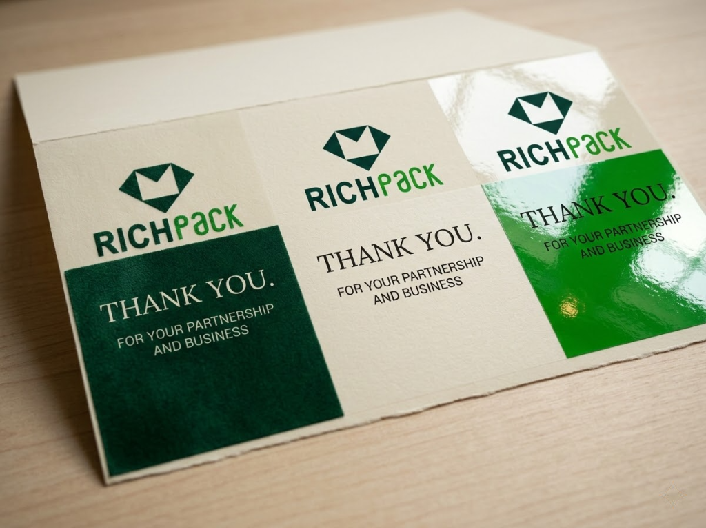
Not all cards need full color. Each choice has a different cost and look:
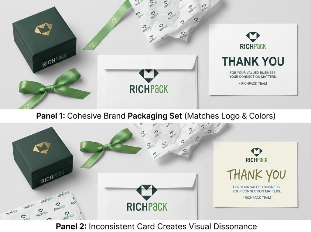
Your thank-you card is part of a larger story. A client may see a jewelry box, a ribbon, and a card. If the logos do not match, the brand looks weak. Check these points before you print:
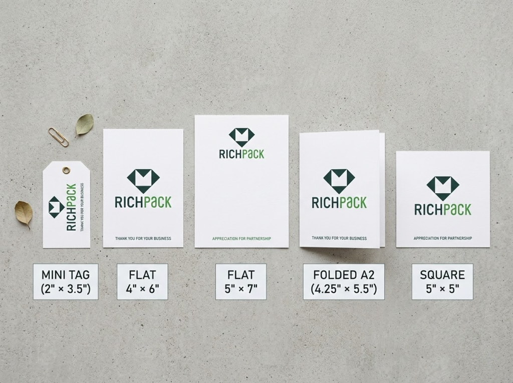
The card shape speaks before you write a word. Physical formats set the tone for your customers. A flat 4×6 card feels different than a folded A2 note. Both send a unique brand signal to the buyer.
Flat cards work well for large orders. They are quick to make. Folded cards offer more room for notes. These feel formal for business clients. Pick based on your goals and budget.
Most business cards use a 4×6 size. Jewelry boxes often use small 2×3.5 tags. Formal notes use A2 sizes. This table shows costs for 500 units.
| Format | Dimensions | Best Use Case | Price Range (per unit, 500 qty) |
| Flat card | 4×6 in / 5×7 in | E-commerce inserts, high-volume client sends | $0.08–$0.25 |
| Folded notecard (A2) | 4.25×5.5 in folded | Professional services, relationship-first sends | $0.20–$0.60 |
| Folded card (A6) | 4.75×6.5 in folded | Corporate gifting, retail packaging inserts | $0.25–$0.70 |
| Square card | 5×5 in | Creative industries, boutique brands | $0.20–$0.50 |
| Mini card/tag | 2×3.5 in | Product packaging, jewelry box inserts | $0.05–$0.15 |
Small cards fit best inside jewelry boxes. They do not need envelopes. This keeps the look clean for the customer.
Custom shapes like circles grab attention. They cost more to produce. Rectangles are faster to make. They are easy to store in bulk. They fit most envelopes. Use custom shapes only when the unique look fits your plan. These shapes take more time to make.
The envelope is what people see first. IgnitePOST brand guidelines suggest using colors or textures. This makes your mail look different from bills. Here are some options:
Do not leave the back of the card blank. Use that space well:
Measure your jewelry box before you design the card. A card that bends or folds to fit looks like a mistake. It should feel like a part of your brand. A 2×3.5 card works best for ring boxes. It sits flat and does not move.
Customers judge your brand the second they touch your card. Paper and finish choices drive that feeling. This matters most for jewelry boxes. The physical feel is part of the jewelry itself.
We measure paper weight in pounds (lb) or grams per square meter (gsm). Use these weights for thank you cards:
For jewelry box cards, a 100–110 lb cover works best. It feels expensive, but it fits standard box sizes. It does not add much weight to the package.
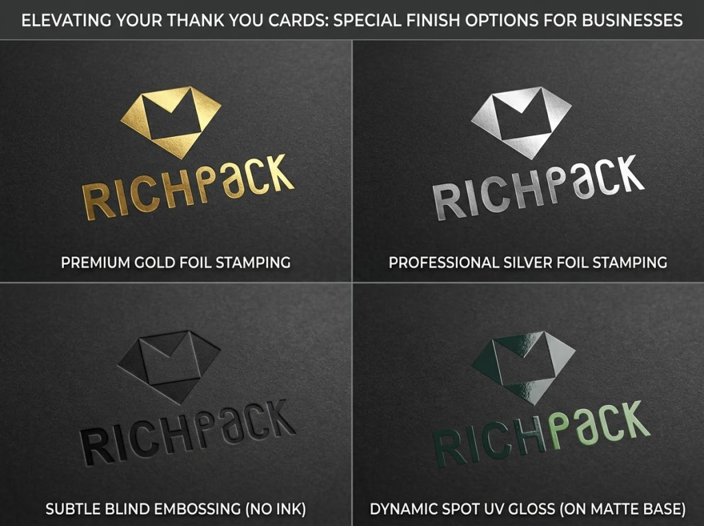
Finish choice is a key branding step. Many owners pick gloss to save money. This is a mistake. Soft-touch matte costs a bit more. It makes your brand look much better.
The table below shows each finish and how it feels. It also shows which brands should use them.
| Finish | Look & Feel | Best For | Handwriting Compatible? |
| Matte | Flat, non-reflective, sophisticated | Luxury, premium brands, soft color palettes | Yes — ideal for handwritten notes |
| Gloss UV | Shiny, vibrant colors, bold | E-commerce, bold design-forward brands | No — ink smears |
| Soft Touch / Velvet Matte | Velvety texture, highest tactile premium | Jewelry, fine goods, luxury retail inserts | Possible on uncoated areas |
| Silk | Semi-gloss, balanced | General business, mid-market brands | Partially — test before ordering |
| Uncoated | Natural paper feel, warm | Artisan, handcrafted, indie brands | Yes — best for full handwriting |
Soft-touch matte feels the most expensive for jewelry boxes. It looks great in photos for social media. It stays clean and does not show fingerprints.
These extra steps turn a card into a gift. People will want to keep it.
Green paper choices matter to buyers today. This is true for gifts and jewelry. Consider these options:
Premium packaging makes a client open your gift. The note inside builds the real bond. Many jewelry brands miss this chance. They use dull words that leave no mark. We can fix that now.
You might send 10 notes to VIPs. Or you might print 5,000 for web orders. This four-step plan works for both. It feels real without taking all day:
Tone is the most common error in gift notes. A B2B partner needs a different style than a retail buyer. Most shops use one dull template for all. This is a mistake. Use the table below to find the right voice for each person.
The right tone depends on the bond. A corporate gift needs a formal style. A retail unboxing note should feel warm. Use these examples to build your own.
| Business Context | Appropriate Tone | Example Closing Line |
| B2B corporate client | Formal, respectful, strategic | “We look forward to continuing this partnership.” |
| Retail/e-commerce customer | Warm, personal, celebratory | “We hope this brings you joy every time you wear it.” |
| Post-event or conference send | Energetic, brief, memorable | “It was great connecting — let’s talk soon.” |
| High-value VIP client | Exclusive, attentive, grateful | “Your continued trust means everything to our team.” |
| New customer (first purchase) | Welcoming, reassuring, excited | “Welcome to the family — we can’t wait to see what you choose next.” |
Hallmark Business Connections found a key fact. Physical cards raise client scores by 25 percent over digital notes. Real pen ink is best for top accounts. For large orders, a nice script font on thick paper works well. Just make sure the card feels like luxury.
For high-value accounts, a handwritten note deserves the time. For mid-tier buyers, a printed note with a real signature works fine.
Avoid these common errors to keep your note sincere:
A smart call to action helps the bond grow. It works when it adds value. Try these:
Your thank-you card must match your jewelry box and website. A mismatch feels off to your customers. They might not see why. But it makes your brand look less professional.
Use your official brand colors. Check your brand guide for these print values:
Ask for a printed proof if you use dark colors. Forest green and navy often look different on paper. Screen colors and print colors do not always match. This is vital before a large print run.
Check your font licenses. Many fonts only work for digital use. Ask your designer if you can use them for print. Try these options:
Pair a serif font for your brand name with a sans-serif font for the message. This looks clean for luxury jewelry brands. It shows you planned the design.
A small 4×6 card has little space. Use this order for your design:
White space is part of the design. It is not wasted space. Too many items on a card hide your logo. Keep it simple.
Create one design system for all your cards. This works for holiday and VIP cards. Do not design each one from scratch. Set these rules:
A great jewelry box card fails if it arrives late. It must reach the client quickly. Timing determines the emotional bond. This bond justifies your brand investment.
Some sales do not need a card. However, these seven moments offer the best results. They build strong ties with your buyers:
Marketing data shows a clear rule. Send a thank you within 48 hours. This has a better impact than a card sent a week later. For jewelry shops, put the card in the box. Do not mail it later.
For B2B firms, send the card within two days. Do this after a meeting or a signed deal. The moment fades after 72 hours.
You might have many clients. Sending a card for every sale is hard. Use a tiered plan instead:
For jewelry brands, put the card in the box. This makes the unboxing feel special. For services, mail the card separately. It shows more effort. Think about these options:
Most jewelry card errors occur during design, vendor talks, or planning. These slips cost money and time. They also damage your brand image.
This is a common production error. A logo looks sharp on a phone screen at 72 DPI. This same file looks blurry on paper. Ensure your files meet 300 DPI. Use CMYK color mode instead of RGB.
Buying too many cards is a risk. Large orders lower the cost per card. But brand styles change. You might end up with 3,000 old cards. Buy a 3 to 6-month supply. Only buy more if your design is final.
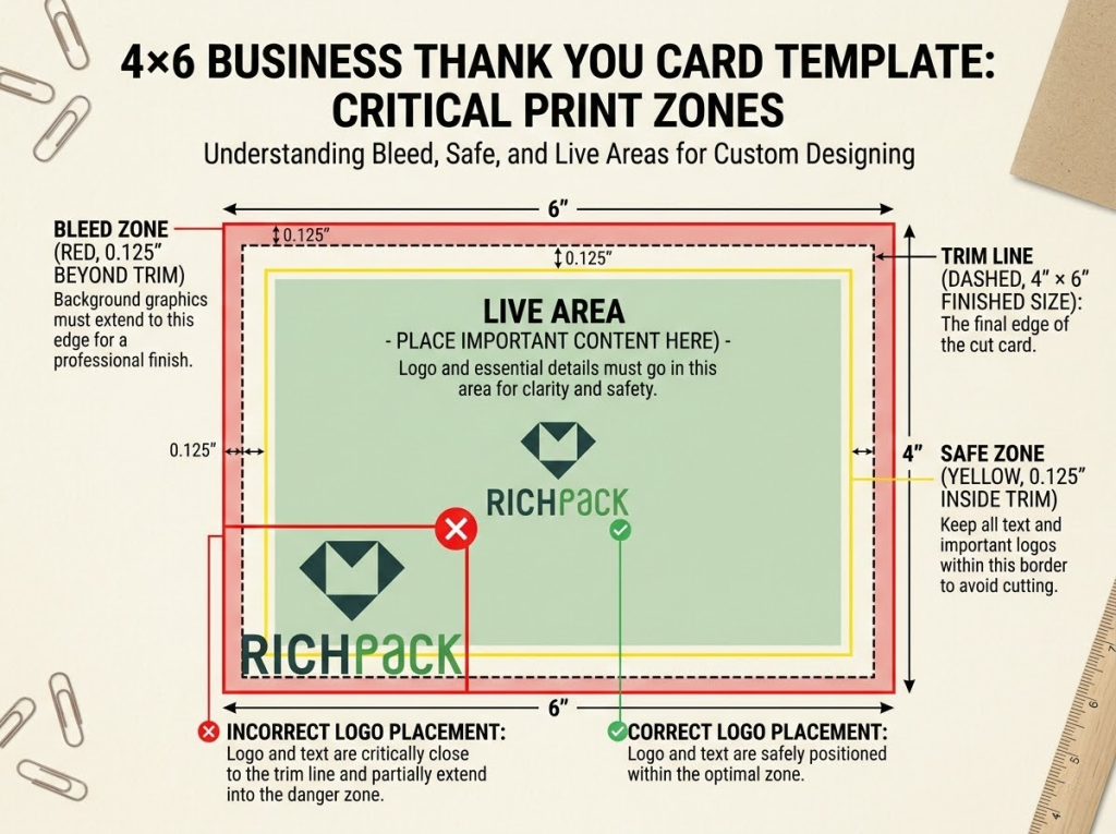
Printers need a 0.125-inch bleed. They also need a 0.125 to 0.25-inch safe zone. Keep your logo out of these areas. Content gets cut if you ignore these rules. Use the vendor template before you start.
Do not pick a finish based on price. Gloss UV is the cheapest choice. Yet, it looks poor for luxury jewelry brands. A matte card costs USD 0.05 more. This small cost adds great value to your brand.
Always ask for a printed proof. Digital screens do not show true colors. They also do not show paper feel. Physical proofs take 5 to 7 days. This wait prevents big errors. Fixing 2,000 bad cards costs much more.
Do not use online templates without changes. Clients notice generic text. Change the sentence style. Add details about your jewelry brand. Make sure the tone fits your firm. A form letter fails to build loyalty.
Match your card to your jewelry box. The card is part of the unboxing experience. Use the same fonts and colors. Use the same paper quality as the tissue wrap. Clashing styles look messy to buyers. Treat the card as part of the whole set.
Use vector files like .AI or .EPS for your logo. These files stay sharp at any size. If you do not have one, send a .PDF or .PNG. Make sure the file is 300 DPI at the final print size. Do not use logos from websites. Those files look blurry on paper.
Buy enough cards to last three to six months. Count how many orders or meetings you have each month. Multiply that number by six. Add 10 percent more for extra needs. Do not buy more than a year’s supply. Your brand style might change before you use all the cards.
Most brands use 4 by 6-inch flat cards. These fit in A6 envelopes. Service firms often pick 4.25 by 5.5-inch folded cards. Small box inserts are 2 by 3.5 inches. Pick your size based on your packaging needs before you finish the design.
Luxury brands often put logos on the back or inside. This lets the customer read your message first. If you want people to remember your brand, put a small logo in a corner. Do not put a large logo in the center of the front. It makes the card feel like an ad.
Jewelry brands often choose 100-pound cover stock for their cards. This heavy paper gives customers a high-end feel. A matte or velvet finish works well for unboxing videos. These finishes do not show fingerprints as glossy paper does. If your budget allows, add a foil logo. This detail creates a signature look that people will remember.
Use the person’s name and mention a detail from your meeting. This makes the note feel real. Write three to five short sentences. End with a friendly invite to stay in touch. Specific details show you care. Even printed cards feel warm when they are personal.
You can add a code, but put it on the back. Putting it in the main note makes it look like a sales pitch. Call it a gift instead of a discount. Say something like, “A small gift for you.” This keeps the focus on your thanks.
Printing takes five to ten business days. This starts after you approve the final proof. Rush orders cost 20 percent more. Plan for two weeks from order to delivery. If you want foil or special finishes, allow four weeks.
Custom cards with your logo help keep jewelry customers. Many brands do not use them well. This makes your brand stand out. Use high-quality logo files. Pick paper that matches your price. Write a personal note. Send the card within two days. These steps keep your card on a client’s desk. They stop the card from going into the trash.
We build full packaging sets for premium brands. We match cards, boxes, ribbons, and tissue. Our team makes sure everything looks like one system. Contact us to talk about your project.
Just submit your email to get exclusive offers (reply within 12 hours)
 PREV
PREV