 PREV
PREV
5 Best Helix Jewelry Packaging Solutions for Studs, Hoops & BarBells
2025-04-21


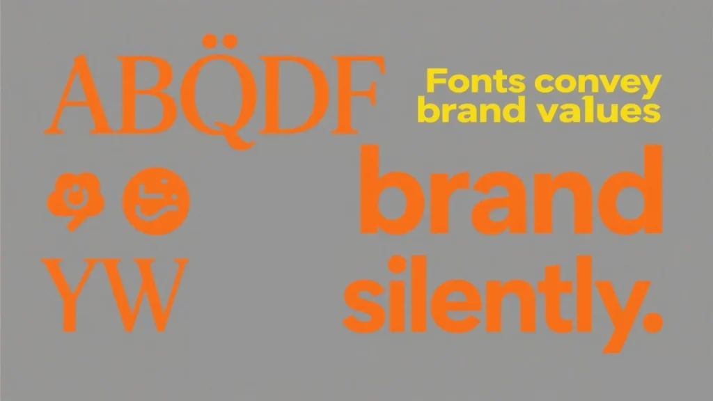
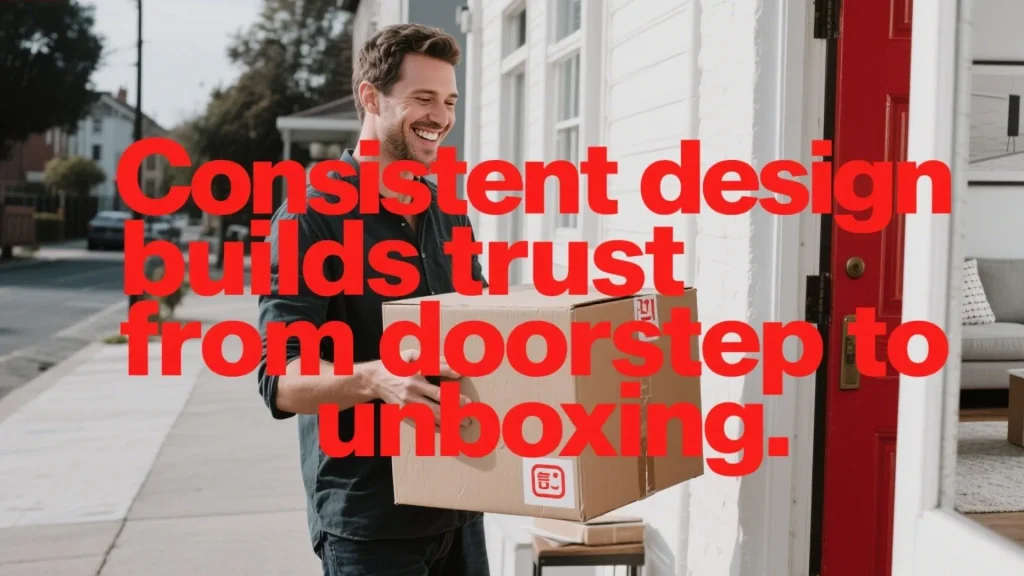
If a customer receives their eagerly awaited order. As they lift the lid, the first thing they notice is the bold, clean lettering on the white shipping boxes packaging. That split-second impression? It speaks volumes about who we are. Every curve of a letter and spacing between words becomes a silent ambassador for our values. We believe design is a handshake between brands and buyers. The fonts we choose whisper quality through crisp serifs, shout reliability with sturdy sans-serifs, and cradle sustainability in every ink choice. Our team spends hours pairing typefaces with textures because we know: when your fingers brush against eco-friendly materials, the visual harmony should feel intentional. This attention to detail backs our product guarantee. From recycled fibers to soy-based inks, every element works together. Even our shipping process—streamlined for speed—carries that same meticulous care. Why? Because consistency builds trust. When customers see cohesive design from doorstep to unboxing, they’re experiencing a promise kept.
· Typography transforms packaging into a brand storytelling tool
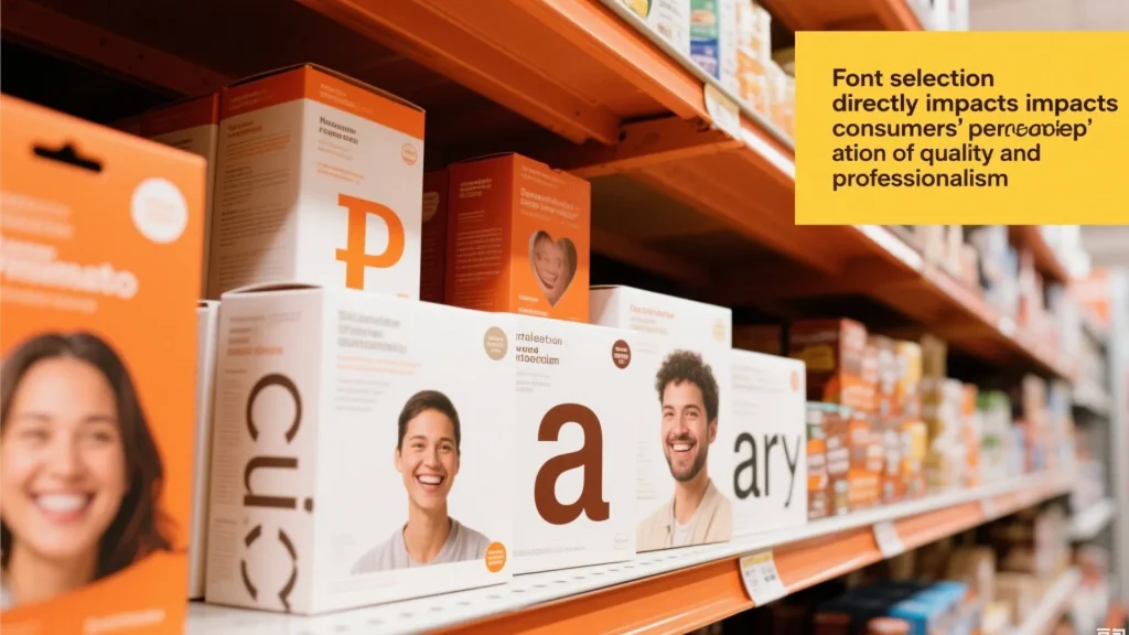
· Font choices directly influence perceptions of quality and professionalism
· Sustainable materials and design elements work together for eco-conscious impact
· Consistent visual language across touchpoints strengthens customer trust
· Strategic design elevates unboxing from routine to remarkable
Typography on packaging is a critical element, especially when it comes to white shipping boxes. These versatile containers, ranging from white corrugated shipping boxes to sleek retail designs, offer a clean canvas that can significantly amplify a brand’s message. The right font choices not only enhance readability but also serve as a powerful, silent brand ambassador, transforming an ordinary white box shipping experience into something memorable and impactful.
Here’s a deeper dive into choosing the best fonts for white shipping boxes design, focusing on readability and brand impact:
The pristine surface of a white shipping box provides an ideal backdrop for typography, allowing colours and letterforms to pop. However, this advantage can be lost if readability isn’t prioritised.
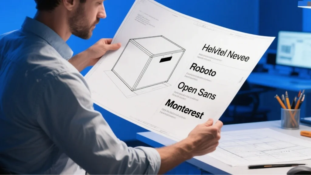
When selecting fonts for a white shipping box, think of yourself as an architect choosing materials. The goal is structural integrity for your message.
Sans-Serif for Modern Reliability: Sans-serif fonts, such as Helvetica Neue, Roboto, Open Sans, or Montserrat, are often preferred for their clean lines and modern aesthetic. Their simplicity makes them highly legible, even at smaller sizes or when viewed quickly, which is crucial for labels and essential information on a white corrugated shipping box. They convey a sense of professionalism, trustworthiness, and clarity.
Kerning and Spacing are Key: Regardless of the font chosen, meticulous attention to kerning (the space between individual letters) and leading (the space between lines of text) is paramount. Even the most legible font can become unreadable if characters are too close together or lines of text are cramped. Generous spacing on a white shipping box prevents visual clutter and ensures that vital details, such as product names, instructions, or ingredients, are easily digestible.
Testing Under Various Conditions: It’s not enough to simply choose a font on a screen. Our designers rigorously test fonts on actual white boxes for shipping under diverse lighting conditions. This ensures that the text remains perfectly legible whether the package is under bright store lights, in a dimly lit warehouse, or being unboxed by a customer in their home. Legibility isn’t just about aesthetic appeal; it’s a non-negotiable factor for customer confidence. When information on a white shipping box communicates clearly, buyers feel assured they’re receiving exactly what’s promised, reducing confusion and fostering trust. This is especially important for compliance and safety information.
Typography is the soul of your visual identity, especially on a white shipping box where it can take centre stage.
Custom Typefaces for Unique Storytelling: Consider developing a custom typeface. For instance, a custom typeface could mirror organic shapes found in recycled materials, tying sustainability directly to every letterform on your white corrugated shipping boxes. This deep alignment between design and values transforms the packaging into a cohesive and memorable brand statement.
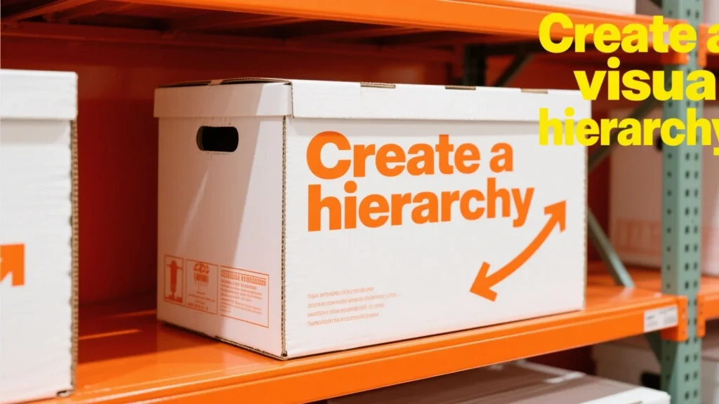
Establishing Visual Hierarchy: Effective design on a white shipping box uses typography to guide the eye. This means pairing bold, impactful headlines (e.g., product name, brand logo) with minimalist body text (e.g., product description, instructions). This creates a clear hierarchy of information, ensuring that customers quickly grasp the most important details before delving into the finer points.
Colour Contrast and Accessibility: While white shipping boxes offer excellent contrast, it’s crucial to ensure colour contrast ratios meet accessibility standards without sacrificing elegance. Black or dark contrasting colours against white are always a safe bet for maximum readability. However, strategic use of a brand’s colour palette can also create visual interest, provided the contrast remains high enough. For example, a deep navy or a rich charcoal can look sophisticated and highly legible against a crisp white background.
Amplifying Perceived Worth: The result of thoughtful typographic composition on white boxes for shipping is packaging that doesn’t just hold products; it amplifies their perceived worth. A well-designed white shipping box with clear, appealing typography speaks volumes about the quality and care put into the product inside. This attention to detail can elevate the unboxing experience and leave a lasting positive impression.
When choosing fonts for your white shipping box design, consider the following:
Print Method: The chosen font should be compatible with the printing method used for your bulk shipping boxes. Some intricate or thin fonts might not reproduce well with certain printing techniques (e.g., flexography on corrugated cardboard), leading to blurred or illegible text. Simpler, bolder fonts often perform better.
Durability and Wear: White corrugated shipping boxes undergo transit. Fonts should be robust enough to withstand potential scuffs and abrasions without losing legibility. Avoid overly delicate or extremely thin fonts for essential information.
Brand Consistency: The fonts chosen for your white shipping box should be consistent with your overall brand identity across all marketing materials. This reinforces brand recognition and1 creates a cohesive customer experience.
“Can I ship my package in a white box?” Absolutely! White shipping boxes are widely accepted by carriers like Royal Mail, DPD, Hermes, and ParcelForce, as long as they meet the carrier’s size and weight requirements and are properly sealed and labelled.
“Do you need the white box to ship priority mail?” For priority mail or any specific service, the requirement isn’t about the colour of the box but rather meeting the carrier’s packaging guidelines for dimensions, weight, and proper labelling. A white shipping box is perfectly acceptable if it adheres to these rules. Some carriers might offer specific co-branded packaging, but it’s not generally mandatory.
By carefully considering these aspects of typography, your white shipping box can become a powerful tool for brand communication, ensuring readability and making a significant brand impact.
Every unopened container tells two stories: what’s inside, and the care taken to deliver it. We craft our guarantees with the same precision as our packaging solutions, blending material excellence with environmental stewardship.
Three layers of inspection ensure every item meets strict durability standards. Teams test materials against extreme temperatures and impact scenarios—because reliability isn’t optional. Our 30-day satisfaction pledge allows hassle-free returns, reinforcing accountability through action. Digital tracking systems of Richpack gift box monitor each phase from production to delivery. This transparency lets customers verify quality markers in real time. When we say “protected,” we mean scientifically proven protection against moisture, crushing, and time.

Forests breathe easier thanks to our SFI-certified sourcing. Minimum 50% post-consumer fibers form the foundation of every solution—all fully recyclable. Even adhesives get scrutinized, with plant-based formulas replacing petroleum derivatives. Energy audits slash manufacturing emissions annually. Partner facilities share our zero-waste targets, creating circular systems that benefit both businesses and ecosystems. For account holders, this translates to carbon-neutral logistics without hidden fees.
If you want to learn about the environmentally friendly packaging trends and mainstream materials of white shipping boxes of sustainable jewelry brands, you can click here to read this article, which lists the top 10 environmentally friendly jewelry packaging solutions, covering material analysis and case practices such as recycled paper, degradable packing peanuts, and organic cotton bags, and also comes with a selection guide and future trend outlook to help you balance brand texture and environmental responsibility. Click here to unlock innovative inspiration for sustainable packaging!

Choices matter. By merging rigorous standards with renewable resources, we turn ordinary transactions into legacy-building partnerships. Trust isn’t printed—it’s proven through every sustainable layer.
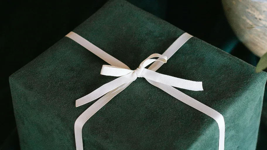
When receiving a package that feels like a gift before it’s even opened. Our team approaches container design as sensory storytelling—where form meets function in perfect harmony. Every crease and corner serves dual purposes: protecting contents while sparking delight.
We craft gift box solutions that balance elegance with endurance. Corrugated materials undergo stress tests to withstand 200-pound loads, while matte finishes resist scuffs during transit. Custom die-cut windows showcase products without compromising structural integrity.
Monthly feedback loops with retailers shape our prototypes. Logistics partners help refine dimensions for optimal pallet stacking. This collaborative process ensures designs exceed expectations for both protection and presentation.
Typography becomes texture when embossed lettering catches light. Recycled fibers receive water-based coatings that enhance durability without environmental guilt. These intentional choices transform utilitarian objects into brand ambassadors that customers proudly display.
Our latest white shipping boxes iteration reduced warehouse damages by 37% while increasing social media unboxing posts. Because true excellence isn’t just seen—it’s experienced through every secure delivery and shared moment.
At Richpack, we’ve shared how strategic typography choices become silent storytellers, merging clarity with brand essence. Our design process balances aesthetics with purpose, ensuring each element reflects your values.
Your trust fuels our innovation. Rigorous testing protocols and eco-conscious materials form the backbone of every solution we create. We stand by our product guarantee with transparent practices that protect both items and ecosystems. From font selection to renewable resources, each decision honors our shared responsibility to future generations.
Join us here in redefining what packaging achieves. Together, we’ll turn routine deliveries into moments that spark joy and build lasting connections. Because excellence isn’t a destination – it’s the standard we carry, layer by intentional layer.
2025-04-21
2025-04-12
2024-12-17
The study find that The 15% minimum recycling target for each packaging material was expected to be reached in all EU Member States except for plastics. This highlights a positive trend in packaging materials cost-benefit. Paper, glass, and metal are preferred for their recyclability. In this blog we’re here to guide you through the exciting world of packaging materials, where… Continue reading Best Fonts for White Shipping Boxes Design: Readability and Brand Impact
If you’re a jewelry brand or packaging designer, you may come across the terms of rigid and flexible packaging when choosing the packaging. As you can tell from its literal meaning, flexible packaging refers to a type of package whose shape can readily be changed when filled or during use. But what exactly is the… Continue reading Best Fonts for White Shipping Boxes Design: Readability and Brand Impact

Uncover how strategic material selection ensures exact dimensions, reduces transportation waste, and meets modern business needs across industries. Ideal for brands prioritizing quality, sustainability, and cost-effective packaging innovation.
Custom Sustainable Jewelry Boxes with Low Minimum Orders | Perfect for Small Jewelry Businesses Needing Green and Branded Packaging Solutions
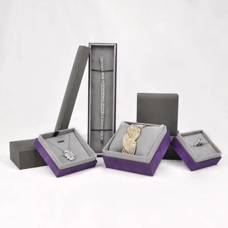
Sustainable Bulk Eco-Friendly Jewelry Packaging for Wholesale Buyers | Designed for Jewelry Wholesalers Focused on Green Packaging and Brand Consistency
Woven Gift Boxes – Fine woven gift boxes with exquisite craftsmanship & unique textures
Adorable Cute Packaging for Cosmetics to Elevate Your Brand – Customizable Designs for the Cosmetic Packaging Market by Richpack
View More
Affordable Custom Jewelry Boxes for Large Orders | Cost-Effective Packaging for Jewelry Brands and Retailers Richpack
View More
Birthday Gift Pack – Festive Treasures Bundled, a Cheerful Assortment for Birthday Euphoria
View MoreJust submit your email to get exclusive offers (reply within 12 hours)