 PREV
PREV

A Guide to Picking the Right Sizes for Custom Gift Boxes
2024-10-10

When you’re shopping, you find that the products with vivid colors are more attractive for you than those in dark tones. This suggests that color plays a crucial role in packaging design. But do you know how color psychology influences buying decisions and your business? Here, we will explore color psychology in packaging and how to apply the right colors to enhance the product’s appeal and increase brand recognition.

Color psychology studies how colors influence a customer’s behavior and decision-making. Certain colors will evoke specific feelings and memories and people will remember those feelings as a decision factor. Abigail Turner, a psychologist, notes that we assign meanings to colors based on emotions, memories, and social influences. These principles apply to packaging as well. For jewelry brands, it will make a big difference in marketing if you exert the impact of colors. Using the right colors in the product and its packaging, you can evoke specific emotions and create a lasting impression that aligns with your brand values.
In branding and packaging design, colors are more than just visual elements, they are a fundamental aspect of branding. Colors have psychological implications that can deliver the brand’s personality, values, and message to consumers.
Colors have a direct impact on consumer behavior. Studies have shown that 85 percent of shoppers name color as the main reason they purchase a product. This makes color selection an important factor in packaging design, especially for jewelry brands aiming to create an emotional connection with their audience.
The right colors can communicate your brand’s message and values at a glance, while the wrong choice may hamper the brand’s image. Like, a deep blue might convey trust and sophistication, while a vibrant red can signify passion and energy. For jewelry brands, it’s pivotal to select colors that not only attract your target audience but also reflect the essence of your brand.
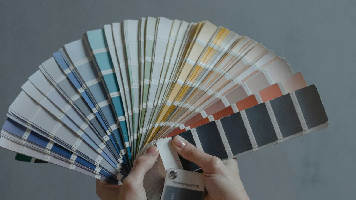
Before you choose the right palette for your jewelry packaging, it’s necessary to identify which colors are right for your brands. In general, these colors align with the following meanings.

Colors are crucial in recognizing and identifying the brand. Thus, it’s important to be consistent across all your packaging designs, like the logo, website visuals, and other marketing materials, not merely in the packaging.
Here are some successful jewelry brands that have mastered the art of using color in their packaging.

Selecting the right packaging colors for your jewelry brand requires a balance between understanding color psychology and aligning with your brand’s identity. Here are some factors to consider when selecting the right colors:
Determine which color can align with your brand values. Different colors can evoke different emotions from your customers. Therefore, choose the right color to align your brand personality and temperament. In addition, making sure to use the same color across marketing, for consistency will also strengthen brand recognition and loyalty.
Think of your brand as a person and ask yourself: How do you want your audience to perceive your brand? What values, interests, and emotions do you want to convey? How do you want to differentiate yourself from your competitors?
Understand the color preferences of your target audience. Try to figure out which kinds of colors may be appealing to them. You can conduct surveys or interviews with your target audience to gather insights on their color preferences and associations.
It is vital to know who your ideal customer is and what they expect from your brand. Your target audience is the one that is most likely to purchase your products or services, having some common characteristics, needs, and preferences. You may rely on such tools as surveys or interviews for you to develop a comprehensive profile of your target market. Demographics, psychological traits, behaviors, pain points, and goals should be considered in this case. By knowing who your target audience is you can choose colors that will appeal to them as well as align with their value system.
For instance, Tiffany’s choice of “Tiffany Blue” represents youthfulness, fashion as well as vitality thus leaving people with a fresh look at various brands.

Analyze data from previous marketing campaigns and sales to identify which colors were most effective in appealing to your audience.
For jewelry packaging brands, A/B testing is particularly vital. First, two boxes for jewelry can be created with different color schemes.
For instance, scheme A involves the use of a classic black and gold combination. The black background emphasizes secrecy and nobility while the golden ornamental lines add a touch of luxury, signifying how precious and eternal jewels are.
Plan B picks out pure fresh light blue plus silver mix-up; light blue packaging design offers one an impression of calmness and elegance while silver trimming looks like shining stars representing purity and brilliance of jewelry.
In monitoring audience engagement, there are several ways to accomplish that. Such pictures can be shared on social media platforms like Instagram with its likes, comments, and shares tracking feature. For instance, let users vote on Instagram which version they prefer to have in their hands asking them to provide a reason behind their choice in the comments section. People can also use data analysis tools to measure the time that a person spends viewing the picture as well as the rates at which people click on it to determine the most effective image versions for user attention.
Study competitor packaging designs and look at which colors they use, and how it affects their branding and product perception.
Apply color psychology to your packaging design. Understand how specific colors elicit different emotions or perceptions in consumers. Moreover, brands ought to keep an eye on color trends in the industry and incorporate color trends into further packaging
In summary, color is a powerful tool for brand marketing. By choosing the right colors, brands can influence customers’ perceptions, drive purchasing decisions, further create brand recognition, and differentiate themselves from competitors.
For jewelry brands, it’s a simple yet effective way to distinguish themselves from others by understanding and utilizing color psychology to create appealing packaging. So you may need to customize your packaging from colors to every detail. Richpack is a great helper that offers competitive jewelry packaging solutions with custom options like materials, colors, and techniques.
Whether you want solid-color boxes or colorful jewelry packaging, we are here to help with our comprehensive solutions. Building a powerful packaging for your brand starts here.
Color is the first language to communicate with consumers, but successful packaging requires integrating color, material, structure, and brand story. Our Packaging Design Full Guide explores how to systematically build this impact.
2024-10-10
2024-10-28
2024-10-25
Did you know that 72% of consumers say that packaging design influences their purchase decisions? In the jewelry industry, where brand image and uniqueness are paramount, packaging can make all the difference. In this article, we will delve into the top 10 customizable jewelry packaging options. These options will enable your brand to convey its… Continue reading Color Psychology and its Power in Jewelry Packaging
Every piece of jewelry is a one-of-a-kind work of art, deserving the utmost care. At Richpack, we specialize in creating custom jewelry boxes that not only present your brand but also provide solid protection. In this article, we’ll take you behind the scenes of our quality control process and show you how we ensure that every… Continue reading Color Psychology and its Power in Jewelry Packaging
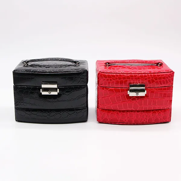
Compact Travel Jewelry Cases with Secure Closures | Perfect for Jewelry Merchants Needing Safe and Space-Saving Travel Storage
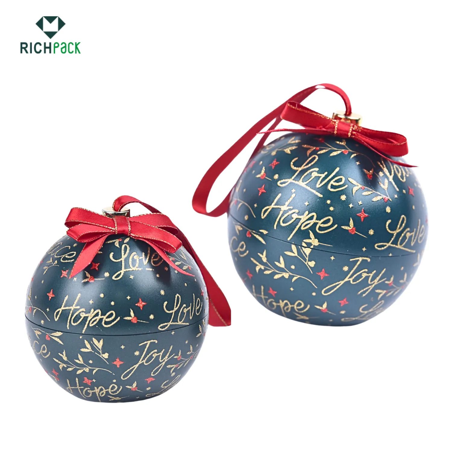
Creative Christmas Gift Boxes Ideas From Richpack | Custom Holiday Gift Box Solutions for Retail and Event Gifting Personalized Design & Fast Delivery
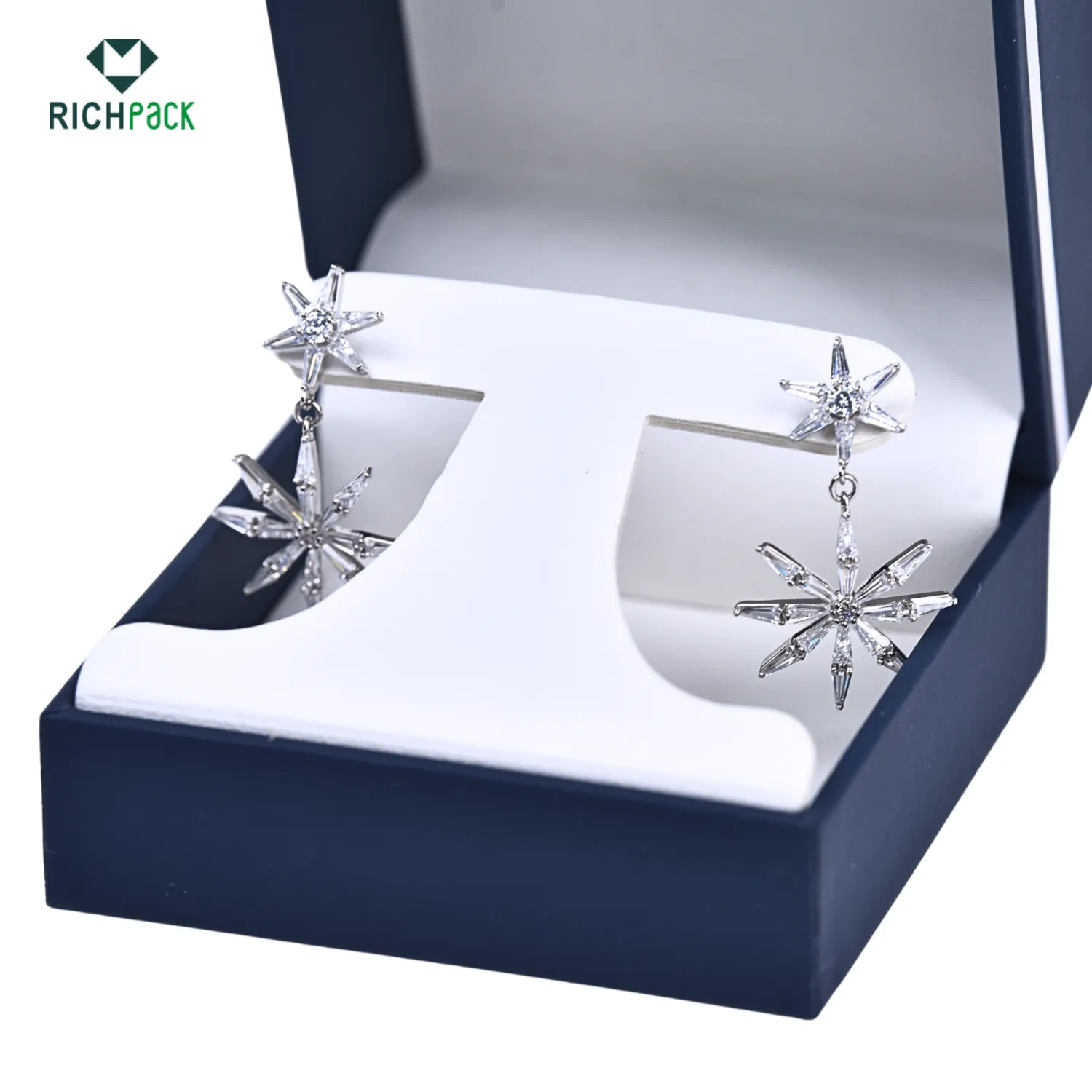
Creative Earring Packaging Design from Richpack | Innovative Jewelry Packaging Ideas for Modern Retailers Dealers & Distributors
Biodegradable Jewelry Boxes for High-End Jewelry Collections | Designed for Premium Brands Focused on Sustainable and Elegant Packaging
View More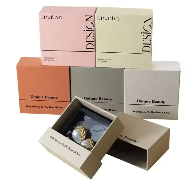
Branded and Sustainable Custom Eco-Friendly Jewelry Packaging with Brand Logo | Tailored for Jewelry Brands Needing Personalized and Green Packaging
View More
Christmas Cookie Gift Boxes with Personalized Holiday Greetings Custom Festive Packaging | Perfect for Seasonal Gifting Richpack
View MoreJust submit your email to get exclusive offers (reply within 12 hours)