
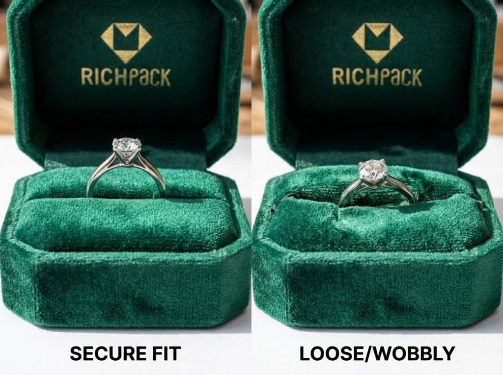
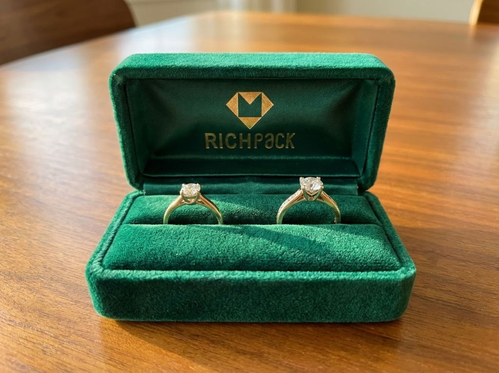
The most awkward scene I’ve ever witnessed is when a customer opens the box right there on the spot—the ring jiggles around loose in its holder. Under the light, the velvet looks dull and gray—like an old rag. You’re smiling on the surface, but inside your head, you’re already calculating the return costs for that order and the repeat business you’ll lose because of it.
But the real problem isn’t whether it’s a “vintage style” or not. It’s that you left out critical standards from your procurement list: proper sizing, velvet durability, color difference checks, and the lifespan of the box’s opening and closing mechanism.
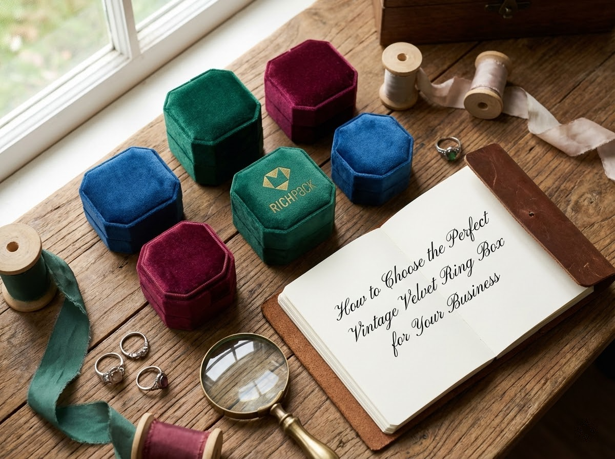
In this guide, we’ll break down how to choose the highest-quality vintage velvet ring boxes for your business, covering several key areas.
When selecting a vintage velvet ring box, we’re not just picking a container to hold a ring. We’re selecting a reliable product that consistently performs perfectly every time.
This reliability shows in three key ways:
Follow this mindset. Stick to these six simple steps, and you’ll turn “vintage charm” into clear, repeatable standards—standards that are easy to inspect and use over and over again.
From my experience working with hundreds of brands, I’ve found that most choose the wrong boxes because they mix up different usage scenarios when placing orders.
Most brands fail to consider factors like portability for proposals, use at wedding venues, in-store handoffs, and e-commerce shipping. Each scenario has completely different needs.
First, we need to define the usage scenarios clearly. Once that’s done, choosing the box’s structure and materials will be a breeze.
“Vintage” isn’t just about color. What truly makes a vintage style feel high-end is the combination of elements like color tone, hardware, shape, and texture.
Break these elements down, and your team will never waste a whole night arguing over subjective questions like “Does this look vintage enough?”
My advice is to create a “vintage element checklist” to align everyone’s judgment:
Velvet fabric determines the upper limit of texture, while structure affects durability. Focusing on only one will cost you dearly in returns and rework down the line.
Avoid problems upfront with these three quick checks:
Because of these velvet surface issues, later in the guide, I’ll give you a repeatable testing process to “identify high-quality velvet fabrics.” Your quality control team can use it directly.
The most common reason for reworks in custom ring boxes isn’t that factories don’t want to do a good job. It’s that you place information in the wrong spots.
From past collaborations, I’ve learned that the outer lid should focus on setting the mood and showcasing texture. The inner lid, on the other hand, is perfect for displaying details and small text. This design not only looks more “vintage” but also feels more sturdy.
When providing materials to your supplier, prepare at least these items (the clearer the details, the more cost you’ll save):
You can think of durability as “return-proof design.” Return policies don’t read like lengthy essays. Instead, they list specific problem types: pilling fabric, fading colors, dents, loose rings, and shipping damage.
If you list these risk points in your inspection standards upfront, suppliers will naturally deliver products that meet your requirements.
I recommend focusing on three key metrics:
There’s no “best” process—only the right one that fits the velvet material’s characteristics, logo complexity, budget, and delivery timeline.
Master this decision-making logic first, and the later process section will cover the specific methods.
Use this basic evaluation criteria:
In the later quality standards section, we’ll provide a checklist you can copy directly into your RFQ or contract. This way, you’ll never have to inspect products based on “feel” alone.
For brands, nothing damages your image more than a cracked box—not even close. What truly hurts is “bald spots” on the velvet surface. When customers touch it, the fibers flatten and turn white. This instantly ruins the vintage luxury vibe you’re trying to create, making the box look like a “cheap prop.”
If your vintage velvet ring box uses velvet on the inside, this chapter will help you turn “good touch” into measurable standards.
When judging velvet quality, start with two checks: how smooth it is, and how well it bounces back after being pressed.
Low-density velvet has a frustrating problem—it shows obvious signs of wear after just a week of being touched on store counters.
On the contrary, high-density velvet with neatly arranged fibers shows a clear texture direction when you run your finger across it.
Ask your supplier to provide sample proof in this simple way (a smartphone photo works fine):
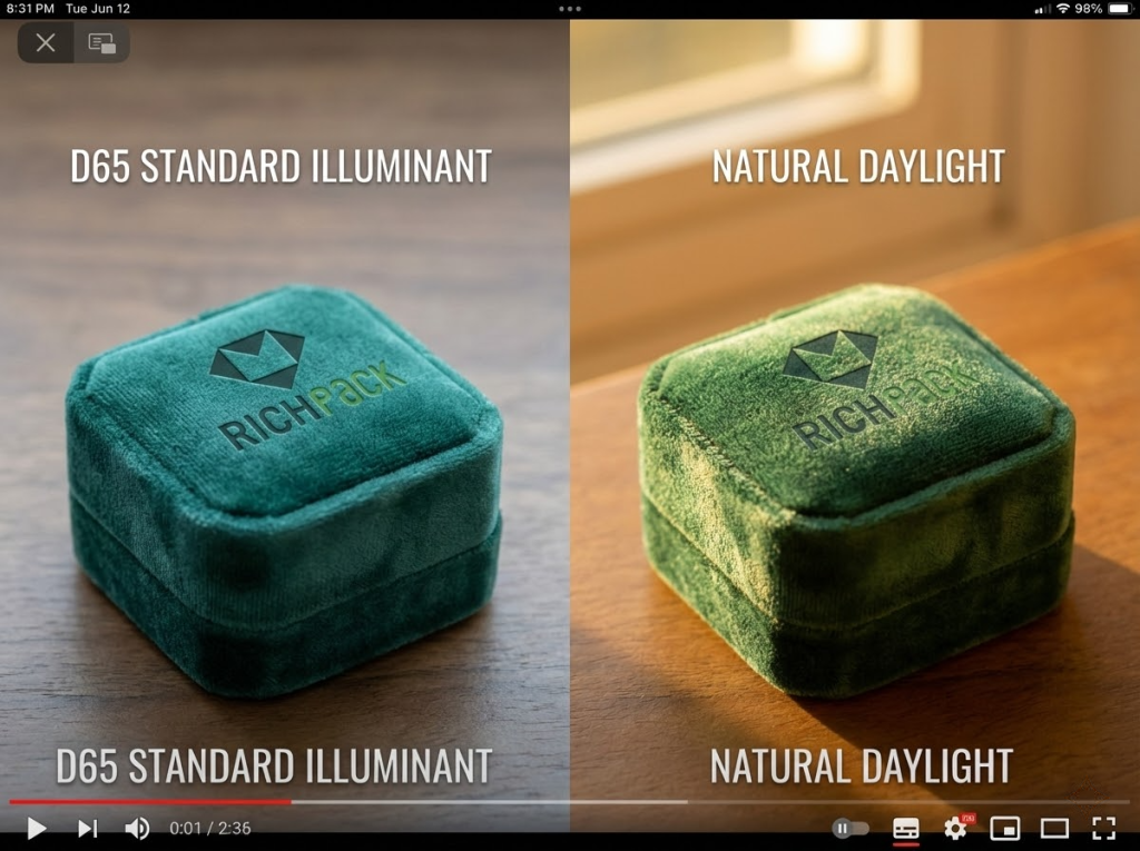
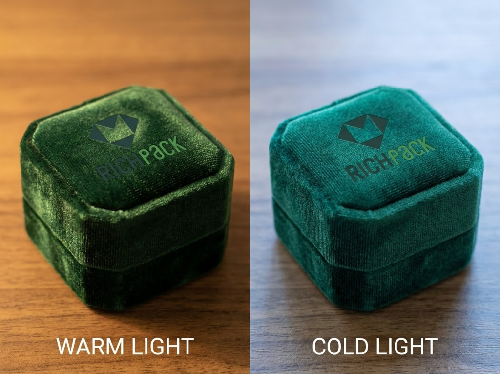
Looking overly pale under light is the most common reason products look cheap. Many buyers only inspect samples under the cold white light of their office. But when the products arrive at stores with warm lighting or under photography lights, they look terrible.
Because of this risk, ask suppliers to provide photos or short videos taken under D65 standard light source. This way, what you see will match exactly what customers see.
Do these three things to avoid problems upfront:
Team members often disagree on “texture.” Some say a fabric feels smooth; others think it feels dry. These arguments usually devolve into subjective preference battles.
But I prefer to turn texture descriptions into a shared vocabulary. This way, buyers, brand teams, and quality control staff can communicate using consistent standards.
Here’s the “texture description checklist” I use (feel free to adopt it):
This method is easy to implement. When inspecting samples from the same batch, rate each texture characteristic on a scale of 1 to 5. Then add a rule to your internal standards: Any item scoring below 3 requires re-inspection or material replacement. This way, during negotiations, you can say “the score doesn’t meet standards” instead of “I don’t like how it feels.”
Shedding and fading always lead to customer complaints: Fibers sticking to rings, color transferring to white shirts, and linings getting ruined with a simple wipe.
You don’t need fancy tools to spot 80% of these risks. Just ask your supplier to perform three “low-cost but high-value” tests—and make sure they take photos to document the results.
You can rate the results using a simple A/B/C grading system (it’s practical and easy to use):
Scoring standards (can be added to inspection rules):
Static electricity attracting dust is a hidden problem in dry regions. Once velvet gets dusty, it immediately looks “dirtier”—no matter how good the design is.
You don’t need to overcomplicate this. The key is to make suppliers prove that “this velvet maintains consistent quality with every delivery,” instead of just giving you vague claims like “it’s eco-friendly treated.”
I recommend adding two practical requirements to your RFQ:
This is where Richpack acts as a “strategic partner”: we turn fabric sources, production batches, and inspection records into traceable documents. This way, every time you reorder, you won’t have to start from scratch or guess.
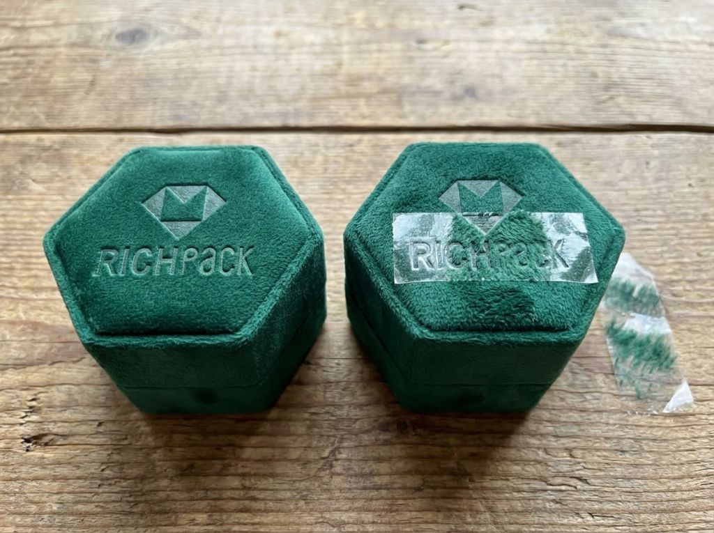
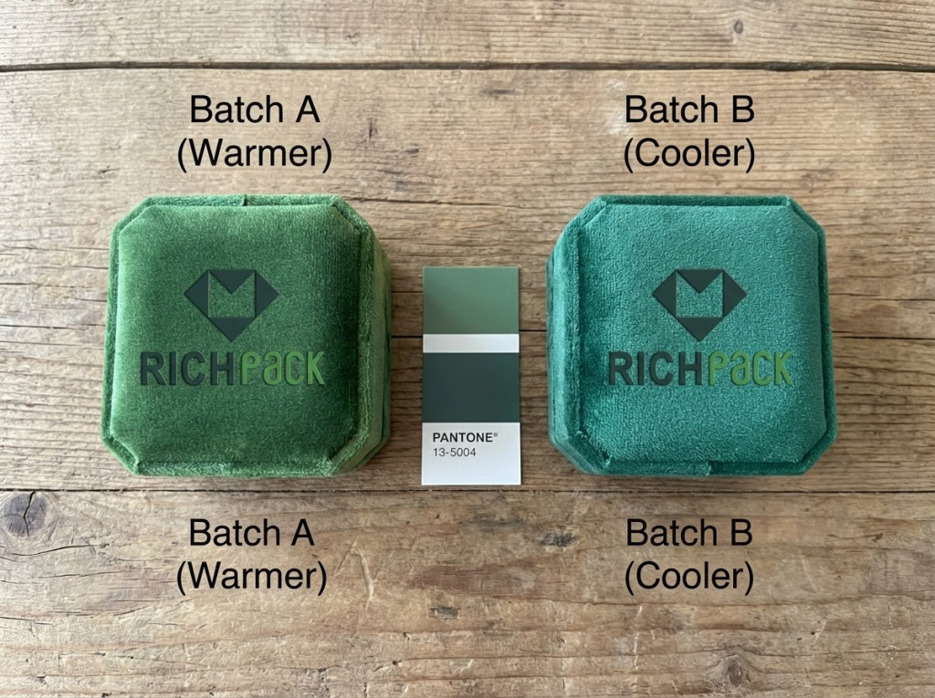
One of the most unfair rework incidents I’ve seen went like this: A sample looked like gemstone blue under the cold white office light.
But when the entire batch arrived at the store, warm lighting turned it purple. The vintage style was completely ruined.
To make things worse, the direction of the velvet fibers splits the same color into light and dark shades. Customers would think you sent the wrong product. Because of these velvet characteristics, stop choosing colors based on swatches—use standardized processes and inspection standards instead.
Warm store lighting turns blue tones purple and gray tones yellow. Cool photography lighting makes burgundy look almost black. What you see on computer color swatches is the “ideal color”; what customers see at the counter and through camera lenses is the “actual color.”
So the first step in choosing a color isn’t picking your favorite shade. It’s determining the lighting conditions you use most often.
You can have your team complete this quick task (takes about 30 minutes):
I’ve found that most color discrepancy disputes aren’t caused by factories cutting corners on materials intentionally. They happen because your internal approval process is chaotic.
Person A takes photos with a smartphone; Person B inspects samples under office lighting; Person C takes samples home and thinks they look better under a desk lamp.
In the end, no one can clearly say: “This is the exact blue we approved.”
But if you standardize the process, suppliers will be much more willing to follow your standards.
I recommend turning your “sample approval process” into fixed steps—the more routine, the better:
There’s no need to debate ΔE (color difference formula) here. Remember: “No process means no consistency.” So in your “custom/wholesale guidelines” section, you can add ΔE and the Golden Sample to your contract terms.
Everyone takes the first sample very seriously. But actual risks usually appear during the second reorder. Why? Because even small changes—like switching fabric batches, dye batches, or even seasonal humidity variations—can cause “subtle, unnoticed color shifts.”
But here’s the truth: you don’t care how much the color shifts. You only care that “this batch doesn’t look like the last one.”
I recommend specifying three things in your cooperation agreement upfront—even if you’re only placing a small trial order:
Just imagine this scenario: you place two batches of boxes under the same counter lighting, and you can immediately tell “they don’t belong to the same series.” If this happens, all the money you’ve invested in your brand will go down the drain.
The most troublesome problem in production isn’t printing errors. Its designs are destined to fail in mass production from the start: samples look perfect, but when scaled up, thin lines turn into blobs, gold edges peel off, and low yield rates even cause delayed deliveries.
Our process guide states this clearly: if the velvet fiber height doesn’t match the production process, the final product will definitely fail, resulting in “blurry patterns, fragile textures, and inconsistent quality.”
When choosing a printing process, focus on just one question: do you prioritize “vintage texture” or “multi-color reproduction”?
Our recommendations also emphasize that this is about “physical compatibility.” Don’t fight against the physical properties of velvet—work with them instead.
Use this “either/or” guide to make quick decisions (then consider the budget/delivery/volume triangle):
Here’s the reality of budget, delivery, and volume: processes that require molds or longer preparation times may have more stable unit costs. Mold-free processes can produce samples faster, but they have stricter requirements for velvet surface structure and edges.
Velvet material problems follow clear patterns. Avoid these issues upfront, and you’ll cut your troubles in half.
Printing small text directly on velvet outer surfaces is extremely risky. Velvet fibers blur the ink and edges, resulting in a messy, smudged look.
Here are the three most common high-risk areas (you can list these as “prohibited items” directly in your RFQ):
If you must use complex logos, here’s a practical alternative: “don’t print them on velvet.” You can display detailed information on the inner lid or metal plates, and only keep the core logo on the velvet outer lid.
When inspecting samples, focus on one thing: can this sample be consistently replicated in mass production?
We usually give the same advice to partner brands. When placing bulk orders, small mistakes aren’t about “looking good or bad”—they’re supply chain accidents.
You can use the “3 samples + 1 record” method to control the production process:
A final reminder: if your inspection standards say “good enough is fine,” your mass-produced products will only give you “good enough” results. On the other hand, if you list key metrics in your inspection checklist, factories will find it much easier to ensure consistent results.
Pro tip: If you want to learn more about “How to Choose the Best Printing Method for a Custom Velvet Ring Box?“, check out this article.
The main reason many brands fail isn’t choosing the wrong materials—it’s using the wrong box type. Physical stores use display trays for in-store handoffs; online sellers use irregular boxes for shipping. In the end, returns and exchanges eat up all profits.
But on the flip side, if you treat box types as “scene-specific tools,” every box type has its purpose.
Below, I’ll analyze these options using the same four criteria. This way, you can compare them directly and make informed choices—no more guessing based on feel.
Procurement tips (opening/closing/inner holder/packaging):
Procurement tips (opening/closing/inner holder/packaging):
Procurement tips (opening/closing/inner holder/packaging):
Procurement tips (opening/closing/inner holder/packaging):
Procurement tips (opening/closing/inner holder/packaging):
Procurement tips (opening/closing/inner holder/packaging):
Procurement tips (opening/closing/inner holder/packaging):
Procurement tips (opening/closing/inner holder/packaging):
Procurement tips (opening/closing/inner holder/packaging):
| Business Scenario | Default Recommended Variant | The Biggest Risk (The Most Common Failure Point) | Recommended Process (Separate Layers for Outer Cover/Inner Cover) |
| Proposal Portable Box (Pocket-Sized/one-Hand Opening) | Single Ring + With Lid/Flip-Top | The ring wobbles inside the inner holder. The corners get crushed from shipping or being squeezed in a pocket. The magnetic closure is too loose and pops open. | Outer cover: Debossing or small-area hot foil stamping (for a retro texture) Inner cover: Print small text/dates on the inner cover via silk screening or sticker (to prevent smudging of small text on suede surfaces) |
| Wedding Ceremony (Wedding Ring Display) | Double Ring Groove + Flip-Top | The two rings tap against each other. The display angle is unsteady. The “click” sound from opening and closing disrupts the ceremony. | Outer cover: Press concave/foil stamping (stable, durable, and good-looking) Inner cover: Oath/date/small text on the inner cover (information layer separated from touch layer) |
| Store Delivery (High-Frequency Counter Opening and Closing) | Square + Flip-Top | The edges are faded from wear; The opening and closing lifespan is insufficient; The suede surface has developed indentations and flattening from being touched. | Outer cover: Embossing is preferred, followed by gold stamping (more friction-resistant). Inner cover: Screen printing or gold stamping for information (stable and suitable for repeat orders). |
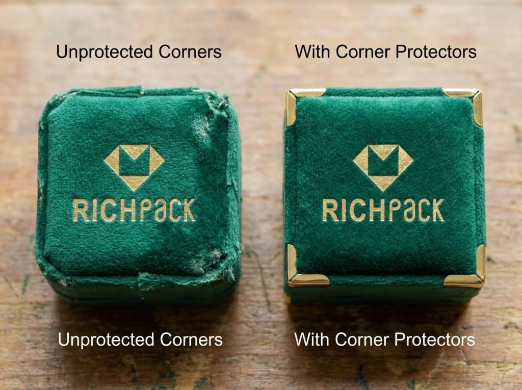
| E-Commerce Shipping (Express Delivery / Sea Freight) | Square + Single Ring | The box collapses due to insufficient pressure resistance; The ring is misaligned; The suede turns “white” because of wear and tear. | Outer cover: Use embossing or small-area hot stamping as much as possible (reduce large-area coverage). Inner cover: Move the information layer inward; also require corner protectors/positioning trays for the outer carton. |
| Gift Set (High Premium Price / Unboxing Experience) | Hexagon/Octagon + Flip-Top | Multi-angle wear; Misalignment when closing the lid; Edge peeling from the crafting process. | Outer cover: Press concave + antique gold stamping (marked with “vintage but premium”) Inner cover: Place multi-color elements on the inner cover (to reduce the failure rate of the outer cover) |
| Co-branded/Limited Edition (Strong Memory Points) | Alien/Custom Shape | Curved surfaces and joint seams lower production yield. Delivery dates shift. Inconsistencies between batches are the most obvious issue. | Outer cover: Prioritize embossing (more tolerant to curved surfaces). Control the area and position for gold stamping. Inner cover: Place complex patterns/gradients on the inner cover or add a metal nameplate (stable). |
| Inventory for Distribution/wholesaling (With Many SKUs and Frequent Reorders) | Square + Multiple Slots | Slot tolerances are inconsistent (some are loose, some are tight); Quality inspection costs have skyrocketed; There are color differences in repeat orders. | Outer cover: Press concave/foil stamping (more stable for repeat orders) Inner cover: Unified information template (consistent for bulk production) + enhanced sealed samples/repeat order standards |
| Photography/Social Media Content (Display as Priority) | Open/Display Tray | Dust/friction; The ring slips off; Not suitable for direct shipment. | Appearance: Minimize the outer cover process. Focus on the texture and anti-slip feature of the tray. Recommendations: Use only for display/photography. Secondary packaging is required for shipment. |
The most common “bulk order problems” aren’t poor designs—they’re the lack of clear, repeatable standards. Samples look great, but when bulk orders arrive, problems like color discrepancies, loose fibers, tight/loose closures, and unstable internal supports all pop up at once.
I’ve found that many brands often underestimate the costs of velvet-related projects. The core issue is “consistency across reorders.” Problems with the first order can be fixed, but fading or color changes in the second reorder will only make your supply chain look unreliable.
Richpack’s solution is straightforward: lock in fabric batches for long-term cooperative customers. We even recommend that customers purchase enough fabric for the entire year’s needs upfront and store it with us. This completely avoids color discrepancies during reorders.
You can refine fabric control into three strict requirements (these can be written directly into contracts):
When it comes to packaging structure, I usually give this reminder: you’re selling rings, not boxes.
But most return problems actually stem from the box itself. E-commerce shipping and in-store handoffs have completely different structural requirements—never use the same structure for all scenarios.
If your products need to be shipped online, add these three requirements to your specifications:
I once worked with an anonymous client whose sample boxes felt “sturdy and solid” in hand. But after bulk orders arrived by sea, all box corners were dented, and the velvet had turned white. This wasn’t because the factory cut corners on materials—it was because the client failed to specify “outer box proportions” and “secondary packaging cushioning” requirements. So the supplier simply delivered the cheapest version possible.
Writing “easy to use/usable” when describing functional features is equivalent to saying nothing useful at all. During procurement, what we really care about is checkout efficiency, SKU management, and employee productivity.
Choosing an embedded layout essentially means choosing “display efficiency per square foot” and “inventory checking error rates.”
We recommend writing embedded design specifications as actionable details:
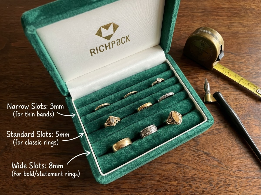
If you’re responsible for product lines like vintage ring jewelry boxes that focus more on “storage + display,” you’ll need to further consider functional aspects like partition design, drawer smoothness, and long-term durability.
One of the most costly types of custom reworks is “unclear document descriptions + endless revisions.”
You can organize brand information into layers: the outer lid should focus on showcasing texture and mood. Try to place information layers (small text, slogans, website URLs) on inner pages or flat surfaces. Don’t fight against the physical properties of velvet materials.
Here’s a document delivery checklist for suppliers (missing even one item can easily cause problems):
If you want a vintage style, we don’t recommend using glossy UV coatings—they look jarring and out of place. Better options are vintage gold foil stamping or deep embossing processes.
I view the sampling process as “supply chain insurance.” If you only check whether a sample looks good once, mass production will teach you a harsh lesson through rework. On the contrary, clear processes make suppliers more willing to cooperate because responsibilities are clearly defined.
We recommend adopting this three-step process (each step must clearly specify “who signs off, what to inspect, and how to keep records”):
Here’s a practical tip: ask suppliers to record process parameters and material batches—even if they’re only for internal use. You’re not trying to make trouble for the factory; you’re buying insurance for “consistency across reorders.”
You can copy this checklist directly into your Request for Quotation (RFQ) or contract. Its purpose isn’t to “find fault”—it’s to tell suppliers that you need consistent, repeatable delivery quality, not just a one-time perfect sample.
Quality Inspection Checklist (recommended to adopt AQL sampling standards)
If you only remember three things, these three will be enough to build a stable reorder business for vintage velvet ring boxes: size compatibility, color consistency, and production yield + quality control (QC).
Poor size compatibility causes rings to jiggle when boxes are opened on counters—completely ruining customer experience. Poor color consistency makes customers feel like you’ve switched suppliers when they reorder. Ignoring production processes and quality control eats away at profits bit by bit through reworks, restocks, and delayed deliveries.
On the flip side, turning these three points into actionable standards transforms your supply chain from “luck-based” to “predictable.”
Now, you can take three actions that deliver results (and save communication costs):
If you want to simplify this process even further, Richpack doesn’t just “sell you boxes.” We integrate styles, materials, processes, sample confirmation, and reorder consistency into a traceable delivery system. You just need to tell us your usage scenarios (store, wedding, e-commerce shipping), target minimum order quantity (MOQ), and budget range—and we’ll work backwards to provide more stable specification recommendations and sample production plans.
Just submit your email to get exclusive offers (reply within 12 hours)
 PREV
PREV