


 PREV
PREV
10 Creative Ideas for Personalized Wedding Thank You Cards
2026-03-20
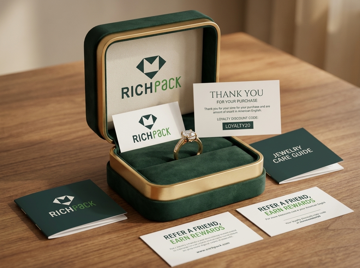



A jewelry box can look polished and still lose the customer after the lid opens. The card may be buried, the next step may be unclear, or the piece may sit loose inside the box.
For a 2026 packaging run, approve one physical sample with the real jewelry, card, box, and outer shipper before printing a larger batch. The best Packaging Inserts give the customer one useful reason to act, return, care for the piece, or remember the brand.
By the end, you can choose one insert goal and match it to a jewelry purchase. You can also check the card against the box and protective insert, then prepare a sample brief for post-launch measurement.
Use this table to narrow the idea before writing copy. Pick the row that matches the customer moment, then give that insert one primary action.
| Idea | Primary customer action | Jewelry use | Suggested format | First signal to track |
| Personal thank-you note | Feel recognized | First order, gift order, or high-touch launch | Flat card or variable note | Repeat order or support response |
| Next-order offer | Return to the store | Matching pieces, replenishment, or gifting cycle | Coupon card or QR card | Code redemption |
| Loyalty or membership prompt | Join or use the program | VIP tiers, early access, or points | Small card or QR card | Enrollment or member action |
| Review or referral request | Share feedback or recommend | Post-unboxing review or gifting referral | QR card | Review or referral completion |
| Related-product card | Explore a relevant next piece | Chain and pendant, ring stack, or collection drop | Mini catalog card or folded insert | Click or assisted purchase |
| Jewelry care card | Use and store the piece properly | Metal, clasp, chain, earring, or storage guidance | Care card or foldout | Care-question change |
| Brand story or maker note | Remember and trust the brand | Craft, design, material, or origin detail | Story card or premium note | Direct response or branded search |
Packaging Inserts work because they reach the customer at a physical moment. The order is open, the product is in hand, and the brand has a short window to be helpful before the box goes on a shelf.
A promotional insert is a card, note, offer, care message, or small add-on that speaks to the customer. A protective insert is the part that holds the product in place. It may use foam, paperboard, corrugated stock, fabric, a tray, or a divider.
The two layers can work together, but they do different jobs. A care card cannot stop a pendant from swinging, and a foam cavity cannot explain how to store a plated piece. Keep the message layer and the protection layer separate when you plan the packout.
In a jewelry box, the difference becomes obvious. The jewelry packaging design and sourcing guide should connect the product, box, protective insert, card, finish, and shipping layer. A customer should see one calm experience, even though several parts are doing different work.
One small card should have one main job. A thank-you note can support recognition. A coupon can invite another order. A care card can prevent confusion.
Trying to request a review, promote a new collection, explain storage, and offer a referral reward on one side of a card creates clutter.
Give the primary action the strongest position. Put the code, QR destination, or support route where the customer can find it without scanning the whole card. Keep secondary information short and useful.
The choice also affects fulfillment. A single standard card is easy to pack, while a product-specific card needs clear version control. Decide whether the extra relevance is worth the added handling before you approve the artwork.
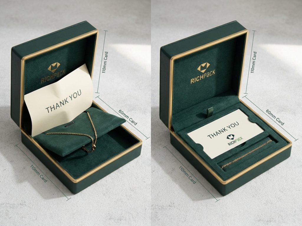
The customer should notice the insert without having to dig for it. A card placed under tissue may feel intentional for a gift, but it may frustrate a customer who needs care instructions quickly. A card placed on top of a ring can hide the first product view.
Test the reveal in the same order the customer will see it. Check the closed box, the first lift, the product view, the card, and the removal path. If the card bends into the lid or catches on a ribbon, the problem is structural, not copy-related.
Small details matter here. A raised ring setting can rub a card that sits too close. A necklace chain can slip under a loose card edge. The packout needs enough clearance for the product and the message to arrive together.
The customer moment should decide the message. A first order may need a warm welcome. A gift order may need a message that helps the recipient understand the brand without exposing the buyer’s private note. A repeat order may respond better to a collection preview or member benefit.
Jewelry type changes the useful detail as well. A necklace card can explain chain storage. An earring card can show how to keep posts and backs together.
A watch card can explain cushion placement and surface care. A ring card can point to stacking, sizing, or storage guidance when those details are true for the product.
The same card does not suit every order. Use one broad version only when the message stays accurate across the product range.
An insert is a testable customer-experience idea, not a guaranteed loyalty result. Assign one primary signal to each version before launch.
Useful signals include:
Keep the first measurement simple. If five messages change at once, you will not know which part helped or created friction.
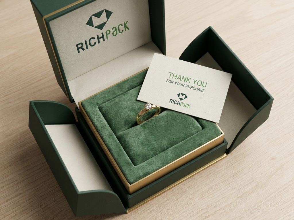
These seven ideas use one classification: customer-experience messages or actions delivered through a physical insert. Samples and small gifts can support an idea, but they do not replace the seven core choices.
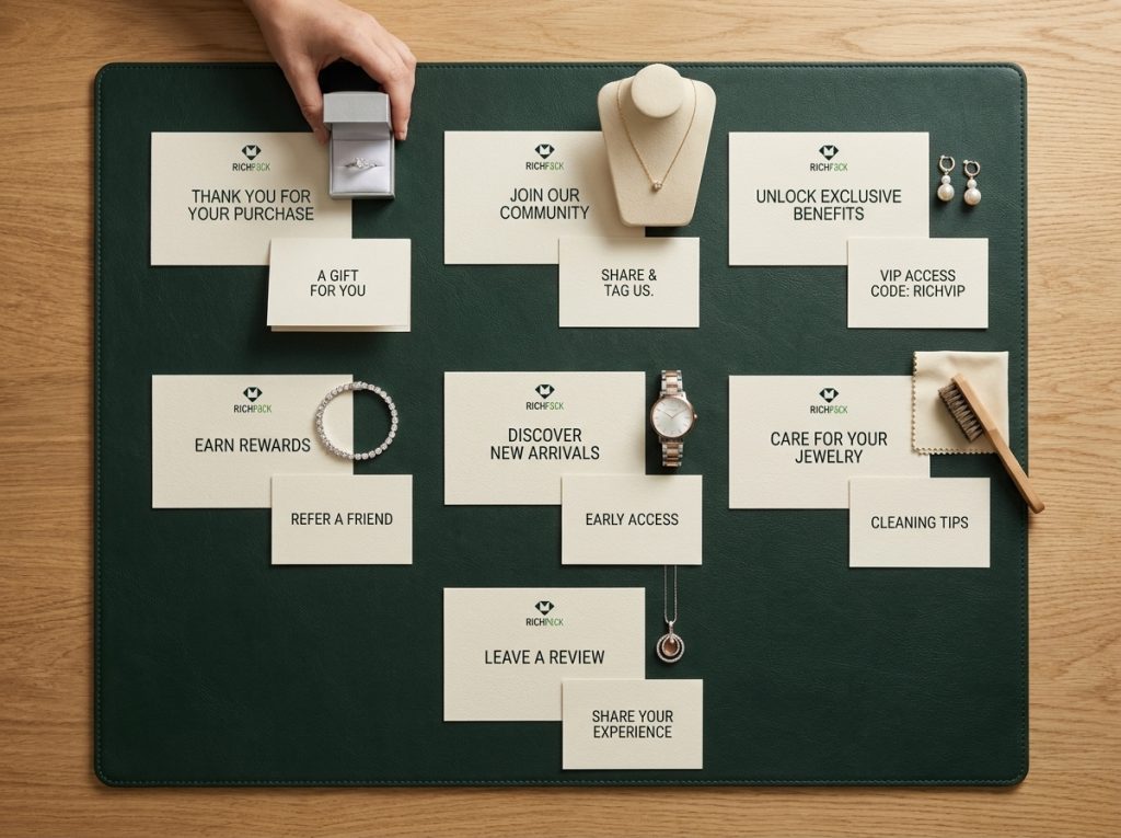
A personal note is the easiest way to make a shipment feel considered. The message can thank the customer for choosing the piece, welcome a first-time buyer, or acknowledge a gift purchase.
Personal does not have to mean handwritten. A printed note with the customer’s name, collection name, or product category can feel specific when the data is accurate. If the packing team cannot control variable text, use a warm standard message instead of risking a misspelled name or wrong product reference.
Jewelry brands can use a short maker note, a collection welcome, or a gift-recipient message. Keep the language close to the product. A ring launch may need a different welcome from a bridal collection or a daily-wear chain.
For a printed starting point, see the custom thank-you card option. Keep the card size and message tied to the box that will carry it.
Check three things before printing:
The aim is recognition, not a long letter. A card that takes ten seconds to read has a better chance of being remembered than a dense paragraph below a large logo.
An offer gives the customer a clear reason to return. Possible formats include free shipping, a fixed credit, a percentage discount, a gift with purchase, or early access to a new collection.
Choose the offer around the product cycle. A matching chain may make sense after a pendant purchase. A fixed credit may suit a higher-value order. An early-access message may fit a limited collection better than a general discount.
The card should state the code, expiry, exclusions, destination, and basic redemption rule. Avoid hiding the offer behind decorative copy. The customer should know what the offer does and when it ends.
For a jewelry package, keep the offer physically separate from the piece. A dark printed coupon under a pale ring can transfer dust or ink if the materials have not been tested. Use a clean card stock and check the surface after the card has sat in the closed box.
Measure redemption against the full program cost. Include printing, version handling, packing time, discount value, and any extra landing-page work. A code that gets used is not automatically profitable.
A loyalty card works best when the brand already has a real program. The card should explain one benefit and one action, such as joining, checking points, unlocking early access, or using a member service.
Jewelry brands may use tiers, previews, repair support, private appointments, or member-only gifting windows. Use only the benefits the customer can receive. A vague promise weakens trust once the customer reaches the destination page.
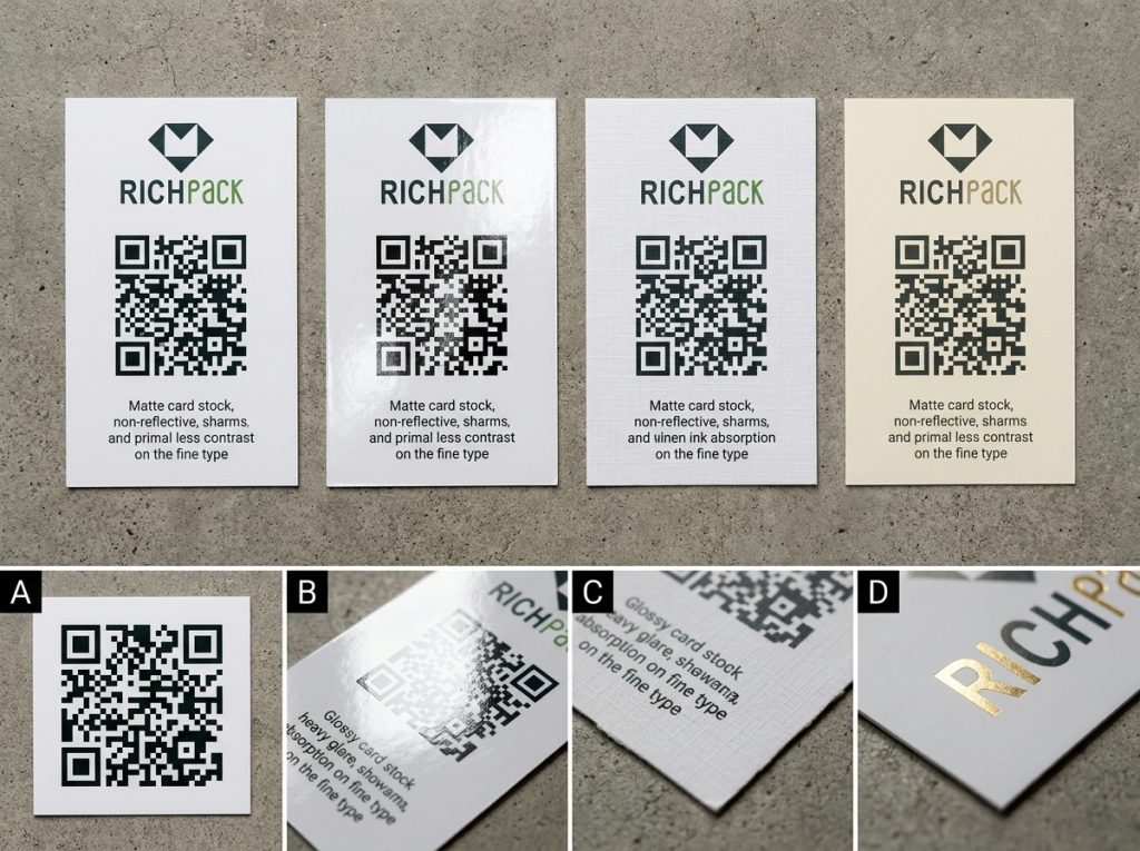
A QR code can shorten the path, but it needs a mobile-friendly destination. Test the printed code under the real lighting and at the real card size. Check the quiet space around the code, the contrast, and whether the landing page still works after the card is in production.
Do not place the whole loyalty program on a small insert. Give the customer the reason to join, the next action, and a simple route to the details.
Review and referral requests use the customer’s recent experience as the starting point. A review request asks for feedback. A referral request asks the customer to introduce another person. They can appear together only when the distinction and the action remain clear.
Timing matters for jewelry. Ask for feedback after the customer has opened the box and inspected the piece. If the product is a gift, the buyer and recipient may have different experiences. Choose the person and timing that match the brand’s process.
Use plain wording such as “Tell us how the piece arrived and how it feels to wear.” Then give one direct route. If a referral reward exists, state its rule separately from the review request. Do not ask for only positive feedback or imply that a reward depends on a favorable review.
The physical card should support an honest response. A QR code, short URL, or support route can reduce effort, but the destination must be maintained and easy to use on a phone.
A related-product card recreates the useful part of an online recommendation after delivery. It can show a matching chain for a pendant, a second ring for stacking, a coordinating earring, or a future collection release.
Relevance matters more than quantity. Two useful recommendations are stronger than a crowded catalog grid. Use the purchased SKU, collection, metal, color, or gifting moment when those fields can be controlled.
The card can also explain why the items belong together. A pendant may need a chain of a matching length. A ring stack may need a different profile to avoid crowding the finger. A gift add-on may need a lower-friction choice than a custom piece.
For a broader view of jewelry box styles, keep the physical presentation consistent with the product family. A card that promotes a refined collection should not arrive bent or oversized.
It should feel connected to the box.
Track clicks and assisted orders, but do not treat every later sale as proof that the card caused it. Use a code, QR code, or clear campaign window when attribution matters.
A care card turns the package into a small service tool. It can explain storage, cleaning limits, clasp handling, chain placement, or when to contact support.
The wording must match the piece. Metal, plating, stones, coatings, cords, clasps, and watch surfaces may need different care. Do not promise that one method prevents tarnish, scratches, or damage across every jewelry type.
Keep the first side simple. Use a few short actions and one support route. A necklace may need a reminder to fasten the clasp before storage.
Earrings may need a note about keeping posts and backs together. A watch may need clear instructions for placing the piece on its cushion without pressing the case.
The card should complement the customizable jewelry box inserts that hold the product. The insert controls position. The care card explains what the customer should do after removal.
Have the product and support teams approve the text. Then print it at the final size and check whether the smallest type is still comfortable to read.
A brand story earns space when it gives the product a reason to be remembered. Choose one verified detail about the design, maker, material, collection, or origin.
Short is better. The customer is opening a box, not reading a company history. A few lines about the shape of a collection, the inspiration behind a symbol, or the craft decision behind a finish can create useful context.
Avoid broad claims about ethical sourcing, handmade production, or environmental benefit unless the brand has records to support them. A precise statement feels stronger than a large promise.
Use the physical format to fit the tone. A folded note can support a collection launch. A small card may suit a daily-wear line. A textured stock can add a touch, but it should not make small type or a QR code hard to read.
The card is only one part of the customer experience. Its size, surface, placement, and removal path must agree with the jewelry box and the protective insert.
Flat cards work for one short message and a single action. Folded cards create room for care details or a small collection story. Die-cut cards can support a product shape, but unusual edges need a clean cut and a safe removal path. Variable-data cards can add relevance when the order system can manage the versions.
Use the smallest format that carries the message comfortably. A large card may look generous in a design file and feel awkward in a small ring box. A tiny card may fit the package, but make the QR code or care text too small.
Decide how the card enters the packout. It may sit above the insert, under a lid, inside a sleeve, or beside a pouch. Test each position with the actual product before choosing the artwork.
A printed message card does not hold jewelry in place. The protective insert must control movement and keep the product from rubbing against a rough board, hardware, or another piece.
The right option depends on the product and route. Foam, paperboard, corrugated stock, fabric, and other materials can all serve different roles, but a material name alone does not prove a finished result. Check the surface the jewelry touches, the cavity shape, the product weight, and the removal force.
For a chain, look for a path that limits tangling. For a ring, check the slot around the setting and band. For an earring, leave room for the post and back.
For a watch, check the pillow or support under compression. A beautiful card cannot rescue a loose product.
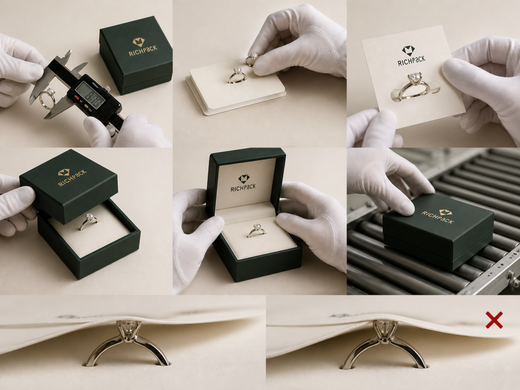
Close the box with the real jewelry, protective insert, card, pouch, ribbon, and any tissue in place. Press lightly on the lid. Look for a raised stone touching the card, a drawer scraping after the insert is wrapped, or a ribbon pull sliding under the sleeve.
Open the package as a customer would. The card should not cover the first product view or force the customer to pull on the jewelry to remove it. The insert should lift without catching a chain or bending an earring post.
Record the failure in physical terms. “Feels crowded” is hard to fix. “The folded card pushes the ring setting into the lid by the final quarter inch,” gives the designer and supplier a clear change.
Stock and finish shape both the message and the hand feel. A matte surface may suit a quiet care card. A textured surface may support a story note. A coating can change glare, writing behavior, color, and QR readability.
Review the physical card under the light used at the packing station and in the customer’s likely room. Small type can disappear on texture. A dark code can lose contrast on a tinted stock. A foil mark can break across a rough surface.
Use the sustainability guidance as a starting point when the card, coating, adhesive, and box must be reviewed together. Approve the finished sample with the jewelry box.
The same color can look different on an uncoated card, coated card, fabric wrap, or dark rigid box.
Keep the card readable before making it decorative. The customer should find the action, care step, or support route first.
For the page reached by a QR code, WCAG 2.2 sets a minimum text contrast ratio of 4.5:1 for normal-sized text. Check the digital destination as well as the printed card.
Variants can make a card more relevant, but they also create more ways to mispack an order. A brand may need different versions by product type, collection, gift status, membership stage, market, or subscription cycle.
Create a simple version name and connect it to the order rule. Keep one approved artwork file for each version. Make the difference visible at the packing station so the team does not have to read a long file name while handling jewelry.
Start with the smallest useful number of versions. If a single care card works across three necklace styles, do not create three cards only because the products have different names. Add a variant when the instruction, offer, or fit changes.
The customer should be able to remove the card without disturbing the jewelry. A card trapped under a tight insert becomes litter instead of a useful brand touchpoint.
Consider the complete material set. Card stock, coating, foil, adhesive, sleeve, foam, fabric, magnet, ribbon, and box construction can change how the package is separated after use. Do not call the complete package recyclable or compostable based on one paper component.
Use narrow wording that the brand can support. A simple paper card may be easier to separate than a laminated or bonded assembly, but the local collection route still matters.
Write the packing action in plain language. The operator should know which card to pick, where it sits, which side faces up, and what to check before closing the box.
Run representative orders at the real station. Include small rings, long chains, earrings with backs, watches, sets, gifts, and any order that uses a different box. Record wrong-version risk, extra handling, and any place where the card slows the work.
A card that looks excellent but adds a confusing step will create avoidable errors. Keep the instruction visible and the packout easy to repeat.
Treat the first run as a controlled learning cycle. Approve the physical experience, choose one signal, and keep the change small enough to understand.
Use a real jewelry piece of jewelry or an accurate, same-size sample. Check the closed box, first view, card position, insert fit, lid or drawer clearance, removal path, print detail, finish, and QR route.
Review the card after it has sat in the closed package. Look for scuffing, fiber transfer, ink rub, bent corners, trapped chain links, or pressure marks. A flat card can look fine on the desk and fail after the box is closed.
Keep the approved sample as the match piece. Record the artwork version, stock, finish, insert, box, product sample, and acceptance notes.
The packing team is part of the customer experience. A rushed operator may put the wrong card in the box, cover the product, or skip a protective step when the insert process is unclear.
Pack a small group of representative orders and record the extra action. Watch the hand movement as well as the clock. A two-second delay may be harmless if the action is obvious. A ten-second search for the right version is a quality risk.
Fix the station instruction before increasing the number of variants.
Connect the idea to the first signal. Use code redemption for an offer, enrollment for a membership prompt, scans for a care page, completed reviews for a feedback card, or assisted orders for a product card.
Set the review window before launch. Compare the insert version with the brand’s normal order behavior and keep product, market, and customer-stage differences visible in the record.
Do not claim that a later order was charged to the card unless the path supports that conclusion. A QR route or code gives a cleaner signal than a general rise in sales.
Segment only when the fulfillment process can keep the versions separate. Useful groups may include first order and repeat order, gift and self-purchase, product type, collection, subscription cycle, or customer value.
Change one meaningful element at a time when possible. If one version changes the card copy, finish, offer, and box placement together, the result will be hard to interpret.
Keep the sample period and customer group in the record. The result belongs to that setup and should not be treated as a universal rule.
Customer support shows where the physical message missed its job. Look for questions about care, storage, sizing, redemption, returns, or how to remove the jewelry.
Return reasons can reveal a different issue. A card that promises a care step cannot fix a loose ring slot. A referral offer cannot repair a scratched surface. Separate message problems from product, box, insert, and shipping problems before changing the copy.
Use the pattern to decide whether the card should be rewritten, moved, reduced, or removed.
A reorder brief should help another person reproduce the approved package. Include:
The drawer insert tray collection fits the measurement and organization part of this work. Keep the card brief separate from the protective insert brief. Review both inside the finished box.
Custom packaging becomes useful when the brand needs the card, box, protective insert, presentation, and reorder process to work as one system. The trigger may be more product variants, a high-touch launch, a recurring subscription, a retail display, or repeated packout errors.
This is the point to compare custom jewelry boxes with a logo to the current package. Bring the real product dimensions, card goal, insert layout, finish direction, quantity, variants, route, and sample acceptance notes.
Budget and freight should stay in the same conversation. Count the coordinated parts, packing steps, and shipping volume before comparing quotes.
It also gives you a place to discuss shipping volume.
Use those inputs for a project quote. Do not turn one estimate into a universal price.
RichPack’s packaging structure review can sit inside that conversation when the box, insert, and message need a coordinated structural decision. Treat the sample as the decision tool. A logo or finish cannot compensate for a box that rubs the product or slows removal.
Give the supplier enough detail to quote, sample, pack, and repeat the package. Include these fields:
Use RichPack’s custom packaging options when the brief expands from a card to the complete branded package. A clear brief lets the supplier respond to the same product, fit, message, and delivery conditions.
Avoid vague requests such as “make it luxury.” Write what the customer must see, touch, remove, understand, and do. That language gives the sample a real job.
Packaging Inserts are extra items placed inside an e-commerce shipment. Promotional inserts include thank-you notes, offer cards, care cards, and brand messages, while protective inserts hold the product in place.
For jewelry, the two layers work together. A card communicates with the customer, and a foam, paperboard, corrugated, fabric, tray, or divider component manages movement and contact. Neither layer should be treated as a universal solution for every product.
A useful insert can make the order feel more considered, reduce care confusion, invite one relevant next action, and keep the brand present after delivery. Jewelry examples include care guidance, a matching-piece suggestion, a membership prompt, a review request, or a referral route.
The result must be measured by the brand’s own order, support, review, referral, or enrollment data. An insert can support loyalty, but it does not guarantee a fixed retention, revenue, or repeat-order lift.
Choose one primary purpose first. The customer moment then guides the content. The insert may carry a thank-you message, one offer, one loyalty action, or a review request.
It may also carry a referral request, related-product suggestion, product-specific jewelry care, or one verified brand detail.
Add the code, URL, QR destination, expiry, or support route only when the customer needs it. Keep the card accurate, readable, and related to the jewelry that arrived.
No. Formats can include flat cards, folded cards, die-cut pieces, variable-data cards, care cards, small samples, or conditional gifts. A physical add-on can support the customer experience when it fits the product and packout.
Foam, paperboard, corrugated stock, fabric, trays, and dividers are structural or protective inserts. They help control movement and contact, but they are not separate loyalty ideas by themselves.
Start with the jewelry type, customer action, box footprint, protective insert, card size, lid or drawer clearance, removal path, print legibility, QR usability, and pack-line speed. Rings, earrings, necklaces, bracelets, watches, and sets may need different support and care details.
Approve a physical sample of the real product before scaling. Check the message, movement, contact surface, opening, removal, finish, and version control together.
A strong insert gives the customer one useful next step and fits the jewelry packaging system. Choose one idea, make one real packout, track one signal, and keep the approved brief for the next run.
When the card, box, and protective insert need to work as one package, contact RichPack about your packaging project.
Contact RichPack about your packaging project with the product, message, fit, finish, quantity, and sample notes ready.
2026-03-20

2024-11-15
2025-07-11

2025-02-19
2025-04-21
2024-11-19
Adorable Cute Packaging for Cosmetics to Elevate Your Brand – Customizable Designs for the Cosmetic Packaging Market by Richpack
View More
Amber Jewelry Packaging | Natural Elegance Meets Sustainable Packaging
View More
Bespoke Personalized Jewelry Storage Solutions with Custom Inserts | Tailored Storage for Jewelry Merchants Needing Unique and Branded Displays
View More
Biodegradable Jewelry Packaging with Personalized Designs for Retailers | Ideal for Jewelers Needing Green and Branded Packaging Solutions
View More
Black Magnetic Gift Box | Luxury Black & Gold Rigid Packaging | Richpack
View More
Bridal Ring Box | Blue Leather Engagement Ring Case – Richpack
View More

