

 PREV
PREV
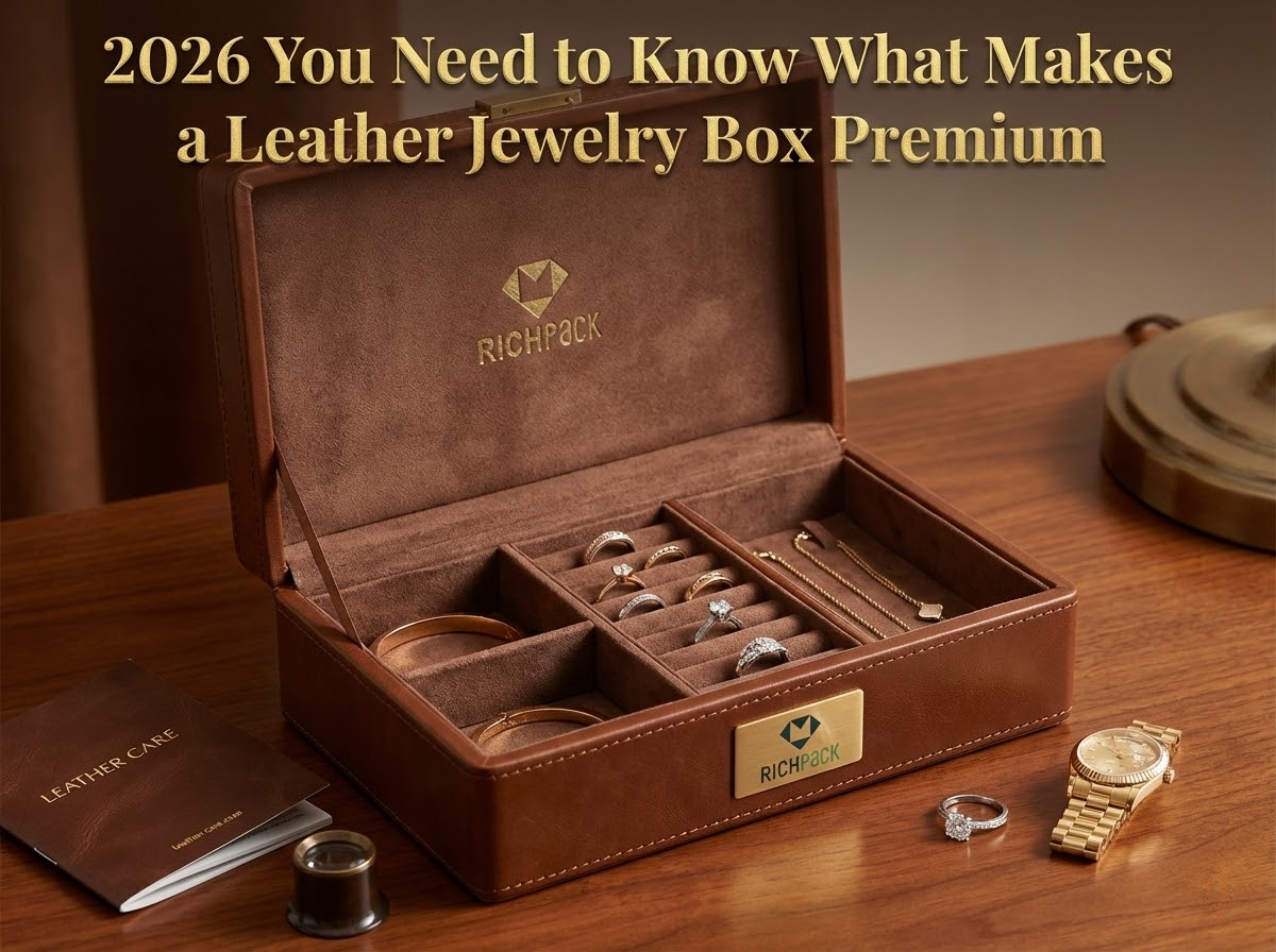
2026 You Need to Know What Makes a Leather Jewelry Box Premium
2026-01-25
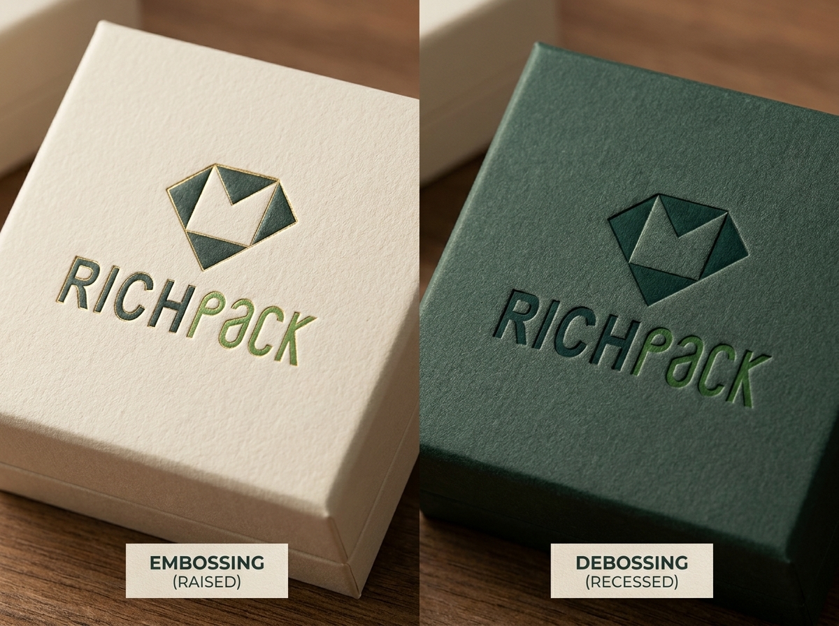



Choosing a finish for a new jewelry box starts with one clear fact: embossing raises a mark, while debossing presses it into the surface. The next step is to match that direction to the board, wrap, artwork, hinge, magnet, insert, foil, and handling route. Brand and packaging teams can use the checks below to compare the finishes, brief a supplier, and approve a sample with clear evidence.
By the end, you will be able to tell embossing from debossing at a glance, match each finish to a jewelry box surface, prepare artwork and supplier notes, and check a real sample for detail, fit, and handling marks. You will also have a short path from design choice to RichPack consultation, so the finish supports the box instead of becoming a last-minute decoration.
For RichPack, the useful next step is not an impulse order. It is a complete jewelry-packaging brief that can move from custom jewelry boxes to a coordinated sample and quote.
The definition comes first. Then the guide moves to costs, styles, and production. Start with the direction, then use the sample checks later to confirm that the result fits the real box structure.
An embossed logo stands above the surrounding board. Light catches the upper edge, while a fingertip follows the relief. The effect is easy to notice on a rigid jewelry box lid, a premium invitation, or a business card with a large, simple mark.
Embossing can be blind, with no ink or foil, or registered to a printed color or foil layer. A raised mark usually feels more prominent, so it suits brands that want a clear focal point. Fine lines and very small type need a proof because pressure can soften detail or distort a narrow edge.
Debossing presses the artwork into the material. The result reads as an indent or engraved impression. It can feel quieter than embossing and works well for understated wordmarks, leatherette wraps, and dark rigid boxes where shadow defines the mark.
Debossing also works with foil or ink. The recessed area may shield a small mark from casual rubbing, but deep impressions can show on the reverse side of a thin sheet. Ask for a physical sample when the package has a visible inside panel or a tightly fitted insert.
The press needs a relief side and a counter side. The geometry, board thickness, surface wrap, pressure, and registration determine the final result. A supplier may recommend a single-level die for a clean logo, a multi-level die for controlled depth, or a sculptured die for artwork with several planes.
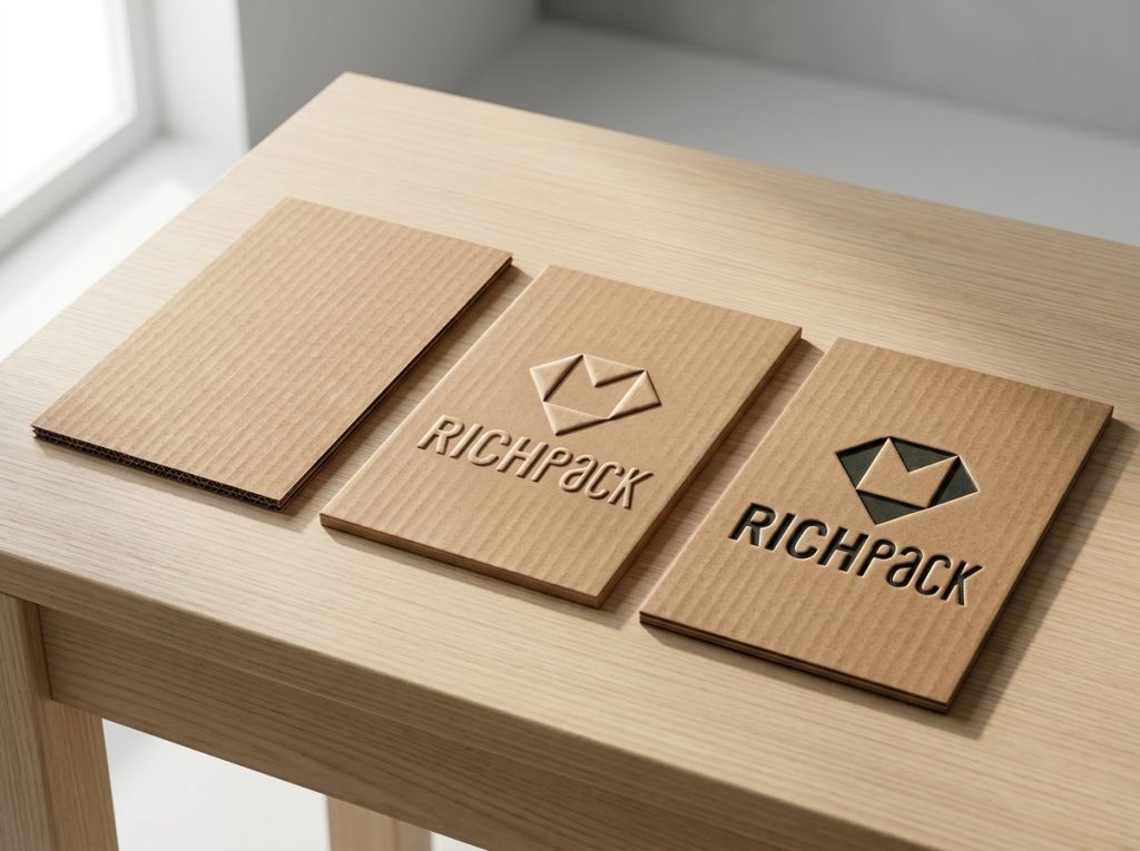
Use this table when a design review needs a fast, physical comparison. It describes observable outcomes and risks, not an unsupported claim that one finish is always more luxurious.
| Decision point | Embossing | Debossing |
| Direction | Design rises above the surface | Design is pressed below the surface |
| Touch | Raised edge and relief | Indented edge and recessed field |
| Visual cue | Highlight on the upper plane | Shadow in the impression |
| Brand mood | Noticeable, expressive, dimensional | Quiet, engraved, restrained |
| Common pairing | Printed color or foil on the raised area | Foil or ink inside the recessed area |
| Best starting artwork | Bold marks with open space | Simple marks that benefit from a controlled indent |
| Main risk | Fine detail can lose definition | Thin stock can show a reverse-side mark |
| Typical packaging fit | Rigid setup boxes and thick paperboard lids | Leatherette wraps, rigid covers, and heavier paperboard |
The difference between emboss and deboss is therefore a direction choice. The better finish is the one that keeps the logo legible, survives handling, and supports the package structure. A raised mark is not automatically stronger, and a recessed mark is not automatically cheaper.
Texture can add recognition and contrast, but it cannot fix a weak structure or unclear artwork. The points below show where the finish helps and where a sample must settle the question.
Texture gives a customer a second way to notice a mark. A hand can find a raised border on a matte lid, or a thumb can trace a recessed monogram before the box is opened. That signal is useful when a package is handled in a store, at an event, or during an unboxing moment.
Blind embossing and debossing create contrast through light and shadow. They can keep a restrained palette while adding depth. A black-on-black jewelry box or a natural paper wrap may benefit from that quiet shift, provided the sample remains visible in the intended retail light.
Blind embossing and debossing use pressure and a die, not a new ink or metal foil layer. This can keep a paperboard pack closer to a simple fiber stream. Fewer surface layers may also make sorting and pulping easier than a pack with plastic film or foil. The whole pack still determines the result.
For a paperboard box, ask the supplier to review the full material bill. Include board, wrap, coating, adhesive, insert, magnet, ribbon, and any foil. A blind finish is a strong start for a recyclable packaging brief. It adds texture without adding foil or plastic film. It does not prove that every box is 100% recyclable or zero-carbon. Local collection rules and the full construction still control that claim.
A well-made impression can make a package feel considered. The effect depends on clean edges, suitable stock, and alignment. Pressing deeper to chase a dramatic look can crush fibers, expose the reverse side, or make a lid harder to close. In practice, “deeper” is a production variable, not a quality score.
Because the design is formed in the substrate, it does not depend on a separate ink layer for its shape. It can still scuff, flatten, or collect dust. Protective coatings, foil, soft-touch films, and repeated handling all change the result, so durability belongs to a tested sample rather than a generic promise.
The choice controls detail, depth, tooling needs, and the way light moves across the mark. Compare the profile and surface style together. A complex die on an unsuitable wrap can add rework without adding value.
A single-level die has a single main height or depth. It is a practical starting point for a wordmark or uncomplicated icon. A multi-level die creates stepped planes, allowing a designer to separate a border, letterform, and center detail. More levels increase setup and proofing demands.
Beveled edges transition into the board at an angle, helping a deeper impression read cleanly. Chisel profiles create a sharper, engraved character. Textured dies add a surface pattern rather than a smooth relief. Sculpted dies model several planes and are reserved for artwork that needs a crafted, dimensional look.
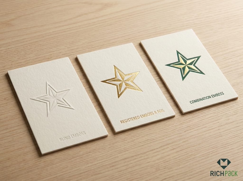
Blind finishing uses texture without ink or foil. It depends on the surface, lighting, and viewing angle. On a matte jewelry box, a blind deboss can feel discreet; on a heavily coated surface, it may be hard to see. Request a sample under the lighting used for product photography and in the customer’s hand.
Registered embossing or debossing aligns the impression with printed ink, foil, or another graphic. Registration tolerance matters around thin borders and small type. A supplier should show how the artwork, print, and die align on the same proof.
Combination work joins a formed impression with foil or another printed layer. Gold foil on a raised logo can sharpen the focal point of a jewelry box. A recessed mark with dark ink can keep the message legible while preserving a quieter surface. Check foil spread, edge cleanliness, and pressure consistency on the decorated sample.
The process connects artwork, tooling, pressing, and approval. A clear handoff at each stage prevents the common failure where a screen proof looks right, but the finished lid does not open, close, or read as expected.
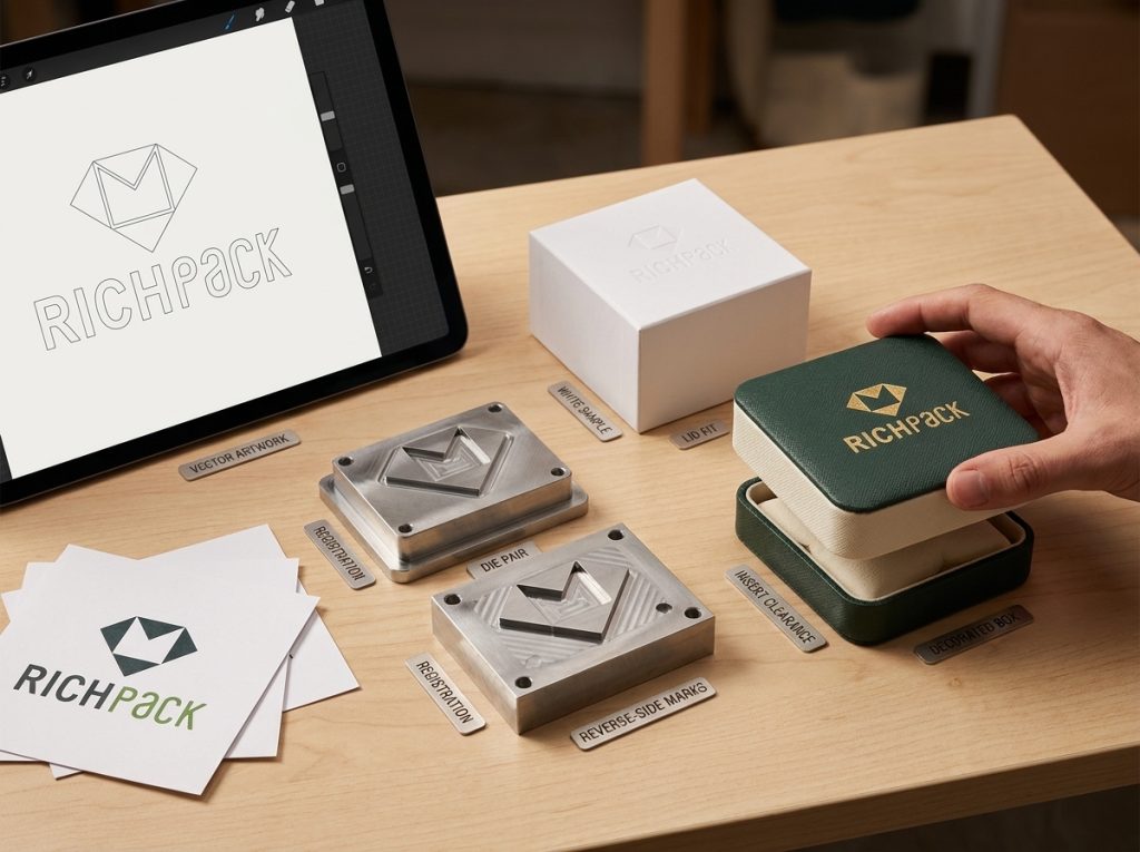
Start with vector artwork and a clear finishing layer. Separate the emboss or deboss shape from print, foil, cut lines, and white ink. Confirm reading size, open counters, border distance, and orientation on the actual panel. Do not assume a logo that looks sharp on a screen will hold the same detail after pressure.
The supplier selects a die metal and profile based on run length, depth, detail, and budget. Magnesium plates cost less and suit short runs and single-level work. Copper plates are more durable for repeated use. Brass is the hardest of the three and suits costly multi-level or sculptured dies. The press aligns the relief die and counter-die, then applies controlled pressure to the prepared stock.
Approve a physical white sample before a decorated production sample. Check the impression from several angles, then inspect the reverse side and nearby folds. On the decorated sample, check registration, foil edges, color consistency, lid fit, and insert clearance. Photograph the sample in the same light used for product approval.
After approval, inspect pieces from the beginning, middle, and end of the run. Rub the mark lightly with a clean glove, close and open the box, and stack finished units as they will be shipped. Record any flattening, cracking, offset, or pressure mark before accepting the batch.
The finish is part of a material system. Board, wrap, coating, insert, closure, and logo placement must be reviewed together, especially when the package is a jewelry box rather than a flat printed panel.
Heavier paperboard and rigid setup boxes usually support an impression better than thin folding stock. As a starting discussion range, many suppliers test paperboard around 250–400 gsm, or roughly 10–16 pt. The conversion varies by board density, so treat it as a brief target, not a universal rule. Coatings and laminated wraps change how fibers respond. A smooth wrap may show a crisp edge, while a textured wrap can soften small details. Confirm the board, wrap, adhesive stack, depth, and score-line distance with the converter.
For very fine artwork, QinPrinting’s 2026 production guide advises at least 1 pt lines for paper and 1.5 pt for fabric or faux leather. These are useful starting checks, not a promise that every logo will hold. Supplier proofing remains essential.
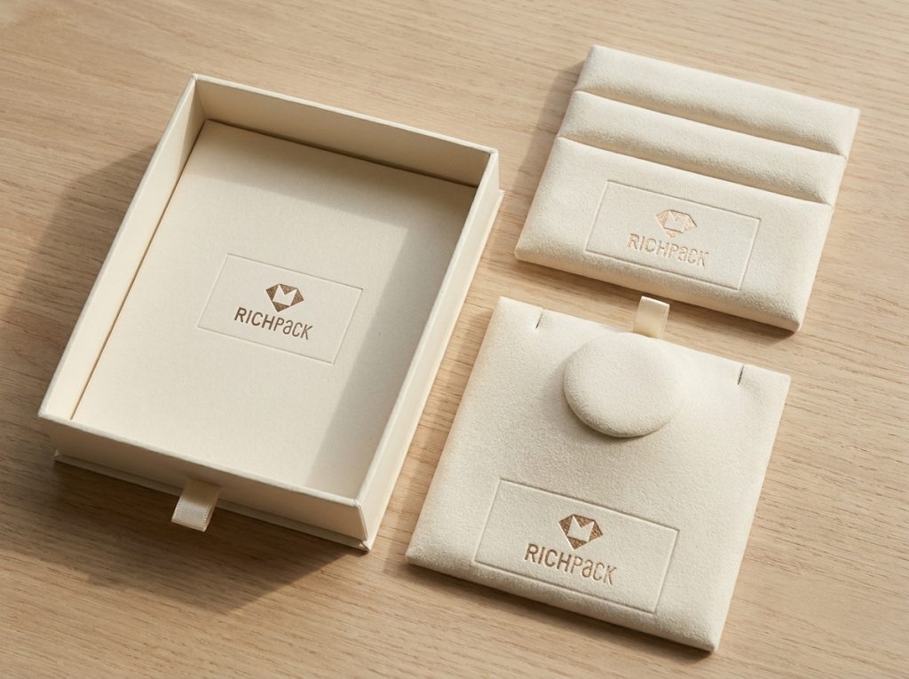
RichPack’s public jewelry-box page presents custom boxes, material options, design, manufacturing, quality control, and logistics as one coordinated packaging service. That matters because the lid finish cannot be approved in isolation. A lid logo may be embossed while the insert remains plain to protect the presentation. A debossed mark can suit a soft-touch or leatherette wrap when the brand wants a quieter opening moment.
The insert still controls how a ring, pair of earrings, necklace, or bracelet sits. Keep the impression away from a hinge fold, magnet pocket, ribbon, or tight insert edge. Review jewelry box materials and the custom packaging process with the finished artwork.
Pressure can crush and break paperboard fibers. At the dieline phase, keep raised or recessed areas a safe distance from score lines. A mark that looks fine on a flat panel may split or burst when the box folds. Ask for a white sample with the real score lines, then fold it before approving the decorated sample.
Foil can make an embossed or debossed mark easier to read, but it adds a second production variable. A matte surface can create shadow contrast; a gloss film can flatten it under direct light. Ask the supplier to show blind and foil options on the same board and wrap.
Use the choice rules below for the first brief, then let the physical sample decide whether the finish is production-ready. This is where design intent becomes a purchase decision.
Choose embossing when the logo should catch light and invite touch. Use open shapes, strong counters, and enough breathing room around the mark. It fits a lid that acts as the package’s main visual surface.
Choose debossing when the brand wants an engraved, controlled impression. It suits leatherette wraps, dark rigid boxes, and tone-on-tone systems. Verify the inside panel if the stock is thin or the impression is deep.
Embossing and debossing can appear on different panels, but using both on one small package can create visual noise. Define which mark leads, which mark supports, and how the two impressions avoid conflicting shadows.
Give the supplier:
Before production, confirm:
If you need to compare structures beyond the jewelry box, browse RichPack’s gift box collection and jewelry box styles. If materials and claims need a sustainability review, read the public sustainability approach and confirm the complete material stack, including coatings, magnets, adhesives, and inserts.
Embossing raises a design above the package surface. Debossing presses the design into the surface. Both use a die and pressure, so the practical difference is the direction of the formed impression.
Embossed paper has a raised design on one side, while debossed paper has a recessed design. The visible result also depends on paper thickness, coating, lighting, and how the sheet is supported during pressing.
Common production choices include single-level, multi-level, beveled, chisel, textured, and sculptured dies, plus blind, registered, and combination finishes. The right option depends on artwork detail, substrate, desired contrast, and the sample result.
Engraving removes or cuts material to create a mark. Debossing forms an impression by pressing the material into a recess. Ask the supplier which process matches the substrate and the tactile effect required for the package.
Debossing means pressing a logo, word, or pattern below a material’s surrounding surface. On packaging, it creates an indented mark that can stand alone or be paired with ink or foil.
Embossing raises packaging artwork; debossing recesses it. Both can make a package easier to recognize and more satisfying to handle, but the finish only works when the substrate, die, artwork, and structure agree. Start with the brand’s desired touch, compare blind and foil options, and approve a sample that includes the real box, wrap, insert, and closure.
For a jewelry brand, the conversion path is clear. Review the custom jewelry box range. Confirm the custom design and production process. Then request a quote with the logo layer, box structure, material stack, finish preference, sample requirement, and QA checks. RichPack’s public company page describes a team that spans design, engineering, production, quality control, and customer support. Confirm all current capabilities, prices, lead times, certifications, and SKU compatibility in the quote.


2026-01-25

2024-12-19

2025-04-12
2024-10-28
2025-06-20

2026-04-20
Affordable Gift Packaging Boxes for Bulk Orders | Cost-Effective Solutions for Large Purchases | Customizable Designs Available
View More
Bulk Gift Boxes for High-Volume Buyers with Custom Branding | Cost-Effective Solutions for Wholesale Purchases
View More
Custom Box Paper Cosmetic Packaging Buy Paper Box,Nail
View More
Custom Cosmetic Box Packaging for Luxury and Retail Brands – High-Quality Cosmetic Packaging Boxes Wholesale for Unique and Sustainable Packaging Solutions
View More
Custom Proposal Ring Box Light Ocean Blue Velvet | Bulk & Custom – Richpack
View More
Eco-Friendly Luxury Gift Boxes for Environmentally Conscious Brands | Sustainable Packaging Solutions | Custom Designs Available
View More

