

 PREV


2026 Jewelry Brand Custom Packaging Stations: Which Warehousing Firms Are Worth Choosing?
2025-09-03
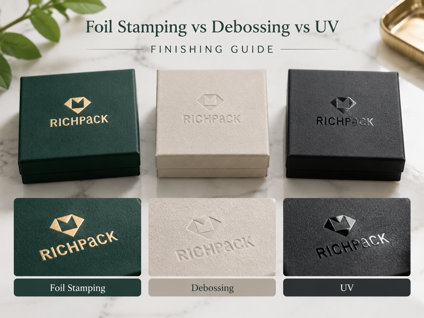



A final decision becomes expensive when it is made from a screen image alone. Foil stamping adds a reflective or colored film, debossing presses a mark into the surface, and spot UV creates selective gloss. For packaging, the right choice depends on the signal you want, the artwork that can hold it, the surface that will receive it, and the sample that proves it.
This guide follows that decision from process and materials to jewelry box applications, supplier files, and production checks. It keeps the broad foil stamping topic focused on packaging and brand selection. The practical question is not which finish sounds most premium. It is which finish will remain clear on the real package.
Foil stamping is a finishing process that transfers a thin foil film to a surface with heat, pressure, and a prepared die or plate. The result is usually a flat mark with a reflective, pigmented, matte, or specialty appearance. Unlike debossing, it does not need to form the board to create its main visual effect.
The press brings the foil and substrate together against the image on the die or plate. Heat and pressure activate the foil’s release and adhesive layers so the selected area stays on the package. The exact press setup depends on the foil, surface, artwork, and converter.
For a brand team, the useful definition is simple: foil stamping adds a controlled color or light response to a specific area. It can identify a logo, outline a border, or highlight a short message without covering the whole panel in ink.
A foil roll is a layered material, not a jar of metallic paint. Its carrier, release layer, color or metallized layer, and adhesive layer must work with the surface receiving the mark. The die or plate carries the image, while the substrate provides the support.
That is why a foil approved on coated paper may behave differently on a laminated rigid box, a textured wrap, or a fabric component. Name the complete surface stack in the brief instead of asking for “gold foil” as if color were the only variable.
Metallic ink adds color through a printed layer. Foil stamping adds a film through a separate finishing operation. Ink can be useful for continuous graphics and fine printed information; foil can create a stronger reflective accent on a short logo or border.
The two can work together. A printed panel may carry the product story while foil identifies the brand mark. Compare them under the light used for product photos, because a reflective foil and a metallic ink may look closer or farther apart as the viewing angle changes.
Embossing raises artwork above the surrounding surface. Debossing presses it below the surface. Foil stamping changes color and reflection, although it can be combined with either formed impression.
The processes can share a die or registration plan, but they solve different problems. Use foil when light or color should lead, debossing when touch and shadow should lead, and a combination only when the added production steps improve the hierarchy of the package.
Hot foil stamping moves from artwork to tooling, heat, pressure, release, and inspection. Each stage can change the final mark, so a finished sample matters more than a generic promise about the process.
Start with vector artwork and separate layers for print, foil, embossing or debossing, spot UV, cut lines, scores, and white ink. Mark the panel direction and identify any folds, hinges, magnets, ribbons, inserts, or closures near the artwork.
Check counters, narrow gaps, borders, and the reading size at the actual viewing distance. A logo that looks clean at 400 percent on a monitor may lose detail when transferred to a textured or wrapped surface.
A stamping die or plate, carries the image to the press, while a counter-die or support surface may hold the panel. The supplier chooses the tooling approach based on the artwork, surface, run, and required effect. The press setup must align the image with the panel and hold the substrate steadily during the impression.
Ask which artwork version and tooling reference will be attached to the sample record. That link makes a later repeat order easier to compare with the approved result.
Heat helps the foil release and adhere; pressure brings the foil into contact with the prepared surface; dwell describes how long the press holds the contact. These variables interact with the foil and substrate, so a setting that works on one wrap cannot be treated as a universal recipe.
A supplier should adjust the process against a physical sample. Increasing pressure to make a weak mark look stronger can create crushed fibers, spread edges, or marks on the reverse side.
Incomplete transfer, pinholes, lifting, or flaking can come from a mismatch between foil and surface, an unsuitable coating, contamination, or an unstable press setup. The visible symptom does not identify one cause by itself.
Inspect both the decorated face and the unused area around it. Rub the approved sample lightly with a clean glove, then repeat the check after normal packing and handling. Record the accepted appearance rather than relying on a color name alone.
If foil sits beside print, an impression, or spot UV, registration becomes a visual quality issue. Misalignment around a thin border or small type can make a package look unstable even when the foil itself has transferred well.
Use a physical approval sequence: artwork proof, white structural sample, decorated sample, then a run check. Compare pieces from the start, middle, and end of production. Keep the approved sample with the board, wrap, foil, artwork version, and inspection notes.
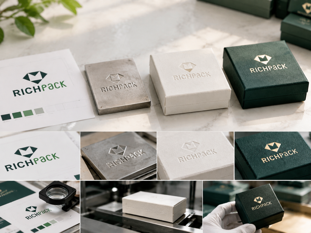
Foil stamping is often added after a printed panel is planned, but the finish should be considered before the artwork is frozen. In foil stamping printing, the printed image, coating, and foil layer need a defined sequence and separate approval layers. This handoff helps the supplier check registration and surface compatibility before production.
Separate the printed image from the foil and coating masks. A logo may need a foil layer, a printed underlayer, or a clear spot UV layer depending on the intended contrast. Name every layer so the supplier can see what decoration is and what is structure.
Do not hide the finish in a flattened artwork file. A flattened file makes it harder to identify the intended sequence and easier to approve the wrong panel direction.
The correct sequence depends on the materials and process. Foil may be applied before or after another printed or coated operation, and that choice can affect adhesion, edge clarity, and registration. Ask the converter to state the planned sequence in the proof.
The approval record should show the same artwork on the same surface. Comparing a foil on one substrate with UV on another does not answer which finish is better.
Offset or digital printing may supply the base image before the finishing stage. The important handoff is not the press brand; it is the file, surface, and registration information that travels with the job.
For a packaging project, include the dieline, printed artwork, finish masks, panel orientation, material stack, and sample owner. RichPack’s gift box collection and jewelry box styles can help teams compare structure before they finalize a finish. The supplier can then identify conflicts before production rather than after a decorated box has been assembled.
A printed proof can show color and layout, but it may not show foil release, coating behavior, pressure marks, lid fit, or the way a reflective mark moves under light. Use it for artwork review, then request a production-representative physical sample.
This matters even more for a rigid jewelry box. The decorated lid must still open, close, align with the insert, and survive packing.
Put the artwork version, finish name, foil color, surface, tooling reference, and approved alternatives in one record. Include photos of the front and reverse sides under the agreed light.
This record is useful for repeat orders. It gives the supplier a reference that is more precise than “make it like the last one.”
The words hot, cold, and digital describe different application routes. The hot foil stamping vs. cold foil comparison is useful only when it includes artwork, substrate, run, registration, and sample result, not the method name alone.
Hot foil stamping uses heat and pressure with a die or plate. It is a natural starting point for a defined logo or short mark on a package panel, provided the foil and surface are compatible.
Cold foil, sometimes called cold foil stamping, is applied through a printing process that uses an adhesive or printed layer to hold the foil. It can fit printed graphics and continuous artwork, but its registration and surface behavior still require a project sample.
Digital foil methods, including digital foil stamping, can support variable or short-run artwork in systems designed for that workflow. The useful question is whether the method can hold the required detail, color, surface, and repeatability for the package.
Hot foil is often considered when a die-formed mark and direct reflective accent are central to the design. Cold foil can be attractive when the foil belongs to a broader printed graphic. The distinction is not a universal quality ranking.
Choose the route that matches the artwork and production plan. Ask how the method handles the selected wrap, the desired foil, the number of panels, the repeat order, and the inspection standard. If the answer is only a process name without a sample plan, the choice is not finished.
Foil color is only one part of the result. Reflectivity, surface texture, print underneath, viewing angle, and product photography all change how the mark is read.
Metallic gold, silver, and copper foils create strong light response on many brand palettes. Gold foil stamping is often chosen for a jewelry logo. The same named color can look different on a dark wrap, a warm paper, or a textured panel, so approve the actual foil on the actual surface.
Pigment foils can provide a solid color without a metallic mirror effect. Matte and gloss options change how the mark catches light. Use the choice to control the brand signal, not to substitute a foil name for a visual target.
Holographic and specialty foils can add movement or a pattern-like effect. Holographic foil stamping can also compete with a small logo or product image. Test the design at the viewing distance where the customer will see it.
Contrast depends on the foil, background, surrounding print, light, and distance. A bright foil on a dark lid may be clear in a showroom and less clear under a soft product-photo setup. Specify the intended light when approving a sample.
View the sample under diffuse light, angled light, and the light used for product photography. Photograph the front and reverse sides. This is a small step that prevents a screen-approved finish from becoming a surprise in ecommerce images or retail display.
Foil stamping is a surface decision, so the substrate and wrap need to be discussed with the artwork. A finish that works on a smooth sheet may need a different proof on a wrapped box or fabric component.
Coated and uncoated paperboard can respond differently to heat, pressure, and adhesive. Confirm the board and any printed or coated layer before selecting a foil. A clean transfer on a swatch does not automatically prove the same result on a folded carton.
Laminate can change adhesion and reflection. Texture can soften edges or break up a small mark. Keep a surface swatch with the artwork approval so a later material change does not silently change the finish.
Fabric and leatherette-style surfaces need their own sample because the surface can compress, absorb, or distort the mark. A recessed mark may support a quiet identity, while foil may need a compatible surface and carefully controlled pressure.
A rigid setup box gives the lid a different support condition from a folding carton. The closure, hinge, wrap, and insert also create structural constraints. Approve the finish on the assembled package, not only on a flat panel.
A foil’s appearance depends on the surface beneath it and the light above it. Board, wrap, coating, adhesive, texture, and handling all contribute to the final signal. Put the complete stack in the supplier brief.
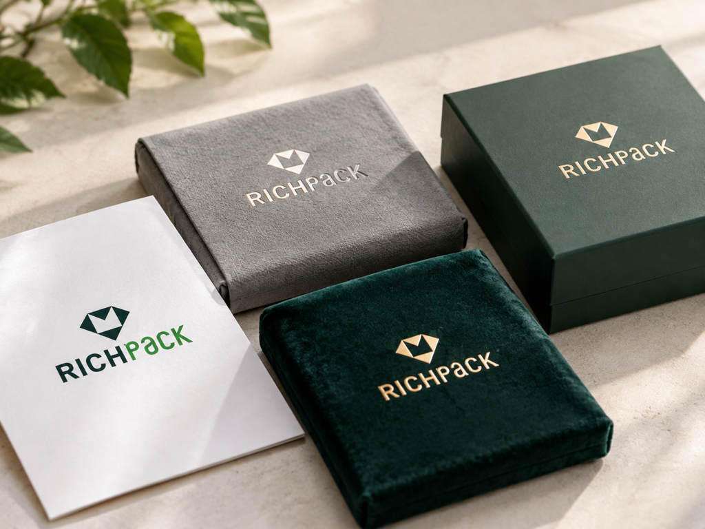
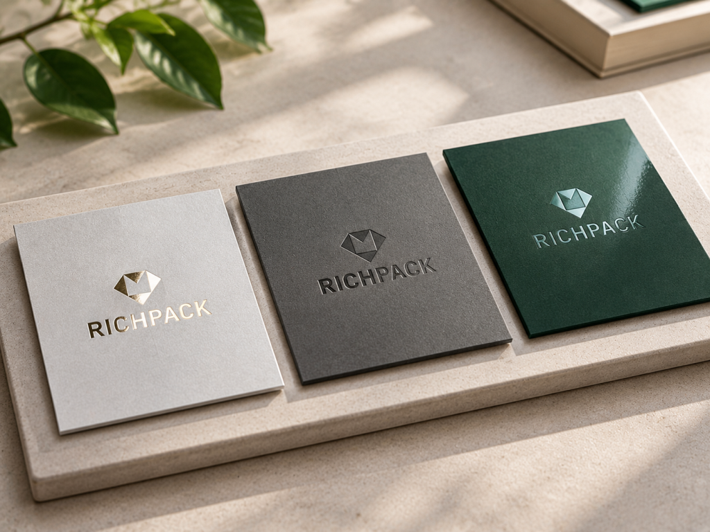
These three finishes solve different visual problems. Foil adds color or reflection, debossing adds a recessed tactile form, and spot UV adds selective gloss. Compare them on the same artwork, same surface, and same light.
Foil is noticed through reflection and color. Debossing is noticed through shadow and touch. Spot UV, a localized UV varnish, is noticed through a gloss change as the package moves.
If the brief says “premium,” translate it into one of these observable signals before asking for a quote. A supplier cannot sample an adjective.
Foil works well for short marks and simple icons when the surface accepts the film. Debossing needs enough material support for the edge and counters to remain clear. Spot UV can follow broader patterns but still needs accurate coverage and curing.
The right finish is the one that keeps the intended detail at the actual viewing distance. Do not choose by screen scale alone.
Foil can show incomplete transfer, foil spread, lifting, or registration drift. Debossing can show crushed fibers, reverse-side marks, or interference with a fold. UV can show uneven coverage, poor curing, scuffing, or a gloss edge that is out of register.
These are risk categories, not predictions. The sample and handling route decide whether the risk is acceptable.
Foil and debossing can require tooling or plates. UV requires coating coverage, curing, and registration planning. Quantity, repeat orders, surface preparation, artwork complexity, and sample rounds affect the quote.
Ask suppliers to quote each option from the same artwork and material brief. Otherwise, a lower number may simply exclude a proof, tooling item, or inspection step.
A combination can work when each finish has a clear job. Foil may identify the logo while a deboss defines the edge, or UV may highlight a printed pattern around a foil mark.
Adding finishes also adds variables. If removing one finish does not reduce the customer’s understanding or the brand hierarchy, keep the simpler specification.
Request three swatches on one board or wrap: foil, debossing, and spot UV. Keep the logo size, panel, light, and surrounding print constant. Record the result in a comparison table with visual signal, touch, detail, structural risk, and handling outcome.
| Criterion | Foil stamping | Debossing | Spot UV |
| Primary signal | Reflection or color | Recessed shadow and touch | Selective gloss |
| Artwork starting point | Short mark, logo, simple icon | Supported mark with clear counters | Broad pattern, border, or printed graphic |
| Surface question | Foil adhesion and release | Board/wrap support and reverse side | Coating compatibility and curing |
| Structural question | Registration near folds and closures | Pressure near folds, hinges, magnets, and inserts | Coverage and scuffing during handling |
| Jewelry-box fit | Focal lid logo or sleeve | Quiet lid mark or wrap signature | Gloss pattern or border on a matte panel |
| Approval test | Light, rub, registration, repeatability | Touch, reverse side, lid fit, repeatability | Angle, curing, scuff, coverage, repeatability |
Foil stamping earns its place when the reflective or colored mark solves a real communication problem. “Premium” is not enough; the team needs to say what the customer should notice.
A foil logo can catch light on a lid, sleeve, tag, or insert card. This gives the brand a visible signature without requiring the entire package to be bright.
A foil mark can add a concentrated accent to an otherwise restrained design. Use it to establish hierarchy, then keep supporting copy readable and calm.
Foil can be paired with a formed impression when the reflection and touch serve different parts of the identity. The combination needs a registration and pressure proof.
A reflective mark may change as the box moves through a display or opening sequence. Test that behavior under the actual light and handling conditions instead of assuming every foil reads the same way.
Combination finishing appears often in premium packaging discussions, but it should be treated as a production sequence rather than a shopping list.
Registered foil aligns the reflective mark with a printed image, border, or color field. Thin borders and small type make registration easier to see, so approve them on the actual panel.
A blind deboss supplies recessed form while foil adds color or reflection. The two can strengthen hierarchy, but the recess must not distort the foil edge or create an unwanted reverse mark.
Foil on a raised area catches light; foil in a recessed area gains a shadow boundary. Choose the direction that supports the logo and structure, then inspect the impression from more than one angle.
Foil and spot UV can divide attention between a focal logo and a broader gloss pattern. They need separate masks, registration checks, and a sample that includes the full sequence.
One well-controlled finish is often easier to read and reproduce than several competing effects. Use a combination only when each layer has a distinct visual or tactile function.
Sampling is where a finish becomes a production decision. It should test the actual material, assembly, light, and handling route.
A white structural sample checks the box, lid, insert, hinge, magnet, ribbon, and closure before decoration hides the problem. Approve the structure first, then the decorated surface.
Use one board or wrap and one artwork file for the foil, deboss, and UV comparison. This prevents a material change from being mistaken for a finish advantage.
Check the sample under the light used for product photography, under angled light, and at the distance where a customer sees the box. Record which view governs approval.
Open and close the box. Check the insert, hinge, magnet, ribbon, and closure around the decorated area. A beautiful lid finish is not approved if it rubs, distorts, or blocks the opening sequence.
Inspect samples from the start, middle, and end of the run. Compare transfer, edge clarity, registration, gloss, scuffing, reverse-side marks, and assembly. Keep the approved sample and inspection record together.

Artwork should tell the supplier what to finish, where to finish it, and which structural areas to protect.
Use vector artwork and a named foil layer. Keep print, foil, embossing/debossing, UV, white ink, cut lines, scores, and safe zones separate.
Fine lines and small counters are more sensitive to transfer, surface texture, and pressure. Ask for a proof at the actual size and remove detail that does not survive the sample.
Large solids can reveal coverage, release, and surface variation more clearly than a small logo. If the design needs a large foil field, make it an explicit sample requirement.
A fold, hinge, magnet pocket, ribbon channel, or closure edge can change pressure and alignment. Mark these zones in the dieline and review them on the assembled package.
A screen proof cannot show transfer, scuffing, reverse-side marks, or lid fit. Approve the sample that represents the final board, wrap, finish sequence, and assembly.
Visible defects help the team ask better questions, but they do not identify a single cause without the sample record.
Look for missing areas, tiny gaps, or uneven coverage. Compare the foil and surface specification, then check whether the defect repeats across the panel or batch.
Edges that fill or blur can reduce counters and small type. Review artwork detail, pressure, dwell, surface texture, and the intended viewing distance.
A shadowed or doubled edge may indicate movement between print, foil, die, or panel. Compare the finish layer to the approved registration reference.
Test the mark after normal handling and packing. Ask whether the foil, coating, adhesive, and wrap were specified together rather than treating adhesion as a color issue.
Reflective surfaces show scratches and shade changes quickly. Inspect multiple pieces and record the accepted appearance under the agreed light.
A pressure mark on the inside panel, a distorted fold, or a lid that no longer closes is a structural failure. Review pressure, panel support, die position, and nearby components.
Jewelry packaging turns a surface decision into an assembly decision. The logo sits on a panel, but the package must also protect the product, open cleanly, and look consistent in photos and handling.
A ring box often has a small lid and a close-fitting insert. Foil can create a clear focal logo; debossing can keep the lid quiet; spot UV can support a printed pattern. Keep the mark away from the hinge and insert edge.
A wider lid can carry a longer wordmark or a centered foil mark. Check the ribbon, hanging insert, closure, and the path the customer uses to open the box.
For teams researching foil-stamped bracelet packaging, the useful comparison is still the same: logo visibility, surface response, insert clearance, and handling after assembly.
Small cards and tags need a size-appropriate proof. A foil mark may work as a short brand signature, while a larger printed field may be better for care or product information.
Fabric components need a dedicated surface sample. Confirm whether foil, debossing, or another marking method keeps the logo readable without distorting the pouch or rubbing during packing.
Larger boxes may support a broader pattern or a finish combination, but the larger panel does not remove the need to test the complete assembly. Keep product information and care details readable inside.
The outer box can carry the main brand signal while the insert stays quiet. Match the finish to the product presentation, material stack, and opening sequence rather than repeating the same mark on every component.
For a starting point, review RichPack’s custom jewelry box collection and custom jewelry packaging range. The public pages show the product context; finish compatibility still belongs in the project brief.

A foil quote is only comparable when each supplier receives the same artwork, material, finish sequence, sample requirement, and inspection standard. Foil stamping services should state those assumptions instead of returning a finish name without a sample plan.
Ask whether the quote includes the die or plate, its reference, revisions, and repeat-order handling. Keep the tooling decision connected to the approved artwork version.
Quantity, repeat orders, panel count, artwork complexity, and setup can change the commercial result. Do not assume a high-level finish name is enough to compare two quotes.
Separate the cost and status of white samples, decorated samples, combination samples, and shipping or handling checks. An approved sample is part of the risk-control process.
Timing depends on artwork approval, tooling, material readiness, finishing sequence, assembly, inspection, and shipping coordination. Ask which dependencies are included in the supplier’s schedule.
A quote that excludes tooling, proofing, assembly, or QA can look lower while carrying more unknowns. Send the same RFQ and ask suppliers to list assumptions and alternatives.
A clear brief turns a finish preference into a production instruction.
Include finished panel dimensions, dielines, panel direction, folds, scores, hinge lines, magnet pockets, ribbons, closures, and insert boundaries.
Name the board, wrap, coating, lamination, adhesive, lining, and closure components. State which surface the foil, deboss, or UV must touch.
Attach vector print, foil, deboss, emboss, UV, white ink, cut, score, and safe-zone layers. State the requested finish sequence and acceptable alternatives.
Include brand colors, foil reference, gloss target, product-photo light, retail-light reference, and the viewing distance that governs approval.
Name the approval owner, sample stages, handling tests, start/middle/end inspection points, accepted alternatives, and the information that must travel with the approved sample.
RichPack’s custom services process publicly describes a design, prototyping, production, quality testing, and shipping-coordination path. Current finish compatibility, price, MOQ, lead time, and SKU-specific capabilities still require project confirmation.
Sustainability questions apply to the complete material stack, not just the board.
Ask how the board, wrap, foil, coating, adhesive, magnet, lining, and insert are specified and documented for the project.
A recyclable board does not answer every question about foil, coating, adhesive, magnet, lining, or mixed materials. Put each component in the supplier conversation.
RichPack’s public sustainability approach provides context for material and certification discussions. It should not be read as proof that every box, finish, or component carries the same certification. Confirm the exact SKU and documentation.
Foil stamping transfers a colored or metallic film to a package surface with heat, pressure, and a die or plate. It creates a reflective or pigmented mark. The final result depends on the foil, substrate, artwork, registration, and sample conditions.
Hot foil stamping uses a heated die or plate, pressure, and a foil film with release and adhesive layers. The supplier must match the foil and surface, then verify transfer, registration, adhesion, and handling on a physical sample.
Hot foil uses heat and pressure with a die or plate. Cold foil is applied through a printing route using an adhesive or printed layer. The better route depends on artwork, substrate, run, registration, and the sample result.
Neither is universally better. Foil is a useful starting point when a logo needs reflection or color. Spot UV is a useful starting point when a printed or matte panel needs selective gloss. Compare both on the same surface and light.
There is no general winner. Debossing forms the substrate, while foil adds a surface film. Both can show wear under rubbing, scuffing, poor support, or unsuitable handling. Test the finished package through its actual route.
Yes, when the artwork hierarchy and production sequence support the combination. Foil plus debossing adds registration and pressure variables, so approve a decorated sample that shows the complete sequence.
Start with the intended signal. Choose a metallic or pigment foil for a reflective logo, debossing for a quiet tactile mark, or spot UV for selective gloss on a printed or matte panel. Confirm the lid, insert, hinge, magnet, ribbon, closure, and handling sample.
Include the dieline, finished panel dimensions, material stack, vector finish layers, foil or gloss references, finish sequence, sample stages, handling checks, inspection points, and approval owner. Ask suppliers to state assumptions and alternatives.
Foil stamping leads with reflection, debossing with touch and shadow, and spot UV with selective gloss. Choose the signal first, then test it on the real surface and assembled jewelry box. Send the approved artwork, material stack, sample requirements, and QA checks through RichPack’s custom jewelry packaging service before production.


2025-09-03


2025-08-18

2026-07-10

2025-03-27

2025-12-24
2026-03-24
Affordable Custom Jewelry Boxes for Independent Jewelers | Budget-Friendly Solutions with High-Quality Designs
View More
Bespoke Custom Jewelry Pouches for Protecting Your Jewelry | Customized Pouch Design
View More
Birthday Gift Boxes for men – Sturdy Boxes for His Special Day’s Elegance
View More
Black & White Gift Bags – Classic, Sturdy丨Present Gifts Sleekly for Any Occasion
View More
Black box with lid for jewelry | Matte black rigid packaging box with lid | Custom sizes and bulk orders at Richpack
View More
Box Shampoo Set Package Cosmetic Paper Packaging Personal Care
View More

