 PREV
PREV
10 Thank You Card Ideas to Boost Jewelry Brand Loyalty
2026-02-13

Holiday packaging needs to do more than look seasonal. For jewelry brands, it must make the product gift-ready, protect small and delicate pieces, work across retail and ecommerce channels, and arrive before the selling window closes.
This guide gives you a practical way to plan festive packaging by working backward from the gift moment: structure, inserts, materials, finishes, sustainability claims, budget, supplier briefs, sample reviews, and a 90-day production timeline. The goal is to help you avoid beautiful boxes that scratch pendants, tangle chains, miss delivery dates, or feel out of sync with the brand.
Before choosing colors, ribbons, or holiday graphics, decide what the package needs to accomplish for the buyer and the jewelry inside. A festive box only works when gift readiness, product protection, brand recognition, and channel fit are solved together.
A seasonal package should make the item feel ready to hand to someone else. That sounds simple, but it affects every design choice that follows.
A ring for a last-minute stocking stuffer, a necklace for a luxury client gift, and a holiday set for a boutique counter all need different packaging behavior. If the package does not match the occasion, it works against the product.
A festive box cannot make up for weak protection. Jewelry is delicate, lightweight, and often easy to damage during shipping or handling.
The packaging needs to hold the piece securely, separate moving parts, and reduce friction against metal, stones, clasps, and plated surfaces. If a customer opens the box and finds a scratched charm or tangled chain, the presentation has already failed.
Seasonal packaging works because it tells the buyer the product belongs to a special moment. The package should feel made for the season, not pulled from a generic shelf.
That signal can come from color, finish, closure style, insert shape, or a small detail like a holiday card. It does not need loud graphics. In luxury jewelry packaging, quiet control often feels stronger than holiday clutter.
Festive packaging should still look like your brand. If the seasonal version feels like it came from another company, you lose recognition and repeat-purchase memory.
A strong seasonal system builds from the existing brand palette, logo placement, texture language, and structure family. The holiday layer adds warmth without erasing the brand code.
The best holiday package saves the buyer time. It should open cleanly, look intentional, and need little or no extra wrapping.
This matters even more in e-commerce, where the package may be the only physical brand moment before the gift is given. A package that already feels complete is easier to buy, easier to give, and easier to remember.
The same seasonal design rarely performs equally well across all channels. A boutique shelf box needs visibility and polish. A shipped gift set needs durability and stack resistance.
When the channel changes, the packaging should adapt to it. You can keep one visual system while adjusting structure, carton strength, and insert style for the route the package needs to travel.
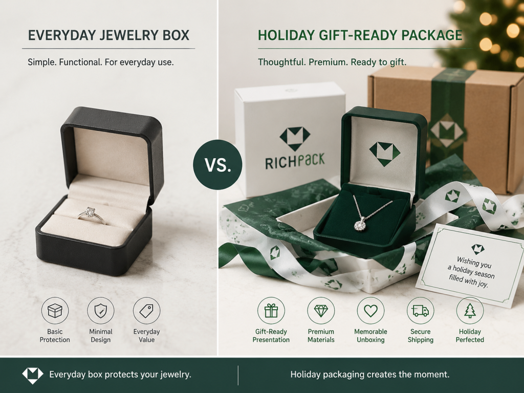
Seasonal packaging has a longer life when it feels worth keeping. This is especially true for jewelry buyers, who often store the box, use it for travel, or keep it as part of the product memory. If the brand wants that keepsake behavior, the structure should feel closer to purpose-built jewelry boxes than disposable gift wrap.
A keepsake feel can come from sturdy board, clean closure tolerance, quality lining, and a restrained holiday finish. If the package feels disposable, it will be treated that way.
Strong holiday packaging starts with the moment the recipient opens the box, then works backward into structure, finish, insert, and production choices. That process keeps the design tied to real use instead of seasonal decoration alone.
Start with the person opening the box, not the person approving the art file. The opening moment tells you what the package needs to communicate first.
Is the buyer expecting romance, celebration, gratitude, or premium restraint? Is the gift going to a retail customer, a VIP client, or an employee program? The answer determines whether the package should feel soft, bold, elegant, or almost ceremonial.
Not every holiday package should chase the same mood. Christmas gifting, year-end appreciation, New Year launches, and winter seasonal sets do not need the same visual language.
A deep red and gold program can work beautifully for some jewelry brands. Others will do better with winter white, evergreen, charcoal, champagne, or muted metallics. The right answer is the one that supports your brand story.
Seasonal packaging does not need holiday symbols on every surface. In many luxury settings, the better move is to make one or two elements clearly seasonal and keep the rest calm.
That seasonal layer might be a ribbon color, foil tone, card message, or patterned sleeve. If too many elements compete, the box starts to feel busy instead of premium.
Your brand codes should stay consistent. Your seasonal codes can shift.
For example, a jewelry brand may always use a certain logo placement, box size, family, and inner fit. The holiday layer can change the exterior color, print finish, insert card, or tie. That gives you freshness without sacrificing consistency.
Before discussing production, gather the surfaces, finishes, and forms that truly match the brand. Do not start with a random list of holiday motifs.
Pull references for box structure, lining texture, foil tone, ribbon width, and gift card style. Then remove anything that feels too loud, too childish, or too far from the product category. The goal is a controlled visual direction, not a scrapbook.
A retail display box needs to attract attention quickly. An e-commerce gift box needs to survive shipping and still look polished when opened.
You may not get both from the same structure. Decide which priority matters most, then design around it instead of assuming one concept can solve every use case.
Seasonal packaging is not just a design project. It is also a production calendar, sourcing task, and launch dependency.
If marketing wants to finalize the look after production has started, the schedule is already under pressure. If procurement waits for artwork before asking about lead times, the box is already late. The earlier those teams talk, the fewer last-minute compromises you make.
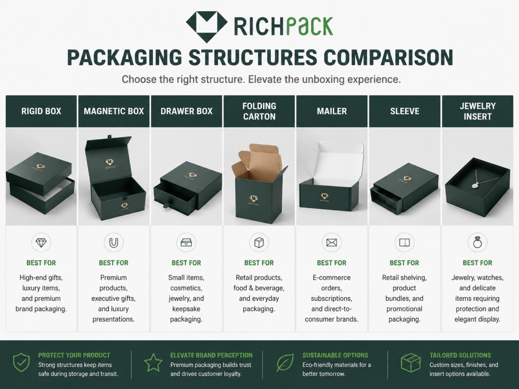
The right structure depends on the product’s fragility, weight, channel, and expected gift value. A lightweight pendant, a premium ring set, and a corporate gift program should not be forced into the same packaging format.
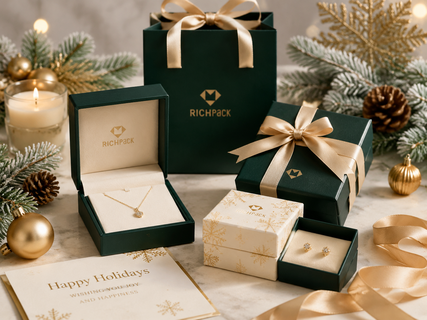
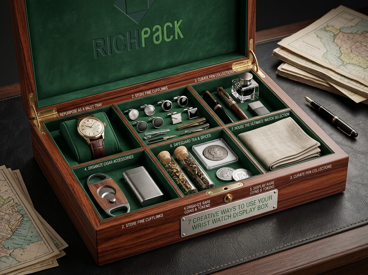
Rigid boxes are a strong choice when the brand wants a premium feel, and the product needs stability. They hold their shape well, photograph nicely, and make the opening moment feel deliberate.
For holiday jewelry sets, rigid boxes work especially well when the insert needs to hold one piece precisely. They also give you room for texture, foil, and custom wrap without making the box feel flimsy. RichPack’s gift boxes category is a useful reference when the project needs a stronger gift-ready structure.
Magnetic closure boxes create a clean, satisfying opening experience. That small closing snap gives the package a more ceremonial tone, which is useful for gifts.
They are a good fit for premium jewelry launches, VIP gifting, and seasonal sets that need a little drama without looking overdesigned. The closure feel matters, so sample the magnet strength instead of relying on a catalog description. For higher-end seasonal sets, magnetic gift boxes can support a more intentional opening moment.
Drawer boxes are useful when the reveal matters. They create a layered opening path and often feel more tactile than a simple lift-off lid.
That makes them a strong choice for holiday gift sets where the package should slow the reveal and build anticipation. They also work well when you want the exterior to stay clean and let the hidden tray carry the festive detail.
Folding cartons are lighter, faster, and easier to scale for some programs. They are not automatically less premium, but they do require stronger graphic discipline.
If you choose a folding structure for a seasonal jewelry line, make sure the insert, print finish, and closure behavior do enough work. Otherwise, the package may look seasonal but feel thin in the hand.
Mailer boxes matter when the package has to travel. If the box is intended for e-commerce, shipping strength becomes part of the design.
A holiday mailer can still feel elevated with a strong outer print, branded interior, and snug insert. The key is making sure the box protects the jewelry after the festive visuals are added.
Gift bags and sleeves work best as support pieces or secondary carriers. They are fast, flexible, and easy to brand.
For holiday jewelry retail, they can complete the presentation without forcing every product into a full, rigid box. A well-made bag with a matching card and tissue can be surprisingly effective when the brand wants a simpler seasonal layer.
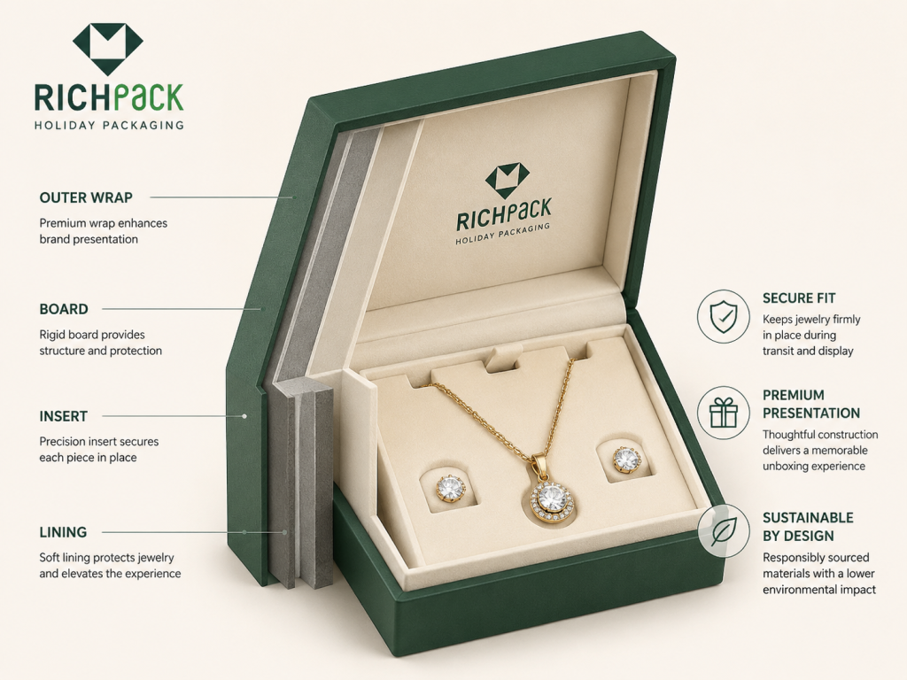
The insert is where jewelry packaging becomes functional. It is not filler. It is the piece that keeps the product from sliding, tangling, or looking disorganized.
Holiday inserts should be selected for the actual jewelry type. Rings, stud earrings, hoops, chains, bracelets, and mixed sets all behave differently inside a box. If the piece needs a tailored hold, plan the custom jewelry box inserts before approving the outer artwork.
If the package travels, the outer protection layer is part of the design. A beautiful box that gets crushed in transit does not feel luxurious when it arrives.
For seasonal gifting, the shipping layer should hold shape, reduce impact, and keep the inner package centered. This is especially important when the box contains a rigid gift unit with a decorated lid or delicate insert.
Jewelry packaging has to balance presentation with restraint, cushioning, and surface safety. The box should make the piece feel special without letting it slide, rub, tarnish, tangle, or arrive looking handled.
Seasonal jewelry packaging should protect finishes first. Rings, plated chains, polished stones, and metal accents can all pick up visible marks if they move around.
A smooth insert, secure fit, and clean lining surface reduce that risk. If the jewelry must touch the packaging material, test that material before production.
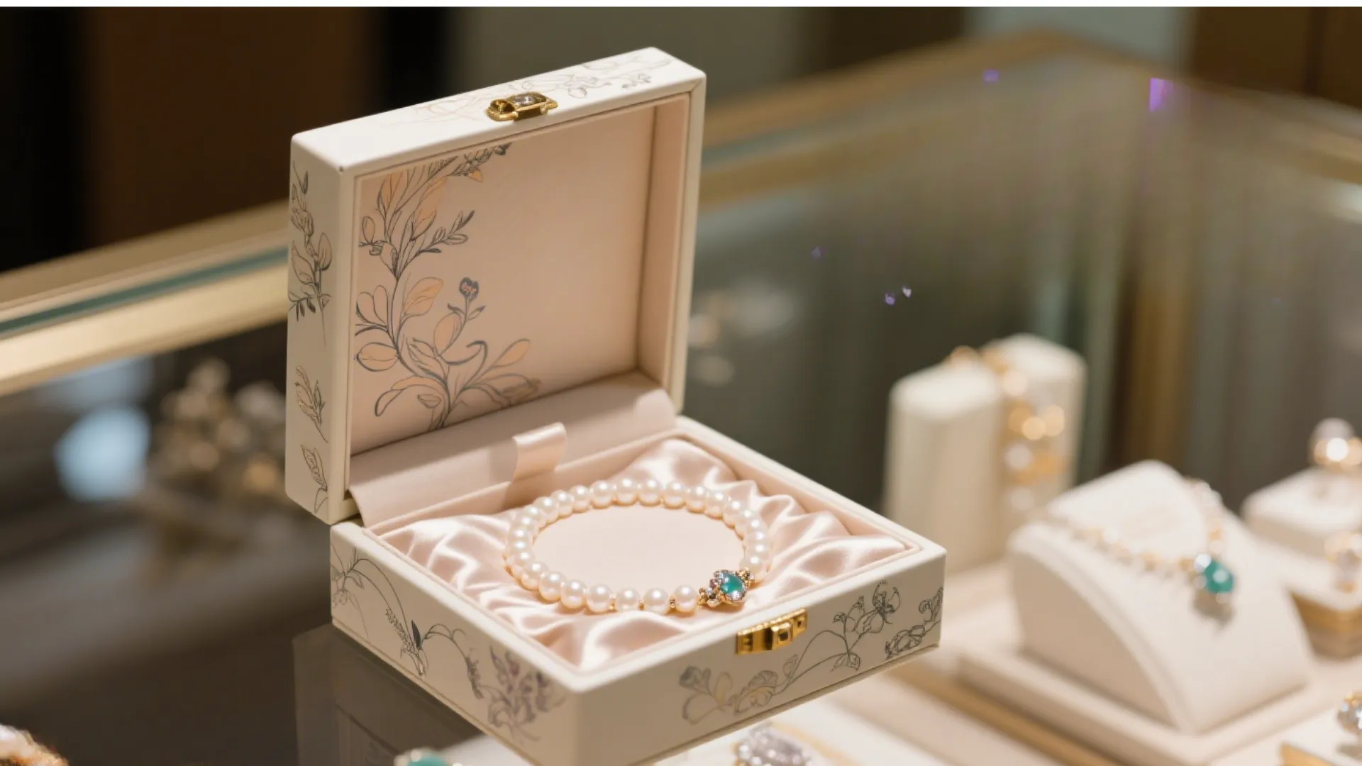
Necklaces and bracelets are among the easiest pieces to turn into a poor opening experience. The chain can shift during shipping, wrap around itself, or sit in a messy position as soon as the box opens.
The insert needs to stop that movement. A holiday package that looks festive but opens to a knot does not feel premium.
Some linings, adhesives, and decorative materials can create unwanted reactions over time. That matters more when the packaging is used for storage or shipped over long distances.
For silver-heavy collections, ask for tested lining options, low-odor adhesives, and materials that do not add unnecessary chemical risk inside the box. Small packaging decisions can protect the product’s appearance long after the holiday season ends.
A ring box should hold the ring upright or centered without making the customer pry it loose. Earring packaging should keep paired pieces together and visible.
If the piece is tiny, the box should not make it feel lost. Holiday presentation should increase perceived value, not bury the product in a decorative cavity.
Longer jewelry pieces need more disciplined insertion. They cannot simply sit in a flat cavity and hope for the best.
A chain slot, wrap path, or restrained tray layout can keep the piece neat and visible. The easier the product is to understand when opened, the stronger the package feels.
A lightweight charm does not need the same insert strategy as a heavy pendant or multi-piece set. If the insert is too loose, the piece moves. If it is too tight, the user feels resistance when removing it.
The right insert should feel like it belongs to the jewelry, not like the jewelry was forced into a generic shape.
Seasonal packaging often looks better in a render than in real light. Velvet can look rich until it sheds. Soft-touch can feel elegant until it picks up scuffs.
Ask for samples under the lighting where the product will actually be seen. A box that looks good in a studio but dull in a store is not a finished solution.
Mixed sets are common during the holidays. A necklace, earring pair, and bracelet may need to sit together without competing for space.
That is where custom insert planning matters most. The package should give each item a clear position and keep the set visually balanced when the box opens.
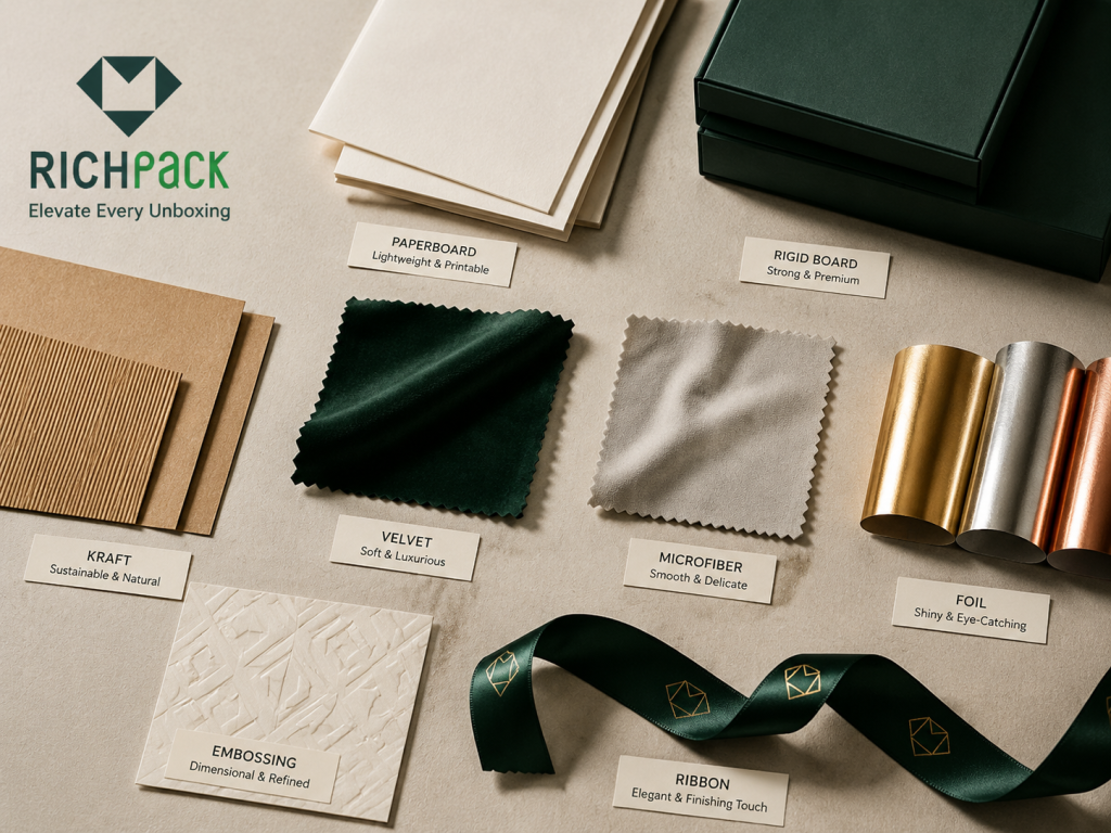
Materials and finishes carry the seasonal mood, but they also affect cost, lead time, durability, and sustainability claims. Choose them based on how they behave in hand, in transit, and under real retail lighting.
Paperboard is useful when you need a lighter-weight and lower-cost structure. A rigid board is better when the package needs to feel more substantial.
If the box is meant to be kept, gifted, or displayed, a rigid board usually creates a stronger impression. If the product is high-volume and the seasonal layer needs to stay efficient, paperboard can still work well with the right surface treatment.
Kraft and recycled stocks can help a holiday package feel grounded, clean, and less overproduced. That does not mean they have to look plain. Compare available packaging materials before deciding whether the sustainability story should lead with board, wrap, insert, or finish.
A smart print treatment, ribbon accent, or simple holiday mark can make the package feel current without overwhelming it with ornament. This is often the right move for brands that want sustainability to feel authentic instead of loud.
Velvet and microfiber are useful when the jewelry needs softness and a more luxurious hand feel. They can work beautifully in seasonal gift packaging because the surface itself communicates care.
They also need more scrutiny than many brands expect. Color transfer, shedding, and fit tolerance should all be checked before committing to a full run.
Foil is one of the clearest ways to make a seasonal box feel premium. A little foil goes a long way.
Gold, silver, copper, and restrained seasonal tones all work when used with discipline. If foil covers too much surface, the package can start to feel busy instead of elevated.
Embossing and debossing add a touch. That tactile quality matters in a season built around gifts, memory, and unboxing.
These finishes are especially effective when the design needs to feel premium without adding too many visual layers. A small raised logo or quiet pressed pattern can do more than a crowded printed surface.
Spot UV can create controlled shine in the right place. Soft-touch can make the box feel smooth and more expensive in hand.
Use both with restraint. If the whole package is covered in special effects, the eye stops noticing the details that were supposed to feel premium.
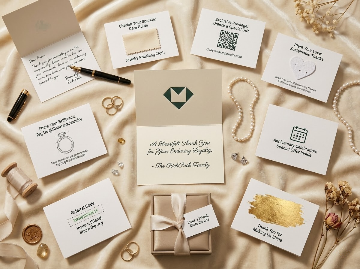
Ribbons and tags are small details, but they can steer the entire impression. They are also among the easiest ways to signal the season without redesigning the entire package.
Treat them as part of the system, not as afterthoughts. Width, material, color, and attachment method all change the result.
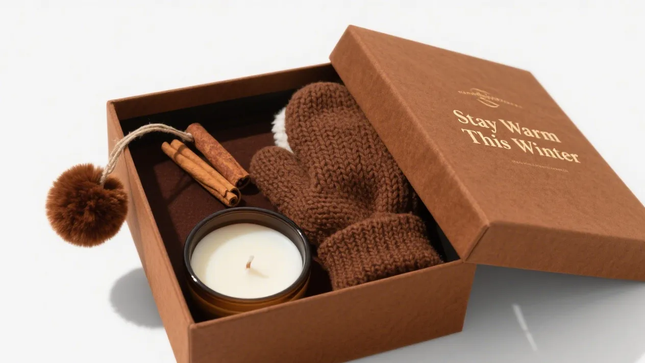
Tissue paper and a short card can make the package feel personal. They also soften the transition from the outer package to the product itself.
For jewelry brands, this is a strong place to carry seasonal warmth without risking the core box design. A clean message and thoughtful fold can do a lot.
Luxury holiday packaging usually works best when one or two details feel intentional instead of every surface trying to be festive. The package should make the jewelry look more valuable, not compete with it.
Luxury rarely needs a crowded surface. In seasonal packaging, restraint often reads as more expensive than decoration.
A single foil mark, quiet contrast color, or clean structural detail can say more than a full printed scene. That is especially true in jewelry, where the product already carries visual value.
Pick one finish to lead the package. If everything is shiny, nothing feels special.
A holiday box can rely on foil, embossing, soft-touch, or ribbon. It does not need all four at once.
Holiday color does not have to mean bright red and green. Those colors work in some cases, but they are not the only seasonal palette.
Deep green, champagne, wine, black, winter white, and muted metallics can all feel festive when handled with control. The best choice is the one that still looks like your brand after the holiday season ends.
Texture is one of the easiest ways to make packaging feel memorable. The hand feel of the wrap, the closure action, and the lining finish all shape the impression.
In jewelry packaging, texture can carry the luxury signal even when the design is visually minimal. That gives you room to feel festive without looking loud.
The fastest way to make a premium package feel cheap is to overload it with stock holiday imagery. Snowflakes, stars, and icons are not the issue. The issue is using them without a point of view.
If the brand has no clear seasonal story, the result looks borrowed. A better package uses fewer symbols and makes each one more intentional.
Jewelry display is already built around elegance, proportion, and restraint. Seasonal packaging can borrow that language.
Use balance, spacing, and material control the way a display designer would. This helps the box feel like a natural extension of the product, not a separate costume.
Holiday packaging often lives twice. It is opened by the buyer and photographed by the buyer.
That means the box should look good up close and in a quick photo. A package with a strong front, clean reveal, and recognizable silhouette has a better chance of being shared and remembered.
A seasonal package still needs a readable brand mark. If the holiday layer hides the logo, the package stops doing its branding work.
Place the logo where it can be seen quickly and elegantly. Good seasonal packaging does not make the buyer hunt for the brand name.
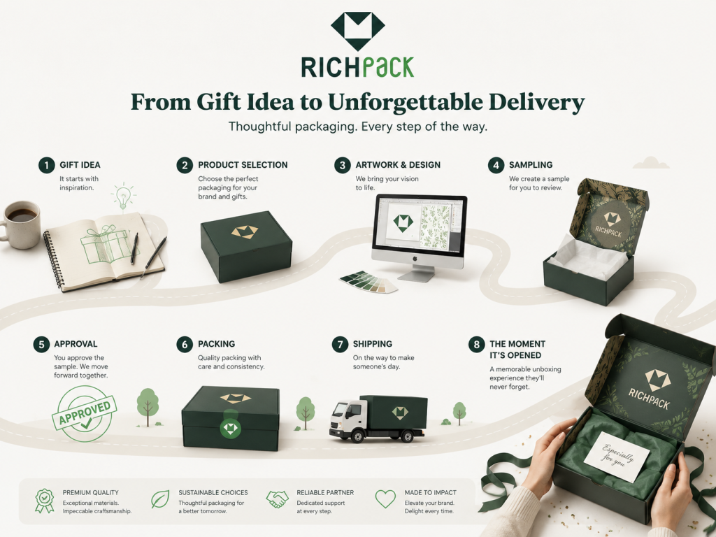
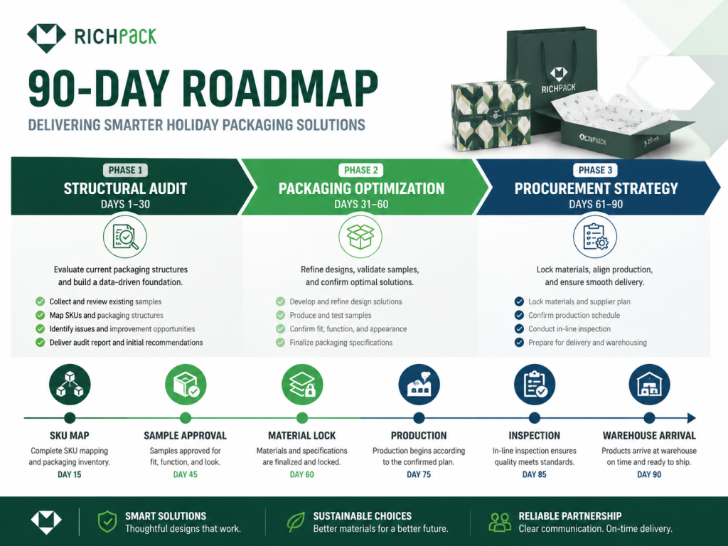
Holiday packaging is as much a calendar problem as a design problem. If structure, sampling, material booking, production, inspection, and freight are not planned early, even a beautiful design can miss the moment it was made for.
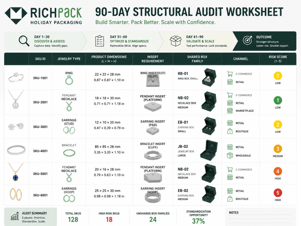
Ninety days out, the packaging team should stop dreaming and start reducing risk. The first job is a structural audit: count every SKU, measure every jewelry type, and decide which items can share one box, one insert family, or one outer shipper.
This is where many holiday programs get bloated. A brand thinks it needs six boxes, then discovers that three insert variations inside two structure families can do the same job.
Phase 1 usually covers days 90 to 61 before launch. The goal is to reduce complexity before design preferences take over.
Audit every ring, earring, necklace, bracelet, and gift set by size, weight, fragility, and channel. Then group them by packaging behavior, not product name. A delicate chain and a thin bracelet may need different visual treatment, but they may share the same anti-tangle insert logic.
Phase 2 usually runs from day 60 to day 31. Now the box has to prove its value.
This is when the team tightens the structure, insert, material stack, and finish plan. The package should shake off its everyday look without turning into a seasonal costume. Keep the design fresh, but make every upgrade justify itself.
Use this phase to test three things:
Phase 3 covers day 30 through delivery planning. This is where a good idea either becomes a real order or turns into a rush fee.
Lock the quantity, supplier capacity, carton plan, freight route, and inspection standard. If the program uses packaging distribution support, confirm warehouse arrival dates, not just factory completion dates.
Work backward from the date the package must be in the warehouse, store, or packing room. Factory completion is not the finish line.
A practical route is simple: delivery date, freight buffer, final inspection, production, material booking, sample approval, structural sample, artwork, and brief. If one of those steps is vague, the schedule is not real yet.
Structural sampling should begin before the artwork is treated as final. Otherwise, the art gets locked into a box that may not fit the product.
For jewelry, test the insert first. If the necklace tangles, the ring leans, or the earring card bends, the exterior design is not ready to carry the season.
Approve color and finish on the actual material stack whenever possible. Screens lie. White paper, kraft stock, coated board, and textured wrap all change color behavior.
Metallic foil needs special attention. Champagne gold, yellow gold, and warm brass can look close in a file and very different on a holiday jewelry box.
Lock the board, wrap, liner, insert, ribbon, and print finish before the factory schedule gets crowded. Materials become harder to secure when every other brand starts buying for the same season.
A late material change can trigger a new sample, new proof, or new quote. That is how a small decision becomes a launch problem.
Ask for capacity in practical terms: daily output, sample lead time, production lead time, QC window, and carton packing speed. A vague “yes, we can do it” is not a production plan.
For larger holiday programs, ask where the bottleneck is. It may be foil stamping, hand assembly, insert cutting, ribbon tying, or final inspection.
Any cross-border holiday program needs buffer time. Transit delays do not care that your launch date is fixed.
Build the buffer into the first schedule, not the apology email. It is easier to hold finished stock for a week than to airfreight a late package at the worst possible time.
Choose the backup plan before you need it. That might mean a simpler finish, a stock structure with a custom sleeve, or a reduced SKU set for the first delivery wave.
This is not defeat. It is how experienced packaging teams keep the program alive when the calendar gets tight.
90-Day Holiday Packaging Roadmap
| Timeline | Phase | Main Work | Buyer Checkpoint | Risk to Watch |
| Days 90 to 76 | Structural audit | Measure SKUs, map jewelry risks, group box families | SKU consolidation sheet | Too many structures |
| Days 75 to 61 | SKU consolidation | Match rings, earrings, necklaces, and sets to shared packaging logic | Box and insert family map | Insert mismatch |
| Days 60 to 46 | Packaging optimization | Build a structural sample, test an insert, and review the gift moment | First physical sample | Pretty box, poor fit |
| Days 45 to 31 | Finish proofing | Approve foil, embossing, color, lining, and carton behavior | Signed sample standard | Color shift |
| Days 30 to 16 | Procurement strategy | Lock quantity, material, supplier capacity, and inspection plan | Purchase order and QC checklist | Capacity bottleneck |
| Days 15 to launch | Delivery control | Final inspection, carton labeling, freight, and warehouse arrival | Arrival confirmation | Late handoff |
The budget should follow the role the package plays in the sale. A seasonal sleeve, premium jewelry launch box, and full corporate gift system all deserve different cost logic because they carry different expectations.
If the seasonal need is light, the budget can focus on a surface refresh instead of a full structural change. That is often enough for repeat customers who already know the brand.
A print change, new insert card, or ribbon update can shift the mood without turning the season into a full packaging rebuild.
Sleeves are a strong middle-ground option. They let you create a seasonal identity without replacing the core box.
That makes them useful when you want a holiday signal but need to control cost and production time. They are also easier to scale if the underlying box system already works well.
When the package itself has to feel like part of the gift, the budget must support that role. A custom rigid box with a tailored insert and premium finish costs more because it does more.
This is where brands often underestimate the cost of structure, finish, and fit. A package that seems simple at the concept stage can become complex once the product, insert, and finish all need to work together.
Luxury holiday sets usually carry the highest expectations. The box, insert, closure feel, and surface finish all matter at the same time.
If the product is positioned as premium, the package cannot look like a quick seasonal add-on. It has to feel designed from the start.
Small runs need careful planning because fixed setup work is spread across fewer units. That makes the per-unit cost feel higher than it does for large orders.
The answer is not to cheapen the package blindly. It is to choose the right level of structure and finish for the quantity you actually need.
Large gift programs need consistency more than novelty. When dozens or hundreds of packages move through one campaign, a clean system matters more than a clever one-off.
Clear specs, stable materials, and simple QC rules save money and time.
The main cost drivers are structure complexity, board weight, finish choice, insert detail, and quantity. Holidays also add pressure to scheduling and logistics.
If you want the package to look more premium without a dramatic cost jump, focus on one or two controlled upgrades instead of changing everything at once.
You can often save by simplifying secondary decoration while keeping the main box strong. That might mean a cleaner print area, one fewer special finish, or a smarter insert layout.
Do not cut corners on fit, closure feel, or product protection. Those are the parts the buyer notices immediately.
Holiday Packaging Budget Planning Matrix
| Program Type | Typical Use | Main Cost Drivers | Best For | Risk to Control |
| Seasonal sleeve | Fast refresh | Print, cutting, assembly | Small brands | Weak premium feel |
| Custom rigid box | Giftable hero SKU | Board, wrap, insert, finish | Jewelry launches | Sampling time |
| Magnetic gift box | Premium unboxing | Structure, magnets, wrap, lining | Luxury sets | Closure feel |
| Gift bag and tissue | Retail support | Paper, handle, foil, quantity | Boutique sales | Inconsistent color |
| Full gift set system | Brand campaign | Box, insert, card, shipper | VIP gifting | Coordination failure |
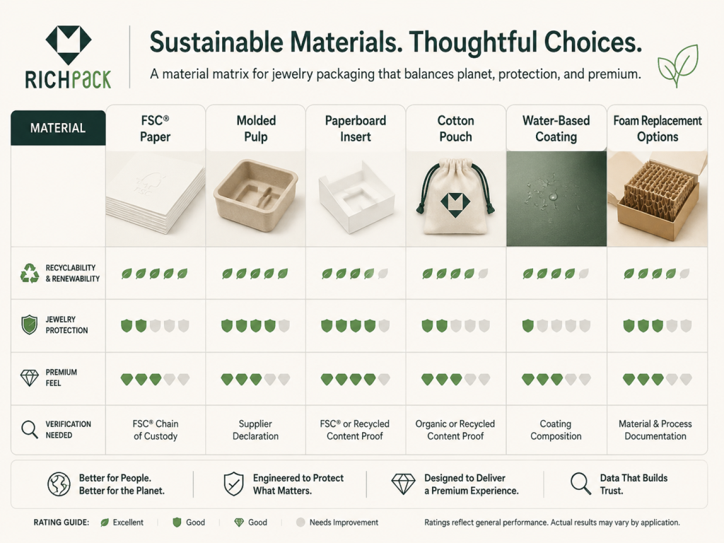
Sustainable holiday packaging needs clear material choices and proof, not broad green language. For jewelry brands, the material story still has to protect the product, feel premium, and make sense after the gift is opened.
Sustainability needs documentation, not mood. Ask for the board grade, recycled-content claim, FSC label type, insert material, adhesive notes, coating choice, and supplier documentation before the package carries a green message.
EPA data gives the business case more weight. In 2018, the United States paper and paperboard performed far better than plastic packaging:
Mono-material packaging uses one primary material family, so the package is easier to sort, separate, and recycle. In jewelry packaging, that usually means moving toward paperboard boxes, paper sleeves, paper-based inserts, and paper labels instead of mixing foam, plastic windows, film lamination, and synthetic lining without a clear reason.
The trade-off is performance. A mono-material plan still has to protect the jewelry, hold the insert shape, and look premium in the customer’s hand.
Mixed materials are not automatically wrong. They are just harder to explain and often harder to recover.
A magnetic rigid box, velvet insert, ribbon, foil logo, plastic window, and laminated sleeve may look good together, but the end-of-life story gets messy fast. If every layer uses a different material family, the package asks the customer to solve a puzzle after the gift is opened.
Plastic alternatives should be chosen by function, not guilt. Molded pulp, paperboard inserts, kraft sleeves, glassine bags, paper raffia, cotton pouches, and FSC-certified paper can all replace parts of a traditional plastic-heavy build.
For jewelry, the hard question is precision. A paper alternative still has to hold a ring upright, stop earrings from rubbing, or keep a chain from drifting into a knot.
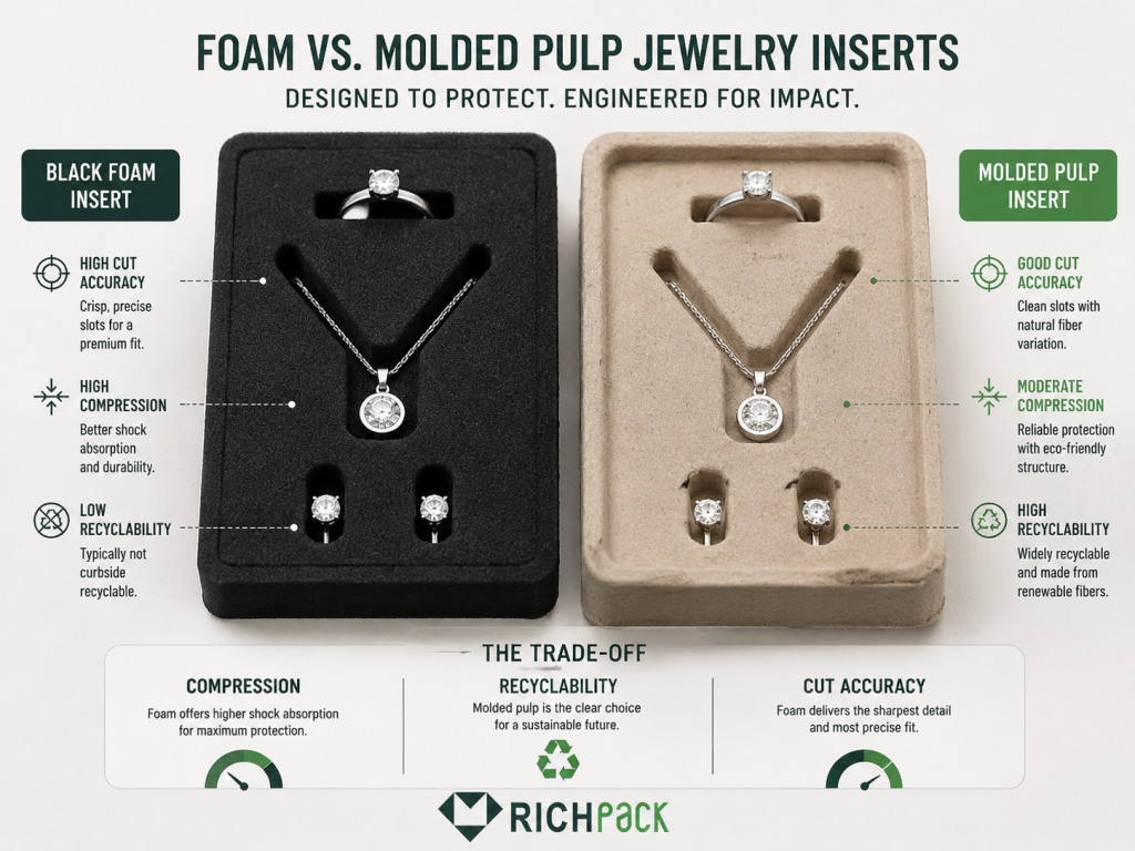
Molded pulp can replace foam when the insert needs shaped cavities, light cushioning, and a more paper-centered material story. It works best when the slot geometry is designed around the jewelry, not copied from a generic sponge insert.
Foam is forgiving because it compresses. Molded pulp is less forgiving. If the slot is wrong, the piece shows it immediately, so tolerance testing matters.
FSC-certified paper is useful when the brand wants a stronger sourcing claim for paperboard, wrap paper, hangtags, inserts, or printed cards. FSC labels are not all the same.
FSC 100% means the material comes from responsibly managed FSC-certified forests. FSC Recycled means the product is made from 100% recycled materials. FSC Mix combines FSC-certified forest material, recycled material, and controlled wood.
Reuse is the cleanest story when the box is strong enough to deserve a second life. Jewelry packaging has an advantage here because customers often keep boxes for storage, travel, or resale presentation.
Design for that second life on purpose. Use a structure that closes cleanly, an insert that can survive repeated handling, and a surface that does not scuff during the first week.
Do not write “eco-friendly” unless the package can prove what has changed. Say FSC Mix paper, molded pulp insert, paperboard sleeve, water-based coating, plastic-free window, or mono-material mailer if that is what the package uses.
Specific language builds trust. Vague language sounds like someone tried to paint the box green after the design was already finished.
Ink and lamination can make or break the material story. A beautiful soft-touch film may create the exact luxury feel the brand wants, but it can also complicate recovery.
Ask whether the finish is necessary, whether a water-based coating can do the job, and whether foil coverage can be reduced without flattening the design.
Paper inserts are easier to align with paper-based packaging systems. Foam inserts are often easier to cut, compress, and fit around awkward jewelry shapes.
The better choice depends on the product. Rings and earrings often adapt well to paperboard or molded pulp. Fine chains may still need a more controlled holding path, especially if they ship long distances.
Sustainable packaging does not have to look plain. It has to look resolved.
A clean, rigid board box, FSC-certified wrap, molded pulp insert, tight color palette, and one restrained foil mark can feel more expensive than a plastic-heavy box trying too hard. Many “green” packages are still trying to shake off a dull image. A better material system can help them do it.
Ask for the chain-of-custody certificate where FSC claims apply, material composition notes, recycled-content statements, coating details, insert material specs, and any test notes for color transfer, odor, and abrasion.
For a practical example, review a sustainable jewelry packaging case before writing the claim. The claim should follow the package, not lead it.
Sustainable Holiday Packaging Material Matrix
| Material Choice | Best Use | Strength | Watchout | Verification to Request |
| FSC 100% paper | Premium wrap, cards, sleeves | Strong sourcing claim | Availability and cost | FSC certificate and label approval |
| FSC Recycled paper | Cards, sleeves, paper inserts | Clear recycled-content story | Color consistency | Recycled-content documentation |
| FSC Mix paper | Rigid box wrap, printed boards | Flexible sourcing | Claim needs explanation | Chain-of-custody certificate |
| Molded pulp | Ring trays, shaped cavities, gift set support | Paper-based insert alternative | Slot precision | Mold test and fit sample |
| Paperboard insert | Earrings, pendants, lightweight sets | Clean mono-material direction | Bend resistance | GSM and fit tolerance |
| Cotton pouch | Secondary jewelry protection | Reusable and soft | Less structural hold | Fiber content and dye test |
| Water-based coating | Surface protection | Lower-impact finish option | Scuff behavior | Coating spec and rub test |
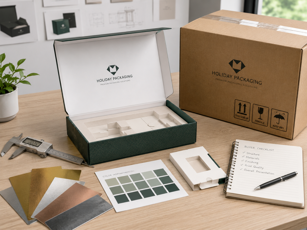
A supplier brief turns a seasonal idea into something that can be quoted, sampled, produced, inspected, and delivered. The more specific the brief is, the less room there is for wrong structures, vague finishes, missed dates, or costly sample revisions.
The starting point is always product size. Without exact dimensions, the box is a guess.
Measure the piece, padding space, and practical tolerance. A good brief tells the supplier what must fit and what must not move.
A ring, necklace, bracelet, and earring pair do not behave the same way in a box. Weight changes hold behavior, and shape changes insert design.
If the package has to hold multiple types, say so early. It changes the structure of the discussion immediately.
The supplier needs real logo files, color references, and any seasonal artwork direction. A vague brand note is not enough. If the team needs help turning ideas into production files, packaging design support should enter the workflow early.
If the brand has existing packaging or store fixtures, send those too. The holiday box should connect to the rest of the brand world.
The holiday direction should describe the feeling you want, not just list motifs. Calm winter luxury is not the same as cheerful gifting, and neither is it the same as playful retail energy.
A clear direction helps the supplier avoid overdecorating the box or drifting into generic holiday art.
Say what the box needs to do. Should it stack, ship, display, open with drama, hold a card, or protect a specific item?
Those needs shape the structure more than the holiday theme does. If the structure is wrong, decoration will not save it.
Name the materials and finishes you actually want to review. That saves time and avoids samples that look pretty but miss the brief.
If you know you want foil, embossing, velvet, or a paper-centered build, say it upfront. Clear direction gets you better quotes.
A seasonal project without a quantity and delivery date is not ready to quote. The supplier needs to judge the feasibility. For project-based work, a custom packaging project should begin with quantity, deadline, channel, and product details.
The shorter the window, the more important it is to simplify decisions. Holiday timing punishes vague projects.
Tell the supplier how the sample will be judged. That might include closure feel, color accuracy, fit, shipping durability, and surface quality.
When the standards are clear, the sample conversation gets much easier. You spend less time explaining what went wrong after the fact.
If your market has special material rules or sustainability expectations, include them in the brief. Do not leave them as a side note.
That detail belongs in the core spec because it can change materials, finishes, and production choices.
Custom Holiday Packaging Brief Checklist
| Brief Item | What to Provide | Why It Matters |
| Product size | Exact dimensions and tolerance | Prevents loose or tight inserts |
| Jewelry type | Ring, earring, necklace, bracelet, set | Determines the insert and lining |
| Channel | Retail, ecommerce, wholesale, gifting | Changes the structure and protection |
| Finish | Foil, embossing, spot UV, lamination | Controls cost and lead time |
| Quantity | Pilot, seasonal run, enterprise run | Controls unit economics |
| Delivery date | Warehouse or store arrival date | Controls production schedule |
Sample review should test the same things a buyer will notice first: look, feel, fit, opening motion, surface quality, and gift readiness. A sample is not approved because it resembles the artwork. It is approved because it behaves as the final package should.
The first look should feel intentional. If the package opens awkwardly or feels cheap in hand, the buyer notices immediately. A formal packaging quality check should include appearance, fit, closure, lining, and shipping condition.
This is the moment when the season either feels elevated or rushed.
The closure should feel smooth and reliable. A magnetic box that closes too softly or too hard does not feel finished.
That feel matters because it shapes the emotional memory of the box. Buyers remember the motion even if they do not name it.
Color can look different on screen, on paper, and under store lighting. Holiday colors are especially prone to this issue.
Always review samples in the light where the box will live. A perfect screen file does not guarantee a good physical object.
Special finishes should sharpen the package, not muddy it. If the foil spreads, embossing disappears, or details collapse at scale, the finish is not ready.
The fix may be minor, but the review has to happen before the run.
The insert is the quiet part of the design that does a lot of work. If the fit is wrong, the jewelry shifts or feels hard to remove.
A holiday package should make the product feel secure and easy to understand at the same time.
Some lining materials flatten, shed, or scuff more than expected. That can weaken the premium feel quickly.
Handle the sample more than once. The first touch and the fifth touch are not always the same.
If the package will travel, test it as it will travel. A beautiful sample that fails in transit is not a success.
Even light jewelry deserves a shipping plan that respects the shape and surface of the package.
The final question is simple: would a customer feel comfortable handing this box to someone else?
If the answer is no, the design still needs work.
One great sample is not the same as a great production run. The real test is whether multiple units feel the same.
If the seasonal program includes many handmade or special-finish elements, consistency becomes part of the value.
Different seasonal programs fail for different reasons, so the package should be judged in context. A small jewelry drop, boutique launch, luxury set, and corporate gift campaign each need a different balance of polish, speed, cost, and control.
A small brand launching a holiday drop usually needs a compact solution that looks premium without requiring a huge run. The package has to do a lot with limited volume. A low MOQ custom jewelry packaging path can help smaller teams avoid overcommitting before demand is proven.
The winning move is often a strong outer box, tailored insert, and one controlled seasonal detail. That gives the line a holiday identity without building an entirely new packaging family.
A boutique launch is about shelf impression and easy gifting. The package must hold attention at a glance and still feel practical for the customer.
This is where a retail-first structure with a strong front-facing design can pay off. If the package looks good on the shelf and opens well in hand, the boutique earns back the investment quickly.
Luxury gift sets need restraint and precision. They are not asking the package to shout. They are asking it to feel certain.
That usually means careful closure feel, clean logo placement, strong lining choices, and a seasonal detail that supports the product instead of competing with it.
Corporate gifting needs consistency, easy assembly, and dependable delivery. The package should look polished without creating unnecessary complexity for the team sending it out.
A good corporate program keeps the presentation controlled and logistics simple. That often matters more than chasing the most decorative option.
A sustainable seasonal capsule should prove its material choices in the box itself. If the visual story and material story do not line up, the message feels thin.
Paper-first construction, reusable sizing, and restrained decoration often work well here. The package should feel thoughtful rather than stripped down.
An agency handoff succeeds when the brief is specific enough to protect the idea during production. Seasonal packaging leaves little room for vague direction.
If the agency wants the final package to stay elevated, the production notes must be as clear as the creative concept.
A late reorder usually means there is no time for invention. The smartest move is to protect what already works.
That may mean reusing an approved structure and updating only the seasonal surface elements. Stability is often more valuable than novelty when the calendar is tight.
The best holiday packages do not disappear after the season. They keep working as storage, display, or keepsake packaging.
That post-season life can quietly increase the value of the package and the memory of the brand.
Most holiday packaging mistakes happen when the team treats the box as seasonal graphics instead of a working product system. These problems are easier to prevent early than to fix after sampling or delivery.
Late starts create pressure at every stage. Artwork gets rushed, sampling gets compressed, and the shipping plan gets fragile.
If the holiday window matters, the schedule has to come first.
A decorative package is not automatically a better package. If the decoration does not support the product, the result is just visual noise.
Seasonal packaging should have a job, not just a theme.
This is the most expensive mistake. A damaged item destroys the gift moment faster than a plain box ever could.
Protection is not a back-end concern. It is part of the design.
Classic holiday colors can work, but they are not mandatory. If every element is loud, the box loses distinction.
A stronger package often uses a tighter palette and lets one or two details carry the seasonal signal.
A finish can look brilliant in concept and disappointing in hand. Foil, soft-touch, embossing, and velvet all need sample testing.
If the finish is not tested, it is only a promise.
A package that looks beautiful on a desk can fail inside a carton. This is one of the biggest mismatches in seasonal packaging.
If the product ships, the package has to survive the route and still arrive giftable.
Customers notice when sustainable language has no detail behind it. Vague claims do not build trust.
Specific material choices create more confidence than broad promises.
Holiday colors can shift quickly under poor lighting. That mistake can hide problems until the boxes are already in use.
Sample reviews should happen where the package will actually be seen.
Holiday packaging is a seasonal packaging system that helps a product feel gift-ready, brand-consistent, and appropriate for a short festive sales window. For jewelry brands, it also has to secure small, delicate pieces so the opening moment does not turn into a scratch, knot, or repair issue.
It makes the product easier to choose as a gift and easier to remember after opening. For jewelry, it also protects the product promise: shine, fit, finish, and the feeling that the buyer chose something worth giving.
Start about 90 days before launch if the structure, insert, or finish is changing. Use the first 30 days for structural audits and SKU consolidation, the next 30 days for sampling and optimization, and the final 30 days for procurement, production control, inspection, and delivery planning.
A strong roadmap includes structural audits, SKU consolidation, packaging optimization, finish proofing, material lock, supplier capacity checks, final inspection, freight planning, and warehouse arrival. The route should work backward from delivery, not forward from the first design meeting.
Keep the core brand system stable and change only the seasonal layer. That seasonal layer might be color, finish, ribbon, card, sleeve, or insert detail, while the box structure, logo behavior, and product fit stay recognizable.
Rigid board, quality paperboard, FSC-certified paper, molded pulp, paperboard inserts, cotton pouches, and tested lining materials can all work. The best choice depends on product risk, channel, budget, and whether the package needs a stronger sustainability story.
Mono-material packaging uses one main material family, so recovery is easier. In jewelry packaging, that might mean a paperboard box, paper sleeve, molded pulp tray, and paper label instead of a package that mixes foam, plastic windows, film lamination, and several decorative materials.
Yes, when the brand wants a clearer sourcing claim for paper-based packaging. FSC 100% uses material from FSC-certified forests, FSC Recycled uses 100% recycled material, and FSC Mix combines certified forest material, recycled material, and controlled wood.
Holiday packaging succeeds when it makes the product easier to give, easier to protect, and easier to remember. For jewelry brands, every seasonal choice should still support fit, finish, timing, and brand trust.
The strongest holiday packaging does three jobs at once. It makes the product feel gift-ready, protects the product in real use, and gives the brand a seasonal presence that still feels like the brand.
For jewelry, that balance matters even more. A beautiful package that scratches the piece or arrives too late is not premium. A practical package that ignores the moment is not seasonal.
If you want the seasonal box to work, start with the gift moment, then design the structure, materials, finish, and schedule around it. RichPack can help turn that brief into a real production-ready program, from design through delivery.
If you are preparing a seasonal launch, start with the product size, quantity, delivery window, and finish direction, then speak with a packaging partner before the calendar gets tight. You can begin here: custom packaging program and packaging design support.
2026-02-13
2026-03-24
2025-06-16
2025-05-17
2025-09-28
2025-09-15
Adorable Small Jewelry Travel Box – Safeguard Your Treasures While Traveling
View More
Art Deco Jewelry Packaging: Blending Elegance & Modernity for Memorable Unboxing with Richpack
View More
Black & White Gift Bags – Classic, Sturdy丨Present Gifts Sleekly for Any Occasion
View More
Box Shampoo Set Package Cosmetic Paper Packaging Personal Care
View More
Brown Gift Bags – 12*16*6cm Specialty Paper | Richpack Brown Gift Bags Bulk
View MoreCharming Custom Logo Gift Bags for Special Gifts – Branded Gift Bags to Make Your Presents Stand Out
View More