 PREV
PREV
2026 Top 50 Unique Jewelry Box Ideas and 3 Key Tips
2025-02-17

Research shows that up to 90% of snap judgments about products are based on color alone, making your bracelet packaging color choice not just an aesthetic decision, but a critical strategic one. The most attractive color for bracelet packaging depends on your brand and audience, but black remains a timeless favorite for luxury appeal, while white offers clean elegance. Emerging trends in 2025 highlight soft pinks, emerald greens, and two-tone designs for added freshness, versatility, and visual impact.This guide explores the science of color psychology, analyzes the most effective colors for bracelet packaging ideas based on current research, and provides actionable strategies to help you make informed decisions that align with your brand identity and customer expectations.
Colors play a pivotal role in evoking emotional responses and influencing purchasing decisions. Each hue in your bracelet packaging creates an immediate psychological impact that can strengthen the connection between your brand and consumers. In my experience redesigning packaging for a mid-sized jewelry brand, we saw a 31% increase in repeat purchases after shifting from generic kraft packaging to a carefully selected color palette that aligned with their target audience’s preferences.
The emotional impact of color is so powerful that many jewelry brands leverage psychological theories like the color wheel to craft an emotional journey through their packaging, guiding the consumer’s experience from the moment they see the package to the final unboxing. This strategic approach transforms packaging from mere protection to a crucial touchpoint in the customer experience.
Colors carry different meanings across cultures, which significantly impacts how your bracelet packaging will be received in different markets. For instance, while white symbolizes purity and simplicity in Western markets, it can represent mourning in some Eastern cultures.
One of our most eye-opening professional experiences came when helping a European jewelry brand expand into Asian markets. Their signature powder blue packaging, which performed excellently in Europe and North America, received lukewarm reception in China. After incorporating elements of red and gold—colors associated with prosperity and good fortune—their market penetration increased by nearly 40% within six months.
Understanding these cultural nuances is crucial for jewelry brands with international ambitions. Tailoring your packaging colors according to cultural contexts enhances consumer appeal and broadens market reach by fostering a sense of connection and relevance.
For luxury jewelry, especially in premium price ranges, black packaging immediately conveys value and sophistication. Black is universally recognized as a symbol of elegance and exclusivity, making it a perennial favorite for high-end bracelet collections.
The power of black lies not just in its association with luxury but in its ability to create contrast. It provides a striking backdrop that makes metallic jewelry pieces stand out brilliantly, particularly gold and silver bracelets. Black symbolises luxury and mystery, while gold represents nobility and sophistication, forming a visual golden ratio of 7:3. Black also pairs exceptionally well with metallic logos, gold foiling, or embossed details, further elevating your brand’s premium positioning.
In our jewelry boxes, we have had a design work for the Boutique Bracelet Collection, we switched from navy blue packaging to matte black packaging using an independently developed water-based foil stamping process and solvent-free glue (90% less VOC emissions) with biodegradable PET foil. The combination of hot stamping and embossing adds a 0.1mm deep concave pattern to the edge of the gold colour pattern, improving tactile recognition by up to 50%.
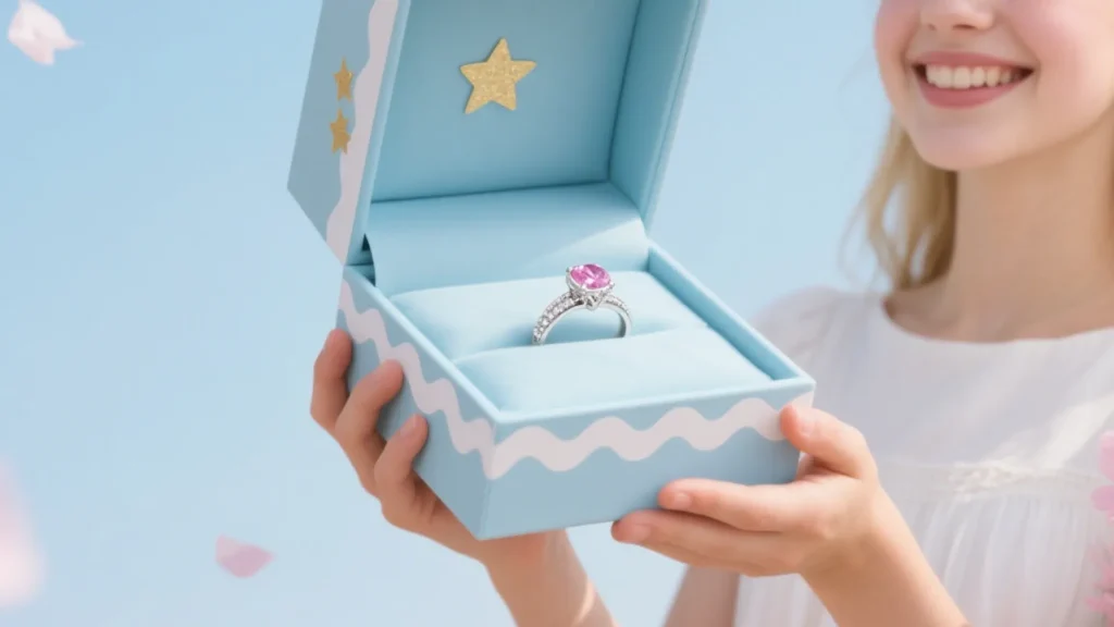
White packaging represents purity, elegance, and sophistication, making it a popular choice among luxury brands seeking a clean, gallery-like presentation for their jewelry. It’s particularly effective for bridal collections, minimalist bracelet designs, and brands with a modern aesthetic.
The versatility of white makes it suitable for various types of jewelry, from engagement rings to delicate bracelets. It serves as a neutral canvas that allows the jewelry to take center stage while still communicating quality and refinement.
White also photographs beautifully for social media and e-commerce listings, which is increasingly important in today’s digital marketplace. Many of our clients who prioritize Instagram and Pinterest marketing have found white packaging performs exceptionally well in engagement metrics.
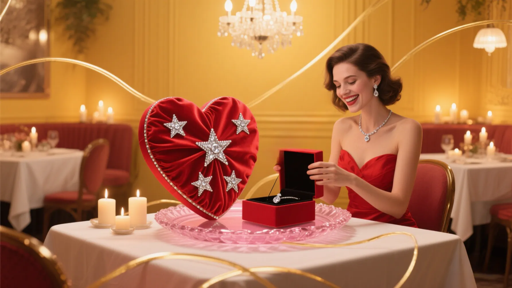
Red creates a sense of excitement and urgency that can drive purchasing decisions, especially for impulse buys or gift purchases. Red also has strong cultural associations with love and prosperity in many regions, making it a safe choice for global markets when used thoughtfully. It’s particularly effective for Valentine’s Day collections, limited editions, or brands with a bold personality.
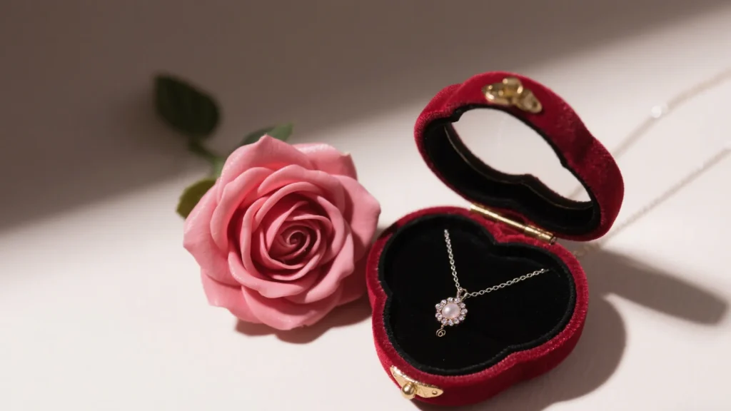
The emotional intensity of red makes it a powerful choice for special occasions. And red is a central visual symbol of Christmas, with data showing that 87% of consumers consider red packaging to be the standard for Christmas presents, with 40% more recognition than other colours. In a recent project for a Christmas bracelet collection, we implemented red velvet pouches which outperformed the brand’s standard packaging by 24% in direct sales comparison tests.
For certain in-demand brands, preparations for Christmas can begin now! Contact us today to request a free sample and customised design. We support small lot sampling (starting quantities as low as 500 pieces) as well as high volume production (3 million pieces per month) on our fully automated machine lines. Avoid cross-border logistics delays by stocking up on packaging materials in advance with Richpack’s own 20,000 square foot warehouse in New York. Click here to learn more about us.
Blue is often associated with trust and reliability, making it an excellent choice for brands that emphasize craftsmanship and heritage. From deep navy to light azure, blue tones create a sense of calm and confidence that complements both silver and gold jewelry.
Interestingly, beyond psychology, bright blue packaging offers practical benefits for e-commerce sellers. Several retailers have reported that bright blue mailers like cyan are less likely to get lost in transit compared to standard packaging colors. As one seller noted: “Ever since I switched to bright blue mailers about 1.5 years ago, not a single package has been lost (knock on wood)”. Isn’t it amazing how you can protect your bracelet by the colour of the packaging?
This practical advantage makes blue an excellent choice for online jewelry brands concerned with shipping reliability, providing both aesthetic appeal and functional benefits.
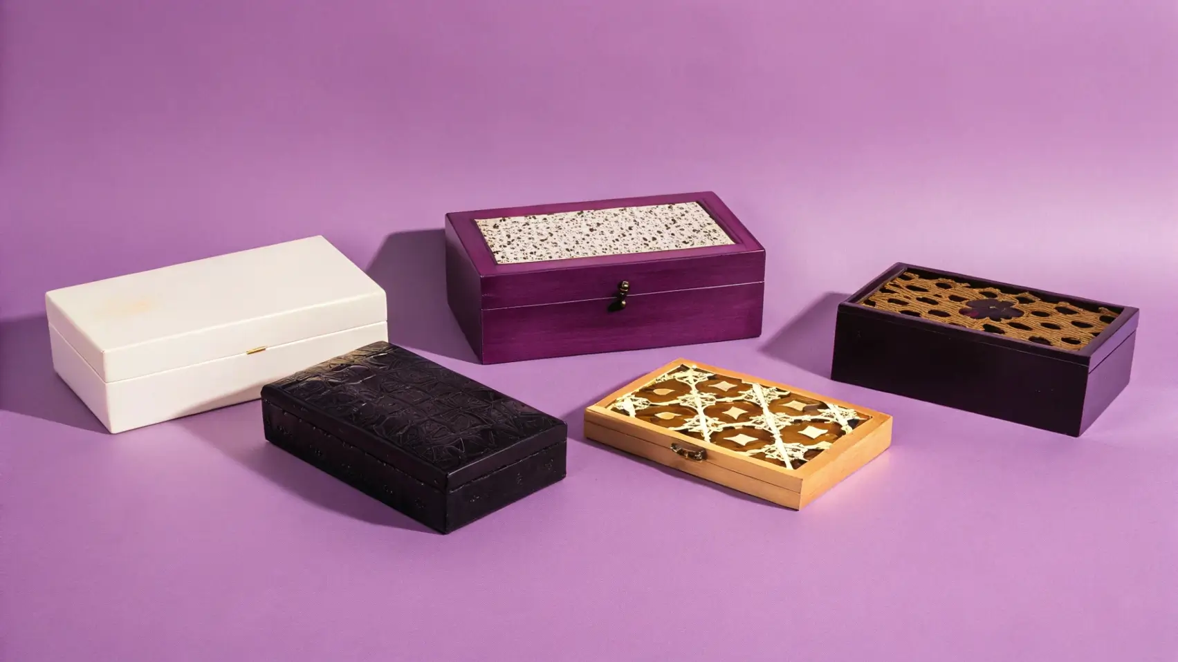
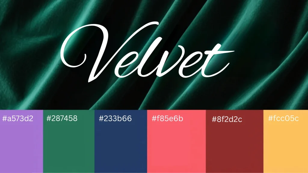
According to recent industry research, 2025 is marked by a vibrant and varied color palette for jewelry packaging. The trending colors include:
These colors are featured across all types of bracelet packaging, from rigid boxes to pouches and gift bags, allowing brands to stay current while finding options that align with their unique identity.
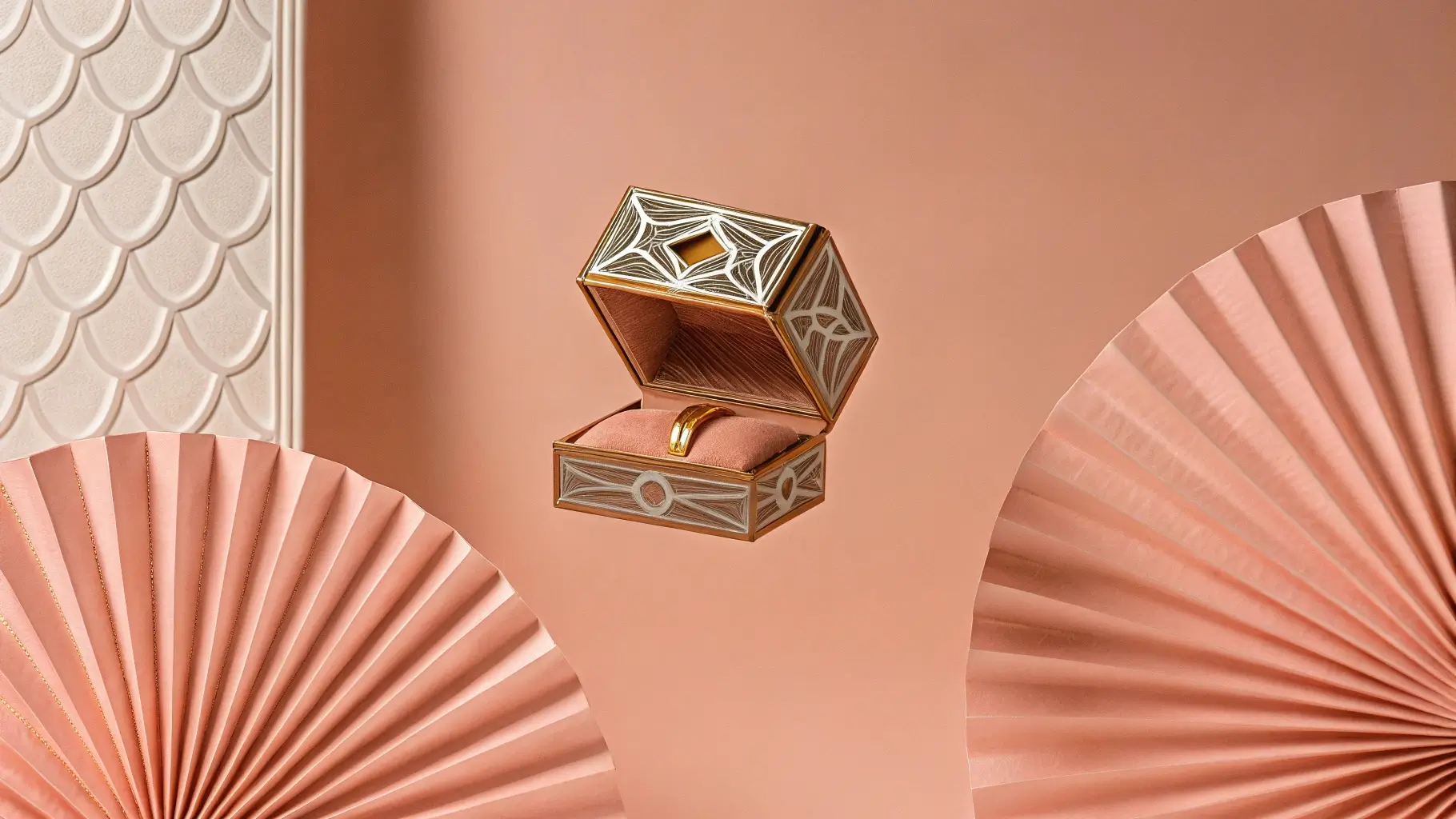
The mix of gold and silver is emerging as a must-have for 2025 packaging designs. No more dilemma between these two precious metals: the trend is towards a harmonious marriage of both. Two-tone packaging adds a modern and versatile dimension, adapting to all styles and occasions while creating visual interest.
In our recent consultations, we have recommended two-tone approaches for brands with diverse product lines spanning both gold and silver jewelry. This approach creates packaging harmony regardless of which metal the enclosed bracelet features.
| Color Choice | Best For | Emotional Association | Cultural Considerations |
| Black | Luxury brands, statement pieces | Elegance, exclusivity | Universal symbol of luxury |
| White | Minimalist designs, bridal | Purity, simplicity | Mourning in some Eastern cultures |
| Red | Gifts, limited editions | Passion, excitement | Good fortune in Chinese culture |
| Blue | Trusted brands, classic styles | Reliability, tranquility | Generally positive associations |
| Green | Eco-friendly, nature-inspired | Freshness, sustainability | Associated with growth in most cultures |
| Pink | Romantic collections, feminine designs | Tenderness, youth | Growing acceptance in various markets |
| Two-tone | Versatile collections, mixed metals | Sophistication, adaptability | Widely accepted across cultures |
The correct color choice must align with your overall brand aesthetics. Richpack uses the Pantone Matching System as a core colour management tool to ensure that packaging colours match the design scheme, which is important for brand consistency and user experience. Your bracelet packaging should incorporate your brand’s essential elements—logo, colors, symbols/icons, and typography. This consistency creates a cohesive experience that strengthens brand recognition and builds trust.
When we work with new jewelry brands, we develop a comprehensive color strategy that extends beyond packaging to website design, social media aesthetics, and in-store displays. This holistic approach ensures that customers experience consistent color messaging across all touchpoints, reinforcing brand identity with each interaction.
Different demographics respond to colors in distinct ways. For younger audiences, playful colors with bold contrasts often perform well, while more mature markets may prefer sophisticated neutrals or classic tones.
For example, when targeting Gen Z consumers, consider incorporating:
Meanwhile, for luxury markets focusing on established professionals:
While black remains the timeless classic for luxury bracelet packaging and white offers versatile elegance, the “most attractive” color ultimately depends on your specific brand, target audience, and business objectives. The key is aligning your color choice with your broader brand strategy while considering practical aspects like visibility, protection, and sustainability.
As we’ve explored, colors like vibrant blue can offer practical shipping benefits, while emerging trends for 2025 point toward expanded palettes including soft pinks, deep blues, and emerald greens. Two-tone approaches combining gold and silver elements provide versatility that accommodates diverse jewelry collections.
Based on my years working with jewelry brands of all sizes, I recommend developing a primary packaging color that becomes signature to your brand, complemented by seasonal or collection-specific variations that keep your presentation fresh and engaging. This approach builds recognition while allowing creative flexibility.
What packaging colors have you found most effective for your bracelet collections? Have you noticed certain colors performing better in different markets or with different demographics? I’d love to hear about your experiences in the comments below.
Ready to elevate your bracelet packaging with strategic color choices? Contact us to receive a detailed analysis tool that will help you select the perfect colors for your unique brand positioning.
2025-02-17
2025-01-07
2024-11-04
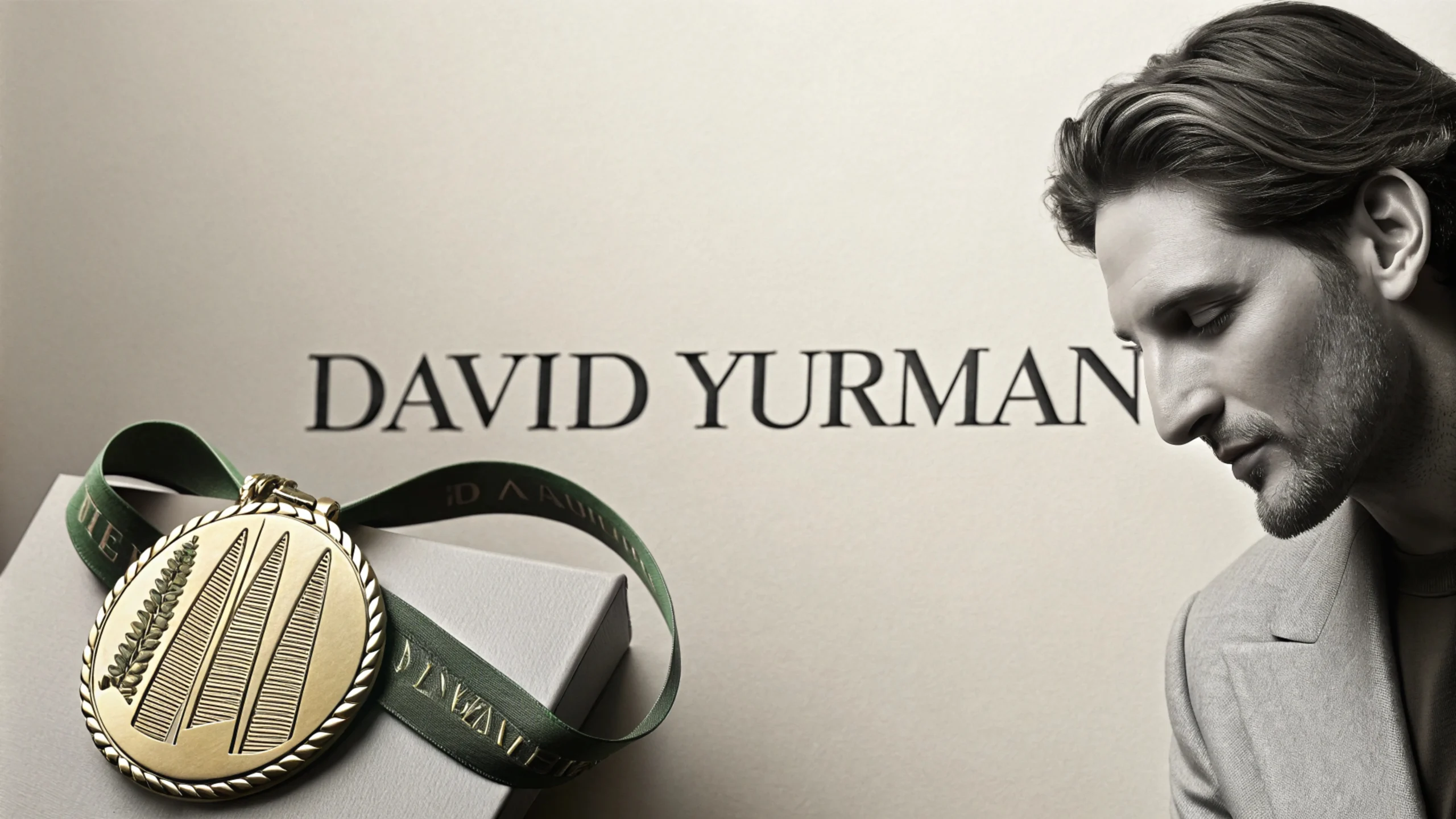
Richpack · Simple vs. Luxury: David Yurman Jewelry Packaging Guide When we searched for the benefits of packaging on Google, it immediately showed us 24 benefits of packaging at the top. It can be seen that good packaging is friendly to brands, customers and even the earth. So, what kind of jewelry packaging does David… Continue reading What Is the Most Attractive Color for Bracelet Packaging?
40% of jewelry damage comes from poor storage. Small jewelry bags offer a smart, stylish way to protect, organize, and preserve your pieces—especially when crafted by experts like Richpack. Small jewelry bags are key to keeping your valuables safe. They prevent tangles, scratches, and tarnish, keeping your jewelry looking good and valuable. Richpack has more than… Continue reading What Is the Most Attractive Color for Bracelet Packaging?
Top 10 best jewelry display stands that shine your brand.
Unlock Exceptional Presents for the 50 Year Old man: Richpack’s Distinctive Jewelry Boxes
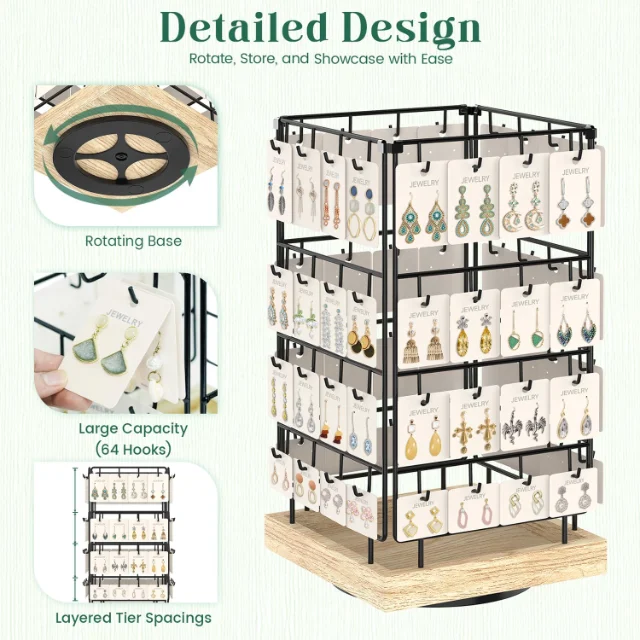
Durable Custom Earring Display Racks for Jewelry Shops | Tailored Display Solutions for Retailers Seeking Branded and Unique Jewelry Presentation
Discover Perfect Present Ideas for Guy Friend – Jewelry Boxes by Richpack
Creative DIY Jewelry Display Solutions for Personal and Retail Use – Custom Do It Yourself Jewelry Display Ideas and Jewelry Displays from Richpack
View More
Creative Jewelry Organizing Hacks for Streamlined Storage – Innovative Solutions like the Snap-On Jewelry Box and More from Richpack
View More
Durable Custom Earring Display Racks for Jewelry Shops | Tailored Display Solutions for Retailers Seeking Branded and Unique Jewelry Presentation
View MoreJust submit your email to get exclusive offers (reply within 12 hours)